
Zoho Analytics is a solid, affordable BI platform with published pricing and a capable AI assistant. Its limitations are real: G2 and Capterra reviewers consistently flag that the interface feels dated for complex visualisation work, advanced configuration outside the Zoho ecosystem requires technical expertise and per-account pricing creates user cap friction as teams grow.
If those gaps are driving your search, here are five alternatives to consider.
| Tool | Starting Price | Best For | Zoho Analytics Capability Traded |
|---|---|---|---|
| Coefficient | From $49/month | Live BI-quality dashboards from spreadsheet data; finance, RevOps, ops teams | BI dashboard UI, visualisation library |
| Microsoft Power BI | $14/user/month | Microsoft orgs, enterprise BI at low per-user cost | Affordability, pricing transparency |
| Tableau | $75/user/month | Visualisation depth, exploratory analytics | Price, ease of entry |
| Databox | Free; Pro from $59/month | Quick KPI dashboards without SQL or BI setup | Analytical depth, data volume handling |
| Looker Studio | Free (Pro from $9/user/month) | Google ecosystem dashboards, free visualisation | Native connectors, Zia AI |
Common Reasons Teams Look Beyond Zoho Analytics
- Visualisation limitations: Chart types and customisation options fall short of Tableau or Power BI for complex, publication-quality dashboards.
- Non-Zoho integrations: Connecting to systems outside the Zoho ecosystem, particularly enterprise databases and data warehouses, requires technical expertise.
- Performance at scale: Slower query performance is a recurring complaint for teams working with high row counts, even on the Enterprise plan.
- User cap constraints: Per-account pricing means scaling user access requires jumping to a higher plan tier rather than adding individual seats.
1. Coefficient
Best for: Finance, RevOps and ops teams that need live, shareable BI-quality dashboards from their data
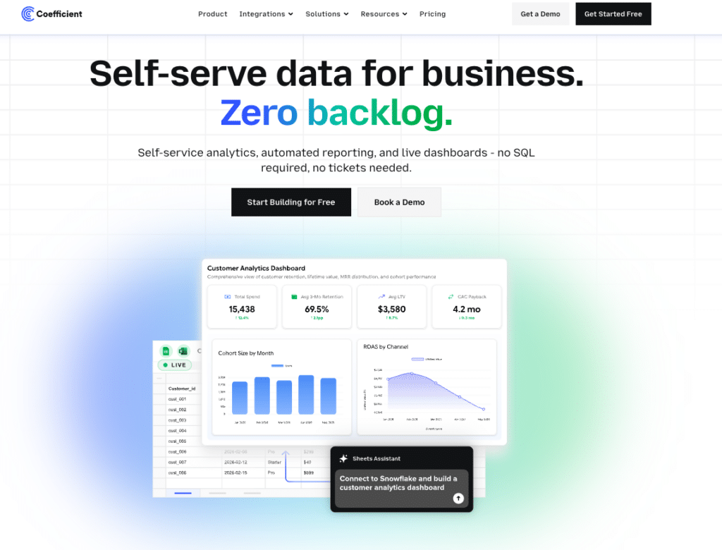
For teams using Zoho Analytics to connect business systems and share dashboards, Coefficient offers a fundamentally different path. Connect 100+ systems, including Salesforce, HubSpot, NetSuite, Snowflake, QuickBooks and Xero, directly to Google Sheets or Excel with scheduled auto-refresh, then publish the output as a live web dashboard using Vibe Reporting. Describe the dashboard you want in plain English. Get a shareable link that updates automatically as the underlying data refreshes.
Rather than asking business users to learn a BI tool, Coefficient keeps analysts in the spreadsheet environment they already use and turns that spreadsheet into a live dashboard source. For finance managers running monthly close reporting, RevOps leads tracking pipeline or ops teams monitoring headcount, this removes the BI platform from the workflow entirely without sacrificing the shareable, live output.
Pros
- Vibe Reporting publishes live, shareable web dashboards from spreadsheet data with no separate BI platform or license.
- Connects to 100+ systems including all major accounting, CRM and data warehouse platforms.
- AI Sheets Assistant builds formulas, charts, pivot tables and dashboards from plain-English prompts.
- Two-way sync pushes updates back to source systems and is not limited to read-only access.
Cons
- Not a standalone analytics platform. Works through Google Sheets or Excel.
- Visualisation is through Vibe Reporting rather than a full BI dashboard builder.
- Less suitable for exploratory analytics across very large datasets.
Pricing: Free plan available. Paid from $49/month. See coefficient.io/pricing.
| “Now teams across the company access real-time financial insights from their spreadsheets and make instant decisions with the most accurate data.” Christian Budnik, FP&A Analyst, Solv |
Microsoft Power BI
Best for: Microsoft ecosystem organisations needing enterprise-grade BI
Power BI delivers more analytical depth than Zoho Analytics at a lower per-user price. At $14/user/month Pro, it is the most cost-effective enterprise BI platform available. Copilot AI adds natural language querying, DAX generation and report summarisation. For organisations already paying for Microsoft 365, the integration with Excel, Teams and SharePoint is native and requires no additional configuration.
Pros
- Lower per-user cost than Zoho Analytics at comparable scale ($14/user/month vs. $145/month for 15 users).
- Copilot AI generates formulas, builds report pages and summarises data from plain-language input.
- Superior visualisation capabilities for complex, enterprise-grade dashboards.
Cons
- Copilot AI requires an additional $30/user/month add-on.
- DAX formula language has a meaningful learning curve.
- Less value for teams not already invested in the Microsoft ecosystem.
Pricing: Free Desktop; Pro at $14/user/month (annual); Copilot add-on $30/user/month.
Tableau
Best for: Organisations that prioritise visualisation quality and exploratory analytics
Tableau remains the benchmark for interactive data exploration. Creator licenses at $75/user/month provide full authoring access. Tableau Pulse adds AI-generated metric summaries and natural language digests. The visualisation depth, chart type library and community resources make Tableau the strongest choice for teams where dashboard quality is the primary requirement.
Pros
- Industry-leading visualisation quality and chart type depth, the strongest case for complex or publication-quality dashboards.
- Tableau Pulse delivers AI-generated metric summaries and proactive anomaly detection.
- Large community and third-party resource library for complex implementations.
Cons
- 2.5x to 5x more expensive than Zoho Analytics on a per-user basis at most plan levels.
- Viewer seats still require a paid license with no free read-only tier.
- Implementation and training costs add to total cost of ownership beyond the per-seat price.
Pricing: Creator at $75/user/month; Explorer at $42/user/month; Viewer at $15/user/month (all annual).
Databox
Best for: Quick KPI dashboards without SQL or BI setup

Stop exporting data manually. Sync data from your business systems into Google Sheets or Excel with Coefficient and set it on a refresh schedule.
Get Started
Databox has one of the lowest barriers to entry in the dashboard category. Pre-built metric libraries for 100+ platforms mean most teams build their first dashboard in minutes. The free plan includes 3 data sources, 3 dashboards and daily refresh. Pro starts at $59/month for unlimited data sources and faster refresh rates.
Pros
- Extensive pre-built metric libraries eliminate SQL for most common integrations.
- Free plan is genuinely functional for small teams evaluating before committing.
- AI Analyst (Genie) on Pro plans adds natural language data queries.
Cons
- Limited depth for custom metrics. Complex calculations require workarounds.
- Genie AI is Pro-only and not available on the free tier.
- Analytical depth falls well short of Zoho Analytics or Power BI for complex reporting.
Pricing: Free (3 data sources, daily refresh); Pro from $59/month for unlimited data sources.
Looker Studio

Best for: Google ecosystem teams needing free, shareable dashboards
Looker Studio is free for the standard product and widely used for Google Analytics, Google Ads and Sheets-based reporting. Looker Studio Pro at $9/user/month adds enterprise governance, scheduling and workspace management. The connector ecosystem is extensive for Google services but requires paid third-party connectors or workarounds for systems like Salesforce, NetSuite or Snowflake.
Pros
- Free for the standard product with unlimited reports and dashboards.
- Native integration with Google Analytics, Google Ads, BigQuery and Google Sheets.
- Easy sharing via Google Workspace permissions.
Cons
- G2 reviewers consistently flag slow load times for complex or multi-source dashboards.
- No native connector for Salesforce, HubSpot or NetSuite. A paid third-party connector or a Google Sheets workaround is required.
- Email reporting was limited to 20 recipients per report as of March 2025.
Pricing: Free (standard); Looker Studio Pro at $9/user/month (annual).
Which Tool Is Right for You?
The right Zoho Analytics alternative depends on where the platform is falling short for you. If visualisation depth is the issue, Tableau is the benchmark but comes at a price. If you need enterprise BI at a lower per-user cost and your organisation runs on Microsoft 365, Power BI at $14/user/month is the most practical switch. If you need free dashboards built on Google data, Looker Studio covers most of that without a license. Databox is the fastest entry point for teams that need KPI dashboards without SQL or a BI setup.
If your team does most of its analytical work in spreadsheets and the core need is live data with shareable dashboards that update automatically, Coefficient is worth evaluating before committing to another BI platform. Start free and connect your first data source in minutes.
| Coefficient connects Google Sheets and Excel to 100+ business systems with scheduled auto-refresh and two-way sync. Vibe Reporting publishes live, shareable web dashboards from your spreadsheet data. Free plan available. Paid plans from $49/month. |


