Every RevOps manager knows the Sunday night routine. Pull Salesforce data, paste it into the spreadsheet, rebuild the pipeline slides, check the numbers match, and send the deck to the CRO before 9 AM Monday. Same report. Different week. The data has changed but the process has not.
Vibe reporting is the name for what breaks that loop. You describe what you want in plain English. The tool builds a live, shareable dashboard from connected data. The report updates itself. The Sunday night rebuild stops.
The concept builds on what MIT Sloan’s Michael Schrage described as vibe analytics: an approach to data analysis that lets decision makers engage directly with data through AI-powered conversation, cutting out the traditional translation step between a business question and a technical answer. Vibe reporting takes that idea into the output layer, where the dashboard or report is the deliverable, not just the insight.
This article covers what vibe reporting actually means in 2026, what separates a real vibe reporting tool from an AI demo that breaks within a week, and which tools are worth using based on what your team actually needs.
What is Vibe Reporting?
Vibe reporting is the ability to describe a report or dashboard in plain language and have AI build it from live, connected data. No SQL. No BI tool configuration. No engineer required. You type what you need, and the output appears as a structured dashboard with charts, metrics and layout that reflects what you asked for.
Two things get confused with vibe reporting that are worth distinguishing up front.
The first is vibe coding. Vibe coding tools like Lovable, Bolt or Claude generate code from a prompt. The code produces a dashboard that looks impressive immediately. The problem is that you now own 2,000 lines of HTML that has to be maintained, updated and debugged every time the data changes. That is not a reporting tool. It is a development project you did not plan to take on.
The second is AI-generated static output. A screenshot, a PDF or a one-time export generated by an AI is not a vibe reporting tool. The word that separates vibe reporting from these is live. If the report does not update when the data changes, it is a one-time output. Most teams find this out after the third week of manually re-running the same prompt.
What Makes a Real Vibe Reporting Tool
Five criteria separate tools that genuinely fit the vibe reporting definition from ones that only fit it during a demo.
Live data connection, not a file you uploaded
A tool that asks you to upload a CSV or paste in a table is not a vibe reporting tool. The data has to come from a connected source: a CRM, an ERP, a data warehouse or a marketing platform. And it has to refresh on a schedule without anyone re-importing it. If the data behind the dashboard is from last Tuesday because that is when you last uploaded a file, the report is already wrong.
Plain-English input that produces structured output
The prompt interface has to produce a real dashboard with charts, labeled metrics and a layout, not a paragraph of text describing what you should build yourself. Ask for a pipeline report by stage and rep, and the tool should return exactly that as a visual you can share. If the output requires you to then build the dashboard in another tool, the AI is an assistant, not a vibe reporting tool.
Numbers that trace to a source
Every metric in a vibe report has to trace back to where it came from. For RevOps teams sharing pipeline numbers with a CRO, and for finance teams putting figures in front of a CFO, a number that looks right is not sufficient. A number that is provably right from a traceable query is what leadership actually needs. Any tool that generates metrics through AI inference rather than direct data query fails this test.
Shareable without a viewer license
Vibe reporting exists to get data to people who do not have access to the BI tool. If every person who views the dashboard needs a paid seat, the distribution problem is not solved. It is just moved to a different invoice. A live URL that anyone can open, without logging in or buying a license, is the correct form of sharing for a vibe report.
Zero maintenance after you publish
If the dashboard breaks when the data changes, it is a liability, not a reporting tool. The refresh cycle has to be automatic and server-side. That means it runs whether or not anyone’s laptop is open. The report is current every morning because the tool refreshed it overnight, not because someone remembered to run it.
The Vibe Reporting Tools Worth Using Today
The tools below are organized by category. The category that belongs first is the one most teams try first.
General AI tools: Claude, ChatGPT
The most common path to vibe reporting in 2026 is to open Claude or ChatGPT, paste in some data and ask it to build a dashboard. The first output is usually impressive. A chart appears. The layout looks clean. Someone screenshots it and posts it in Slack.
The problems start in week two. Here is what happens structurally, and why none of these are fixable with a better prompt.
There is no persistent data connection. Every session starts from scratch. If you want an updated dashboard, you re-upload the data, re-explain the context and re-run the prompt. That is not automation. That is manual reporting with an extra step.
Numbers are derived, not queried. A language model is a next-token predictor. It does not run a SQL query against your CRM. It produces the number that is most statistically plausible given the context. A plausible number and a correct number are not the same thing, and the gap between them is what ends up in front of your CRO.
Code grows unmaintainable. If you ask for a vibe-coded dashboard, every edit adds more code. By month two, no one can read it. The only recovery option is to start again from scratch.
The data refresh does not exist. When your Salesforce data changes, Claude does not know. When a deal closes or a stage updates, the dashboard stays as it was the last time you prompted. That is a static report with an AI aesthetic, not a live reporting tool.
The teams that understand this most clearly are the ones who tried it first. Most come back to a connected tool within 30 to 60 days. The AI tools below are not being dismissed. Claude is used internally at Coefficient. Anthropic is a Coefficient customer. The distinction is this: Claude wins the demo moment. A connected tool wins the job.
AI dashboard builders
This is the category that closes the gap between what general AI tools demonstrate and what teams actually need for recurring reporting.
Coefficient
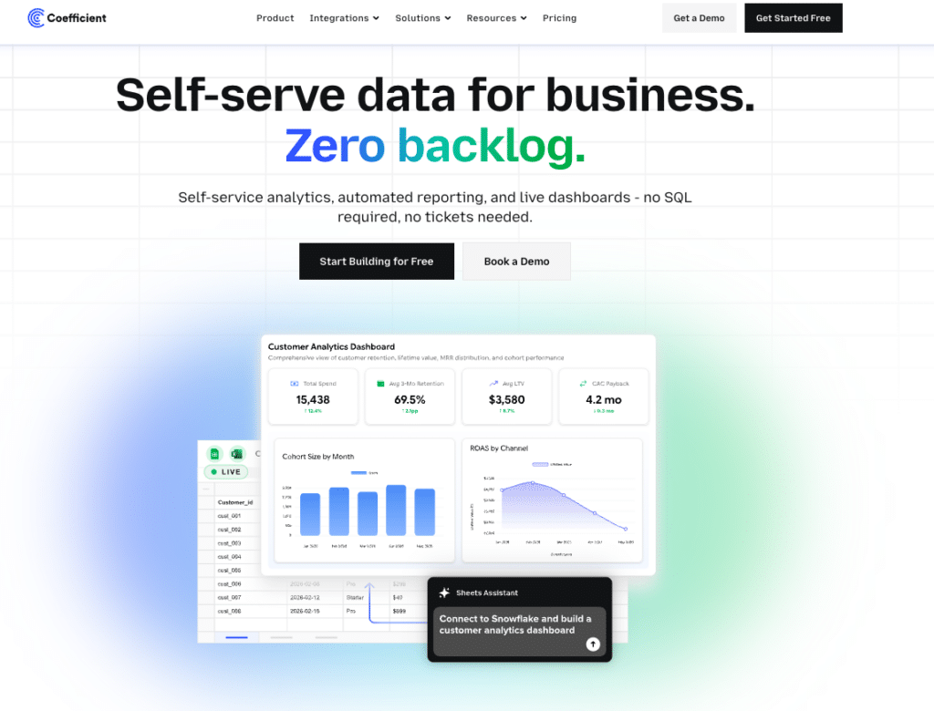
Coefficient connects 150+ data sources directly to Google Sheets or Excel, then lets you build live, shareable web dashboards from that data using plain English. The workflow is: connect your source (Salesforce, HubSpot, NetSuite, Snowflake, QuickBooks and more), describe the dashboard you need, and AI builds it while writing the SQL query behind every metric. The Explain button shows exactly which tabs and columns each figure comes from. No hallucinated numbers in front of leadership.
Server-side scheduled refresh means the dashboard is current every morning without anyone touching it. You share a live URL. Viewers access it for free with no per-seat licensing. They can also ask questions of the data through an Ask-AI sidebar. Two-way sync means corrections can be pushed back to source systems directly from the spreadsheet.
See AI dashboard example for RevOps and marketing use cases.

Supercharge your spreadsheets with GPT-powered AI tools for building formulas, charts, pivots, SQL and more. Simple prompts for automatic generation.

Limitation: requires Google Sheets or Excel as the data layer. Not a standalone BI platform. Free plan available. Paid from $49 per month for data sources.
Customer Feedback:
“I sent a live dashboard instead of a PDF. My client asked for three more.” Allison James, Nammex
“I expect this to replace most of the reporting decks we send around today.” Kevin Liu, Unity
Equals
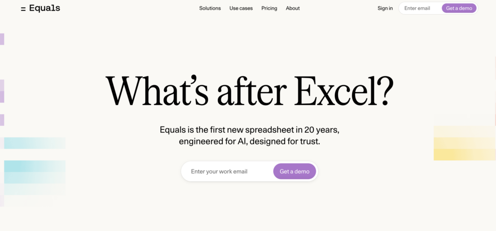
Equals is a browser-based spreadsheet platform that connects directly to data warehouses and databases, including Snowflake, BigQuery, Redshift, Salesforce and HubSpot, and keeps every spreadsheet live as the underlying data updates. Any spreadsheet can be turned into a shareable dashboard, and those dashboards can be scheduled to push updates automatically to Slack or email each morning. An AI Assist feature generates formulas, summaries and chart recommendations from plain-English descriptions of what you need. Writeback capability lets you edit records in Equals and push changes back to Salesforce or HubSpot directly. Trusted by teams at Notion, Atlassian and Stripe. Plans start at $18 per user per month.
Limitation: warehouse-native connectivity means it works best for teams already on Snowflake, BigQuery or a SQL database. Less suited for teams whose data lives primarily in a CRM or ERP without a warehouse layer in between.
Best for: RevOps and finance teams at fast-scaling companies that want spreadsheet-style analysis on top of live warehouse data, with automated dashboard distribution built in. You can find Equals pricing here.
AI-assisted BI platforms
These are traditional BI platforms with conversational AI features layered on. They are not vibe reporting tools in the strict sense. Setup requires data engineering, connectors need to be maintained and per-viewer licensing applies. They belong in this list because many teams consider them, and the trade-offs are worth understanding before committing.
ThoughtSpot
ThoughtSpot pioneered the search-driven analytics model: type a business question, get a chart back. The Spotter AI assistant extends this with conversational follow-ups and automated insight detection. It connects to Snowflake, BigQuery, Databricks and other warehouse sources. For organizations with clean, well-modeled data and a data team to maintain it, ThoughtSpot delivers fast answers to ad-hoc questions. Essentials plan starts at $25 per user per month. Pro starts at $50 per user per month. Limitation: requires significant upfront data modeling. Messy schemas or rapidly evolving data models produce poor search results. Best for: enterprises with data engineering resources and well-governed warehouse data.
Sigma Computing
Sigma Computing uses a spreadsheet-like interface that queries cloud data warehouses directly. Finance and operations teams used to working in rows and columns find the learning curve lower than traditional BI tools. It connects to Snowflake, BigQuery, Databricks and Redshift. AI features assist with formula generation and anomaly detection. Pricing is not publicly listed. Based on procurement data, median annual deployments run around $61,000 with a platform fee of approximately $30,000 and Creator licenses at $2,000 to $3,500 per user annually. Limitation: every dashboard interaction runs a live query against your warehouse, so warehouse compute costs add to the total bill. Best for: data teams and finance orgs that want spreadsheet-like querying directly against a warehouse, with IT resources to manage the deployment.
Power BI with Copilot
Power BI is the default BI choice for Microsoft-heavy organizations. Copilot adds conversational report generation on top of the existing Power BI model: describe a visual in plain English and Copilot generates it. Pro licensing runs $14 per user per month. The Copilot add-on costs $30 per user per month on top of that. Limitation: setup requires data modeling and pipeline maintenance that most business users cannot own independently. Every viewer needs a Pro seat. Best for: organizations already in the Microsoft 365 ecosystem with an analytics team to build and maintain the underlying data models.
Comparison Table
| Tool | Category | Live Data Connection | Shareable Without Login | Starts At | Best For |
|---|---|---|---|---|---|
| Coefficient | AI dashboard builder | Yes, 150+ connectors | Yes, free viewers | Free plan. Paid from $49/month. No per-user fees. | RevOps and finance teams in Sheets or Excel |
| Rows | AI-powered spreadsheet | Yes, 50+ connectors | Shareable reports | $15/user/month | Small teams wanting smarter spreadsheets |
| ThoughtSpot | AI-assisted BI | Yes, warehouse-native | Viewer licensing required | From $25/user/month | Enterprises with clean warehouse data |
| Sigma Computing | AI-assisted BI | Yes, warehouse-native | Viewer licensing required | Contact for pricing (approx. $61k/year median) | Data teams using Snowflake or BigQuery |
| Power BI with Copilot | AI-assisted BI | Yes, with data modeling | Pro seat required ($14/user/month) | $14/user/month Pro plus $30/user/month Copilot | Microsoft-heavy orgs with analytics teams |
| Claude or ChatGPT | General AI | No, session-based only | No persistent URL | Free tier available | One-time analysis, not recurring reports |
How to Pick the Right Vibe Reporting Tool
Three scenarios cover most teams evaluating these tools.
Your team lives in Google Sheets or Excel and needs live CRM or ERP data in shareable dashboards
Coefficient is the direct answer. Connect your data sources, describe the dashboard, share the URL. The spreadsheet stays as the data layer, the dashboard is the distribution layer, and the refresh happens automatically. Start with the free plan.
Your org has a data warehouse, a data engineering team and 500 or more potential viewers
ThoughtSpot or Sigma are worth evaluating. Both connect natively to warehouse data and both have AI features that reduce the SQL burden for business users. Budget for setup time, data modeling work and per-user licensing at scale.
You need a one-time dashboard for a client presentation and you have the data ready
A general AI tool works for this. Upload the data, generate the chart, screenshot or export it. Plan on rebuilding it next time rather than expecting it to update.
Vibe reporting as a category is still settling. The tools doing it well in 2026 share one consistent trait: they separate the AI’s job, which is structure, layout and query writing, from the data’s job, which is truth, refresh and governance. Teams that get both right stop rebuilding the same report every week. Teams that only get the first part right end up with a good-looking dashboard that is wrong by Friday.
If the manual reporting loop is the problem, Coefficient is free to start and connects to your first data source in minutes.


