Most business questions never get answered. Not because the data does not exist, but because the path from question to answer runs through a data team queue, a SQL request and a two-day wait for a dashboard that is already out of date by the time it arrives. Vibe analytics is the name for what eliminates that bottleneck.
The concept was defined by MIT Sloan’s Michael Schrage as an approach to data analysis that lets decision makers engage directly with data through AI-powered conversation, cutting out the translation step between a business question and a technical answer. Where the dashboard era asked “why did it happen?”, the vibe era asks “what emerges if we explore together?” The data team bottleneck does not disappear. It just stops being the only path.
This article covers what vibe analytics actually means in practice, how it differs from vibe reporting, what to look for in a tool and which options are worth evaluating in 2026.
Vibe Analytics vs. Vibe Reporting: The Distinction That Matters
These two terms are related but not the same, and confusing them leads to buying the wrong tool. Vibe analytics is about exploration. Vibe reporting is about distribution.
Vibe analytics is what happens when a growth lead asks “why did conversion drop in the second week of April?” and gets an answer through conversational back-and-forth with AI, drilling into cohorts, comparing time periods and following the data wherever it leads. The output is insight. It is not necessarily a shareable artifact.
Vibe reporting is what happens when a RevOps manager describes a pipeline dashboard in plain English, AI builds it from live connected data and shares a URL that updates itself every morning. The output is a recurring, governed deliverable. It does not require exploratory back-and-forth.
Teams need both, but they need them from different tools. A tool optimized for exploration is not necessarily the right tool for producing a dashboard the CFO checks every Monday. A tool optimized for recurring reports is not the right tool for ad-hoc root cause analysis. The tools section below is organized with this distinction in mind.
What Makes a Real Vibe Analytics Tool
Four things separate tools that genuinely fit the vibe analytics definition from ones that add a chat box to an existing dashboard and call it conversational.
Conversational follow-up, not just one-shot answers
A single natural language query that returns a chart is a natural language query tool. Vibe analytics requires the ability to follow up: “break that down by region”, “now compare it to last quarter”, “why is the northeast different?” The conversation builds context. Each answer informs the next question. If the tool resets between questions, it is not doing vibe analytics.
Connection to live data, not uploaded files
Uploading a CSV and asking questions about it is file analysis. Vibe analytics connects to live data sources so the exploration is based on current numbers, not last week’s export. The distinction matters most when the question involves recent events or fast-moving metrics.
Answers that are explainable and traceable
In an exploratory session, it is tempting to accept a chart at face value. A real vibe analytics tool shows its working: the query it ran, the columns it used, the logic behind the calculation. Without this, the insight is unverifiable and the exploration cannot be turned into a governed report later.
Self-serve for non-technical users
If the tool requires a data engineer to set up the semantic layer before a business user can ask a question, it is a governed BI platform with a chat interface. True vibe analytics is self-serve: the business user asks the question and gets the answer without a ticket, a model or a week of setup.
The Vibe Analytics Tools Worth Using in 2026
General AI tools
This is where most people start because there is no setup and the first result is usually fast. Understanding the limits is the useful part.
Claude and ChatGPT
Both tools handle conversational data exploration reasonably well when you paste in a dataset or upload a file. Ask “what is driving the drop in Q2 revenue?” and you get a response that reasons through the data, suggests hypotheses and produces charts. The follow-up conversation works. The context carries across turns within the session.
The structural limit is the same one that applies to vibe reporting: no persistent connection to live data. The session ends and the context disappears. The next time you want to explore the same question with updated numbers, you start over. For one-time analysis of data you have on hand, these tools are genuinely capable. For recurring exploration of live business data, the reset cost accumulates fast. Every session is a blank slate with no memory of your metrics, your definitions or what you explored last week.
AI-native analytics platforms
These tools are built specifically for the vibe analytics use case: conversational exploration of data, with live connections, explainable answers and self-serve access for business users. They are the most direct fit for teams that want the full vibe analytics experience without building a BI stack.
ThoughtSpot
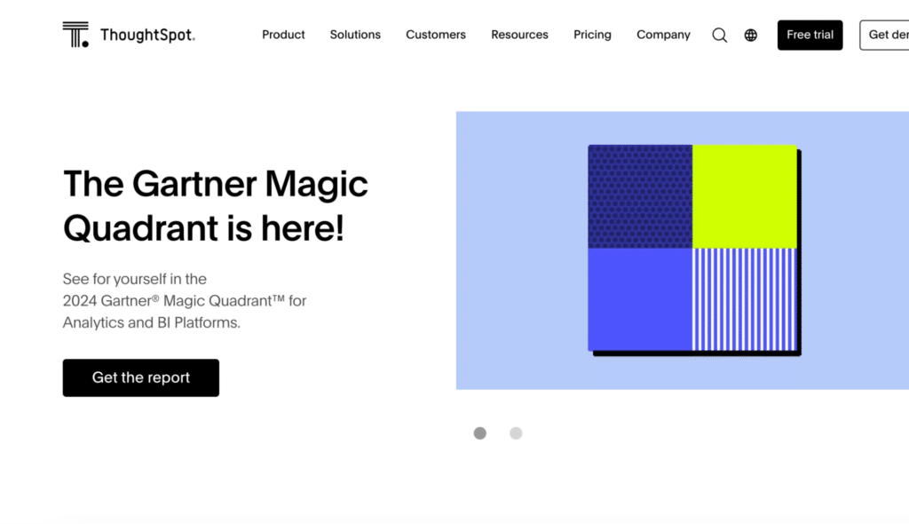
ThoughtSpot is the most established name in search-driven analytics. Type a business question in plain English and get a chart back without touching SQL. The Spotter AI agent extends this with conversational follow-ups, automated anomaly detection and agentic analysis that surfaces insights without the user needing to know what to ask. SpotterViz turns a natural language prompt into a complete, styled dashboard automatically, and the platform connects natively to Snowflake, BigQuery, Databricks, Redshift and Azure Synapse. Pricing starts at $25 per user per month for the Essentials plan and $50 per user per month for Pro, both billed annually.
The main constraint is the data model requirement: ThoughtSpot works best when the underlying warehouse data is clean and well-structured. Messy schemas or rapidly evolving models tend to produce poor search results, which means there is meaningful data engineering work before business users can self-serve reliably. It is best suited to enterprises with dedicated analytics resources and governed warehouse data.
Coefficient
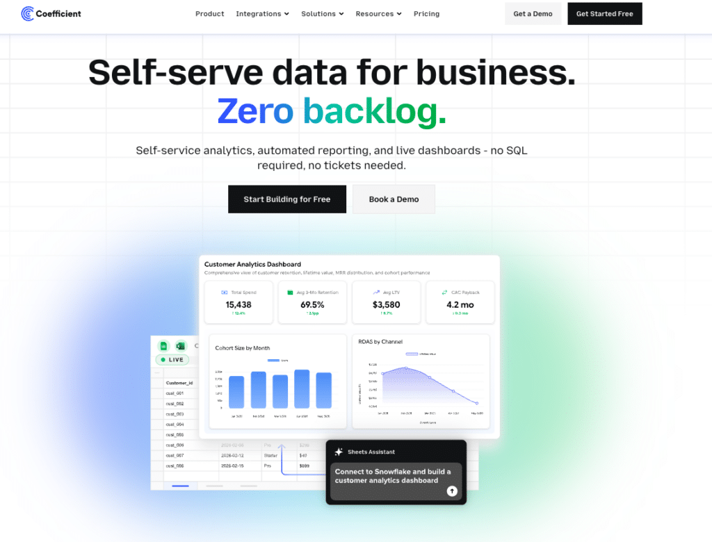
Coefficient approaches vibe analytics from the spreadsheet layer rather than a standalone platform. Sheets Assistant is an AI built directly into Google Sheets that understands the actual columns, logic and context of your spreadsheet rather than making generic guesses about your data structure. Ask it to build a pivot table, write a SQL query, generate a chart or pull unstructured data from Gmail or PDFs into a structured sheet, and it delivers the output directly without leaving the spreadsheet.
On the distribution side, Coefficient connects 150+ data sources including Salesforce, HubSpot, Snowflake and NetSuite to Google Sheets or Excel and builds shareable web dashboards from that live data. Viewers of those dashboards get an Ask-AI sidebar to keep exploring the data conversationally without needing spreadsheet access. Every number traces to a SQL source via the Explain button, which is what makes the output trustworthy enough to share with a CFO or a board.
The free plan covers the basics and paid plans start at $49 per month with no per-user fees. The constraint is the same as every other Coefficient use case: it requires Google Sheets or Excel as the data layer and is not a standalone BI platform. It is best suited to RevOps and finance teams whose analytics workflow already lives in spreadsheets.
“I sent a live dashboard instead of a PDF. My client asked for three more.” Allison James, Nammex
Julius AI
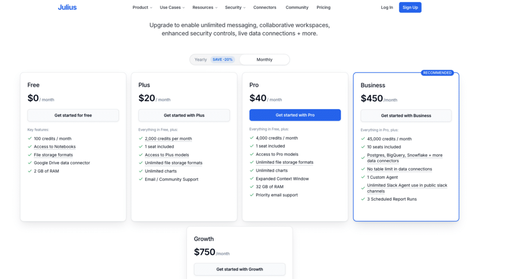
Julius AI takes a more accessible approach. Upload a CSV, connect a database or link a Google Sheet, ask a question in plain English and get an interactive chart back in seconds. The Notebooks feature is what makes it genuinely useful for recurring analysis: build a sequence of steps once, save it and run the same analysis on updated data each week without starting from scratch. The Python code behind every visualization is visible and editable, which matters for analysts who want to verify the logic before sharing the output.

Supercharge your spreadsheets with GPT-powered AI tools for building formulas, charts, pivots, SQL and more. Simple prompts for automatic generation.

Supports data cleaning, merging, forecasting and predictive modeling. SOC 2 compliant. Plans start at around $18 per month. The main limitation is that Julius works best for file-based exploration. It is not built for live CRM or ERP connectivity in the way a warehouse-native tool is, so teams with data spread across business systems will hit that ceiling fairly quickly.
AI-assisted BI platforms with conversational features
These are governed BI platforms that have added conversational AI on top of their existing architecture. They are powerful for organizations with data engineering resources and a need for governed, enterprise-scale analytics. They are not self-serve for a growth analyst who wants to explore a hypothesis without filing a request.
Sigma Computing
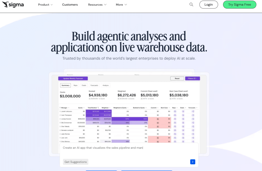
Sigma Computing uses a spreadsheet-like interface that queries cloud data warehouses directly, which makes the learning curve lower for finance and operations teams used to working in rows and columns. AI features assist with formula generation, anomaly detection and automated insight summaries, and every dashboard interaction runs a live SQL query against the warehouse rather than pulling from a cached data extract.
Pricing is not published. Based on procurement data, median annual deployments run around $61,000, with a platform fee of approximately $30,000 and Creator licenses at $2,000 to $3,500 per user annually. One cost worth noting is that every query runs against the warehouse, which means warehouse compute costs add to the total bill as usage scales. It is best suited to data teams and finance organizations with existing warehouse infrastructure and the engineering resources to manage the deployment.
Power BI with Copilot
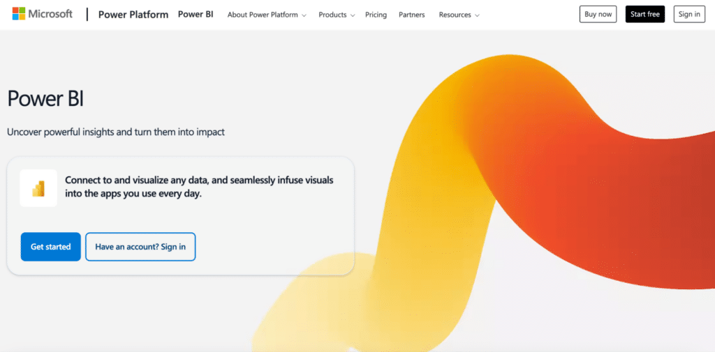
Power BI is the default BI choice for Microsoft-heavy organizations, and the Copilot feature adds a conversational layer on top: describe what you want to explore and Copilot generates the visual against your existing data model. Pro licensing runs $14 per user per month, with the Copilot add-on costing an additional $30 per user per month.
The quality of what Copilot produces depends almost entirely on how clean and well-structured the underlying data model is, which means there is real data engineering work required before the conversational layer becomes reliably useful. For organizations already running Power BI with an analytics team maintaining the models, Copilot is a meaningful productivity gain. For teams without that foundation, it is not the right starting point.
Comparison Table
| Tool | Primary Use | Live Data Connection | Conversational Exploration | Best For | Starts At |
|---|---|---|---|---|---|
| Claude or ChatGPT | Ad-hoc exploration | No, session-based | Yes, within session only | One-time analysis of data on hand | Free tier available |
| ThoughtSpot | Search-driven analytics | Yes, warehouse-native | Yes, Spotter AI agent | Enterprises with governed warehouse data | From $25/user/month |
| Julius AI | AI data analyst | Files, databases, Sheets | Yes, Notebooks for repeatable workflows | Analysts exploring files and databases | From $18/month |
| Coefficient | In-sheet analytics and live reporting | Yes, 150+ business sources | Sheets Assistant in Sheets, Ask-AI on dashboards | RevOps and finance teams working in Google Sheets or Excel | Free plan. Paid from $49/month. No per-user fees. |
| Sigma Computing | Warehouse BI | Yes, warehouse-native | AI-assisted formulas and summaries | Data teams querying Snowflake or BigQuery | Contact for pricing |
| Power BI with Copilot | Enterprise BI | Yes, with data modeling | Copilot generates visuals conversationally | Microsoft-heavy orgs with analytics teams | $14/user/month Pro plus $30 Copilot |
How to Pick the Right Vibe Analytics Tool
The question to answer before evaluating any tool is: am I trying to explore a question or produce a recurring output? Most teams need to do both, but usually one is the bottleneck.
Your bottleneck is exploration: you have questions your data team cannot answer fast enough
Julius AI is the lowest-friction starting point. Upload your data, ask the question, follow up conversationally. For enterprise teams with warehouse data and governance requirements, ThoughtSpot is the more scalable answer.
Your bottleneck is recurring reporting: you spend hours rebuilding the same dashboard every week
Coefficient is the direct answer. Connect your data sources, describe the dashboard in plain English, share a live URL. The rebuild stops. Free plan available.
Your analytics workflow lives in Google Sheets and you want both exploration and distribution
Sheets Assistant handles the exploratory questions inside the spreadsheet. The AI dashboard builder turns the findings into a live, shareable URL. The entire workflow stays in one place without a separate analytics platform.
You want to explore first with a dedicated tool, then report on what you find
Use Julius AI or ThoughtSpot for the exploratory phase. When you have identified the metrics and dimensions worth tracking, Coefficient turns that into a live, recurring dashboard that does not need to be rebuilt every week.
Your organization has a data warehouse and an analytics team
Sigma or Power BI with Copilot are worth evaluating. Both require data engineering investment upfront and deliver governed analytics at scale in return.
Vibe analytics in 2026 is not a single tool. It is a shift in how business teams interact with data: from waiting for reports to asking questions directly. The tools that support this shift well share one quality: they keep the human in the conversation rather than replacing them with a static dashboard. The analyst still decides what to explore. The AI handles the mechanics of getting there.
If the insight you are chasing needs to become a recurring, trusted report, Coefficient bridges that gap from exploration to live distribution.


