Table of Contents
![]()
-
1. 10 B2B Sales Dashboards for RevOps Teams in 2026
- 1. Sales Forecasting Dashboard
- 2. Sales Performance Dashboard
- 3. Pipeline Management Dashboard
- 4. Sales Cycle Dashboard
- 5. Sales Activity Dashboard
- 6. Sales Rep Scorecard Dashboard
- 7. Win/Loss Analysis Dashboard
- 8. Sales Opportunities Dashboard
- 9. Leads Dashboard
- 10. Sales Revenue Dashboard
- Build Custom Sales Dashboards with Coefficient in Google Sheets
- B2B Sales Dashboards: The Ultimate Tool for RevOps Professionals
- 2. How to build a lead generation dashboard in Google Sheets
- 3. Sales Performance Dashboard: Free Spreadsheet Template
- 4. How to Build a Sales Dashboard in Google Sheets
- 5. Sales KPIs Dashboard: 4 Free Google Sheets Templates
- 6. Free Sales Templates: SalesOps Dashboards for Google Sheets
- 7. 5 Sales Tracking Spreadsheet Templates for Reporting
- 8. Opportunity History Template: Track Sales Forecast Changes


According to a recent study by Gartner, organizations that leverage advanced analytics and sales dashboards achieve a 20% increase in win rates and a 10% decrease in sales cycles. This underscores the importance of choosing the right sales dashboards for your RevOps team.
In this comprehensive guide, we’ve curated the 10 most effective B2B sales dashboards that can transform your RevOps operations.
These dashboards offer real-time insights, predictive analytics, and the ability to track key performance indicators, enabling your team to make informed decisions, optimize sales processes, and drive revenue growth.
Let’s dive in!
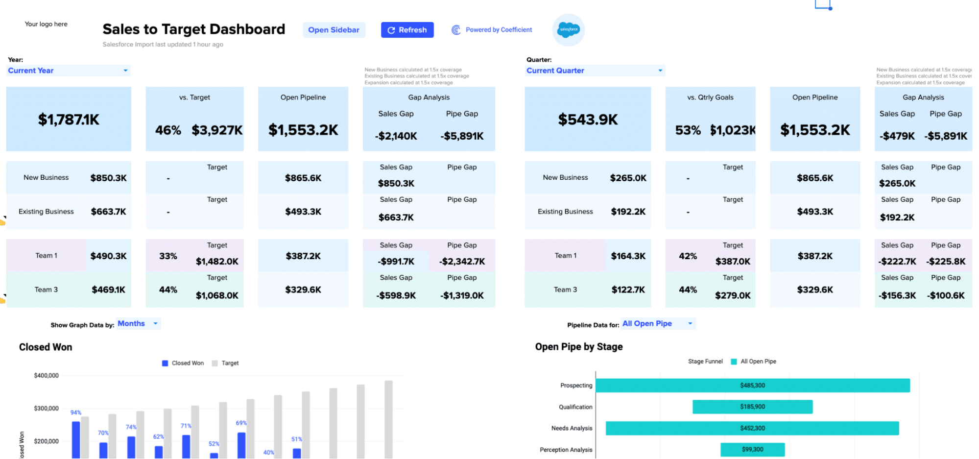
1. Sales Forecasting Dashboard
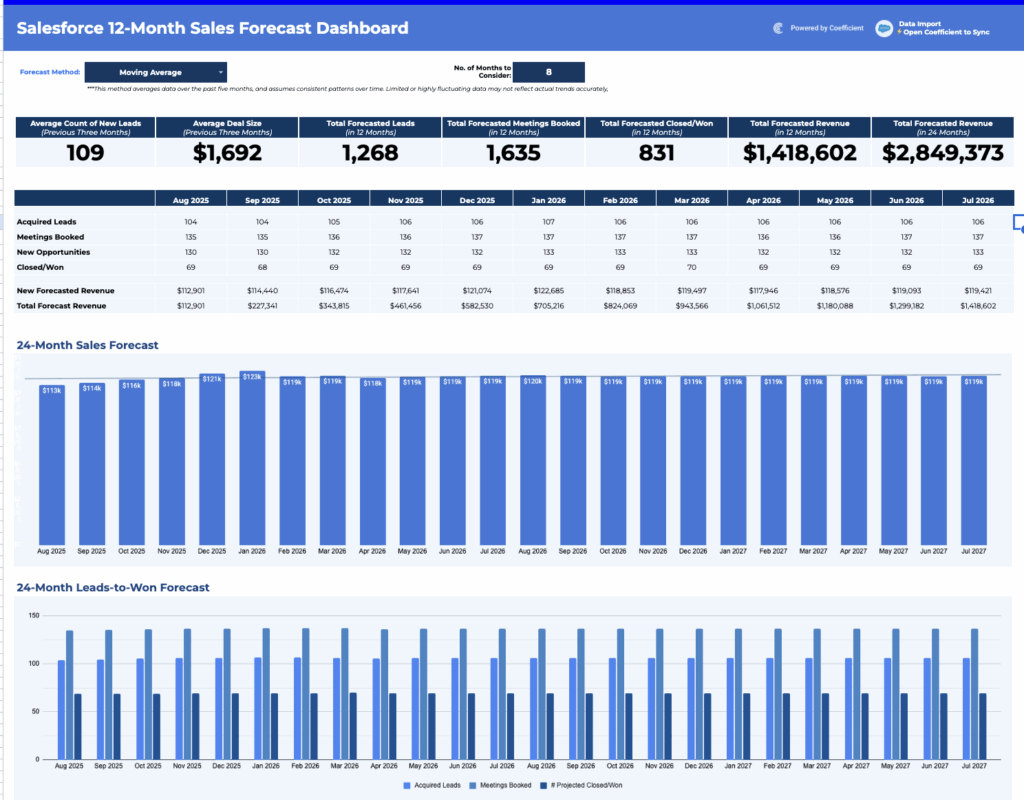
A Sales Forecasting Dashboard is a vital business tool to predict future sales performance. It allows you to closely monitor key revenue operations metrics such as projected revenue, sales quotas, and pipeline trends.
- Projected Revenue: This metric estimates how much money your business expects to earn in a specific period. It helps in setting realistic financial goals and allocating resources effectively.
- Sales Quotas: Sales quotas are targets or goals set for your sales team. The dashboard helps you monitor their real-time progress, ensuring they stay on track and meet their objectives.
- Pipeline Trends: Understanding pipeline trends means analyzing the flow of potential deals. The dashboard provides insights into how leads progress through your sales process, helping you identify bottlenecks or opportunities for improvement.
Using a Sales Forecasting Dashboard allows you to make informed decisions, allocate resources efficiently, and adapt your sales strategies based on real-time data. This proactive approach enhances your ability to meet revenue goals and stay competitive in the market.
2. Sales Performance Dashboard
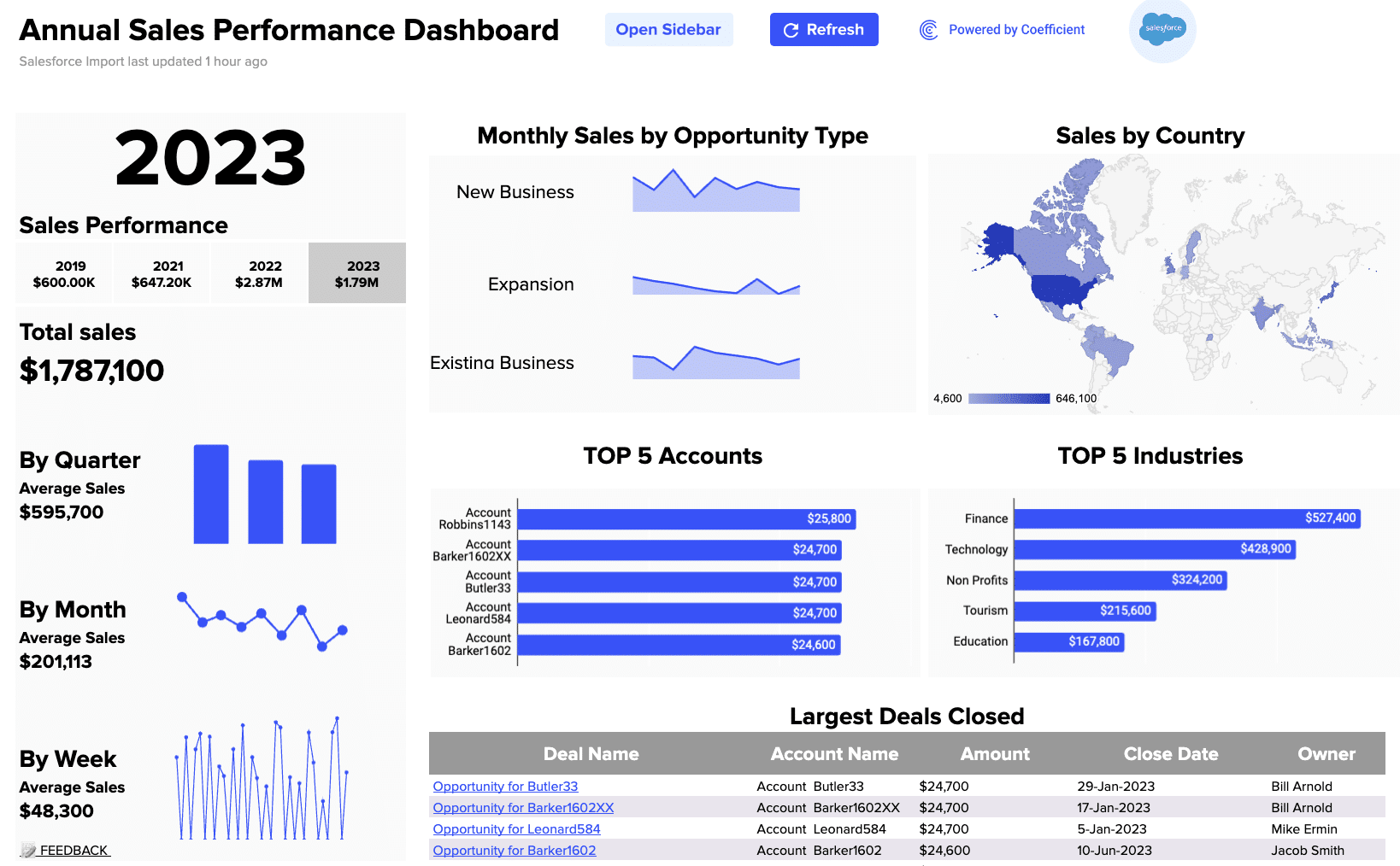
A Sales Performance Dashboard is an essential tool for businesses aiming to enhance their sales operations and drive success. This user-friendly dashboard provides real-time insights into both individual and team sales activities, facilitating effective monitoring and decision-making.
One of its primary functions is to track the number of calls each salesperson makes, offering a clear view of their outreach efforts. This information helps sales managers ensure their team actively engages with potential customers and prospects.
It allows businesses to keep tabs on the number of deals closed, providing a crucial measure of sales effectiveness and revenue generation. It helps identify which strategies yield the best results and which areas may require improvement.
3. Pipeline Management Dashboard
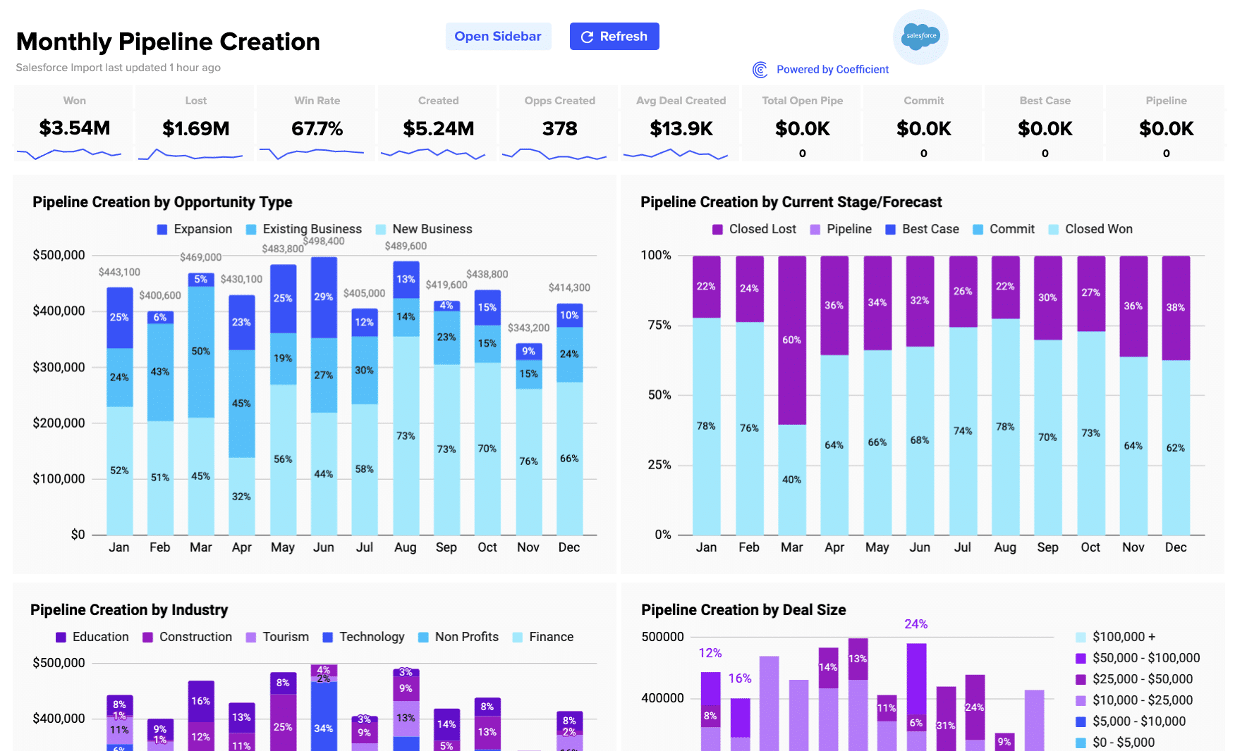
The Pipeline Management Dashboard is a powerful tool designed to help businesses assess and enhance the health of their sales pipelines. This user-friendly dashboard provides a clear and real-time view of critical pipeline metrics, allowing for informed decision-making.
At its core, the dashboard offers the ability to analyze pipeline health by various key factors:
- Stage Analysis: It allows you to closely monitor the progress of deals at different stages of the sales process. This insight helps identify where potential bottlenecks or delays may be occurring, enabling proactive measures to keep the pipeline flowing smoothly.
- Projected Close Dates: The dashboard provides estimates for when deals are expected to close. This information is invaluable for managing cash flow, resource allocation, and setting realistic revenue expectations.
- Win Rates: By tracking win rates, businesses can gauge the effectiveness of their sales strategies. It helps in understanding which types of leads or opportunities are more likely to convert into actual sales.
4. Sales Cycle Dashboard
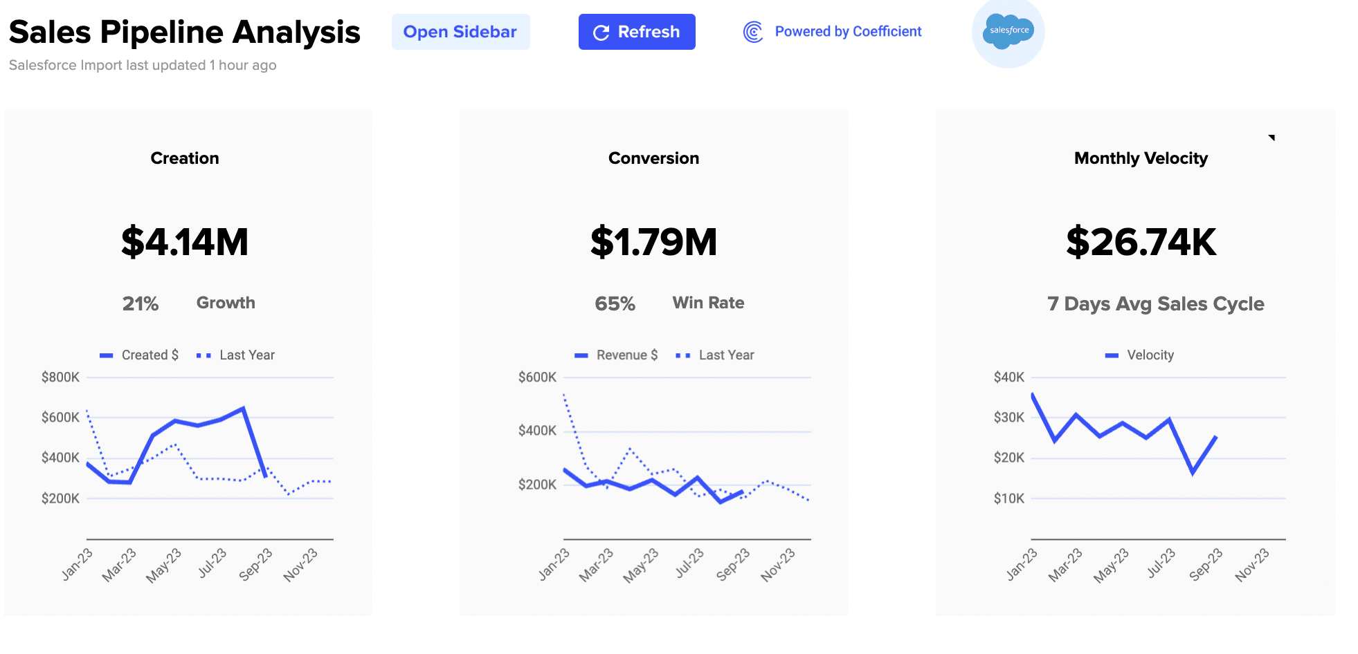
The Sales Cycle Dashboard is a valuable tool for businesses seeking to streamline their sales processes and identify areas for improvement. This user-friendly dashboard provides a clear and real-time view of the various stages within the sales cycle, enabling effective analysis.
One of its key functions is to review the sales cycle stages. It allows sales teams and managers to track and assess the progression of leads and deals through the sales process. This insight helps identify where potential bottlenecks or delays may occur, allowing for prompt intervention to keep the sales cycle running smoothly.
The dashboard works by providing a visual representation of each stage in the sales cycle, allowing for quick and easy identification of areas that may require attention. By actively monitoring the sales cycle, businesses can make data-driven decisions to optimize their processes, reduce sales cycle times, and ultimately increase revenue.
5. Sales Activity Dashboard
A Sales Activity Dashboard is a vital tool for monitoring your sales team’s performance on a daily and weekly basis. This dashboard provides real-time insights into key activities such as calls, emails, and demos. By tracking these activities, you can assess the team’s productivity and effectiveness in engaging with potential customers.
On a daily basis, the dashboard displays the number of calls made, emails sent, and demos conducted by each team member. This allows you to identify trends and allocate resources where needed. It also helps set daily targets and keep the team accountable for their actions.
The weekly view provides a broader perspective, summarizing the cumulative activities of the team throughout the week. This enables you to assess progress toward your sales goals and make strategic adjustments as necessary.
A Sales Activity Dashboard empowers you to make data-driven decisions and optimize your sales team’s efforts, ultimately driving better results and revenue growth.
6. Sales Rep Scorecard Dashboard
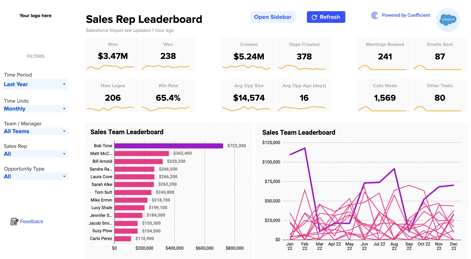
The Sales Rep Scorecard Dashboard is a pivotal instrument for businesses aiming to boost their sales team’s performance and overall success. It offers a comprehensive assessment of each sales representative’s achievements, encompassing metrics such as deals closed and activities completed.
Managers can use this dashboard to easily identify top-performing reps, providing the foundation for recognition and motivation within the team.
For those reps facing performance gaps, the dashboard serves as a valuable coaching resource, pinpointing areas for improvement and allowing for tailored training initiatives.
Efficient resource allocation becomes feasible as the dashboard aids in discerning which reps excel and require more support, contributing to more equitable workload distribution. It facilitates goal tracking, aligning reps and managers with sales targets, and empowers data-driven decision-making that optimizes sales strategies.
Enhanced accountability, driven by active performance monitoring, encourages reps to consistently work toward their objectives, ultimately resulting in revenue growth.
7. Win/Loss Analysis Dashboard
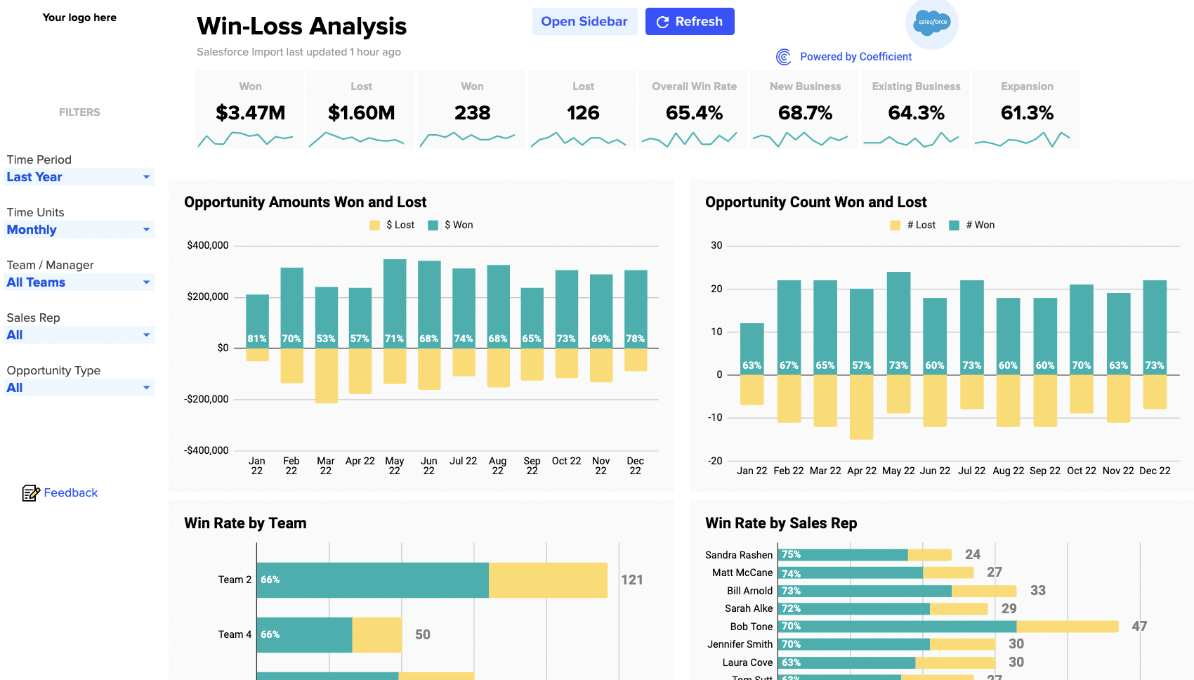
The Win/Loss Analysis Dashboard is a powerful tool designed to help businesses gain deeper insights into the factors contributing to both successful and unsuccessful deals. Its primary purpose is to enhance the sales process by understanding why deals are won or lost.
This dashboard provides a structured view of the reasons behind deal outcomes. It allows sales teams to identify patterns and trends by categorizing and analyzing various factors such as pricing, competition, product features, customer feedback, and sales rep performance.
By dissecting the data from this dashboard, you can:
- Improve Strategy: Gain a better understanding of what works and what doesn’t in your sales approach. Use this knowledge to refine your sales strategies and tactics.
- Enhance Product/Service Offerings: Identify areas where your products or services may fall short and make necessary improvements to meet customer needs better.
- Competitive Insights: Understand how your offerings compare to competitors, helping you adapt and stay ahead in the market.
- Sales Rep Training: Pinpoint areas where sales representatives may need additional training or support, leading to improved performance.
- Pricing Strategy: Determine whether pricing is a significant factor in winning or losing deals and adjust pricing strategies accordingly.
- Customer Feedback: Leverage customer feedback to make targeted improvements and provide a better buying experience.
8. Sales Opportunities Dashboard
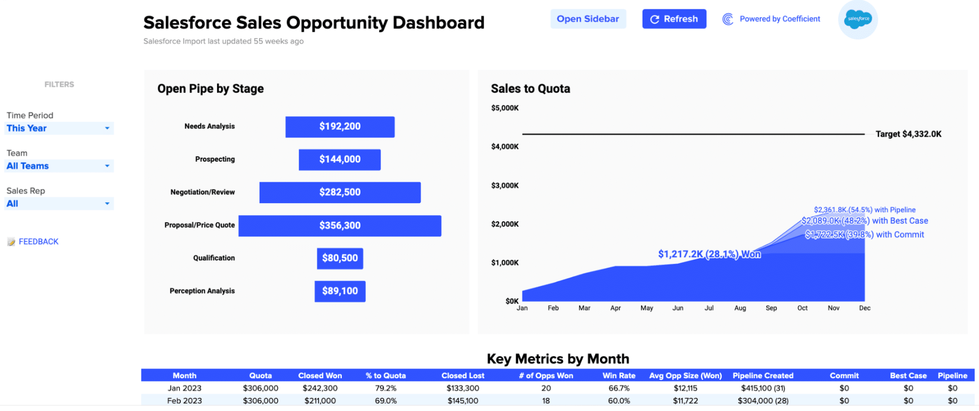
A Sales Opportunities Dashboard is a crucial tool for monitoring and managing your sales pipeline effectively. This dashboard allows you to keep tabs on your open opportunities, making it easier to prioritize and strategize. You can categorize opportunities by stage, owner, and expected close date.
You can quickly identify which deals are in the early stages of development and which ones are closer to closing. This helps your team focus their efforts where they’re needed most.
Assigning owners to each opportunity ensures accountability and helps you know who’s responsible for moving the deal forward. Plus, knowing the expected close date gives you a clear timeline for revenue projections and resource allocation.
9. Leads Dashboard
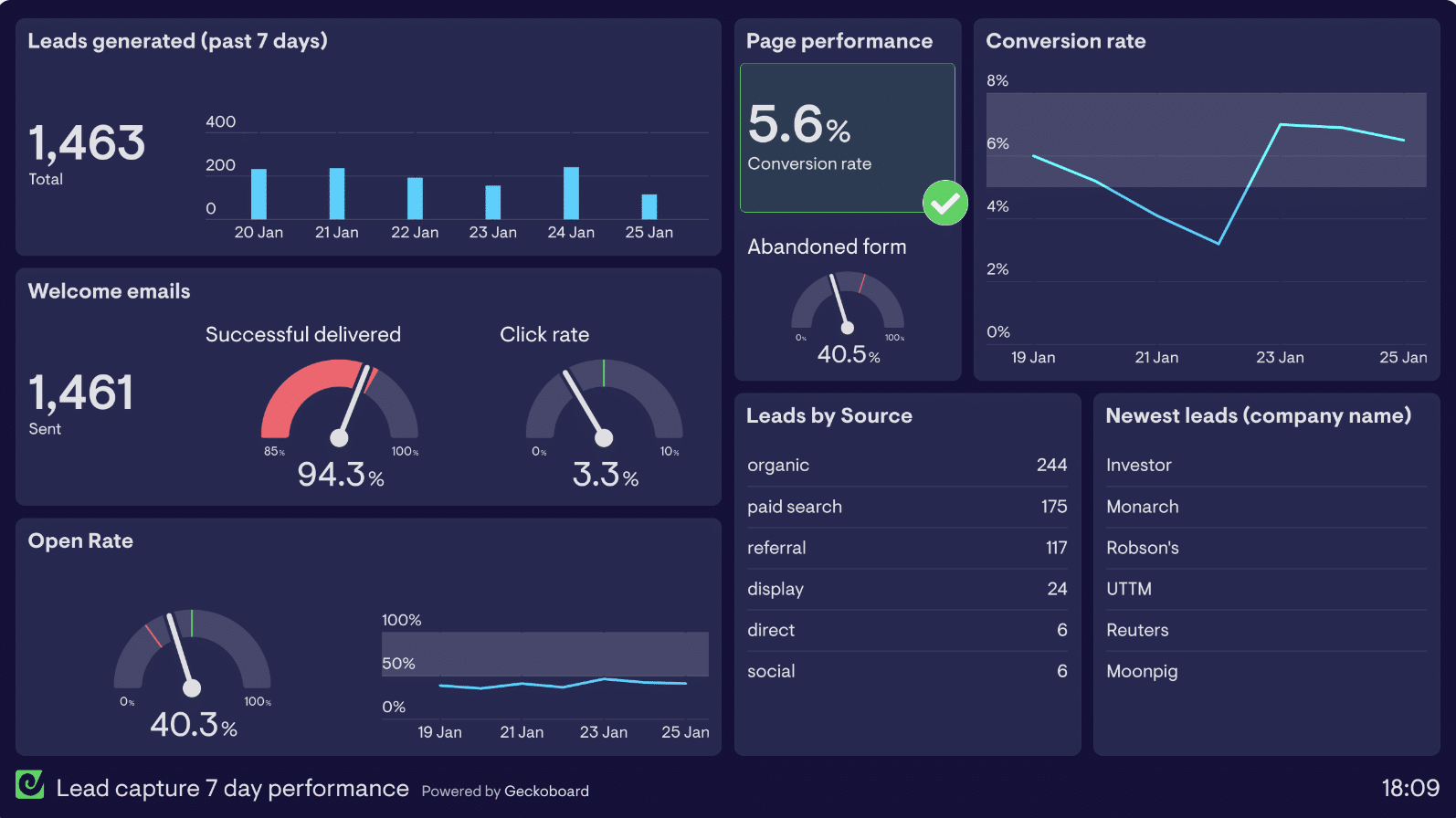
A Leads Dashboard is a dynamic tool for gaining insights into your lead generation efforts. This dashboard allows you to monitor three critical aspects of your lead management: lead volume, lead quality, and lead velocity.
- Tracking lead volume gives you a clear picture of how many leads your marketing efforts are generating. This data helps you assess your marketing campaigns’ effectiveness and set realistic growth targets.
- Evaluating lead quality helps you distinguish between leads that are more likely to convert into customers and those that may not be as promising. It’s essential to prioritize high-quality leads to maximize your sales team’s efficiency.
- Lead velocity measures the speed at which leads move through your sales funnel. This metric helps you identify bottlenecks and areas where leads are getting stuck, enabling you to take corrective actions promptly.
10. Sales Revenue Dashboard
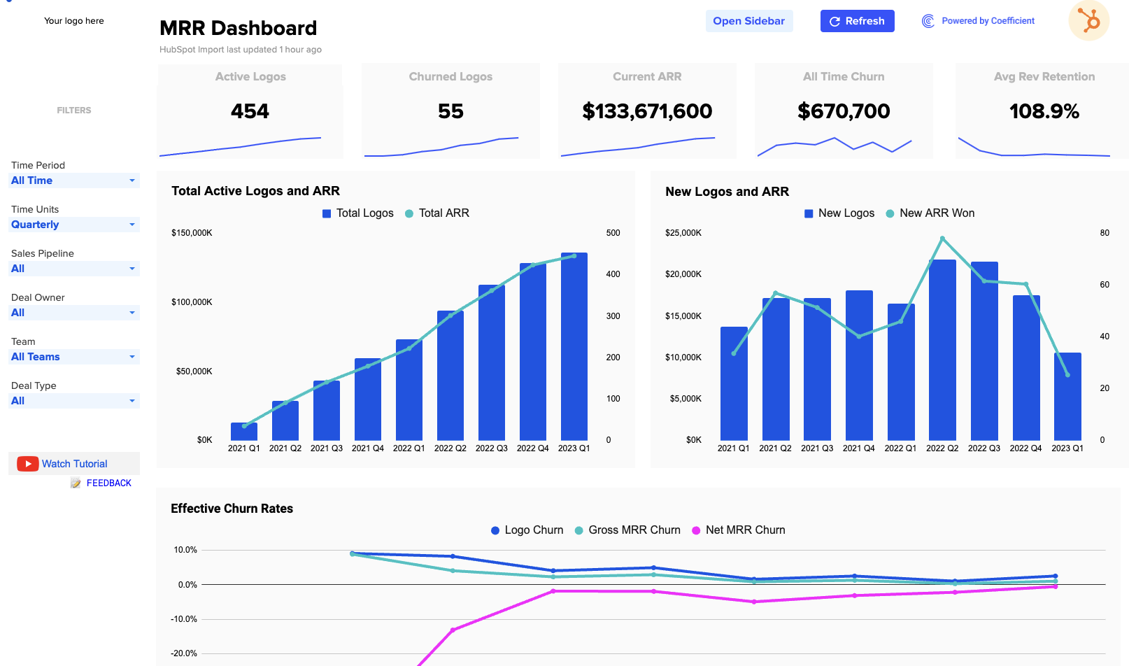
You can use the Sales Revenue Dashboard to make informed decisions and drive growth. This dashboard, which tracks Monthly Recurring Revenue (MRR) and Annual Contract Value (ACV), offers a straightforward way to understand your business’s financial health.
You can ensure that your monthly income is on track, much like tracking a subscription fee. Meanwhile, monitoring ACV allows you to gauge how much each customer is worth annually, simplifying long-term financial planning.
In addition to tracking current revenue, business owners can use this dashboard to assess the effectiveness of their sales and marketing strategies.
If MRR and ACV are consistently growing, it’s a sign that your business is healthy and on an upward trajectory. Conversely, if these numbers decline, it’s a clear indicator that adjustments are needed, whether in customer retention strategies or expanding services.
Build Custom Sales Dashboards with Coefficient in Google Sheets
Coefficient simplifies the process of creating custom sales dashboards within Google Sheets. It bridges the gap between your sales data from various sources, such as Salesforce, HubSpot, Outreach, Pipedrive, Tableau, and many more, enabling you to access real-time information effortlessly.

Explore More Pre-Built Sales Dashboards
Connect Live CRM Data to Pre-built Sales Dashboards
Show Me The Templates
It also comes with free customizable templates and visualization options, making it user-friendly even for those without extensive data analysis expertise. Check out some more templates here!
B2B Sales Dashboards: The Ultimate Tool for RevOps Professionals
Having the right insights at your fingertips is crucial. These 10 powerful B2B sales dashboards are the secret weapon for RevOps teams, offering unparalleled visibility and strategic advantage.
Whether it’s tracking leads, analyzing revenue growth, or optimizing customer acquisition, these dashboards are your trusted allies.
Transform your sales analytics and boost your sales performance with Coefficient’s intuitive and powerful platform!