

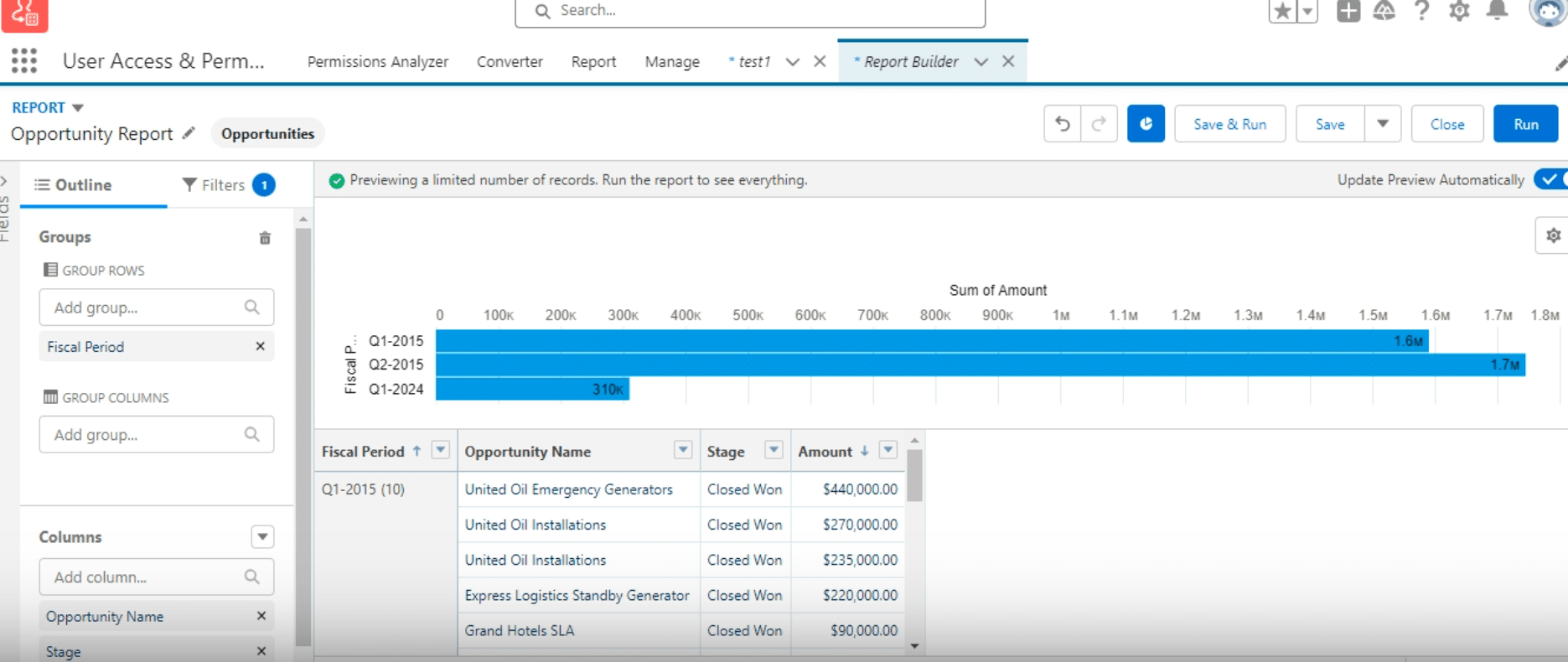
Open your Opportunity report in Salesforce with fields like opportunity name, stage, and amount
Click on the “Summarize” option for the Amount field and select “Sum” to aggregate total values
Group your data by Fiscal Period to organize opportunities by quarter with subtotals for each group
Add a chart to visualize your summarized data by selecting an appropriate chart type like a bar chart
Customize the chart type and formatting to best represent your data’s narrative and insights
Finalize your report and integrate it into a dashboard for broader organizational visibility and access
Are you struggling to summarize data and graph it in Salesforce reports? You’re not alone. Salesforce users at all levels often find it challenging to extract meaningful insights from their complex datasets.
This guide will walk you through the process of creating a sum of records and then graphing them within Salesforce reports, ensuring you can visualize your data in a more impactful way.
Step-by-Step Guide: Can I Create a Sum of Record and Graph It in Salesforce Reports
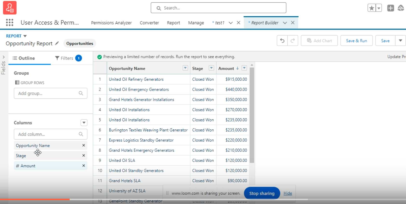
Step 1. Open Your Opportunity Report
The journey to impactful data visualization begins with your Salesforce opportunity report. Navigate to this report, where you’ll typically find the opportunity name, stage, and amount fields.
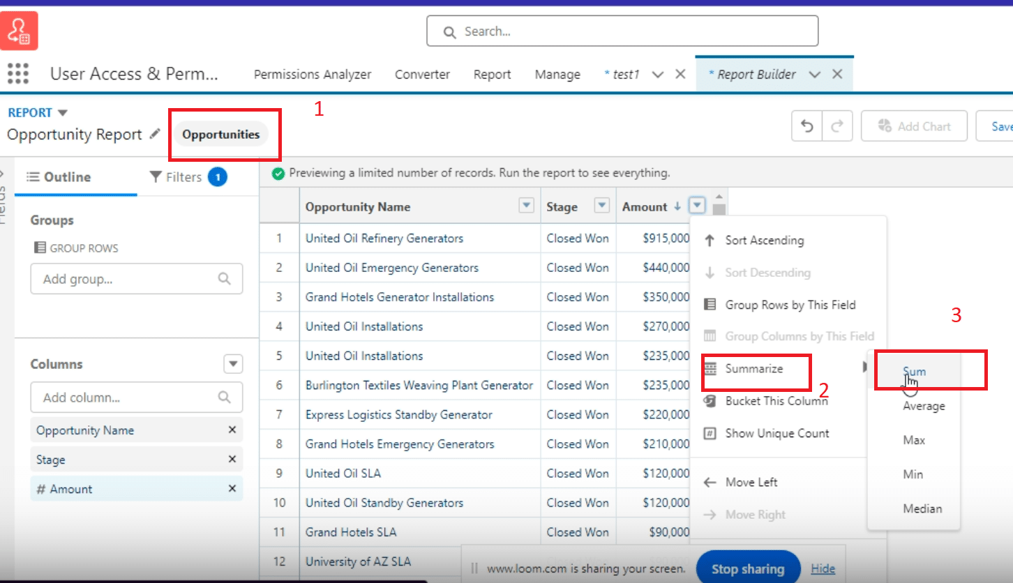
Step 2. Summarize the Amount Column
Next, move to summarize the “Amount” field by selecting the “Summarize” option. Apart from sum, Salesforce offers other summarization functions like average, maximum, and median.
For our purposes, choose “Sum” to see the aggregate of these opportunities at the bottom of your report.
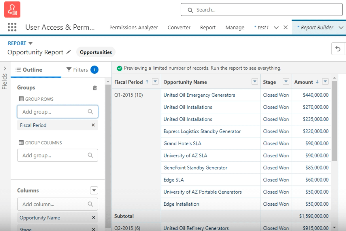
Step 3. Grouping by Fiscal Period
Enhance your report’s structure by grouping data based on the fiscal period.
This organization allows you to see opportunities clustered by quarter, lending clarity to your data’s temporal distribution. Grouping also introduces subtotals for each cluster alongside a grand total, adding layers of insight into your data.
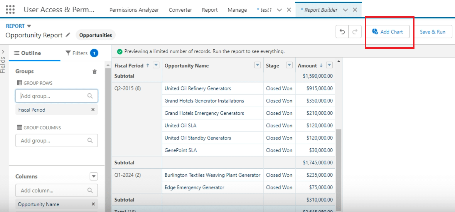
Step 4. Adding and Customizing the Chart

Explore 8 cutting-edge techniques that are revolutionizing how Salesforce admins manage their daily tasks. Contribute more significantly to business outcomes and become a key driver of efficiency and innovation.
See the Techniques
A chart brings your summarized data to life. Salesforce reports offer a variety of chart types; however, a bar chart often provides the most clarity for summarizing and comparing data.
The flexibility to switch between chart types means you can tailor the visualization to best suit the data’s narrative.
Step 5. Finalizing Your Report and Dashboard Integration
With your data properly summarized and graphically represented, the final step is to integrate this report into a dashboard.
This visibility allows for broader organizational consumption and enables data-driven decision-making across teams.
Challenges and Best Practices
Overcoming Common Challenges:
- Navigating Salesforce’s Reporting Options: With a plethora of reporting options, identifying the right one for your needs can seem daunting. Prioritize reports that align closely with the insights you seek.
- Selecting the Right Summarization Function: Beginners might find it challenging to understand which summarization function to use (Sum, Average, Max, etc.). The “Sum” function is most suitable for financial data to aggregate values.
- Grouping Data Effectively: Properly grouping data can significantly enhance the readability and analytical value of a report. Utilize grouping by time periods like fiscal quarters or by categories to better segment your data for analysis.
- Choosing the Appropriate Chart Type: The complexity of your data and the story you aim to tell should dictate the chart type. A bar chart is often the most versatile and comprehensible option for summarizing and comparing data.
Best Practices for Salesforce Reporting:
- Cleanse Your Data Regularly: Ensuring data cleanliness is paramount for accurate reporting. Regularly audit your data for inconsistencies or inaccuracies.
- Customize and Experiment with Reporting Features: Salesforce offers extensive customization options for reports. Experiment with different functions and features to find the best fit for your reporting needs.
- Maintain User-Centric Report Design: Design reports with the end-user in mind. Use clear, descriptive titles and labels, and avoid overcrowding your report with excessive data points.
- Leverage Dashboard Integration: Enhance organizational visibility and access to key insights by integrating your summarized reports into dashboards. This allows for easier consumption of data across teams.
Conclusion
Elevate your Salesforce reporting experience by leveraging Coefficient’s integration solutions. By connecting Salesforce with Google Sheets or Excel, you can further refine your data analysis process, ensuring your team stays ahead with real-time, actionable insights.
Don’t let complex data visualization challenges slow you down. Explore the power of Coefficient, a 5-star rated tool on AppExchange, and transform your Salesforce strategy today.


