

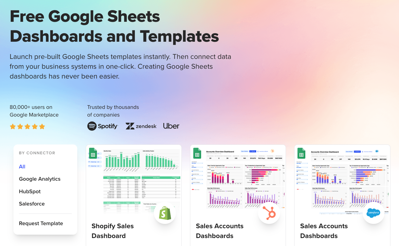
Table of Contents
![]()
- 1. 10 B2B Sales Dashboards for RevOps Teams in 2026
- 2. How to build a lead generation dashboard in Google Sheets
- 3. Sales Performance Dashboard: Free Spreadsheet Template
-
4. How to Build a Sales Dashboard in Google Sheets
- What is a sales dashboard?
- Why use Google Sheets to create a sales dashboard?
- Pre-requisites to Build your Sales Dashboard
- Import your dataÂ
- Create your interactive sales dashboard
- Launch a Pre-Built Sales Dashboard In Google Sheets in One Click
- Conclusion: Building a sales dashboard in Google Sheets doesn't have to be rocket science
- 5. Sales KPIs Dashboard: 4 Free Google Sheets Templates
- 6. Free Sales Templates: SalesOps Dashboards for Google Sheets
- 7. 5 Sales Tracking Spreadsheet Templates for Reporting
- 8. Opportunity History Template: Track Sales Forecast Changes


A sales dashboard shows a bird’s eye view of your sales performance and whether or not you’re meeting your targets. It presents your data in comprehensive, easy-to-read visualizations and reports.
However, while most sales management and Customer Relationship Management (CRM) tools provide built-in dashboards, most have limited customization features and only include a few metrics.
What’s more, unless you’re well versed and know how to set up a sales dashboard in CRMs like Salesforce, HubSpot, Pipedrive or Zoho CRM the entire process could take up too much time and effort.
Google Sheets provides a more straightforward solution with its features, apps, functions, and formulas that allow you to create custom reports and visualizations for your sales dashboard quickly.
In this guide, we’ll cover what a sales dashboard is, what key metrics to include, and how you can build one using Google Sheets.
Want to skip to the fun part? Pick a free Google Sheets sales dashboard that aligns with your reporting needs, make a copy, and pull in your live data from Salesforce or HubSpot in just a few clicks.
What is a sales dashboard?
A sales dashboard is an easy-to-understand graphical presentation of your critical sales data. It’s intended to help sales managers and company owners (among others) to make better, data-driven business decisions.
Dashboards present your sales data in a more meaningful way, often through graphs, heatmaps, gauges, and other visualizations.
These can be interactive or static; and most modern sales dashboards are dynamic, time-based (showing data in adjustable or regular time frames), and often connected in real-time to a database or data source.
Essentially, a sales dashboard involves sales-specific data points and metrics that give you an up-to-the-moment view of your sales operation’s health.
Why use Google Sheets to create a sales dashboard?
Google Sheets offers way more than the basic formulas and functions you might expect. If you know what you’re doing (and some help from AI), you’ll uncover powerful insights, tables, and charts that make building custom reports surprisingly easy. Key benefits of Google Sheets is,
It’s Built for Calculations – Google Sheets gives you a huge list of functions and formulas that let you manipulate your data however you need to extract the insights you’re after.
Cloud Accessibilty – Since it’s cloud-based, you can access your Google Sheets dashboard from anywhere with your Google account. This makes teamwork and collaboration much smoother and gives you flexibility in how you work.
Plays Well With Other Data – You’ve got functions for importing data from multiple sources, pulling maximum values from database ranges, and linking data from other spreadsheets and sheets.
You can tackle everything from basic project management to sophisticated financial modeling, all while creating visual dashboards that actually make sense of your data.
Some of the most popular applications include:
- Gantt charts for product management
- Sales forecasting models and pipeline dashboards
- Lead to opportunity conversion rate tracking
- Interactive performance dashboards with real-time data
- Financial models and budget forecasting
The key is that Google Sheets handles both the number crunching and visual presentation, so you’re turning raw data into actionable insights rather than just staring at spreadsheets. The analysis and reporting possibilities are pretty extensive once you get comfortable with it.
AI Features in Google Sheets Makes Things Easier
With Google’s Gemini built right into Google Workspace, you can generate formulas by simply describing what you want in plain language. Tools like Coefficient AI take this even further to help you build pivots, create charts automatically, clean up data and discover insights or anomalies just using natural language instead of writing complex formulas.
Pre-requisites to Build your Sales Dashboard
Before you start building your sales dashboard, identify the data points and metrics you want to track, highlight, and see.
Know the Key Performance Indicators (KPIs) that are meaningful to you, your managers, and your team. You can then determine the data sources and types to monitor.
It helps to consider these questions.
- Where will your data come from? Will your data source allow automated importing, exporting, and syncing, or will you need to do it manually? Will this require a third-party tool?
- Who is the dashboard for (or your target audiences)? Is your sales dashboard for your sales manager, reps, or admin?
- How often will you need to update the sales dashboard?
- What specific metrics and data points show up often in your reports?
- What are your identified KPIs?
- Are there metrics that are regularly seen or reviewed as more crucial than others during your sales team meetings and one-on-one salesperson (or rep) reviews?
- Does your company have multiple sales teams, such as field and inside sales units?
Address these questions to help you determine what data and metrics to include and how to best present the information to get the most out of your sales management dashboard.
Import your data
Let’s start by importing your sales data to Google Sheets.
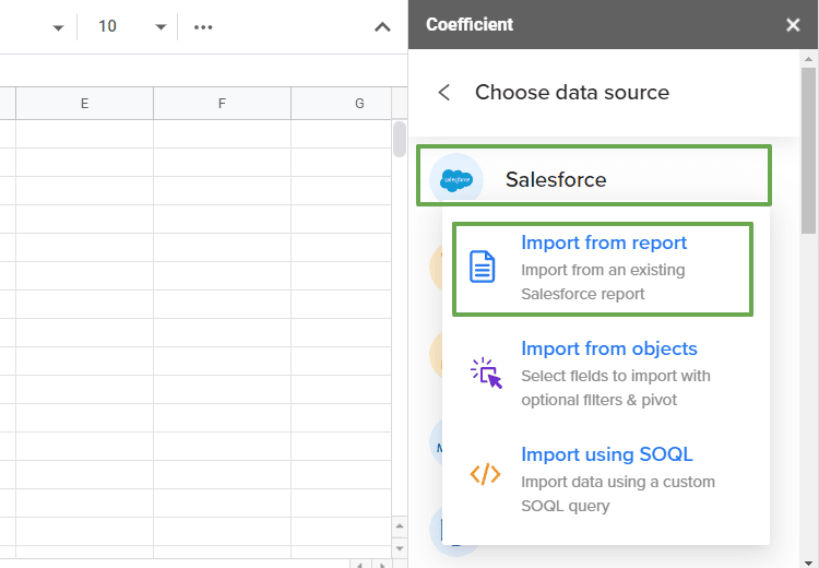
In this guide, we’ll show how you can import your data from Salesforce to Google Sheets seamlessly using the Coefficient application.
Coefficient is a powerful tool for importing, exporting, and syncing your data. It’s easy to set up and use, streamlining fetching data from your data source.
Once you install the Coefficient: Salesforce, HubSpot data connector app from Google Workspace Marketplace, launch it from the Add-ons tab on the Google Sheets menu.
On the Coefficient pop-up window, click Import Data and select Salesforce.
If you have a ready Salesforce report, choose Import from report. This can save you a lot of time and effort when importing the sales data you will use to build your dashboard.
Select the objects you want to include in your Salesforce data import and use the search box to find objects quickly. Next, select the fields you want to add to your dataset.
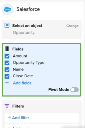
You can also add a filter and sort criteria, set an import limit, and name your import so you can find and reuse it easily for your future reports and analyses.
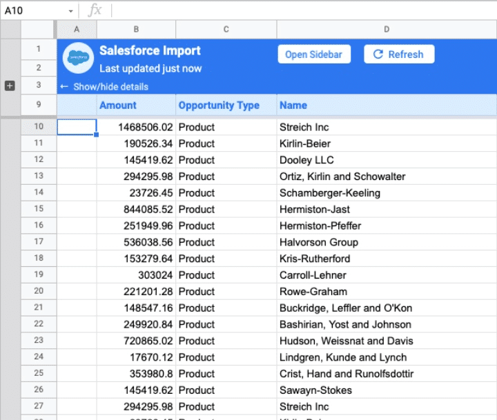
Click Import. This should auto-populate the data to Google Sheets in a few seconds or minutes, depending on the size of your data.
This is how your Salesforce data import on Google Sheets can look.

Automatically sync your CRM Data to Google Sheets or Excel.
Setup in a minute. Automate Import & Export Forever. Enable 2-way sync between Salesforce, HubSpot and your Sheets.
Learn more about Coefficient for Sales
Create your interactive sales dashboard
A sales dashboard can include many components and sections. However, in this guide, we’ll focus on building a dashboard with these sections:
- Deals (Won, Open, and Lost)
- Geo chart with total revenue of all countries and conversion rate
- Lost deals vs. Won deals
- Win ratio
Use a sales dashboard template
To simplify creating your sales dashboard, start with a template that you can easily build on, such as this sample Monthly Sales Dashboard from HubSpot.
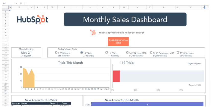
Using a sales dashboard template for Google Sheets speeds up your dashboard creation since you can easily customize the sections and replace the data.
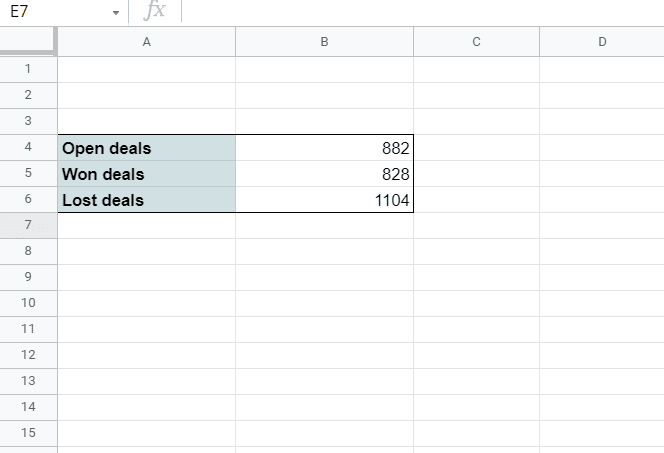
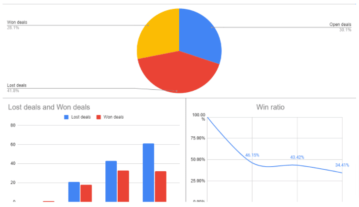
Deals (Won, Open, and Lost)
Your imported sales data should include your won, open, and lost deals.
To calculate the number of deals based on won, open, or lost status, use this sample formula with the COUNTIF function. In this example, we’ll calculate the won deals.
=IF (
ISBLANK(A19) ,
COUNTIF (Deals!AL2:AL,”won”) ,
COUNTIF (Filter(Deals!AL2:AL,Deals!Z2:Z=A19),”won”))
To better understand this formula, here’s a quick breakdown:
- Deals!AL2:AL should be the status column of your imported data
- Deals!Z2:Z is the org_id.address column of your imported data
- A19 is a cell with the country name
Use the same formula to calculate the number of open and lost deals (replace “won” with “open” and “lost”), and you should end up with something that looks like this.
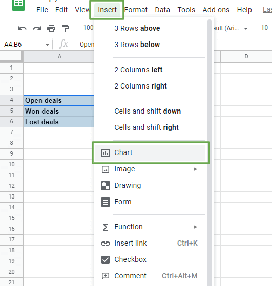
Create a visualization of the values using a pie chart. Select the data range, click Insert from the Google Sheets menu, and click Chart.
On the Chart Editor pane, select Pie chart from the Setup tab. Click the Customize tab and format the labels, colors, texts, and other chart elements.
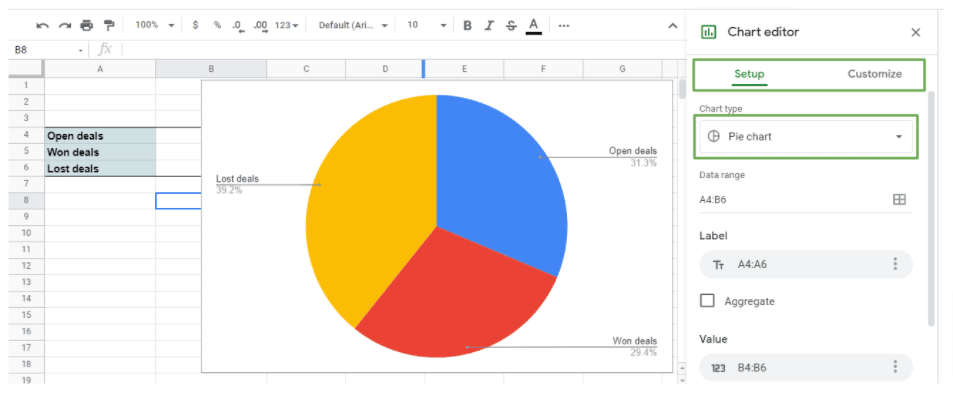
Add the pie chart to your sales dashboard template or spreadsheet.
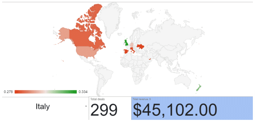
Geo chart
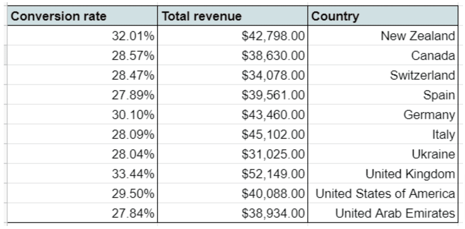
To create your Geo chart, you’ll need three columns for conversion rate, country, and total revenue, respectively.
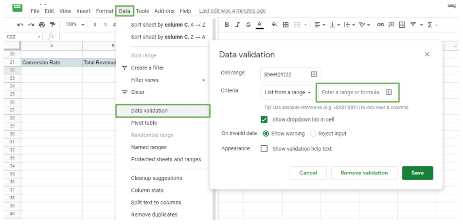
You can use the Data Validation function to fill in the Country column manually. Click Data on the Google Sheets menu > Data validation and select the column or range with the country names on your dataset.
A faster way is to use the sample formula below.
={“Country name”; UNIQUE(Deals!Your range here)}
Next, let’s figure out the conversion rate per country, which is the ratio of your won deals to your total deals.
Use this formula:
=COUNTIF (Filter(Deals!AL$2:$AL,Deals!$Z$2:$Z=A61),”won”)/
COUNTA (
Filter (Deals!$AL$2:$AL,Deals!$Z$2:$Z=A61))
The Deals!AL2:AL in the formula refers to the status column, and the Deals!Z2:Z is the org-id.address (or country name) column of the imported data. A61 is a cell for the country name.
Drag the formula or use the Ctrl+d Copy Down shortcut to use it for the other countries in your data.
Finally, to get the Total revenue, calculate the sum of all the won deals for each country using this formula.
=SUM (
Filter (Deals!$AF$2:$AF,Deals!$Z$2:$Z=A54,Deals!$AL$2:$AL=”won”)
)
The value column is the Deals!AF2:AF while Deals!AL2:AL refers to the status column of the imported data. A61 is a cell with the country name, and Deals!Z2:Z is the org_id.address column.
Your final table should essentially look like this.
Now that you’ve set up the data you need for each country, add a Geo chart to visualize the information for your sales dashboard.
Select the table, click Insert from the menu, then Chart. On the Chart editor, under the Setup tab, choose Geo chart.
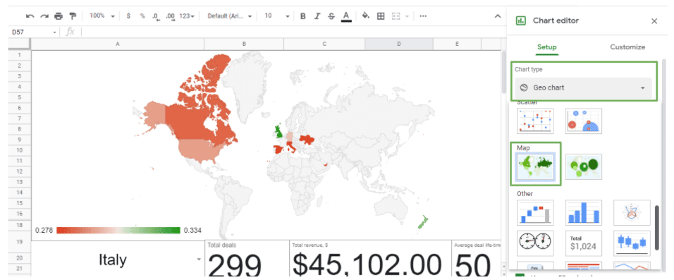
Customize your Geo chart’s appearance and configuration accordingly and add it to your sales dashboard.
Lost deals vs. Won deals
Calculating the lost and won deals is pretty straightforward by using the formula below.
=IF (
ISBLANK(A19) ,
COUNTIF (Filter(Deals!AL2:AL,Deals!CN2:CN=2016),”won”) ,
COUNTIF (Filter(Deals!AL2:AL,Deals!Z2:Z=A19,Deals!CN2:CN=2016),”won”)
)
Replace Deals!CN2:CN=2016 with each corresponding year to get the value of the rest of the data. Use the same formula to calculate your lost deals and replace “won” with “lost” in the formula.
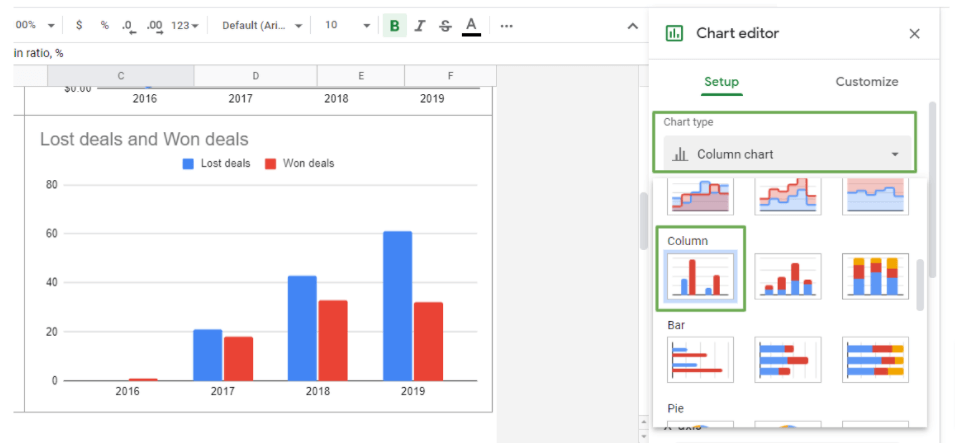
Once you have the data, apply a column chart.
Select the column containing the years, lost, and won deals. Follow the same process of inserting a chart, choose Column chart as the chart type, and customize the graph as you prefer before adding it to your sales dashboard.
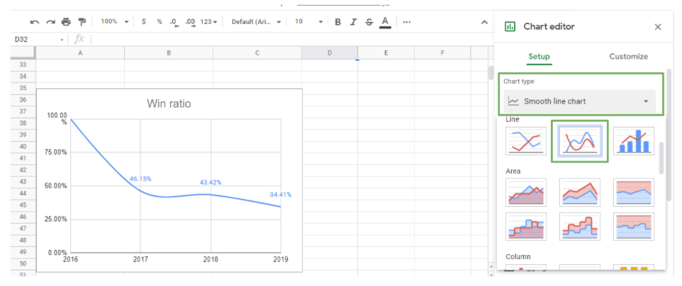
Win ratio
Calculate the win ratio by dividing your won deals by the closed deals (lost deals plus won deals).
You can use a simple formula: A cell with your won deals in 2016/(a cell with your lost deals in 2016+a cell with your won deals in 2016).
For example:
=E75/(D75+E75)
You can then calculate the win rate for the remaining years and create a smooth line chart to add to your sales dashboard.
Select the year and Win ratio columns and follow the same steps when inserting a chart. Choose the Smooth line chart from the chart type options and modify the graph elements accordingly.
At this stage, you should have all the charts and data visualizations you need to create your sales dashboard.
Apply your desired formatting and customizations and organize your charts in a way that best suits users and your target audiences.
You can create specific dashboards, such as a sales KPI dashboard, and add other key metrics. This can include your lead conversion rate, customer lifetime value, monthly sales growth, and retention and churn rates.
Launch a Pre-Built Sales Dashboard In Google Sheets in One Click
Building a sales dashboard in Google Sheets requires a significant amount of manual work. That’s why Coefficient designed our Salesforce Sales Operations Starter Dashboard Template. Our Sales Operations Starter Template enables you to launch a complete, pre-built sales dashboard in a single click.
The template allows you to do everything outlined in this guide, and more, without requiring your team to build dashboards from scratch. By combining three major templates into one Sheet, the Sales Operations Starter Template gives a comprehensive view of your sales operations, from start to finish. Monitor your sales operations with pre-engineered dashboard and reports, including:
Annual Sales Performance Dashboard
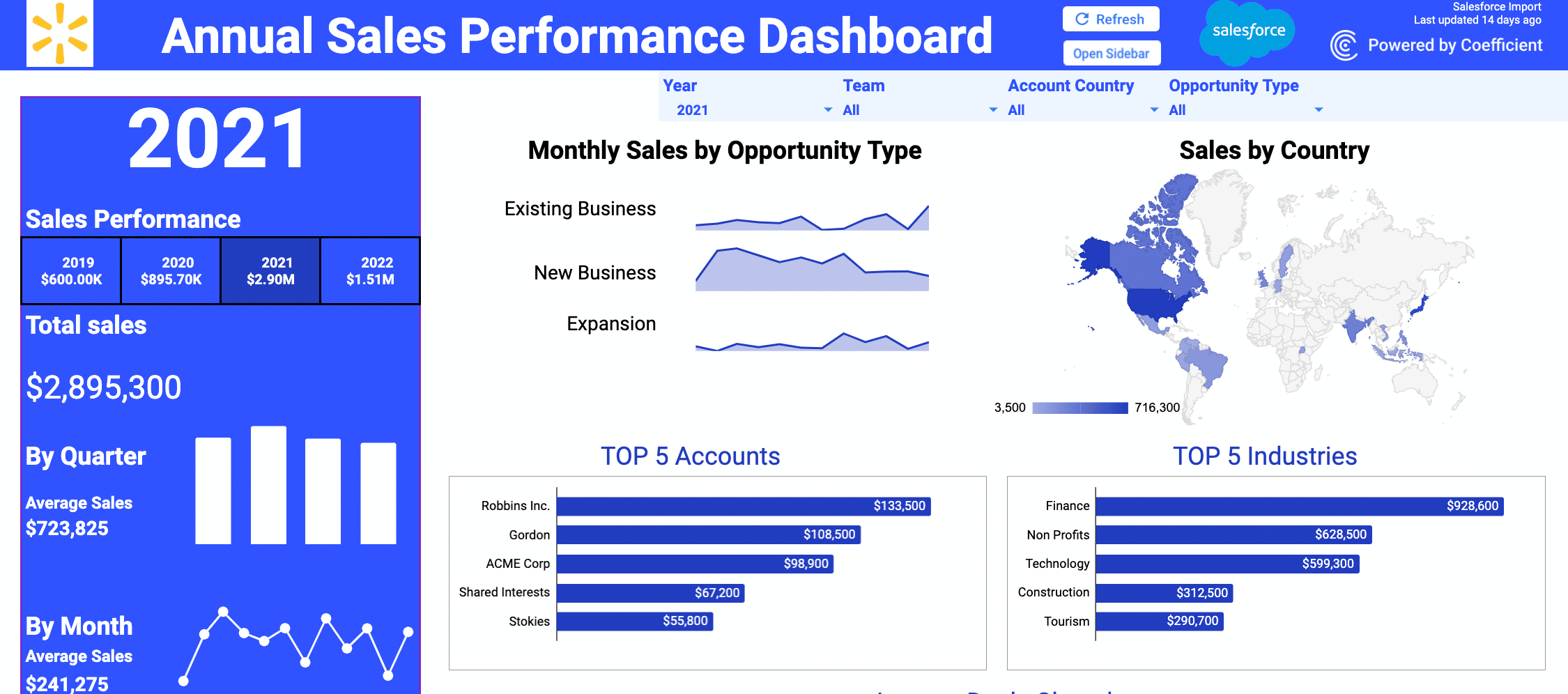
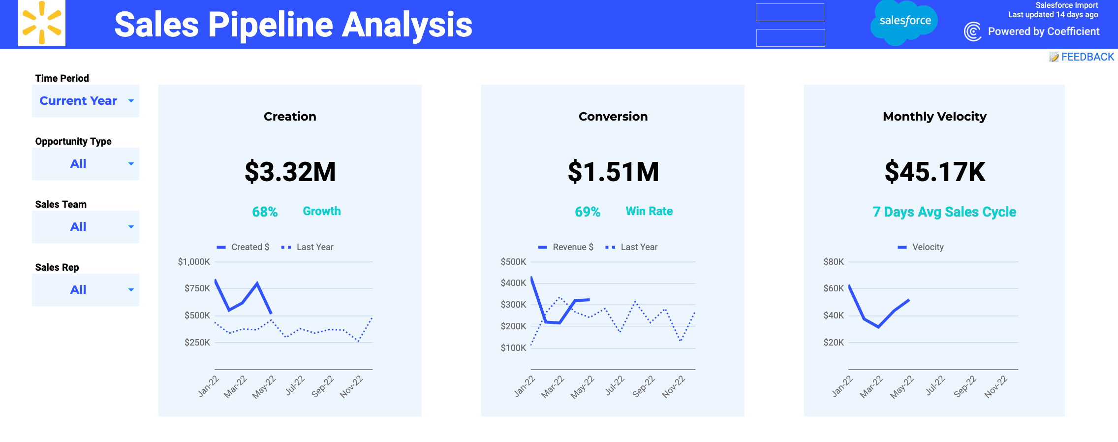
Sales Pipeline Analysis Dashboard
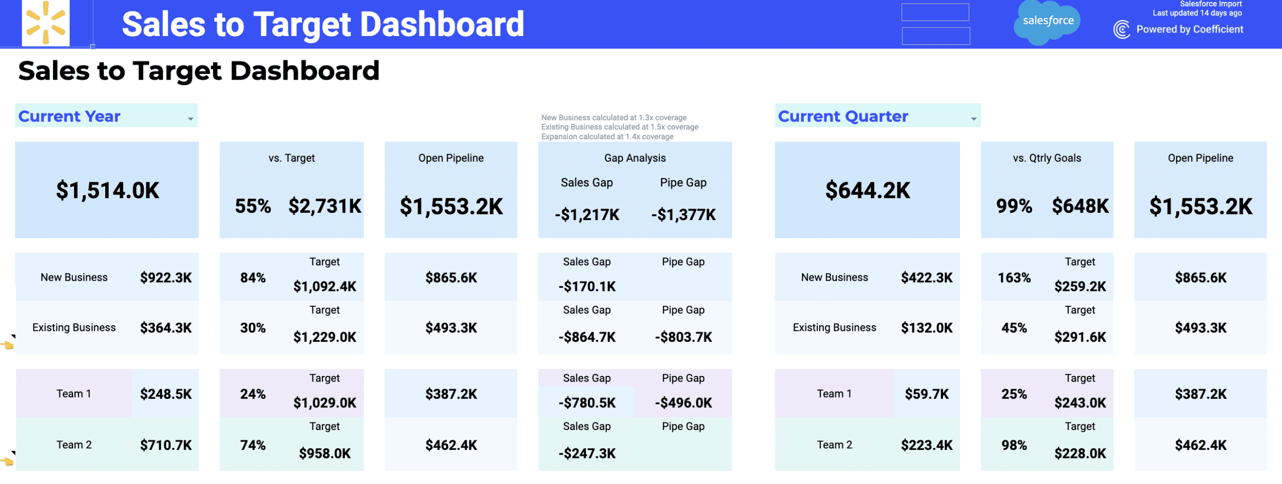
Sales to Target Dashboard
The Sales Operations Starter Template includes all of the core charts, metrics, and KPIs you to need to monitor and grow your sales. Track sales performance and objectives using a one-click Google Sheets template, including:
- Identify top performing teams, regions, industries, and accounts
- Compare monthly results for pipeline creation, win rates, average deal age, average deal size, and sales velocity
- Monitor pipeline capacity to ensure you’ll always hit targets
- Slice and dice your sales results by company size, deal type, and other filters
The Sales Operations Starter Template can save your team a tremendous amount of resources. And it’s free to use so you have nothing to lose by trying out the template right now.
Conclusion: Building a sales dashboard in Google Sheets doesn’t have to be rocket science
Now that you know the essential steps to create a sales dashboard in Google Sheets, you can start creating one with the help of our guide.
Using Google Sheets’ formulas and functions to create your sales data reports, analyses, templates, and visualizations, you can efficiently build and customize your sales dashboard.
Plus, importing, exporting, and syncing your data is uber-easy fast with Coefficient. The app lets you fetch data from your source to import to Google Sheets instantly with a few clicks.
You can also guarantee your dashboard data is always live and updated since Coefficient lets you schedule data auto-refresh. This means you won’t need to import new data every time the information from your source changes, saving you and your sales team a huge chunk of time and effort.
Try Coefficient for free today!