Coefficient held its first ever Spreadsheet Gladiator Challenge last week, culminating in a live webinar where Ben Collins and other judges unveiled the winner! The contest generated many terrific sales dashboard examples — and we wanted to share them with you.
Some of the world’s top Google Sheets ninjas participated in the challenge, a spreadsheet contest that required each participant to create a sales dashboard for an imaginary chocolate factory.
It was a nail biter — and the first place winner walked away with $5,000! The reaction to the contest has been tremendous: in fact, we’re still responding to all of your comments and feedback.
Here’s a recap of all the amazing sales dashboards from the final round, along with some of the brilliant observations our judges made. You can watch the full webinar here.
What is the Spreadsheet Gladiator Challenge?
Our inaugural Spreadsheet Gladiator Challenge was a multistage spreadsheet competition with a creative verve. Just like gladiators of old, the gladiators in our contest entered a colosseum — but this one was called “Google Sheets.”
Participants had to create a sales dashboard for the chocolate factory of Dr. von Brunswick — a mysterious and reclusive chocolatier who apparently has a Ph.D in puppetry. The associated cash prizes were gigantic for a spreadsheet contest, including a $5,000 reward for first place, $1,000 for second place, and $500 for third.
The participants had to create their sales dashboards using a Google Sheet that contained Salesforce data imported via Coefficient. Other than that, there were very few rules.
After dashboard submissions on July 25th, there was a frenzied five day voting period. Anyone could view the dashboards and vote for them. The top five dashboards moved onto the final round.
At the end of the voting period, these participants claimed the top five spots:
- Manaday Mavani – 232 votes
- Sebastian Schurmann – 215 votes
- Karlos Calderon – 191 votes
- Katey Adams – 178 votes
- Diego Martinez Lucioni – 116 votes
The final round was the most rigorous yet. A three judge panel (a triumvirate, as they would call it in Rome) composed of spreadsheet and RevOps experts rated the dashboards across numerous criteria on a scale from 1 to 10. The esteemed panel of judges included:
- Ben Collins, Founder – Collins Analytics LLC (Emperor of Spreadsheets)
- Heidi Thompson, VP GTM Strategy & Revenue Operations at Unqork (RevOps Romulus)
- Frank Ferris, Templates Program Manager at Coefficient (Spreadsheet Slayer)
The gauntlet culminated on August 3rd with a live webinar wherein the judges revealed the winners of the contest. So who took home the big prize? Read on to find out!
Spreadsheet Gladiator Challenge: Final Round Dashboards
1st Place
Katey Adams
Total Score: 7.89
Analysis: 8
Design: 7
Creativity: 8.7
Wow! Katey’s sales dashboard had it all, and it’s no surprise she walked away with the $5,000 first place prize. The dashboard had centralized controls, a frozen-in-place top navigation, a sleek design with toggleable presentations, excellent organization, and visualizations/reports that answered any conceivable question.
But all the bells-and-whistles really made this dashboard stand out. Many features went above and beyond normal dashboard design, such as delete-proofing the spreadsheet, providing documentation so new employees could implement updates, and leveraging dynamic ranges to adjust data imports. This made Katey’s dashboard one of the best the judges had ever seen, in any context.
The Judges Said
“Very, very clever. This is a dashboard you could dig into for days.” – Ben
“I loved the automated error messages. If you check off two boxes, the dashboard displays an error message. It’s great. I feel like this dashboard answers every single question I could ever have about the dataset.” – Heidi
“The dashboard is cat and toddler proof. If someone comes in and deletes something, the deleted portion is re-added via a query function and a hidden dashboard. It’s beautifully organized. I’ve never seen anything like it.” – Frank
Second Place
Diego Martinez Lucioni
Total Score: 7.78
Analysis: 7.7
Design: 8.7
Creativity: 7
Diego’s sales dashboard came in just behind Katey’s, so he took home the $1,000 second place prize. The design of the dashboard was gorgeous, easily the best in the contest. His use of slicer filters, borders, scorecards, and other functions made the presentation stand out.
Diego’s careful attention to color, contrast, and proportion didn’t just make the dashboard pretty to look at. This focus on design made the dashboard functionally superior, and easier to understand and analyze. The dashboard was a great example of style being substance, rather than style over substance.
The Judges Said
“This was the best designed dashboard. Really just a clean dashboard to look at.” – Ben
“I love, love, love the tickers. I think they’re fantastic.” – Heidi
“Really well-organized. Awesome color scheme. Great use of charts.” – Frank
Third Place
Sebastian Schurmann
Total Score: 7.56
Analysis: 7.7
Design: 8
Creativity: 7
Sebastian’s clever, nimble sales dashboard rounded out the runner-ups, earning the $500 third place prize. His dashboard paired incisive visualization with a neat design with easy-to-use navigation.
Sebastian made great use of sparklines, charts, and an alternative filtering method featuring drop down cells with validation rules. The judges especially liked how he included expected sales by next step to provide clarity for sales leadership. Overall, it was fantastically executed, a sales dashboard example that is perfect for just about any scenario.
The Judges Said
“I like the design of this one. It was nice and simple and gave you the answers quickly. That’s what dashboards are supposed to do.” – Ben
“Expected sales by next step is truly valuable. I love that.” – Heidi
“The nice touch about using drop down filters is that you can choose from a variety of metrics.” – Frank
Honorable Mention
Manaday Mavani
Total Score: 7.00
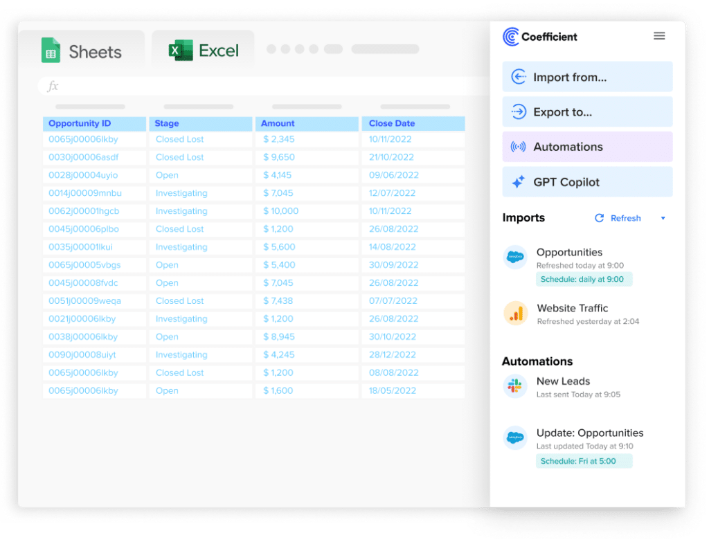
Stop exporting data manually. Sync data from your business systems into Google Sheets or Excel with Coefficient and set it on a refresh schedule.

Analysis: 7.0
Design: 7.3
Creativity: 6.7
Manaday’s sales dashboard received honorable mention in the competition for its beautiful aesthetic, nuances, headers with borders above the charts, intuitive interface, and exemplary use of filters and pivot tables. The dashboard also links to the underlying data, so users can resolve disputes with the raw data.
The Judges Said
“I like that the controls are all in one place. The quick links are really clever. This was nicely done.” – Ben
“These are my favorite filters out of all the entries. They’re the most relevant for when I’m meeting with the CRO.” – Heidi
“There are a lot of small touches that you might only notice if you’ve been working with spreadsheets for a long time” – Frank
Honorable Mention
Karlos Calderon
Total Score: 6.67
Analysis: 6.7
Design: 6.7
Creativity: 6.7
Karlos’s sales dashboard also won honorable mention for amazing use of charts, a fixed scroll bar that made viewing data easier, and a seamless method for changing columns. The design of the dashboard was also sleek and clear, with well-presented data. Dr. von Brunswick would have no trouble obtaining the information he needs to take over the world with this sales dashboard.
The Judges Said
“Really effective scorecards.” – Ben
“I like the filters.” – Heidi
“This is an impressive, amazing looking dashboard.” – Frank
Too-Cool-for-School
Max Makhrov
Numbers are for squares!
Max did not land in the top 5 during the voting round, but his dashboard was so cool, the judges had to show it off. Use this sales dashboard example if you want to be the Van Gogh of spreadsheets.
Max’s sales dashboard took the creative premise of the contest to the next level, with chocolate-themed visualizations, maps, and even randomly generated poems. For instance, his charts incorporated pixel art of chocolate bars that were proportional to various sales metrics. And much of it was done with conditional formatting.
Bravo, Max!
The Judges Said
“We were looking for things that were unexpected. This was certainly unexpected.” – Ben
“I absolutely love it.” – Heidi
“We were blown away by this one. We had to show it off. Incredibly creative.” – Frank
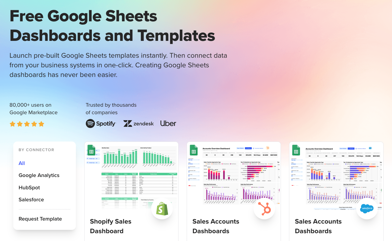
Copy and customize pre-built Google Sheets templates. Creating Google Sheets dashboards has never been easier.
Harness These Sales Dashboard Examples Right Now!
Our first-ever Spreadsheet Gladiator Challenge saw some of the finest Google Sheets warriors take the art of sales dashboarding to a new level. The creativity of these sales dashboard examples speaks to the passion and expertise of our community.
But this won’t be the last Spreadsheet Gladiator Challenge. Stay tuned in the near future for an exciting announcement!
