HubSpot’s native filtering limits you to predefined date ranges rather than specific months, and combining multiple filters for deal stage, source, and date can create unexpected results due to filter interaction issues.
Here’s how to build month-specific deal attribution reports with precise date filtering and validation to ensure you’re capturing exactly the deals you intend to analyze.
Create precise month-specific deal filtering with transparent validation using Coefficient
Coefficient provides superior filtering capabilities for month-specific reporting by allowing exact date range specification and transparent filter validation. You can combine “Deal Stage = Closed Won,” specific month date ranges, and “Original Source is known” filters simultaneously without the interaction issues that occur in HubSpot’s native interface.
How to make it work
Step 1. Set up dynamic month selectors for flexible date filtering.
Create dropdown lists for month/year combinations that automatically calculate the start and end dates for that month. Use formulas like =DATE(YEAR(A1),MONTH(A1),1) for month start and =EOMONTH(A1,0) for month end. Your Coefficient import filters will reference these calculated date cells for precise month-based filtering.
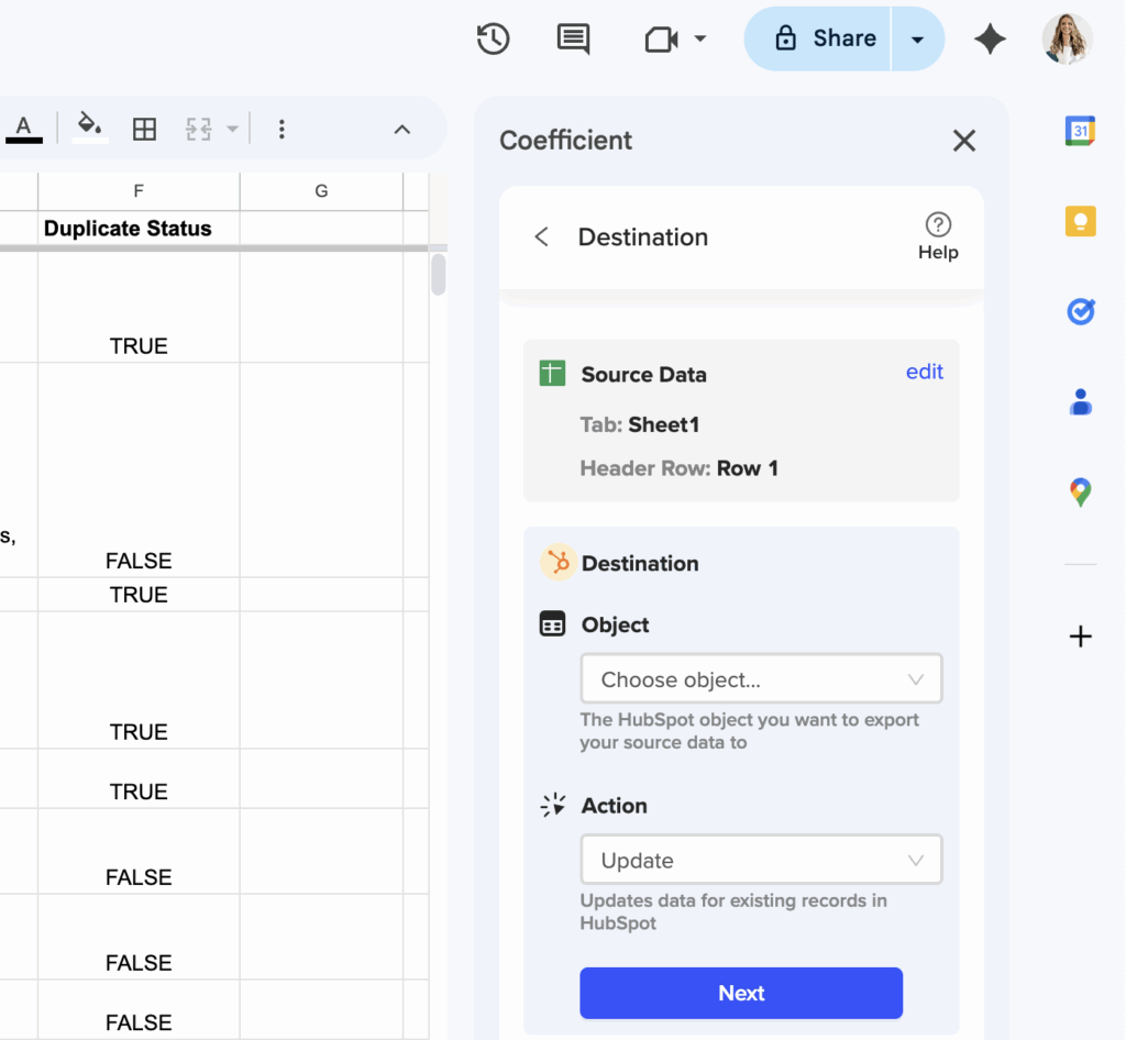
Step 2. Configure simultaneous filters for accurate deal capture.
Set up your Coefficient import with filters for “Deal Stage = Closed Won,” “Close Date” within your specific month range, and “Original Source is known” to exclude null values that skew results. Use dynamic filtering to reference your calculated date cells so the month selection automatically updates your import.
Step 3. Add validation formulas to verify filter accuracy.
Create validation checks using COUNTIFS to verify your deal counts match expected totals: =COUNTIFS(CloseDate,”>=1/1/2024″,CloseDate,”<=1/31/2024",DealStage,"Closed Won"). Use SUMIFS to cross-check deal values and ensure your filter logic is capturing the intended deals for your monthly analysis.
Step 4. Build month-over-month comparison capabilities.
Use HubSpot snapshots to capture historical monthly data and create comparison tables that show how your attribution metrics change over time. This provides context for your current month’s performance and helps identify trends in your traffic source effectiveness.
Get month-specific attribution that’s actually accurate
Precise month filtering with transparent validation ensures your closed won attribution analysis captures exactly the deals you want to analyze. Start building monthly attribution reports with filtering you can trust.