Free reporting tools can help you generate clear, actionable reports without the cost of licensing fees. These tools allow you to collect, analyze, and present data in user-friendly formats.
In this guide, we’ll explore the best free reporting tools available in 2025.
You’ll learn about their benefits, how to choose the right one, and how to use spreadsheets for automated reporting. By the end, you’ll be ready to select and use the best free reporting tools for your needs.
Advantages of Using Free Tools for Reporting
Cost Savings
For startups, small businesses, or teams with limited budgets, these tools offer a way to perform crucial data analysis and reporting without breaking the bank.
By eliminating licensing fees and subscription costs, companies can allocate their resources to other critical areas of their operations.
Access to Basic Functional Reporting
Free reporting tools often cover the essential needs of many organizations. These tools typically include capabilities for data import, basic analysis, and various visualization options.
For many small to medium-sized businesses, these features are more than sufficient to create meaningful reports and gain valuable insights from their data.
Useful for Building Simple Dashboards
Many free reporting tools excel at creating simple, yet effective dashboards. These visual representations of key performance indicators (KPIs) and metrics can be invaluable for quick decision-making and performance tracking.
With drag-and-drop interfaces and pre-built templates, even users with limited technical skills can create impressive dashboards that communicate data clearly and effectively.
Opportunity to Test and Learn Before Investing in Paid Solutions
Free reporting tools offer a low-risk environment for organizations to experiment with different reporting strategies and methodologies. Teams can use these tools to refine their reporting processes, identify their specific needs, and gain experience with data visualization techniques.
This knowledge proves invaluable when the time comes to invest in more advanced, paid solutions, ensuring that the chosen tool aligns perfectly with the organization’s requirements.
Things to Consider When Choosing a Reporting Tool
Data Visualization Capabilities
The power of a reporting tool lies in its ability to transform raw data into compelling visual stories. Look for tools that offer a wide range of chart types, customization options, and interactive elements. The best free reporting tools should allow you to create everything from basic bar charts to more complex visualizations like heat maps or treemaps.
Data Integrations
In today’s data-rich environment, the ability to connect to various data sources is crucial. Evaluate tools based on their capacity to integrate with your existing data systems, whether they’re databases, cloud storage services, or business applications. Tools that offer seamless data connections save time and reduce the risk of errors from manual data entry.
Shareability and Collaboration Features
Reports are most valuable when they can be easily shared and collaborated on. Look for tools that allow you to share reports securely, both within and outside your organization. Features like real-time collaboration, commenting, and version control can greatly enhance team productivity and ensure everyone is working with the most up-to-date information.
Customization Options
Every organization has unique reporting needs. The ideal free reporting tool should offer flexibility in customizing the look and feel of your reports. This includes the ability to add your company’s branding, adjust layouts, and tailor reports to specific audience needs.
Data Security and Compliance
Even with free tools, data security should never be compromised. Ensure that the reporting tool you choose has robust security measures in place, including data encryption, user authentication, and access controls. If your industry is subject to specific regulations (e.g., GDPR, HIPAA), verify that the tool complies with these standards.
Scalability and Performance
Consider your future needs when selecting a reporting tool. While your current requirements might be modest, choose a tool that can grow with your organization. Look for features like the ability to handle larger datasets, support for multiple users, and options to upgrade to more powerful versions if needed.
User-friendliness and Learning Curve
The best reporting tool is one that your team will actually use. Prioritize tools with intuitive interfaces and comprehensive documentation or tutorials. A steep learning curve can delay implementation and reduce adoption rates within your organization.
Data Quality Management
Accurate reports depend on clean, reliable data. Look for tools that include features for data cleaning, validation, and transformation. The ability to spot and correct data inconsistencies can save countless hours and prevent costly decision-making errors.
Integration with Existing Systems
Your reporting tool should play nicely with your current tech stack. Consider how well it integrates with your existing systems, such as your CRM, ERP, or project management tools. Seamless integration can automate data flows and ensure your reports always reflect the most current information.
How to Use Google Sheets or Excel for Automated Reporting?
Spreadsheet are powerful, versatile tools that can be leveraged for creating sophisticated automated reports. These familiar platforms offer several advantages:
Flexibility in data manipulation and analysis
Wide range of built-in functions and formulas
Extensive charting and visualization options
Ability to automate tasks through macros or scripts
Collaborative features for team-based reporting
While they may not have all the bells and whistles of dedicated BI tools, spreadsheets can be transformed into robust reporting solutions with the right approach and add-ons.
Step-by-step Guide to Creating a Basic Automated Report with Coefficient
To elevate your spreadsheet reporting game, let’s explore how to create an automated report using Coefficient, a powerful add-on that brings live data into your spreadsheets.
Coefficient is a game-changer for data professionals and business intelligence teams. It allows you to sync live data from over 50 business systems directly into Excel and Google Sheets, enabling you to build and refresh reports and dashboards using the most up-to-date information. This capability addresses one of the biggest challenges in spreadsheet-based reporting: keeping data current.
Here’s a brief guide to get you started:
Install the Coefficient add-on in your Google Sheets or Excel.
Connect to your data source(s) using Coefficient’s wide range of integrations.
Import the relevant data into your spreadsheet.
Design your report layout, including charts and tables.
Set up automatic refresh schedules to keep your data current.
For a more detailed walkthrough, check out this video tutorial on creating an automated sales dashboard using Coefficient:
By using Coefficient, you’re not just creating a static report – you’re building a live, self-updating dashboard that ensures your team always has access to the latest data.
Tips for Optimizing Spreadsheet-based Reports
To make the most of your spreadsheet reporting:
Use named ranges for easier formula creation and maintenance.
Leverage conditional formatting to highlight important data points.
Create a separate sheet for raw data and use another for your visualizations.
Utilize pivot tables for dynamic data summarization.
Implement data validation to ensure data integrity.
Handling Large Datasets in Spreadsheets
While spreadsheets are powerful, they can struggle with very large datasets. Here are some strategies to manage big data in your reports:
Use filters and slicers to allow users to focus on specific data subsets.
Implement pivot tables to summarize large datasets efficiently.
Utilize Coefficient’s ability to query and import only the necessary data, reducing the load on your spreadsheet.
Consider using data models (in Excel) or connected sheets (in Google Sheets) for more efficient data handling.
Optimize your formulas to reduce calculation time.
By following these guidelines and leveraging tools like Coefficient, you can transform humble spreadsheets into powerful, automated reporting solutions that rival more expensive dedicated tools.
Top Free Reporting Tools in 2025
In this section, we’ll explore eight powerful free reporting tools that can help you transform your data into actionable insights without breaking the bank.
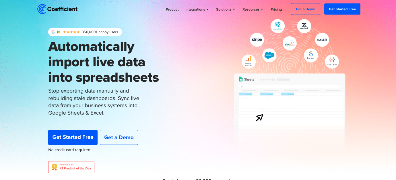
Spreadsheets (Google Sheets and Microsoft Excel + Coefficient)
Spreadsheets are beloved for their flexibility and familiar interface. Coefficient elevates them to powerful real-time analysis and decision-making tools by connecting them to live business data.
Features and capabilities:
Sync live data from 50+ business systems into Excel and Google Sheets
Build and refresh reports and dashboards using real-time data
Push spreadsheet data back to source systems
Automate report distribution and alerts via Slack and email
Ensure data accuracy with direct connections to source systems
Pros:
No-code interface allows non-technical users to create sophisticated reports in familiar spreadsheet environments
Real-time data connections eliminate manual data entry and ensure up-to-date information
Cost-effective alternative to expensive BI tools, leveraging existing spreadsheet licenses
Enables centralization of data from multiple sources (CRM, ERP, marketing tools, etc.) into a single interface
Cons:
While powerful, it may not offer all advanced analytics features of dedicated BI platforms
Performance can still be affected by very large datasets, though less so than traditional spreadsheets
Best use cases:
Small to medium-sized businesses that need flexible reporting solutions without a significant learning curve will find spreadsheets ideal. They can quickly create and modify reports as needed.
Teams that frequently perform ad-hoc analysis and reporting will appreciate the quick turnaround time that spreadsheets offer. They can rapidly prototype ideas and generate insights.
Organizations where many team members are already familiar with spreadsheet software can leverage this existing knowledge for collaborative reporting efforts. This can lead to faster adoption and more widespread use of data-driven decision-making.
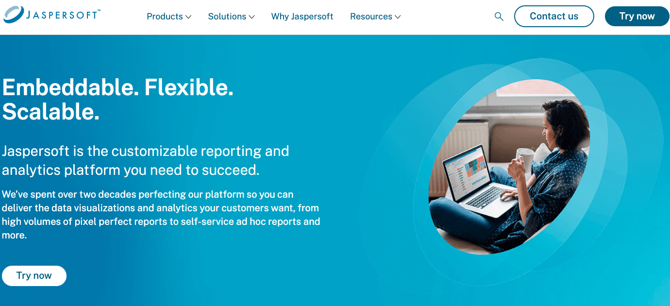
Jaspersoft
Jaspersoft is a comprehensive open-source business intelligence suite that has been a player in the BI space since 2001. It offers robust reporting capabilities suitable for organizations of all sizes.
Features and capabilities:
An interactive report designer that allows for pixel-perfect report creation
Multi-tenancy support, enabling multiple organizations to use the same instance securely
Integration capabilities with various data sources, including traditional databases and big data platforms
Options for embedded analytics, allowing businesses to integrate reporting directly into their applications
Pros:
Jaspersoft’s scalability makes it an excellent choice for growing businesses. As your data needs expand, the platform can accommodate increased complexity and volume without requiring a complete overhaul of your reporting infrastructure.
The tool benefits from strong community support, which translates to a wealth of resources, tutorials, and troubleshooting help available online. This can be invaluable for organizations with limited internal expertise.
The high degree of customization available in Jaspersoft allows organizations to tailor their reports and dashboards to match their specific branding and reporting needs. This flexibility ensures that the tool can adapt to various business scenarios.
Cons:
For beginners or those new to BI tools, Jaspersoft presents a steep learning curve. Its powerful features come at the cost of complexity, which may require significant time investment to master.
While the community edition offers substantial functionality, many advanced features are reserved for the paid version. This limitation may become apparent as your reporting needs grow more sophisticated.
Best for:
Medium to large enterprises that require a scalable reporting solution will find Jaspersoft’s architecture suitable for their needs. The tool can grow with the organization, handling increased data volumes and user loads.
Organizations looking to embed analytics directly into their own applications or products can leverage Jaspersoft’s embedded analytics capabilities. This is particularly useful for software companies looking to add reporting features to their offerings.
Companies with technical resources and the ability to invest time in implementation and customization will be able to take full advantage of Jaspersoft’s powerful features. This makes it a good fit for organizations with dedicated IT or BI teams.
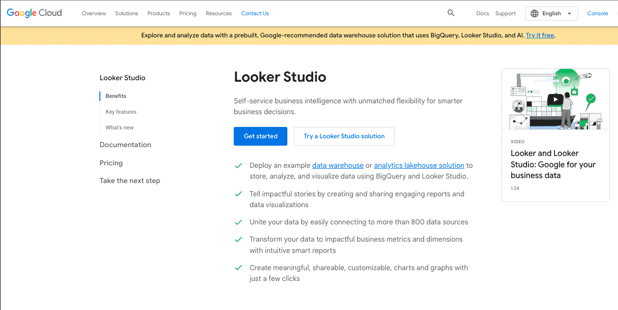
Looker Studio
Looker Studio, previously known as Google Data Studio, is Google’s free data visualization and reporting tool. Launched in 2016, it has quickly gained popularity due to its user-friendly interface and strong integration with Google’s ecosystem.
Features and capabilities:
An intuitive drag-and-drop report building interface that makes creating visually appealing reports accessible to non-technical users
Real-time collaboration features, allowing multiple team members to work on reports simultaneously
Seamless integration with Google products and a growing number of third-party data sources
Highly customizable dashboards and reports that can be tailored to specific business needs
Pros:
Looker Studio’s user-friendly interface significantly lowers the barrier to entry for data visualization and reporting. This accessibility encourages more team members to engage with data, fostering a data-driven culture.
The tool’s strong integration with Google services makes it an excellent choice for organizations already using Google Analytics, Google Ads, or other Google products. Data can be pulled directly from these sources with minimal setup.
Google regularly updates and improves Looker Studio, adding new features and data connectors. This ongoing development ensures that the tool remains current with evolving business intelligence needs.
Cons:
While Looker Studio excels at data visualization, it has limited advanced analytics features compared to some other BI tools. Users looking for complex statistical analysis or predictive modeling may find it lacking.
Some data source connections, particularly for non-Google services, require paid add-ons. This can increase costs for organizations needing to connect to a wide variety of data sources.
Best for:
Small to medium-sized businesses that need to create professional-looking reports and dashboards without investing in expensive BI tools will find Looker Studio highly valuable. Its free pricing and ease of use make it an attractive option for companies with limited budgets.
Marketing teams and agencies heavily reliant on Google Analytics and Google Ads will benefit from Looker Studio’s seamless integration with these platforms. They can easily create comprehensive marketing performance reports and dashboards.
Organizations looking to democratize data access and encourage more team members to engage in data analysis will appreciate Looker Studio’s collaborative features and user-friendly interface. It can serve as an excellent tool for fostering data literacy across the organization.
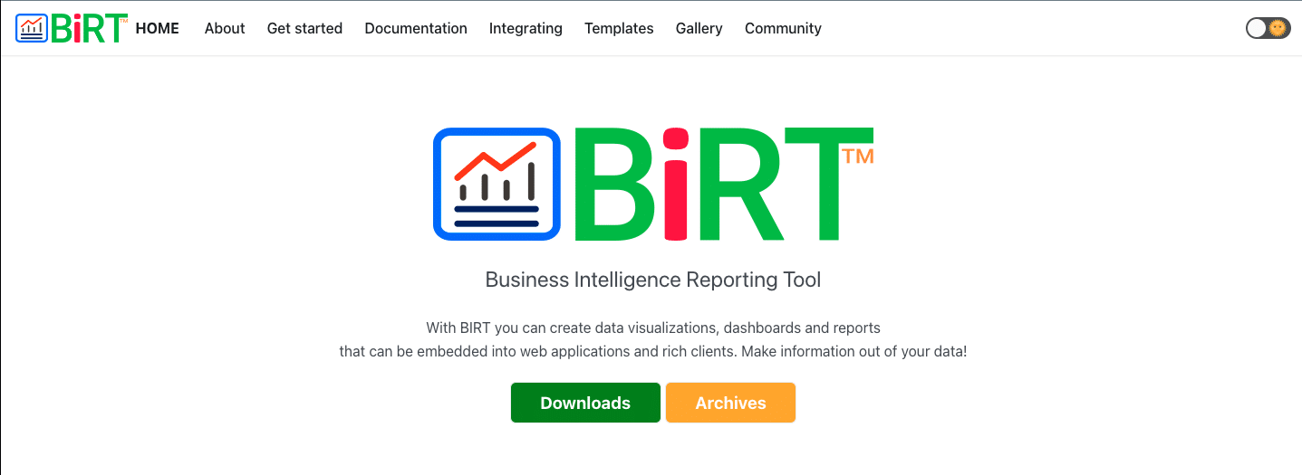
BIRT
BIRT (Business Intelligence and Reporting Tools) is an open-source reporting system that has been part of the Eclipse Foundation since 2004. It’s designed to integrate seamlessly with Java and Java EE applications, making it a favorite among developers.
Features and capabilities:
A robust report designer with drag-and-drop functionality, allowing for the creation of complex, multi-page reports
Support for a wide range of data sources, including databases, web services, and custom data objects
A powerful charting engine that enables the creation of various types of data visualizations
The ability to embed reports directly into web applications, providing a seamless user experience
Pros:
BIRT’s high degree of customizability allows developers to tailor the reporting solution to their exact needs. This flexibility makes it possible to create unique, organization-specific reporting solutions.
The tool’s strong integration with Java applications makes it an excellent choice for organizations with existing Java-based systems. Reports can be seamlessly incorporated into these applications, providing a cohesive user experience.
BIRT benefits from an active open-source community, which contributes to ongoing development, bug fixes, and a wealth of shared knowledge and resources.
Cons:
BIRT requires significant technical expertise to implement and use effectively. This high barrier to entry can make it challenging for non-technical users or organizations without dedicated development resources.
Compared to some commercial alternatives, BIRT has limited out-of-the-box features. Many advanced functionalities may need to be custom-developed, which can be time-consuming and resource-intensive.
Best for:
Organizations with Java-based applications that need to incorporate reporting functionality will find BIRT particularly useful. Its ability to integrate seamlessly with Java makes it an excellent choice for these scenarios.
Development teams looking for a reporting solution that they can heavily customize and extend will appreciate BIRT’s flexibility. It provides a solid foundation that skilled developers can build upon to create tailored reporting solutions.
Companies with the technical resources to invest in customization and ongoing maintenance can leverage BIRT to create powerful, unique reporting systems. This makes it suitable for larger organizations with dedicated IT teams or software development companies building reporting into their products.
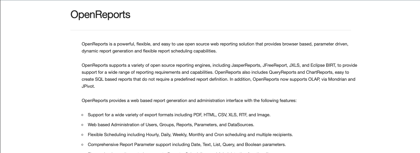
Openreport
Openreport is a lightweight, web-based reporting tool designed with simplicity and ease of use in mind. It aims to provide basic reporting capabilities without the complexity often associated with more comprehensive BI suites.
Features and capabilities:
A web-based report designer that allows for the creation of reports through a browser interface
Support for multiple database types, enabling connections to various data sources
Basic charting and graphing options for data visualization
Capability to schedule report generation and distribution
Pros:
Openreport’s simplicity makes it easy to set up and start using quickly. This can be particularly beneficial for small organizations or departments that need to implement a reporting solution with minimal overhead.
The tool has minimal system requirements, making it suitable for deployment in various environments without the need for powerful hardware.
For organizations with basic reporting needs, Openreport provides a straightforward solution without the complexity of more feature-rich tools. This can lead to faster adoption and easier maintenance.
Cons:
Openreport’s feature set is limited compared to more comprehensive BI tools. Organizations with complex reporting requirements may find it lacking in advanced capabilities.
As data volumes and user numbers grow, Openreport may not scale as effectively as some other solutions. This could potentially lead to performance issues for larger organizations or those with extensive reporting needs.
Best for:
Small businesses or individual departments that need to implement a reporting solution quickly will find Openreport’s simplicity advantageous. It can provide basic reporting capabilities without a significant investment of time or resources.
Organizations with straightforward reporting requirements, such as generating regular sales reports or inventory summaries, can benefit from Openreport’s focused feature set. It provides the essentials without unnecessary complexity.
Teams with limited technical resources may find Openreport more manageable than more complex alternatives. Its user-friendly interface and straightforward setup make it accessible to users without extensive technical expertise.
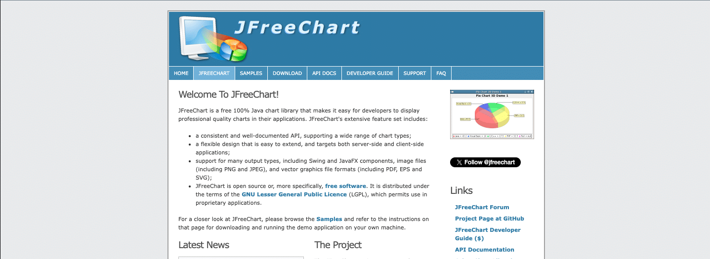
JFreeChart
JFreeChart is a free Java chart library that has been a staple in the Java development community since 2000. It enables developers to add professional-quality charts to their applications, enhancing data visualization capabilities.
Features and capabilities:
Support for a wide range of chart types, including pie charts, bar charts, line charts, scatter plots, and more
Highly customizable chart properties, allowing developers to control every aspect of the chart’s appearance
Ability to output charts in various formats, including PNG, JPEG, PDF, and SVG
Support for interactive charts in Java applications, enabling features like zooming and clicking on chart elements
Pros:
Try the Free Spreadsheet Extension Over 500,000 Pros Are Raving About
Stop exporting data manually. Sync data from your business systems into Google Sheets or Excel with Coefficient and set it on a refresh schedule.
JFreeChart is known for its high-quality chart rendering, producing professional-looking visualizations that can enhance the appearance and effectiveness of reports and dashboards.
The library offers extensive customization options, allowing developers to tailor charts to exact specifications. This level of control is particularly useful for creating branded or specialized visualizations.
JFreeChart comes with comprehensive documentation and a well-defined API, making it easier for developers to integrate and use effectively in their projects.
Cons:
As a Java library, JFreeChart requires Java programming knowledge to implement and use. This makes it unsuitable for non-technical users or organizations without Java development resources.
JFreeChart is not a standalone reporting tool but rather a charting component. Organizations needing a complete reporting solution will need to integrate it with other tools or build additional functionality around it.
Best for:
Java developers working on applications that require embedded charts or visualizations will find JFreeChart invaluable. It provides a robust solution for adding data visualization capabilities to Java programs.
Organizations with existing Java-based reporting systems can use JFreeChart to enhance their visualization capabilities. It can be integrated into these systems to provide more advanced or customized charting options.
Projects requiring highly customized charts that aren’t easily achievable with off-the-shelf solutions can benefit from JFreeChart’s flexibility. It allows for the creation of unique visualizations tailored to specific needs.
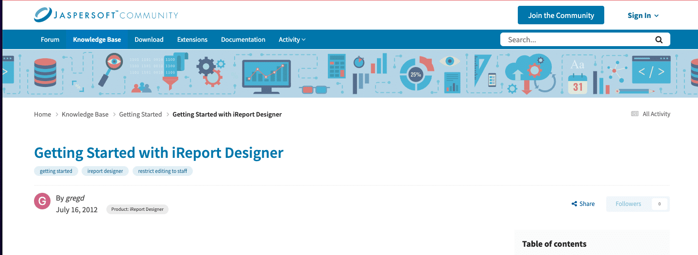
iReport
iReport is a visual report designer for JasperReports, one of the most popular open-source reporting engines. Developed by JasperSoft, iReport provides a user-friendly interface for creating complex, professional reports.
Features and capabilities:
A WYSIWYG (What You See Is What You Get) report designer that allows for intuitive report creation
Support for a wide range of data sources, including relational databases, XML, and custom data sources
Ability to use scriptlets for implementing advanced report logic and calculations
Export capabilities to multiple formats, including PDF, XLS, HTML, and CSV
Pros:
iReport’s intuitive design interface makes it accessible to users with varying levels of technical expertise. This can speed up the report design process and reduce the learning curve for new users.
The tool offers powerful reporting capabilities, including support for subreports, charts, and complex layouts. This allows for the creation of sophisticated, information-rich reports.
As part of the JasperReports ecosystem, iReport benefits from strong community support and integration with other Jasper tools. This can provide a pathway to more advanced BI capabilities as needs grow.
Cons:
While more user-friendly than some alternatives, iReport still requires some technical knowledge to use effectively. Users may need to understand concepts like SQL queries and data structures to fully leverage its capabilities.
For very simple reporting needs, iReport may be overkill. Its feature set is geared towards more complex reporting scenarios, which can be overwhelming for basic use cases.
Best for:
Organizations already using or planning to use JasperReports will find iReport to be an excellent companion tool. It provides a visual interface for report design that complements JasperReports’ powerful engine.
Businesses with complex reporting requirements, such as financial institutions or healthcare organizations, can leverage iReport’s advanced features to create detailed, multi-layered reports.
Teams with some technical expertise but who prefer a visual design tool over coding reports manually will appreciate iReport’s balance of power and usability. It allows for the creation of sophisticated reports without requiring extensive programming knowledge.
Pentaho
Pentaho Community Edition is a comprehensive open-source business intelligence platform that includes tools for reporting, data integration, OLAP analysis, and data mining. It’s been a significant player in the open-source BI space since 2004.
Features and capabilities:
A report designer with drag-and-drop functionality for creating a wide range of reports
Data integration and ETL (Extract, Transform, Load) tools for preparing and moving data
OLAP (Online Analytical Processing) analysis capabilities for multidimensional data exploration
Dashboarding and data visualization tools for creating interactive BI solutions
Pros:
Pentaho CE offers an all-in-one BI solution, providing tools for various aspects of data processing and analysis. This comprehensive approach can reduce the need for multiple disparate tools.
The platform is highly extensible through plugins, allowing organizations to add functionality or customize the tool to their specific needs. This flexibility can be valuable as business requirements evolve.
Pentaho benefits from an active open-source community, which contributes to ongoing development, bug fixes, and a wealth of shared knowledge and resources.
Cons:
The setup and configuration process for Pentaho CE can be complex, often requiring significant technical expertise. This can make the initial implementation challenging for organizations without dedicated IT resources.
While the community edition offers a broad range of features, it has limitations compared to the enterprise edition. Some advanced functionalities may only be available in the paid version.
Pentaho CE has a steep learning curve, especially for non-technical users. It may require substantial training and time investment to fully leverage its capabilities.
Best for:
Organizations needing a full BI stack but lacking the budget for commercial solutions can benefit from Pentaho CE’s comprehensive feature set. It provides a range of BI capabilities in a single platform.
Companies with technical resources for implementation and customization can take full advantage of Pentaho’s flexibility. It’s well-suited for organizations with dedicated IT or BI teams who can invest time in setup and ongoing management.
Businesses looking to explore BI capabilities before investing in commercial solutions can use Pentaho CE as a starting point. It allows them to understand their BI needs and processes before committing to a paid solution.
Challenges of Using Free Tools for Reporting
While free reporting tools offer numerous benefits, they also come with certain limitations and challenges. Here are some key issues to consider:
Limited Functionalities
Free tools often lack advanced features found in their paid counterparts, such as predictive analytics or complex data modeling capabilities.
Scalability Issues
As your data volume and complexity grow, free tools may struggle to handle increased demands, leading to performance issues.
Lack of Advanced Features
Advanced analytics, machine learning integration, or specialized visualizations may be absent or limited in free versions.
Limited Support and Documentation
Free tools often have less comprehensive documentation and limited customer support, relying more on community forums for troubleshooting.
Potential Security Risks
Some free tools may have fewer security features or slower security updates, potentially exposing your data to vulnerabilities.
Data Governance and Compliance Challenges
Free tools may lack built-in features for data governance, audit trails, or compliance with specific industry regulations.
Best Practices for Live Reporting and Real-Time Data Analysis
What is Live Reporting?
Live reporting refers to the practice of presenting data in real-time or near-real-time, allowing users to access the most up-to-date information for decision-making.
Importance of Real-Time Data in Modern Business Intelligence
Real-time data enables:
Faster decision-making
Proactive problem-solving
Improved customer experiences
More agile business operations
Tips for Effective Live Reporting
Prioritize key metrics: Focus on the most critical KPIs for real-time monitoring.
Design for clarity: Use clear, concise visualizations that are easy to interpret quickly.
Set up alerts: Implement automated notifications for significant data changes or threshold breaches.
Ensure data quality: Validate and clean data in real-time to maintain accuracy.
Optimize performance: Use efficient data processing and caching techniques to minimize latency.
AI and machine learning for predictive analytics on streaming data
Case Study: Successful Implementation of Live Reporting in E-commerce
An online retailer implemented live reporting to monitor website traffic, sales, and inventory levels in real-time. This allowed them to:
Adjust pricing dynamically based on demand
Identify and resolve website performance issues quickly
Manage inventory more effectively, reducing stockouts and overstocking
Personalize customer experiences based on real-time behavior
The result was a 15% increase in sales and a 20% improvement in customer satisfaction scores.
5 Popular Live Dashboard Templates in Google Sheets
Coefficient offers a range of connected templates that can supercharge your Google Sheets reporting capabilities. Here are five popular options:
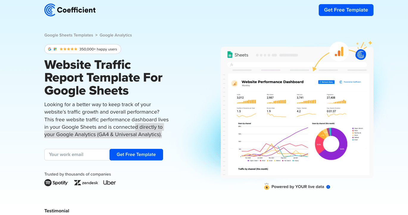
Website Traffic Report Template for Google Sheets
This template integrates Google Analytics (GA4 and Universal) with Google Sheets, offering real-time visualization of website performance. It provides customizable metrics on traffic acquisition, popular pages, and audience behavior, allowing for detailed analysis of essential website data.
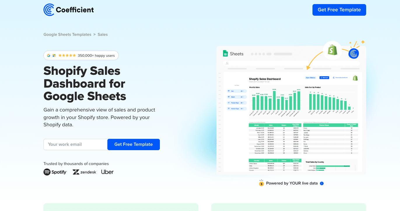
This template provides a detailed, real-time view of your Shopify sales metrics within Google Sheets. It allows you to track sales revenue and orders, customize fields, and integrate data from other sources like QuickBooks and Salesforce.
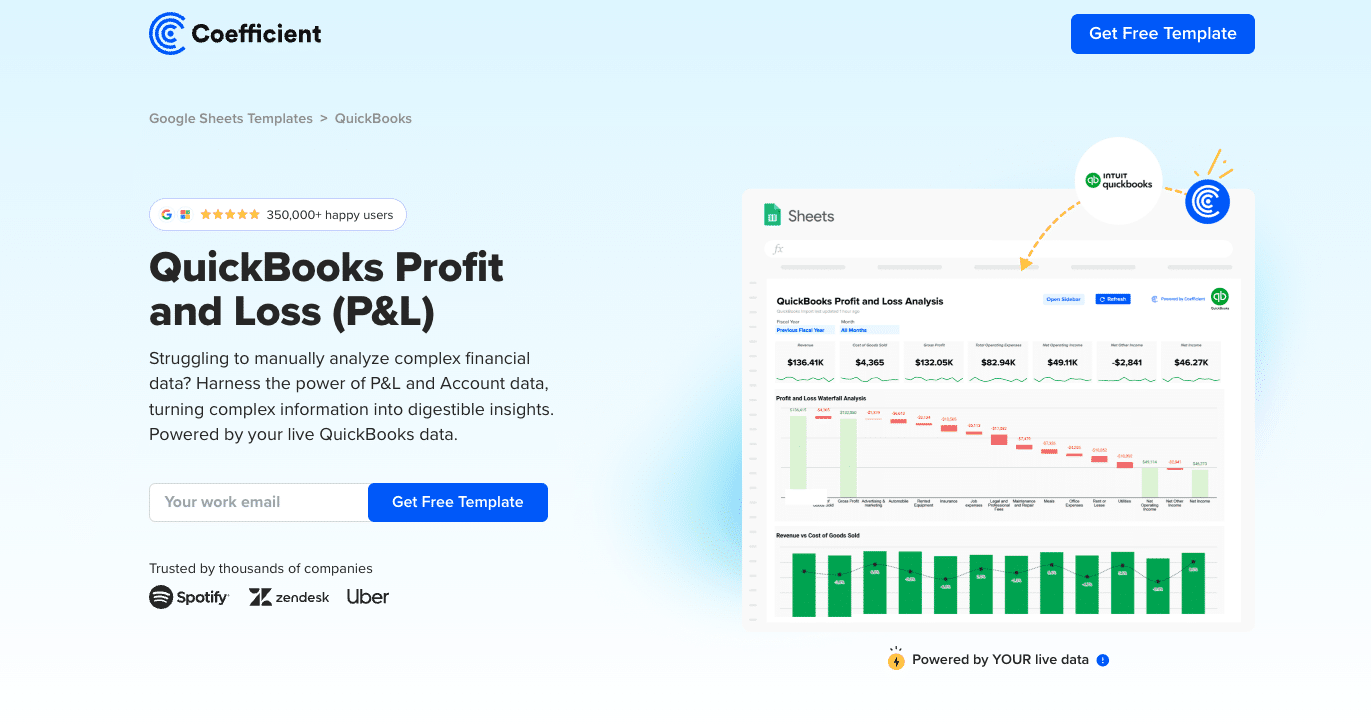
This template integrates with QuickBooks to provide a comprehensive, real-time view of your financial data within Google Sheets. It allows you to access Profit & Loss data instantly, utilize pre-built formulas, and customize the dashboard to fit your analysis needs.
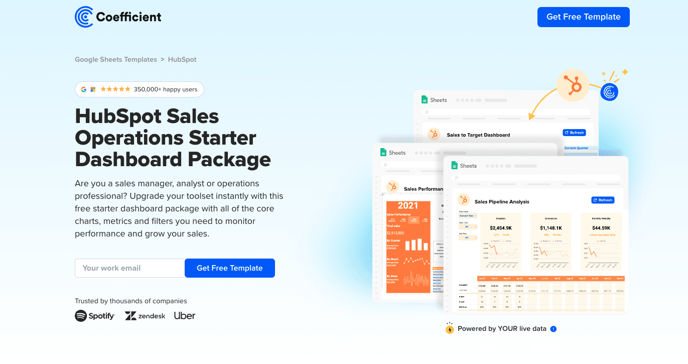
This template offers a pre-built dashboard package for tracking sales operations metrics. It automatically populates with live data from HubSpot, allowing you to monitor performance, track KPIs, and gain insights into top-performing teams and regions.
This template unifies key metrics from GA4, HubSpot, Chargebee/Stripe, and QuickBooks, providing a comprehensive view of your business’s performance. It helps you track growth, pinpoint bottlenecks, and forecast long-term financial health.
Free reporting tools offer powerful capabilities for businesses of all sizes to analyze data and gain valuable insights. While they may have some limitations compared to paid solutions, these tools provide an excellent starting point for organizations looking to enhance their data analytics and business intelligence capabilities.
We encourage you to explore and experiment with the various tools discussed in this guide. Each has its strengths and may be suited to different use cases within your organization.
To take your reporting to the next level with enhanced capabilities and seamless data integration, consider trying Coefficient. Its ability to connect your spreadsheets with live data sources can dramatically improve your reporting efficiency and accuracy.
Try the Spreadsheet Automation Tool Over 700,000 Professionals are Raving About
Tired of spending endless hours manually pushing and pulling data into Google Sheets? Say goodbye to repetitive tasks and hello to efficiency with Coefficient, the leading spreadsheet automation tool trusted by over 350,000 professionals worldwide.
Sync data from your CRM, database, ads platforms, and more into Google Sheets in just a few clicks. Set it on a refresh schedule. And, use AI to write formulas and SQL, or build charts and pivots.
Julian AlvaradoContent lead
Julian is a dynamic B2B marketer with 8+ years of experience creating full-funnel marketing journeys, leveraging an analytical background in biological sciences to examine customer needs.
700,000+ happy users
Wait, there's more!
Connect any system to Google Sheets in just seconds.