Dynamic reporting is transforming how organizations leverage data for decision-making. By providing real-time insights and interactive capabilities, it’s enabling businesses to respond swiftly to market changes and internal shifts. Let’s explore how dynamic reporting is revolutionizing business intelligence and how you can harness its power.
What is Dynamic Reporting?
Dynamic reporting refers to the process of generating data visualizations and analytics that update in real-time as new data becomes available. Unlike static reports, which present a snapshot of data at a specific point in time, dynamic reports offer a live, interactive view of an organization’s metrics and key performance indicators (KPIs).
Key characteristics of dynamic reporting include:
- Real-time data updates
- Interactive elements (filters, drill-downs, etc.)
- Customizable views and dashboards
- Automated data refresh and distribution
The evolution from static to dynamic reporting mirrors the broader shift in business operations towards agility and data-driven decision-making. As organizations face increasingly complex and rapidly changing environments, the ability to access and analyze up-to-the-minute data has become crucial for maintaining a competitive edge.
Static vs Dynamic Reporting: Finding the Right Balance
While dynamic reporting offers numerous advantages, it’s essential to understand the differences between static and dynamic approaches to determine the best fit for various reporting needs.
Key Differences:
- Data Freshness: Static reports present historical data, while dynamic reports offer real-time or near-real-time information.
- Interactivity: Dynamic reports allow users to explore data through filters and drill-downs, whereas static reports are fixed.
- Resource Requirements: Dynamic reporting often requires more robust infrastructure and data pipelines to support real-time updates.
Scenarios for Each Approach:
Static reporting excels in:
- Regulatory compliance reporting
- Historical trend analysis
- Situations where data stability is crucial for decision-making
Dynamic reporting shines in:
- Operational monitoring and alerting
- Sales and marketing performance tracking
- Financial forecasting and scenario planning
Hybrid Approaches:
Many organizations find value in combining static and dynamic reporting. For example:
- Using dynamic dashboards for daily operations while generating static reports for monthly board meetings
- Implementing dynamic elements within otherwise static reports to highlight key metrics or recent changes
By leveraging both approaches, businesses can balance the need for real-time insights with the stability and consistency required for certain reporting functions.
Advantages of Dynamic Reporting
Real-time Insights for Agile Decision-making
Dynamic reporting empowers decision-makers with up-to-the-minute data, enabling them to:
- Respond quickly to market changes
- Identify and address issues as they arise
- Capitalize on emerging opportunities
Improved Data Accuracy and Relevance
By continuously updating with the latest information, dynamic reports:
- Reduce the risk of decisions based on outdated data
- Provide a more accurate representation of current business conditions
- Allow for immediate validation of strategic initiatives
Enhanced Interactivity and User Engagement
Interactive features in dynamic reports foster a culture of data exploration:
- Users can customize views to focus on relevant metrics
- Drill-down capabilities enable deeper insights
- Visual representations make complex data more accessible
Automated Updates and Reduced Manual Effort
Dynamic reporting systems automate many traditional reporting tasks:
- Eliminating manual data collection and entry
- Reducing the risk of human error
- Freeing up time for analysis rather than report preparation
Increased Data Literacy Across the Organization
By making data more accessible and interactive, dynamic reporting:
- Encourages employees at all levels to engage with data
- Promotes a data-driven culture throughout the organization
- Improves overall understanding of key business metrics
Better Alignment Between Data Teams and Business Users
Dynamic reporting bridges the gap between technical and non-technical stakeholders:
- Data teams can focus on building robust, scalable reporting systems
- Business users gain self-service access to the insights they need
- Collaboration improves as both groups work with the same up-to-date information
Examples of Dynamic Reporting
Coefficient offers a range of connected templates that can supercharge your Google Sheets reporting capabilities. Here are five popular options:
Website Traffic Report Template for Google Sheets

This template integrates Google Analytics (GA4 and Universal) with Google Sheets, offering real-time visualization of website performance. It provides customizable metrics on traffic acquisition, popular pages, and audience behavior, allowing for detailed analysis of essential website data.
Get real-time website analytics in Google Sheets.
HubSpot Sales Operations Dashboard Package
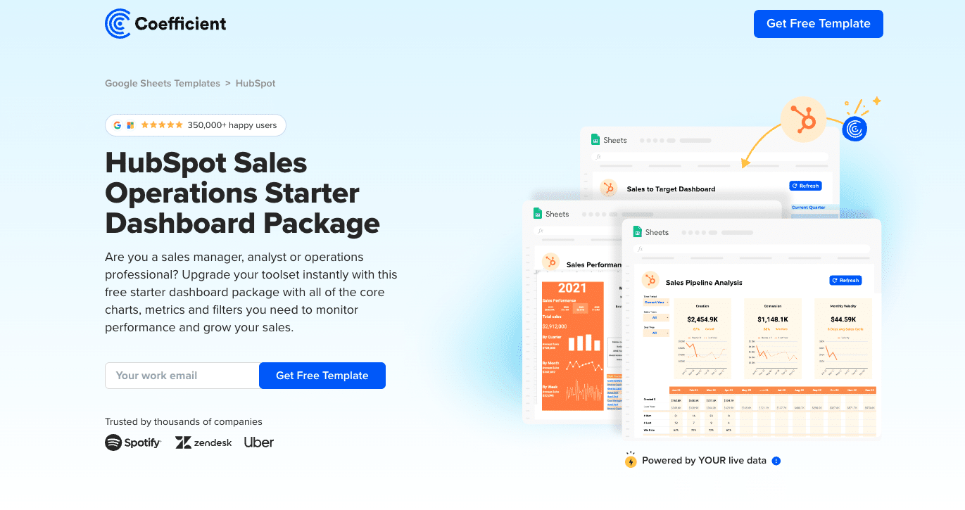
This template offers a pre-built dashboard package for tracking sales operations metrics. It automatically populates with live data from HubSpot, allowing you to monitor performance, track KPIs, and gain insights into top-performing teams and regions.
Create HubSpot sales dashboards without leaving Google Sheets.
SaaS Financial Model

This template unifies key metrics from GA4, HubSpot, Chargebee/Stripe, and QuickBooks, providing a comprehensive view of your business’s performance. It helps you track growth, pinpoint bottlenecks, and forecast long-term financial health.
Consolidate your SaaS metrics into one Google Sheets dashboard.
For more templates and to explore the full range of possibilities, visit Coefficient’s Full Template Gallery.
How to Build a Dynamic Report?
Dynamic reporting allows you to create living, breathing analyses that evolve with your data. Here’s how you can set up dynamic reports using Coefficient:
Let’s walk through the process of creating an ad-hoc report to understand Win-Rate.
Step 1. Connect Your Data Source:
- Open the Coefficient sidebar in your spreadsheet.
- Select “Import from” and choose your CRM or sales data platform (e.g. Salesforce).
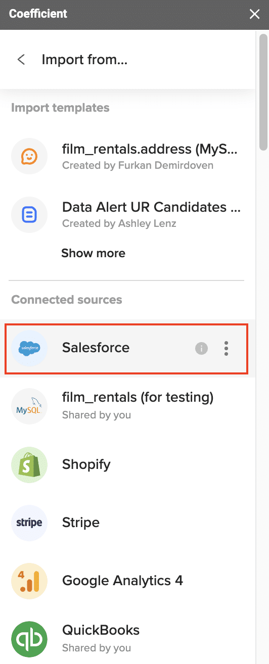
- Follow the prompts to authorize and connect your account.
Step 2. Import Data:
- Once connected, “From Objects & Fields”
- Select relevant fields such as deal status, deal value, and close dates.
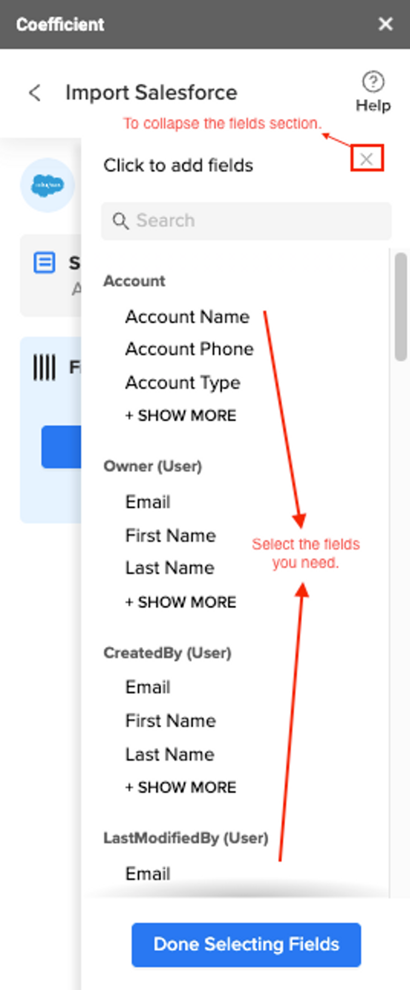
- Customize your import by choosing specific reports or creating a custom query.

Step 3. Create the Report:
- With data imported, calculate the win rate by dividing won deals by total deals.
- Use spreadsheet functions to summarize and visualize the data.
- Create pivot tables to group deals by status and calculate win rates for different time periods or sales reps.
Step 4. Automate and Refresh:
- Set up automated data refreshes to keep your report current.

Step 5. Analyze and Share:
- Examine the data to identify trends and insights in win rates.
- Share the report with your team by granting access to the spreadsheet.
- Set up alerts via Slack or email to notify team members when new data is available.
Top Dynamic Reporting Tools: A Comprehensive Comparison
Dynamic reporting tools have revolutionized how businesses analyze and visualize data. Let’s compare five leading tools in this space, exploring their features, strengths, and ideal use cases.
Coefficient

Coefficient is a powerful dynamic reporting tool that seamlessly integrates with spreadsheets, bringing live data directly into your familiar Excel and Google Sheets environments.
Key Features:
- Live data sync from 50+ business systems
- Easy report and dashboard building with real-time data
- Two-way data sync capabilities
- Automated report scheduling and alerts
Pros:
- Familiar spreadsheet interface reduces learning curve
- Real-time data updates ensure accuracy
- Extensive integration options with popular business systems
Cons:
- Primarily focused on spreadsheet-based reporting
- May require some spreadsheet knowledge for advanced features
Best For: Businesses that rely heavily on spreadsheets for reporting and analysis, especially those looking to enhance their existing workflows with live data and automation.
Tableau
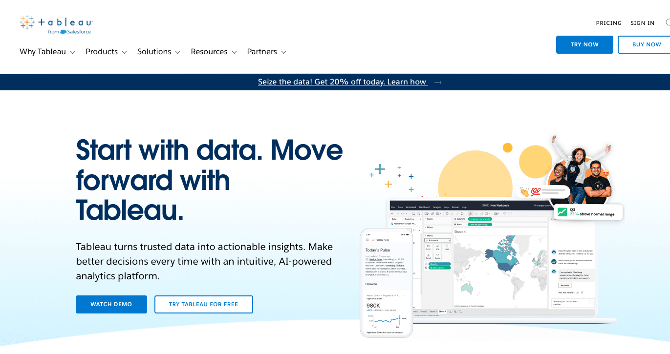
Tableau is renowned for its robust data visualization capabilities and intuitive interface, making it a popular choice for businesses of all sizes.
Key Features:
- Drag-and-drop interface for creating visualizations
- Wide range of chart types and customization options
- Strong data blending and preparation tools
- Mobile-friendly dashboards
Pros:
- Powerful and flexible visualization options
- User-friendly interface for non-technical users
- Large user community and extensive learning resources
Cons:
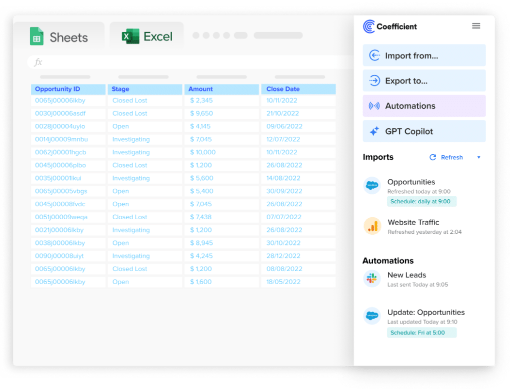
Stop exporting data manually. Sync data from your business systems into Google Sheets or Excel with Coefficient and set it on a refresh schedule.
Get Started
- Can be expensive for small businesses
- May require significant training for advanced features
Best For: Organizations that prioritize data visualization and need to create compelling, interactive dashboards for various stakeholders.
Power BI
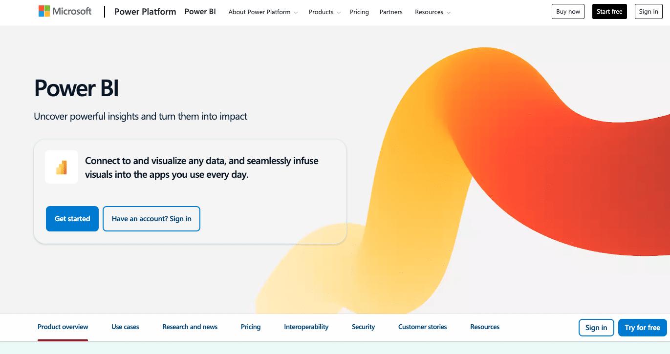
Microsoft’s Power BI is a comprehensive business intelligence platform that integrates seamlessly with other Microsoft products and services.
Key Features:
- Deep integration with Microsoft ecosystem
- Self-service analytics capabilities
- Natural language query functionality
- Robust data modeling and DAX formula language
Pros:
- Cost-effective for organizations already using Microsoft products
- Regular updates and new features
- Strong data governance and security features
Cons:
- Steeper learning curve for advanced features
- Limited customization options compared to some competitors
Best For: Microsoft-centric organizations looking for a powerful BI tool that integrates well with their existing software ecosystem.
Looker
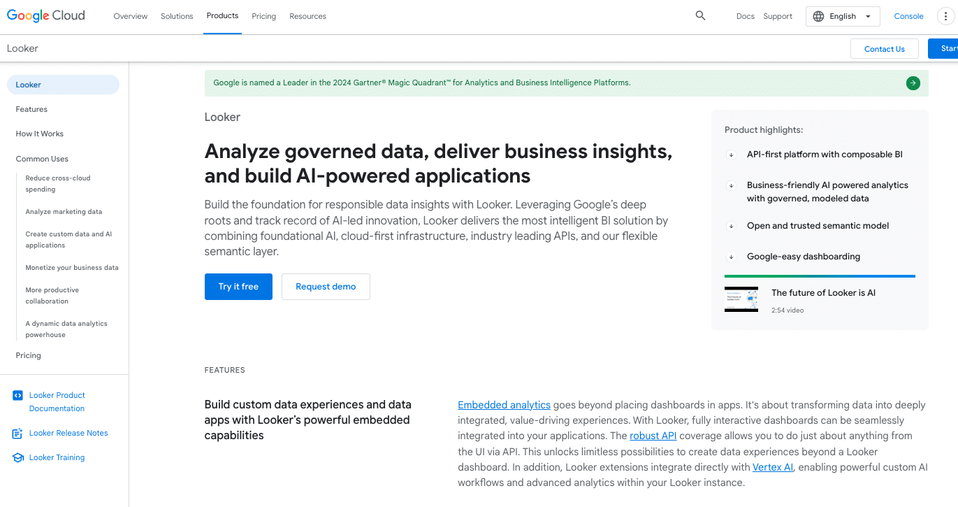
Looker, now part of Google Cloud, is a modern, cloud-native business intelligence platform known for its robust data modeling capabilities.
Key Features:
- Powerful data modeling language (LookML)
- Embedded analytics capabilities
- Collaborative features for team-based analysis
- Strong API and developer tools
Pros:
- Scalable architecture suitable for large enterprises
- Excellent for companies with complex data relationships
- Strong support for data governance and version control
Cons:
- Higher learning curve due to LookML
- Can be more expensive than some alternatives
Best For: Data-driven organizations with complex data structures that need a scalable, cloud-native solution with strong governance features.
QlikView

QlikView is known for its associative data model and in-memory processing, offering a unique approach to data analysis and visualization.
Key Features:
- Associative data model for uncovering hidden insights
- In-memory data processing for fast performance
- Strong data compression capabilities
- Extensive chart and visualization options
Pros:
- Powerful for exploring complex data relationships
- Fast performance even with large datasets
- Flexible deployment options (on-premise or cloud)
Cons:
- Steeper learning curve for new users
- Less intuitive interface compared to some competitors
Best For: Organizations dealing with complex data relationships and large datasets that need powerful exploration and analysis capabilities.
Best Practices for Building Effective Dynamic Reports
Dynamic reporting has revolutionized the way organizations handle data analysis and decision-making. For data professionals, mastering the art of building effective dynamic reports is crucial in today’s data-driven business landscape. To maximize the value of dynamic reporting and create impactful, user-friendly reports, consider these best practices:
Choosing the right data sources and integration methods
Selecting appropriate data sources is the foundation of any successful dynamic reporting system. Consider the following:
- Identify key data sources that align with your business objectives: Conduct a thorough analysis of your organization’s goals and KPIs to determine which data sources will provide the most valuable insights.
- Ensure data quality and consistency across sources: Implement data cleansing and validation processes to maintain high data quality standards. This may involve deduplication, standardization, and error correction techniques.
- Use robust ETL (Extract, Transform, Load) processes for data integration: Leverage modern ETL tools and techniques, such as real-time data streaming or change data capture (CDC), to ensure efficient and accurate data integration. Consider implementing a data lake or data warehouse architecture for centralized data storage and management.
Data modeling for dynamic reporting
A well-designed data model is crucial for creating flexible and performant dynamic reports:
- Create a clear and scalable data model: Utilize dimensional modeling techniques, such as star or snowflake schemas, to create a structure that can easily accommodate new data sources and evolving business requirements.
- Define relationships between different data entities: Establish clear hierarchies and associations between data entities to enable drill-down capabilities and multi-dimensional analysis.
- Use appropriate data types and formats for optimal performance: Choose the most efficient data types for each field (e.g., using integers for IDs instead of strings) and consider data compression techniques to improve query performance.
Design for interactivity and user experience
User engagement is key to the success of dynamic reports. Focus on creating an intuitive and visually appealing interface:
- Implement intuitive filters and drill-down capabilities: Use cascading filters, slicers, and hierarchical drill-downs to allow users to explore data at various levels of granularity.
- Use consistent color schemes and layouts across reports: Develop a style guide that ensures visual consistency across all reports, enhancing user familiarity and ease of use.
- Provide context and explanations for complex metrics or visualizations: Incorporate tooltips, hover-over explanations, and linked documentation to help users understand complex data points or calculations.
Ensure performance and scalability
As data volumes grow and user bases expand, maintaining performance becomes crucial:
- Optimize queries and data retrieval processes: Use techniques such as query optimization, indexing, and partitioning to improve data retrieval speed.
- Implement caching mechanisms where appropriate: Utilize in-memory caching or materialized views to store frequently accessed data and reduce query load on the database.
- Regular performance testing and optimization: Conduct load testing and monitor query execution times to identify and address performance bottlenecks proactively.
Implementing data governance and quality control measures
Maintaining data integrity and compliance is essential for building trust in your dynamic reports:
- Establish clear data ownership and stewardship roles: Define responsibilities for data quality, access control, and metadata management across the organization.
- Implement data quality checks and validation processes: Use data profiling tools and set up automated data quality checks to ensure ongoing data accuracy and completeness.
- Ensure compliance with relevant data protection regulations: Implement data masking, encryption, and access controls to adhere to regulations such as GDPR, CCPA, or industry-specific requirements.
Balancing automation with human oversight
While automation can significantly enhance efficiency, human expertise remains crucial:
- Automate routine reporting tasks to save time: Use scheduling and distribution features to automate report generation and delivery, freeing up time for more complex analysis.
- Implement alerts for anomalies or significant changes in data: Set up automated notifications for unusual patterns or threshold breaches to enable timely interventions.
- Maintain human review for critical decisions and interpretations: Encourage data analysts and domain experts to review automated insights and provide context or additional analysis where needed.
Strategies for user adoption and training
The success of a dynamic reporting system depends on user engagement and proficiency:
- Provide comprehensive training and documentation: Develop a mix of training materials, including video tutorials, hands-on workshops, and detailed user guides tailored to different user roles and skill levels.
- Create a support system for users: Establish a dedicated help desk, user forums, or internal communities where users can seek assistance and share best practices.
- Gather and act on user feedback: Implement regular feedback loops through surveys, user testing sessions, and analytics on report usage to continuously improve the reporting system.
Embracing Dynamic Reporting for Data-Driven Success
Dynamic reporting tools have transformed how businesses interact with their data, enabling real-time insights and fostering a data-driven culture. By choosing the right tool and implementing best practices, organizations can unlock the full potential of their data assets.
Ready to revolutionize your reporting and drive real-time, data-driven decisions? Get started with Coefficient today and experience the power of dynamic reporting firsthand.

