What Is Databox?
Databox is a business intelligence and dashboard platform for marketing teams, agencies, and business analysts who need to pull data from multiple sources into a single view. It connects to 130+ tools including Google Analytics, HubSpot, Salesforce, Shopify, Stripe, QuickBooks, and SQL databases, turning that data into dashboards, scorecards, and automated reports.

The platform targets growing companies and agencies that want a more accessible alternative to heavy enterprise BI tools. Its core proposition is centralising metrics so teams can monitor performance, set goals, and make decisions without context-switching between platforms.
Databox serves two main use cases: in-house marketing and ops teams monitoring internal KPIs, and agencies building client-facing reporting at scale. The pricing model affects both differently, and understanding how it works before signing up saves real money.
Databox Pricing: Plans and What They Cost
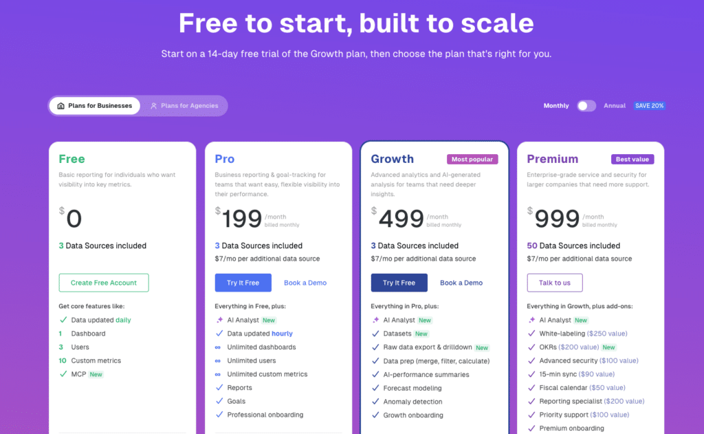
Databox publishes its pricing openly at databox.com/pricing. The structure is two main tiers for businesses (Free and Pro), with higher plans available on request, priced by the number of data sources you connect rather than by user count. Unlimited users are included on every paid plan.
| Plan | Monthly Price | Annual Price | Data Sources Included | Key Limits / Unlocks |
| Free | $0 | $0 | 3 | 1 dashboard, 3 users, daily refresh, 10 custom metrics, 11 months historical data |
| Pro | $199/month | $159/month | 3 included, unlimited limit | Unlimited dashboards, unlimited users, hourly refresh, AI Analyst (Genie), Reports, Goals |
| Additional data sources | $7/mo (monthly) | $5.60/mo on annual billing |
| All pricing sourced directly from databox.com/pricing. Databox also offers Growth and Premium plans for higher-volume teams — contact Databox sales for current pricing on those tiers. |
How Data Source Billing Actually Works
The per-data-source model is where Databox’s real cost diverges from the headline plan price. Both Free and Pro include 3 data sources. Every additional source costs $7/month on monthly billing or $5.60/month on annual billing.
A data source is not just a connector — it is each individual account or property within a connector. Connecting Google Analytics across three website properties counts as three data sources. Connecting two HubSpot portals counts as two. For most marketing teams managing multiple tools and accounts, the 3 included sources run out fast.
To illustrate: a typical marketing team connecting Google Analytics (2 properties), Google Ads, Facebook Ads, HubSpot, and Salesforce is at 6 data sources. On Pro, that means 3 additional sources at $5.60/month each on annual billing, adding $16.80/month on top of the $159 base. At 10 sources it becomes $159 + $39.20 = $198.20/month. Scale that across an agency with multiple client accounts and the bill compounds quickly.
What the Free Plan Actually Gives You
The Free plan is genuinely usable for individuals or very small teams who need basic visibility into a handful of metrics. You get 3 data sources, 1 dashboard, 3 users, and daily data refresh.
The practical limits: one dashboard makes it hard to build separate views for different teams or clients. Daily refresh means the data you see could be up to 24 hours old. Custom metrics are capped at 10. Historical data goes back 11 months.
For teams that need hourly refresh, multiple dashboards, or AI-powered analysis, the free tier is a starting point, not a working environment. The upgrade to Pro unlocks all of those capabilities alongside unlimited users and dashboards.
Add-Ons and Paywalled Features
Several features most teams consider standard are either locked behind the Pro tier or sold as separate add-ons on top of any plan.
- AI Analyst (Genie): Pro and above only. Natural language querying and AI-generated performance summaries are not available on Free.
- Reports and Goals: Pro only. Basic automated reporting and goal tracking require upgrading from Free.
- White-labeling: Available as a paid add-on. Agencies wanting branded dashboards pay extra regardless of base plan tier.
- 15-minute sync: Available on higher tiers or as a paid add-on. Pro syncs hourly by default.
- Advanced security (Force SSO, Force 2FA, Activity Log): Add-on or higher tier. Not included in Free or standard Pro.
- OKRs: Paid add-on. Not included in base plan pricing.
- Dedicated CSM and priority support: Higher tiers only.
Multiple public reviews flag the layered paywall structure. One Capterra reviewer described it as nickel and dime — at every turn you will be charged for features, usage, branding, or support. Another noted that basic features like integrations and branding required additional fees beyond the base plan. These are consistent themes, not edge cases.
Who Databox Is and Isn’t Right For
Databox earns its cost for marketing teams and agencies that need a dedicated dashboard environment, client-ready automated reporting, and broad connector coverage. The Pro plan delivers genuine value for teams that need hourly refresh, AI analysis, and unlimited dashboards across a modest number of data sources.
The value equation weakens for teams that need to connect many data sources, non-technical business users who want live data in a familiar environment without learning a new platform, and teams where the per-source cost compounds past the point of easy justification.
The free plan is a legitimate starting point for individuals or very small teams. But the jump from free to meaningful usage often requires Pro plus additional data sources, pushing the actual monthly spend well above the headline $159/month.

Stop exporting data manually. Sync data from your business systems into Google Sheets or Excel with Coefficient and set it on a refresh schedule.
Get Started
Databox vs. Coefficient: Two Different Answers to the Same Problem
Both tools address the problem of getting live data from business tools into one place. They answer it differently.
Databox builds a new environment for your data. You connect sources, build dashboards inside Databox, and share them from the platform. This works well for teams that need a polished, dedicated dashboard tool with client-ready presentation and automated reporting. But it means maintaining a separate platform alongside the spreadsheets where most analysis already happens, and paying per data source as your coverage grows.
Coefficient brings the data to where you already work. It connects 100+ sources directly into Excel or Google Sheets on a scheduled refresh. Live data lands in the spreadsheet environment your team already uses, with the formulas, pivot tables, and models already built. No new platform. No per-data-source penalty. No separate login.
For non-technical business users, the practical difference matters. Databox requires building and maintaining a separate reporting environment. Coefficient makes the spreadsheet they open every morning the live reporting environment, without asking them to learn anything new.
For data and analytics teams, the self-service angle is the key distinction. Coefficient lets business users pull the specific data they need directly into their own spreadsheet without filing a ticket or waiting on the data team. That self-service layer lives inside Excel or Google Sheets rather than requiring adoption of a dedicated tool.
The two tools are also complementary for teams that need both spreadsheet flexibility and polished dashboard presentation. Coefficient handles live data connectivity into spreadsheets. Databox handles the shareable, client-ready dashboard output. Teams using both get the analytical depth of spreadsheets and the presentation quality of a dedicated BI tool, each doing what it is best at.
| Databox Free | Databox Pro | Coefficient | |
| Works inside existing spreadsheets | No | No | Yes (Excel + Google Sheets) |
| Starting price | $0 | $159/month (annual) | From $49/month |
| Data sources included | 3 | 3 + $5.60/mo each additional | 100+ flat |
| Users | 3 | Unlimited | Unlimited |
| AI analysis | No | Yes (Genie) | Yes (AI Sheets Assistant) |
| Dashboards | 1 | Unlimited | One-click web publish |
| Data refresh | Daily | Hourly | Scheduled (all plans) |
| Two-way data sync | No | No | Yes |
Is Databox Worth the Cost?
The Free plan is worth trying — it costs nothing and gives you a working sense of the platform before you commit. For individuals monitoring a small number of sources, it may be enough.
Pro at $159/month is a reasonable price for the full feature set if your team connects 3 to 6 data sources and needs hourly refresh, AI analysis, and unlimited dashboards. Beyond that, the per-source billing pushes actual monthly spend meaningfully higher than the base plan suggests.
The honest consideration is whether a dedicated dashboard platform is what your team actually needs, or whether the problem is more simply getting live data into the environment where work already happens. If it is the latter, the money is better spent on a tool like Coefficient that solves the data access layer without requiring a new platform to maintain alongside it.


