
Most KPI reports fail before anyone reads them. Not because the metrics are wrong, but because the data is stale, the format buries the signal in noise, and there is no clear action anyone is supposed to take after reading it.
This guide covers what makes KPI reporting actually useful in 2026: how to pick the right metrics, how to structure reports for different audiences, how AI is changing the workflow and which tools handle the heavy lifting so your team spends time on decisions rather than data assembly.
What Is a KPI Report?
A KPI report is a structured document or dashboard that presents key performance indicators against defined targets, with enough context to drive a decision. The emphasis is on decision, not display. A report that shows numbers without making clear what to do about them is a status update, not a KPI report.
A useful KPI report answers three questions: Where are we? Are we on track? What needs to happen next? Every section, metric and chart should serve one of those three questions.
KPI Report vs KPI Dashboard: Know the Difference
These terms are used interchangeably but serve different purposes. Mixing them up leads to building the wrong thing for the wrong audience.
| KPI Report | KPI Dashboard | |
|---|---|---|
| Format | Structured document with narrative context | Live, interactive visualisation |
| Update frequency | Scheduled (weekly, monthly, quarterly) | Real-time or near-real-time |
| Primary audience | Leadership, board, investors, cross-functional stakeholders | Operators, team leads, anyone monitoring daily |
| Primary purpose | Historical analysis, strategic review, accountability | Operational monitoring, rapid response |
| Best for | Monthly close reviews, investor updates, QBRs | Daily standups, ops dashboards, live displays |
Most organisations need both. A live dashboard for day-to-day monitoring and a scheduled KPI report that adds narrative context and recommended actions. Neither replaces the other.
How AI Is Changing KPI Reporting in 2026
Three trends are reshaping how teams build and consume KPI reports.
Natural language querying is removing the analyst bottleneck. Instead of waiting for a data team to build a custom report, managers can ask questions in plain English and get answers instantly. Power BI Copilot generates complete report pages from plain-English prompts. Tableau Pulse pushes proactive KPI summaries when metrics shift. Coefficient’s AI Sheets Assistant builds formulas, charts and pivot tables from natural language. Analysts shift from repetitive report-building to strategic interpretation.
Automated anomaly detection is making KPI reports proactive. Rather than waiting for someone to notice a metric has drifted, AI systems flag unusual patterns as they emerge and surface them automatically. This reduces the lag between a problem appearing in the data and someone acting on it.
Proactive metric alerts are replacing manual dashboard checks. Coefficient’s slack and email alerts, Tableau Pulse, Power BI alerts, Geckoboard’s Slack integration and similar tools push KPI summaries when thresholds are crossed. The question shifts from ‘did anyone remember to check?’ to ‘did the right person receive the alert?’
KPI Reporting Best Practices
Use fewer KPIs with more context
5 to 7 KPIs per report or view is the practical limit before cognitive overload sets in. This does not mean tracking only 5 things across the business. It means each report shows the 5 to 7 metrics most relevant to its specific audience. An executive dashboard and a sales manager dashboard should look different even if they draw from the same data.
Every KPI needs three data points to mean anything: the current value, the target and the trend direction. A number without context is just a number.
Connect to live data, not manual exports
Stale data is worse than no data. A dashboard that shows last week’s numbers because someone forgot to update the CSV creates false confidence. Every KPI in a report that drives decisions should pull from a live, automated connection to the source system, not from a manually refreshed spreadsheet.
This is the single biggest failure point in most KPI reporting workflows and the easiest one to fix with the right tooling.
Match the report format to the audience
Executives want three metrics and a direction. Operations teams want drill-down capability. Finance wants variance vs plan with narrative context. Building one universal KPI report for all audiences produces a report that works for none of them. The most effective KPI reporting programmes have different report formats for different audiences drawing from the same governed data layer.
Separate leading from lagging indicators
Lagging indicators (revenue, churn, headcount) tell you what happened. Leading indicators (pipeline coverage, NPS trend, time-to-hire) predict what will happen. Reports that only track lagging indicators are postmortems. Reports that include both are actionable. For each lagging KPI in your report, identify the leading indicator that predicts it and track both.
Make the next action explicit
Every KPI that is off track should have an owner and a proposed action in the report. Not just ‘conversion rate is down 12%’ but ‘conversion rate is down 12% vs target. Owner: Sarah Chen, proposed action: audit top-of-funnel quality by Friday.’ Reports without owners and actions are reading material, not management tools.
Top KPI Reporting Tools in 2026
The tools below cover the full spectrum from spreadsheet-native options to enterprise BI platforms. Pricing reflects 2026 published rates.
| Tool | Starting Price | Best For | Live Data |
|---|---|---|---|
| Coefficient | Free & Paid From $49/month | Teams heavily using Google Sheets or Excel for analysis, reports & dashboards. | Yes: 100+ source systems |
| Microsoft Power BI | $14/user/month (Pro) | Microsoft-stack organisations, enterprise KPI reporting | Yes: DirectQuery and scheduled refresh |
| Tableau | $75/user/month (Creator) | Visualisation-first teams, Salesforce CRM users | Yes: live connections and Tableau Pulse alerts |
| Databox | Free & Pro from $59/month | SMBs, marketing teams, quick KPI setup | Yes: 100+ pre-built integrations |
| Klipfolio | From $80/month (Klips) | Custom KPI dashboards, agencies | Yes: 130+ data sources |
| Geckoboard | From $49/month | Real-time TV dashboards, office displays | Yes: 90+ integrations |
| Zoho Analytics | Free & Paid from $30/month | Zoho ecosystem users, affordable BI | Yes: 500+ app connectors |
| Looker Studio | Free (Pro $9/user/month) | Google ecosystem teams, free KPI reports | Yes: native Google data |
1. Coefficient
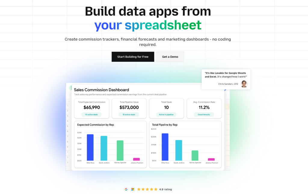
Best for: Teams that do their reporting work in Google Sheets or Excel.
Coefficient connects spreadsheets directly to 100+ source systems, including Salesforce, HubSpot, NetSuite, Snowflake, QuickBooks and Xero, with scheduled auto-refresh and two-way sync. Vibe Reporting (early access, April 2026) generates live, shareable KPI dashboards from spreadsheet data via a plain-English description. No BI tool required. No manual exports. The KPI report updates automatically as the underlying data refreshes.
Pricing: Free plan available. Paid from $49/month. See coefficient.io/pricing.
| “Coefficient automated everything. Instead of manually exporting data every day, I just sit back and watch the data update automatically.” Christian Budnik, FP&A Analyst, Solv |
2. Microsoft Power BI
Best for: Microsoft-stack organisations needing enterprise KPI reporting at a low per-user cost.
Power BI Pro at $14/user/month is the most cost-effective enterprise KPI reporting platform. Copilot AI (add-on at $30/user/month) generates KPI report pages from plain-English prompts and writes DAX formulas automatically. Native integration with Excel, Teams, SharePoint and Azure means most Microsoft-stack organisations already have the infrastructure in place.
Pricing: Free Desktop; Pro at $14/user/month; Premium Per User at $24/user/month; Copilot add-on $30/user/month.
3. Tableau
Best for: Enterprise teams where visualisation quality and proactive KPI monitoring are primary requirements.
Tableau’s chart library and VizQL engine remain the benchmark for complex KPI dashboards. Tableau Pulse, available in Tableau+, delivers personalised KPI summaries to users via Slack, email or Salesforce when metrics shift. Instead of checking dashboards, business users receive relevant KPI alerts automatically.
Pricing: Creator at $75/user/month; Explorer at $42/user/month; Viewer at $15/user/month (all annual).
4. Databox
Best for: SMBs and marketing teams that need KPI reports fast without SQL or BI setup.
Pre-built metric libraries for 100+ platforms mean most teams publish their first live KPI report in under an hour. The free plan includes 3 data sources, 3 dashboards and daily refresh.

Stop exporting data manually. Sync data from your business systems into Google Sheets or Excel with Coefficient and set it on a refresh schedule.
Get Started
Pricing: Free (3 data sources, daily refresh); Pro from $59/month.
5. Klipfolio
Best for: SMBs and agencies that need custom KPI dashboards with full data source flexibility.
Klipfolio connects to 130+ sources including custom APIs. Starts at $80/month. The trade-off is setup complexity: custom connections require SQL or JavaScript knowledge.
Pricing: From $80/month (annual, 3 dashboards).
6. Geckoboard
Best for: Teams that need real-time KPI dashboards on office TV displays. Purpose-built for large-format rendering. From $49/month. Connects to 90+ data sources without SQL. Slack and Teams alerts when KPIs shift.
Pricing: Starter at $49/month (3 users, 1 dashboard); Essential from $99/month; Scale from $369/month.
7. Zoho Analytics
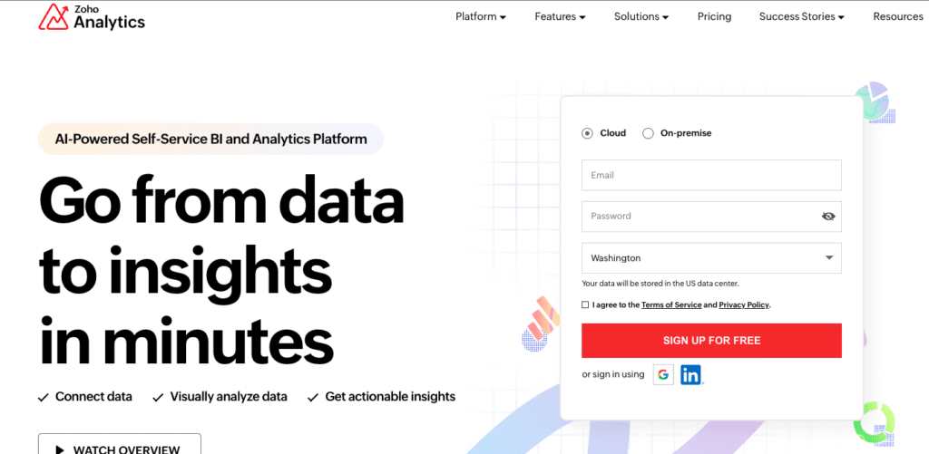
Best for: Zoho ecosystem users and teams that need affordable, published-pricing BI.
From $0 to $575/month on annual billing. Zia AI natural language querying included on all plans at no extra cost.
Pricing: Free (2 users, 10K rows); Basic $30/month; Standard $60/month; Premium $145/month; Enterprise $575/month.
8. Looker Studio

Best for: Google ecosystem teams that need free, shareable KPI reports.
Free for the standard product. Pro at $9/user/month adds enterprise governance and scheduling. No native connector for Salesforce, HubSpot or NetSuite without a paid third-party connector.
Pricing: Free (standard); Looker Studio Pro at $9/user/month (annual).
How to Automate KPI Reporting
- Manual KPI reporting has a predictable lifecycle: someone builds it, it runs for a few months, then it gets abandoned because it takes too long to maintain. Automation is what separates KPI reports that last from ones that quietly die.
- Connect directly to source systems. Replace CSV exports and manual data pulls with a direct connection from your reporting tool to Salesforce, HubSpot, NetSuite, Snowflake or whichever system holds the data. Set an auto-refresh schedule. Done once, the data updates without anyone touching it.
- Use templates and scheduled distribution. Build the report once with the right metrics, layout and context sections. Then schedule it to generate and distribute automatically on the cadence your audience needs: weekly for operational teams, monthly for leadership, quarterly for board-level reporting.
- Set threshold alerts rather than relying on periodic reviews. If a KPI crosses a critical threshold, the right person should know immediately, not at the next scheduled review. Configure alerts in your reporting tool so that exceptions surface in real time rather than being discovered in the monthly report three weeks later.
Frequently Asked Questions
What should a KPI report include?
At minimum: the metric name, current value, target, variance (actual vs plan), trend over the relevant period, and an explicit note on what action is required when the metric is off track. Executive KPI reports should also include a narrative summary of 2 to 3 sentences interpreting the data, not just presenting it.
How often should KPI reports be produced?
Match the cadence to the decision cycle, not the data availability. Sales pipeline KPIs should be reported weekly because the sales cycle moves weekly. Financial close KPIs are monthly because that is when the books close. Board-level KPIs are quarterly. The most common mistake is reporting everything at monthly frequency regardless of how quickly the underlying business moves.
What is the difference between a KPI and a metric?
A metric is any quantifiable measure. A KPI is a metric that is directly tied to a strategic objective and has a target attached to it. Revenue is a metric. Revenue vs plan for the quarter is a KPI. Website sessions is a metric. Website sessions to MQL conversion rate against a 3% target is a KPI. KPI reports should include KPIs, not just metrics.
What is the best free KPI reporting tool?
Looker Studio is the strongest free option for Google ecosystem teams. Power BI Desktop is free for report creation but requires a $14/user/month Pro licence to share. Zoho Analytics has a permanent free plan supporting 2 users and 10,000 rows. Databox’s free plan supports 3 data sources and 3 dashboards with daily refresh.
How do I automate KPI reporting in Google Sheets?
Coefficient connects Google Sheets directly to Salesforce, HubSpot, NetSuite, Snowflake, QuickBooks and 100+ other systems with scheduled auto-refresh. Build the KPI report once in Sheets with the right charts and formatting. Coefficient keeps the data live. Vibe Reporting publishes the output as a shareable live dashboard link. No manual data pulls, no stale numbers.
Should KPI reports include Power BI or Tableau dashboards?
For organisations already on Power BI or Tableau, embedding live dashboards in KPI reports is a natural complement. Power BI reports embed directly into Teams and SharePoint for stakeholder distribution. Tableau dashboards can be shared via link for read-only viewing. The key is that the data behind them should be live, not exported static snapshots. A KPI report that embeds a stale Power BI screenshot is no better than a manual spreadsheet.


