


Table of Contents
![]()
- 1. 10 Best CRM Reporting Tools for 2026
- 2. Sales Velocity Tracking: How to Calculate and Track Overtime in Google Sheets
- 3. Average Deal Size: How to Measure + Optimize Forecasting (With Template)
- 4. How You Can Measure and Optimize Pipeline Velocity
- 5. How You Can Measure and Optimize Win Rate Today (2024 Guide)
- 6. Quota Attainment: How to Measure in 2026 (With Template)
- 7. Top 10 Sales Metrics to Track in 2025
- 8. How to Analyze Sales Rep Performance in Google Sheets
- 9. 5 Sales Revenue Metrics to Measure Success in 2024 (With Templates)


Win rate is a crucial metric that reflects your sales team’s effectiveness in closing deals. It provides valuable insights into the health of your sales process and helps identify areas for improvement.
In this guide, we’ll dive deep into win rate, explore how to calculate it, and show you how Coefficient’s Win Loss Analysis Dashboard for HubSpot can help you optimize your sales performance.
Want a quick video walkthrough instead? Analytics expert, Frank Ferris, has you covered.
Understanding Win Rate
Win rate represents the percentage of sales opportunities that result in closed deals. It’s a key indicator of your sales team’s ability to convert leads into customers.
A high win rate suggests a strong sales process, effective lead qualification, and compelling product or service offerings. Conversely, a low win rate may signal issues in your sales approach, such as poor lead quality, ineffective messaging, or intense competition.
Factors that impact win rate:
- Lead Quality: Higher-quality leads that align with your ideal customer profile are more likely to convert into won deals.
- Sales Skills: A well-trained and experienced sales team can effectively communicate value, overcome objections, and close deals.
- Competitive Landscape: Your win rate can be influenced by the strength of your competitors and their offerings.
How to Calculate Win Rate
To calculate win rate, use this formula:
Win Rate = (Number of Won Deals / Total Number of Deals) x 100
- Number of Won Deals: The count of sales opportunities that resulted in closed-won deals within a given period.
- Total Number of Deals: The total count of all sales opportunities pursued within the same period, including both won and lost deals.
Using a Pre-Built Pipeline Dashboard with Win Rate
Coefficient’s Win Loss Analysis Dashboard in Google Sheets built for HubSpot or Salesforce makes it easy to track and analyze your win rate.
Here’s a quick tutorial on how to use it:
Step 1: Download the (Free) Pipeline Analysis Dashboard
To start, head to Coefficient.io.
Enter your work email in the box and click ‘Get Free Template.’
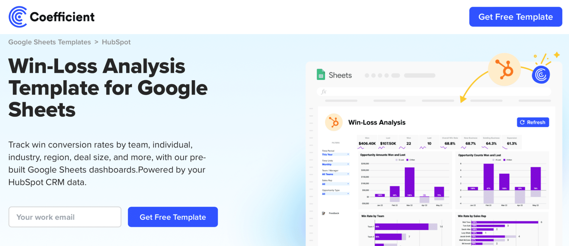
You can save the template to your Google account by clicking the ‘Use Template’ button at the top right corner of your screen.
Coefficient will open in a new spreadsheet.
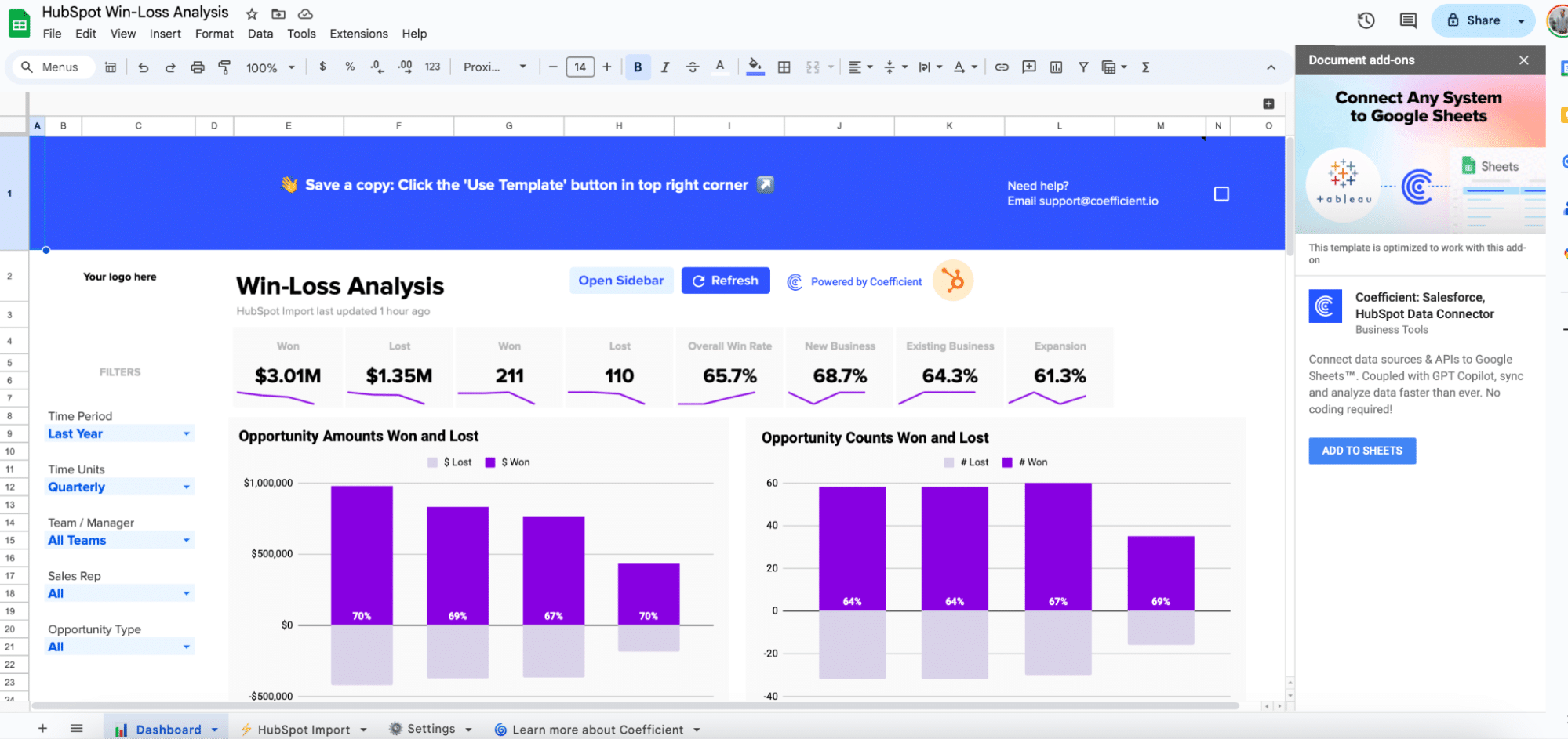
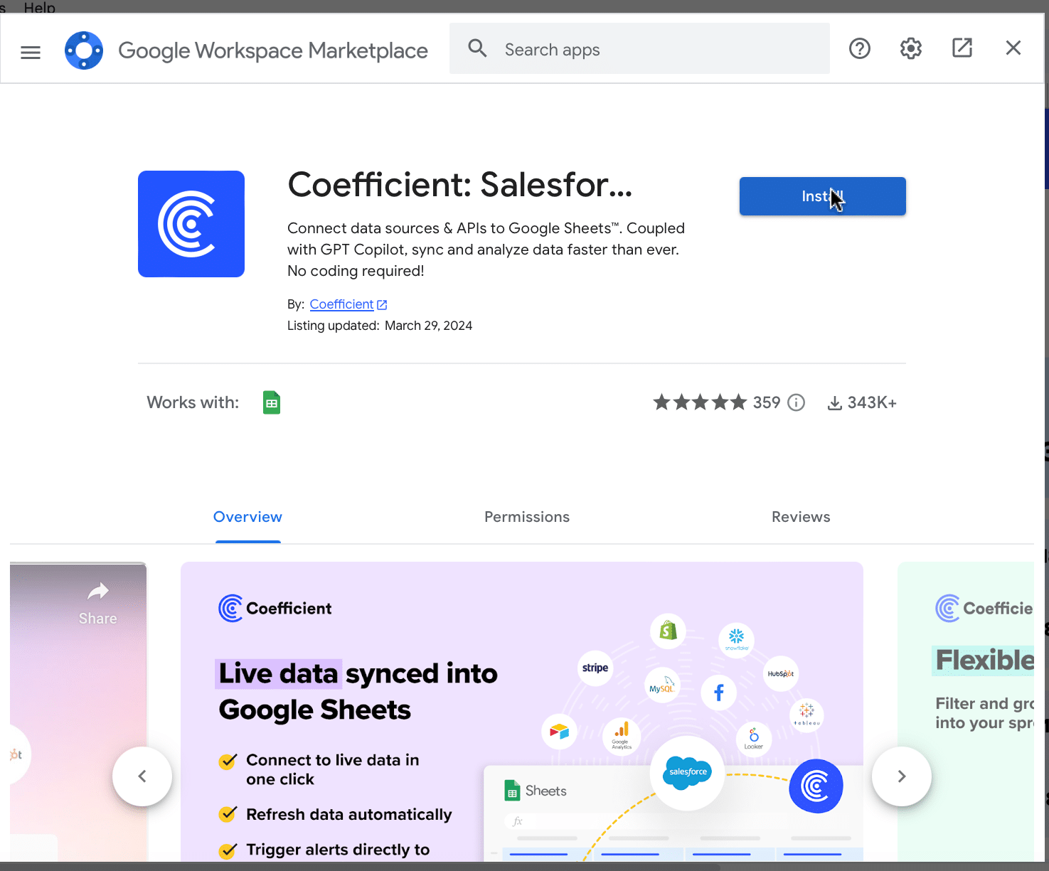
If this is your first time using Coefficient, you’ll need to add it as an add-on to Google Sheets. Click ‘Add to Sheets’ to continue.
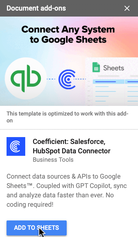
Hit the ‘Install’ button and follow the prompts to complete the installation.
Step 2: Connect Coefficient to HubSpot or Salesforce
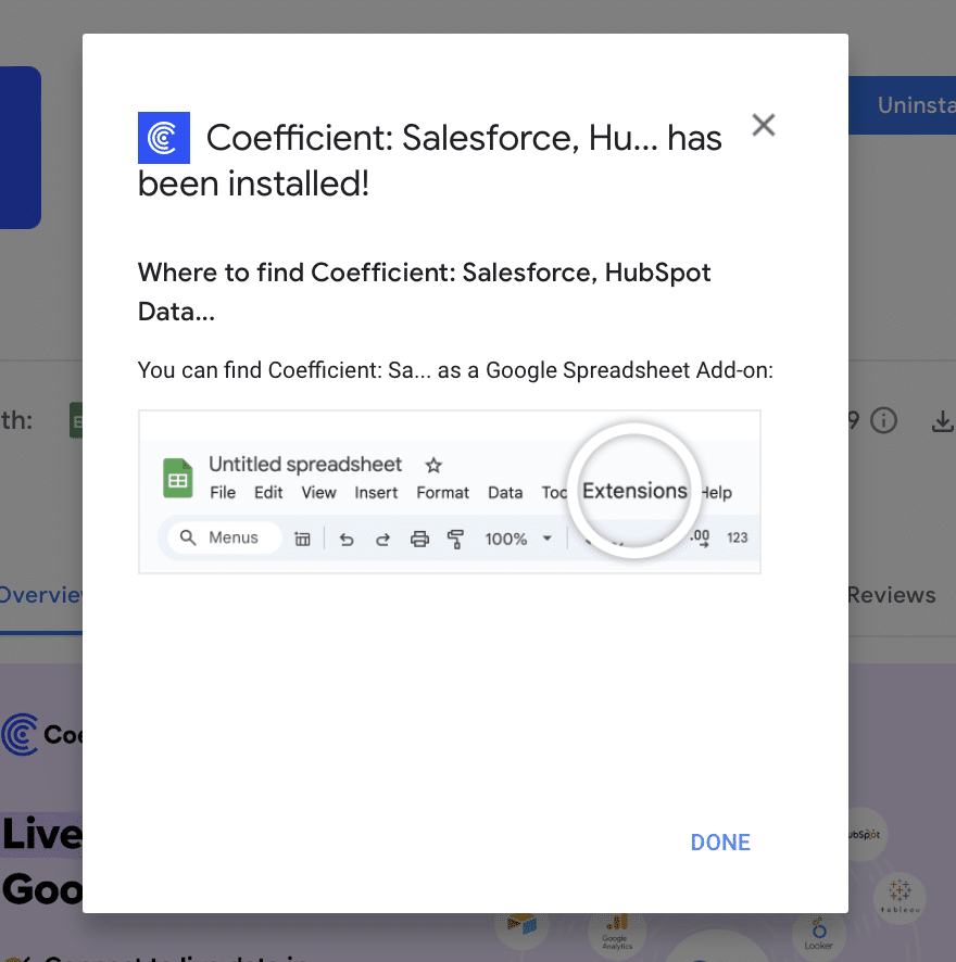
After installation is complete, click ‘Done’ to return to your spreadsheet.
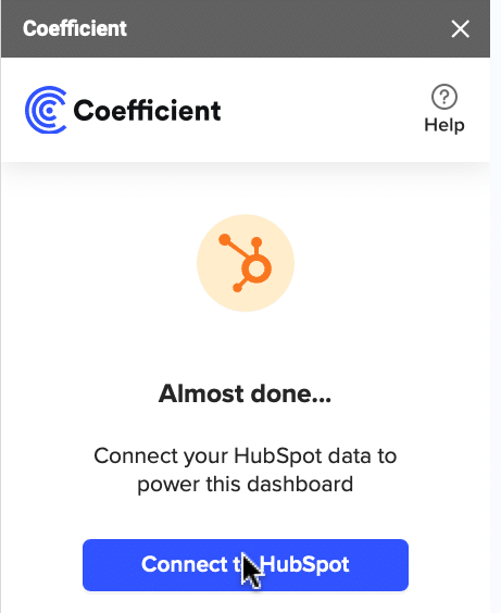
Click ‘Connect to HubSpot’ from the Coefficient menu on the right-hand side of your spreadsheet.
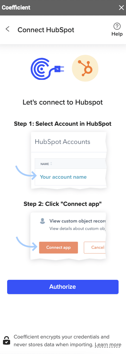
Follow the prompts to authorize Coefficient to your HubSpot account.
If successful, you’ll see the following notification at the top of your spreadsheet.

To update your data, navigate to the ‘HubSpot Import’ tab of your spreadsheet and click ‘Refresh.’
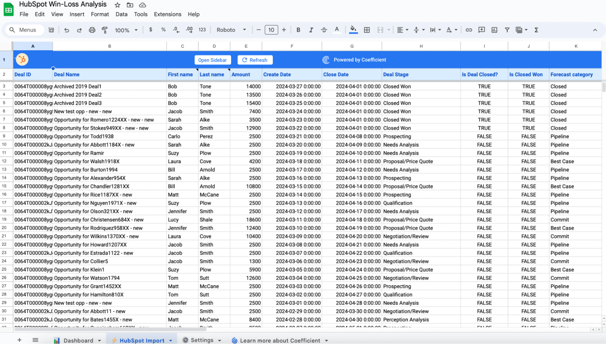
You can also auto-refresh your data by clicking ‘Set Refresh Schedule.’
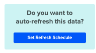
Set up an hourly, daily, or weekly auto-refresh schedule, and Coefficient will automatically update your data based on that time interval.
That means, going forward, Coefficient will automate your HubSpot data exports to Google Sheets for you.
Step 3. Customize Your Dashboard
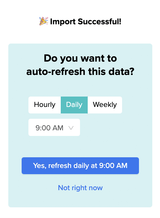
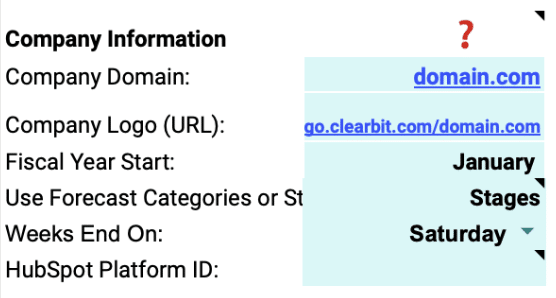
Tailor the template to your organization’s unique needs by navigating to the ‘Settings’ tab.
You can customize by:
Company Information: Add your domain URL, logo, and fiscal year start date.
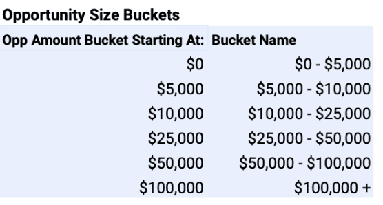
Opportunity Size Buckets: Define the deal size ranges for analysis.
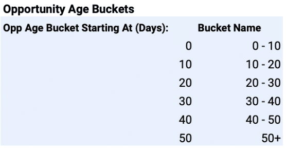
Opportunity Age Buckets: Set the age ranges for tracking deal progression.
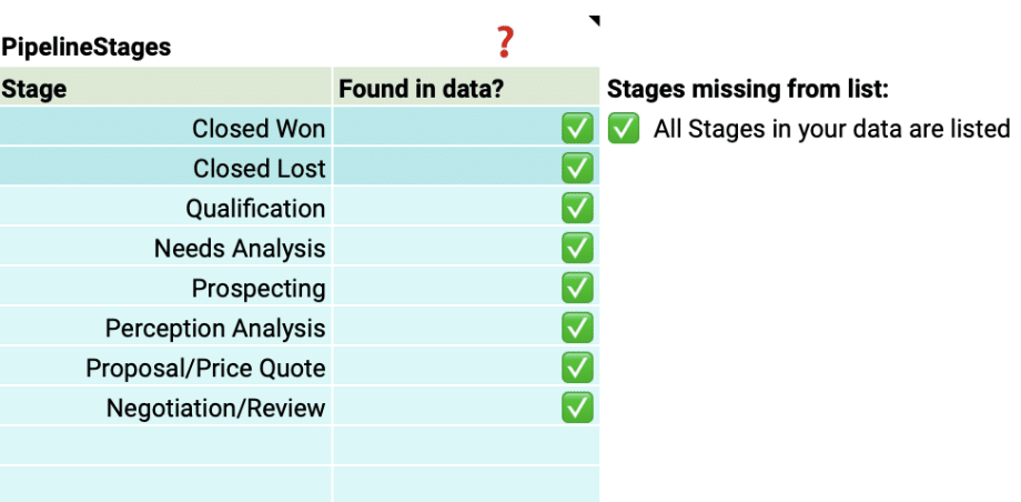
Pipeline Stages: Match the stages to your HubSpot sales pipeline.
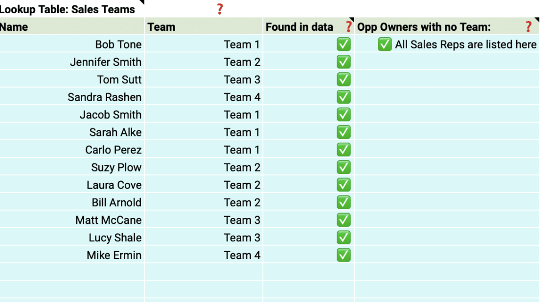
Team Members: Include details about your sales team for personalized insights.
With just a few simple customizations, you can transform the Win Loss Analysis Dashboard into a powerful tool tailored to your organization’s specific needs.
Deep Dive into the Win Rate Dashboard Template
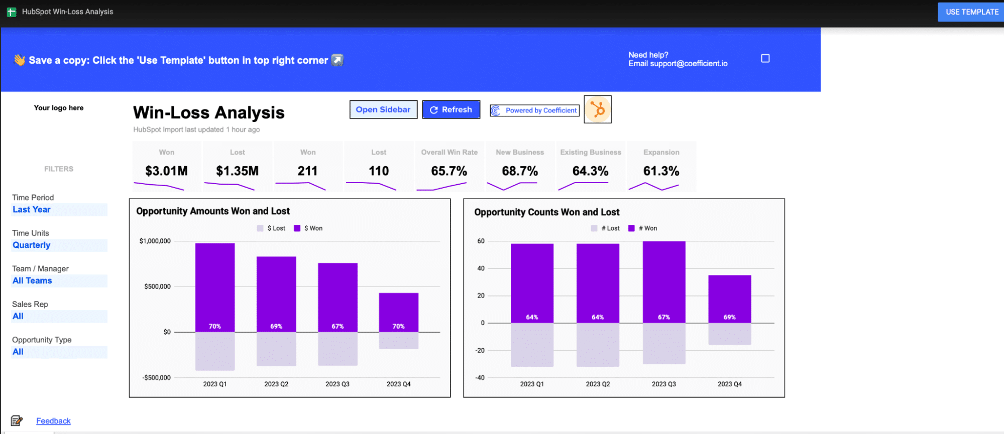
The Win Loss Analysis Dashboard provides a comprehensive view of your win rate performance. Key visualizations include:
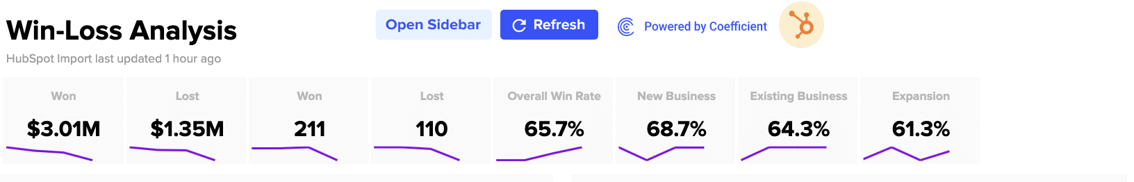
Opportunity Amounts Won and Lost: Compare the total value of won and lost deals.
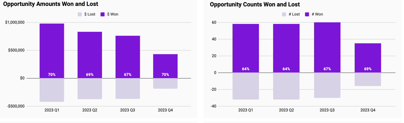
Opportunity Counts Won and Lost: See the number of deals won and lost over time.
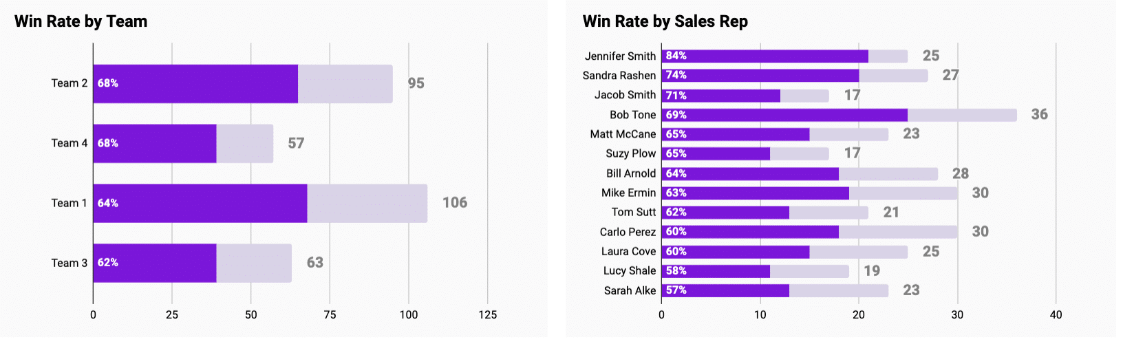
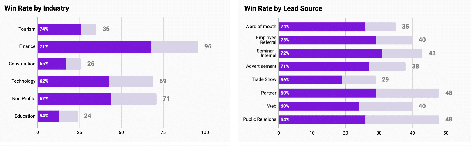
There are also a wide range of graphs to help visualize Win Rate across a few dimensions to help identify performance patterns by:
Team and Sales Rep
Industry and Lead
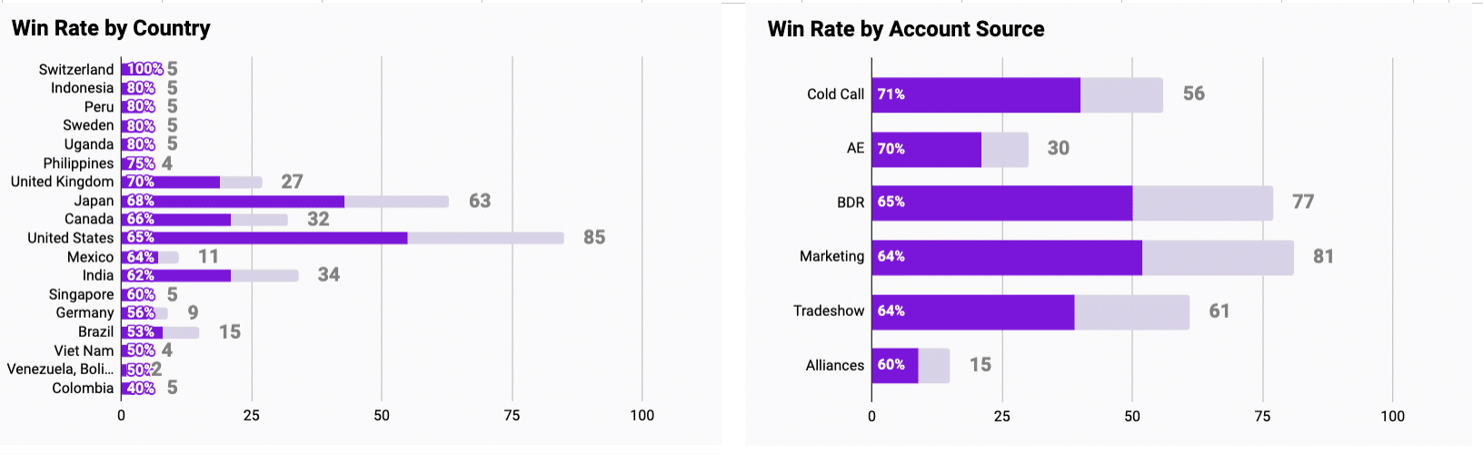
Country and Account Source
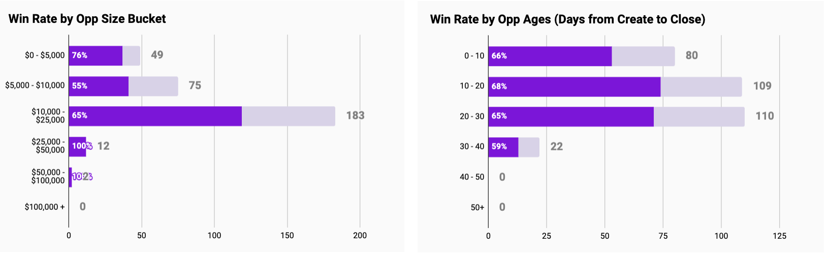
Opportunity Size Bucket and Opportunity Age
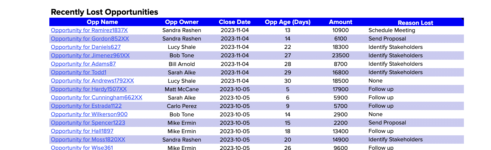
Finally, the Win Rate dashboard allows you to review details of recently lost deals to identify improvement areas in a table beneath the graphs above.
Actionable Insights from Win Rate Analysis
Win rate data empowers you to make strategic decisions and optimize your sales approach:
- Replicate successful strategies: If certain techniques, industries, or lead sources yield higher win rates, consider applying those approaches more broadly.
- Adapt to market changes: Use real-time data to stay agile and responsive to market trends affecting your win rate.
- Streamline sales processes: Identify bottlenecks or stages where deals often stall, and refine your sales process accordingly.
The Power of Live Data
Coefficient’s dashboard templates leverage real-time data, enabling you to:
- Quickly spot and respond to changes in win rate trends
- Make decisions based on the most current information
- Tailor your analysis to your specific priorities and needs
- Easily collaborate and share insights across your organization
Elevate Your Sales Performance
Mastering your win rate is essential for driving sales growth and improving overall performance.
Coefficient’s Win Loss Analysis Dashboard arms you with the tools and insights needed to make data-driven decisions and optimize your sales strategies.
Don’t wait – download the free Win Rate analysis dashboard template or sign up for Coefficient today and start boosting your sales performance!