Every Monday morning, someone opens a slide deck, pastes in last week’s numbers, reformats the chart so the colors match the brand guide, and sends it to the group. Nobody questions the process. It’s just how reporting works here.
This piece is a challenge to that default.
Vibe dashboards are not a product category you can buy off a shelf. They’re an outcome: what happens when a live data layer meets an AI that builds visualizations from plain English. The static dashboard is the incumbent. It has been for a decade. This is a direct comparison of the two, written for the people who are still spending Friday afternoons maintaining a report that could be running itself.
What Is a Static Dashboard?
A static dashboard is a fixed visual report. The charts, tables and numbers are configured at build time. The data does not update on its own. When new numbers come in, someone has to go back in, re-pull the data, reformat, and redistribute.
The formats are familiar: a PowerPoint deck emailed every Friday, an Excel file with charts built from a pasted export, a Google Sheet tab someone updates manually before the weekly call, a PDF generated from a BI tool that nobody has touched since Q3.
Static dashboards are not inherently wrong. There are contexts where a frozen record is exactly what you need: board presentations that get filed, year-end financials, regulatory submissions, audit documentation. In these cases the data is supposed to be frozen. Changing numbers after distribution creates problems.
The issue is scope creep. Static becomes the default for everything, including use cases where the data is supposed to move: pipeline reviews, weekly campaign performance, monthly close tracking. These are not archive documents. They are operational reports that need to reflect where things stand right now, not where they stood when someone last had time to pull a CSV.
| The real cost of static reporting is not the tool. It is the hours spent rebuilding the same report every week by someone who should be doing analysis instead. |
What Is a Vibe Dashboard?
The term vibe coding was coined by Andrej Karpathy in February 2025, describing an approach to software development where you direct AI with intent rather than explicit instructions. Within months the concept jumped from engineering to data. MIT Sloan formally defined vibe analytics in February 2026 as “an approach to data analysis that lets decision makers engage directly with data through AI-powered conversation.”
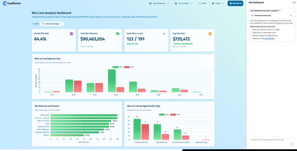
A vibe dashboard is the output of that approach applied to reporting. You describe what you want to see. The AI builds it from live data. The result is a shareable web dashboard, accessible via a URL, that updates automatically as data refreshes. Nobody configures chart types. Nobody maps fields. Nobody emails a file.
The practical difference from a static dashboard is not just speed of creation. It is the ongoing relationship between the dashboard and the data. A vibe dashboard stays connected to the source system. When new records come in, the numbers change. The person who asked the question does not need to rebuild anything.
What a vibe dashboard is not: a way to get good answers from bad data, or a replacement for data governance. AI building a dashboard from a stale CSV gives fast, confident, wrong answers. The live data layer is the foundation. The AI is the interface on top of it. Coefficient’s Live Web Dashboards are built on this logic: 150+ connectors to source systems, scheduled auto-refresh, and an AI chat layer that builds BI-quality web dashboards from Google Sheets or Excel in plain English. Not a standalone BI platform. Requires Google Sheets or Excel.
Static vs Vibe Dashboards Comparison
Neither format wins on every dimension. The table below maps the practical differences so the comparison is honest rather than one-sided.
| Dimension | Static Dashboard | Vibe Dashboard |
|---|---|---|
| Build time | Hours to days | Minutes via AI chat |
| Data freshness | Point-in-time at creation | Live, auto-refreshes on schedule |
| Maintenance burden | High. Manual refresh every cycle | Near zero. AI rebuilds on request |
| Skill required | Spreadsheet or BI tool skills | Plain English |
| Sharing model | File or attachment | URL. No tool access required |
| Cost to scale | Grows with headcount and time spent | Flat. One live dashboard replaces many exports |
| Best for | Board packs, audits, sign-off reports | Recurring ops reports, self-serve analysis |
The maintenance burden row is where the argument concentrates. Static dashboards require someone to own the refresh cycle. That person spends time on mechanics, not analysis. Vibe dashboards shift that time back to the work that actually matters.
When to Use Static Dashboards vs Vibe Dashboards
Use static dashboards where the data needs to be frozen and auditable: board packages, regulatory filings, year-end financial statements, compliance documentation. These are contexts where the report is a record. The audience needs to know the numbers they are looking at are the same numbers everyone else saw. Changing them after distribution would undermine the point of the report.
Use vibe dashboards where the data is supposed to move: pipeline visibility, weekly marketing performance, finance close tracking, sales scorecards, campaign attribution. Any report that a team rebuilds on a recurring schedule because the underlying numbers change is a candidate. The signal is simple: if the same person is rebuilding the same report every week, the format is working against the team.
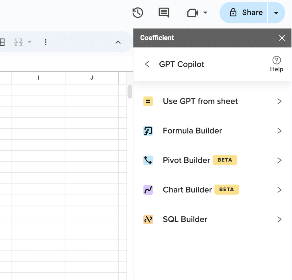
Supercharge your spreadsheets with GPT-powered AI tools for building formulas, charts, pivots, SQL and more. Simple prompts for automatic generation.

Use vibe dashboards for ad hoc questions that no existing dashboard answers. In a static reporting world, that question becomes a ticket, a meeting, a new export, and two days of turnaround. With a vibe dashboard, the analyst describes the question in plain English, the AI builds the view from live data, and the answer exists in minutes. The question does not need to be anticipated in advance.
Teams that are still defaulting to static for all three of these scenarios are carrying maintenance debt they have normalized. The dashboard templates at Coefficient show what common operational reports look like when the refresh is automatic and the build is conversational.
What Vibe Dashboards Actually Require
Vibe dashboards are not a shortcut around data infrastructure. They are an interface layer built on top of it. Getting that sequence wrong is how teams end up with AI-generated charts that look authoritative and are completely wrong.
Three things need to be in place before the AI layer adds value:
- Live data connectivity: Source systems need to be connected directly, not exported. A CSV is a dead end.
- Scheduled refresh: Data needs to update on a predictable cadence so the dashboard reflects current reality at the moment someone opens it.
- Basic data hygiene: Field names, object relationships and metric definitions need to be consistent at the source. The AI cannot reconcile three different definitions of “closed won” across three different Salesforce configurations.
Teams that have already invested in clean CRM data, a connected data warehouse and consistent metric definitions can adopt vibe dashboards with very low friction. Teams still running on weekly CSV exports have a prerequisite step first. That step is worth taking. It eliminates the static refresh cycle entirely, not just for one dashboard but for every report that follows.
Klaviyo made this shift. Their BI team used Coefficient to extend live Snowflake data to 50+ business users across finance, marketing and RevOps, without requiring SQL skills or BI tool licenses. Evan Cover, Director of BI Engineering and Governance, put it plainly: “We had to move fast, iterate, and ensure data from Snowflake was accessible for non-technical users.” The data layer was already governed. Coefficient handled the last-mile delivery into the spreadsheets where those users actually worked.
The Bottom Line
Static dashboards are not going away. They have a legitimate place in any reporting stack for records that need to be frozen, filed and auditable. The problem is using them for everything else because they are familiar and require no upfront setup.
Vibe dashboards flip the maintenance equation on recurring operational reports. The dashboard builds itself, stays connected to the data and updates without anyone touching it between views. The analyst stops being a formatting function and starts being an analyst again.
Try Coefficient free and build your first live dashboard in minutes.