Organizations are generating more data than ever in the AI era, but raw data alone does not drive decisions. The right business intelligence tools transform complex datasets into clear visuals that reveal key insights and inform smarter choices.
The best data visualization tools range from platforms that work inside your existing spreadsheets to full-scale BI environments built for enterprise analytics teams. Which one fits your organization depends on your technical resources, existing stack, and the problem you are actually trying to solve.
This post compares the leading BI tools for data visualization, highlights their standout features, and helps you identify the right fit for your team.
Quick Reference
| Tool | Key Features | Pros | Cons | Best For |
| Coefficient | 100+ connectors, scheduled refresh, AI Sheets Assistant, two-way sync | Works in Excel & Google Sheets, no-code setup, flat pricing | Not a standalone BI platform, | Teams that want live data in their existing spreadsheet environment |
| Tableau | Connects to many data sources, mapping & geographic analysis, advanced calculations, collaboration & sharing | User-friendly interface, excellent support & training, strong user community | Can be expensive at scale, AI features still maturing, less suited for massive data | Organizations needing polished visual storytelling and interactive dashboards |
| Power BI | Integrates with Microsoft tools, Copilot AI, customizable drag-and-drop visuals, natural language queries, mobile access | Familiar Microsoft look and feel, extensive tutorials, affordable pricing tiers | Less flexible for custom visuals, steep learning curve for advanced modeling | Microsoft-centric organizations looking for affordable, scalable BI |
| Qlik Sense | Associative data engine, drag-and-drop data exploration, Qlik Answers AI, robust data integration | Highly customizable, impressive processing speed, strong governance & security | Higher learning curve, complex pricing | Teams that need free-form data exploration and deep associative analytics |
| Looker | Browser-based dashboard builder, LookML for reusable data models, Gemini AI, embedded visualizations | Easy data exploration once set up, powerful analyst tools, pre-built data models | Requires data engineering resources for LookML setup, less flexible for custom visuals | Data-mature organizations on Google Cloud needing governed, embedded analytics |
1. Coefficient
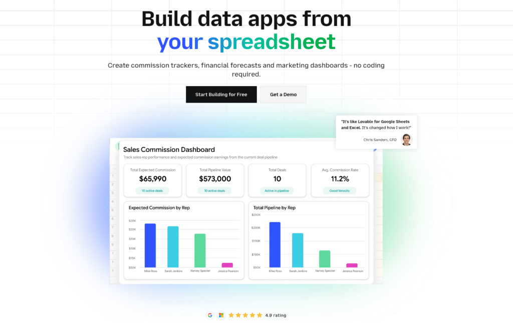
Coefficient connects live data from 100+ business systems directly into Excel and Google Sheets. Unlike traditional BI platforms that require learning a new tool, Coefficient works inside the spreadsheet environment your team already uses, turning static files into live, auto-refreshing reports and dashboards without any coding required.
It serves teams across finance, sales ops, marketing, and RevOps who need current data in their workflow without switching platforms or filing data requests.
Use Cases:
- Revenue and pipeline reporting using live CRM data from Salesforce or HubSpot
- Marketing performance dashboards pulling from ad platforms, Google Analytics, and more
- Financial reporting and analysis using live data from QuickBooks, NetSuite, or Sage Intacct
Key Features:
- 100+ pre-built connectors to CRMs, databases, ad platforms, and finance systems
- Scheduled auto-refresh (hourly, daily, or weekly) keeps reports current without manual exports
- AI Assistant for formula creation, building charts & dashboards, pivot tables, and data cleaning
- Two-way sync: write data back to source systems like snowflake, hubspot, salesforce, quickbooks and more directly from your spreadsheet
Pros:
- Works inside Excel and Google Sheets. No new tool to learn or maintain.
- No-code setup with same-day deployment and no implementation fees
- Flat pricing with no per-user fees and a free plan available
Cons:
- Not a standalone BI platform for complex multi-dimensional modeling
- Limited to spreadsheet-friendly teams only.
2. Tableau
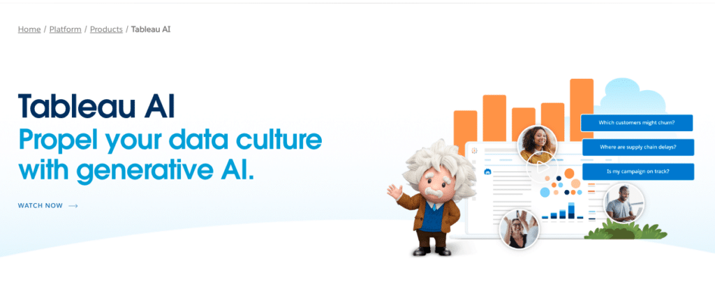
Tableau, now part of the Salesforce ecosystem, is one of popular data visualization tools on the market. Its intuitive drag-and-drop interface makes it easy to create interactive dashboards and reports, even without a technical background. Recent additions including Tableau Pulse and AI-driven insights have extended its self-service analytics capabilities.
Use Cases:
- Sales and marketing analytics
- Financial reporting and forecasting
- Supply chain optimization
Key Features:
- Connects to a wide variety of data sources including Salesforce, databases, and cloud apps
- Powerful mapping and geographic analysis capabilities
- AI-driven insights with Tableau Pulse for proactive metric monitoring
- Collaboration and sharing features for organization-wide access
Pros:
- Short learning curve thanks to user-friendly drag-and-drop interface
- Excellent customer support and training resources
- Strong community of users who share tips and resources
Cons:
- Can become expensive for large deployments (Creator license at $75/user/month)
- AI features still maturing compared to AI-native analytics platforms
3. Microsoft Power BI

Microsoft Power BI is a suite of business analytics tools that deliver insights throughout your organization. Tightly integrated with Microsoft 365, Azure, and Excel, it is a natural choice for companies already running on the Microsoft ecosystem. The addition of Copilot AI brings natural language analytics to business users across plans.
Use Cases:
- Sales analytics and forecasting
- Marketing campaign optimization
- Financial performance tracking
Key Features:
- Deep integration with Excel, Teams, Azure, and other Microsoft tools
- Copilot AI for natural language queries and AI-generated report summaries
- Customizable data visualizations with drag-and-drop simplicity
- Access data and reports from mobile devices with native apps
Pros:

Stop exporting data manually. Sync data from your business systems into Google Sheets or Excel with Coefficient and set it on a refresh schedule.
Get Started
- Familiar Microsoft interface minimizes training needs
- Extensive online resources and tutorials
- Competitive pricing with Pro at $14/user/month
Cons:
- Less flexible than some other tools for building fully custom visuals
- Steep learning curve for advanced data modeling with DAX and Power Query
4. Qlik Sense
Qlik Sense is a powerful, flexible business intelligence platform for creating interactive data visualizations. Its unique associative data engine lets users explore data in a free-form way, revealing hidden relationships that traditional query-based tools can miss. A 15-year presence in Gartner’s Magic Quadrant for Analytics and BI reflects its consistent enterprise credibility. Recent additions including Qlik Answers and Qlik AutoML have extended its AI capabilities.
Use Cases:
- Risk management and fraud detection
- Customer behavior analysis
- Logistics and supply chain optimization
Key Features:
- Associative data engine for free-form data exploration across all fields and tables
- Drag-and-drop interface for building interactive dashboards
- Qlik Answers AI and AutoML for predictive insights and intelligent recommendations
- Robust data integration from multiple sources with strong governance controls
Pros:
- Highly customizable and extensible platform
- Impressive processing speed for large data volumes
- Strong data governance and security features
Cons:
- Higher learning curve than some more basic BI tools
- Pricing can be complex depending on deployment and tier
5. Looker
Looker is a cloud-based BI and data visualization platform that is now a core part of the Google Cloud suite. It is built around LookML, a modeling language that creates a single source of truth for business metrics ensuring everyone across the organization works from the same data definitions. Gemini in Looker adds AI-powered analytics for natural language exploration and automated insights.
Use Cases:
- Web and mobile app analytics
- Digital marketing performance measurement
- Sales pipeline optimization
Key Features:
- Browser-based interface for building and sharing interactive dashboards
- LookML modeling language for reusable, governed data definitions
- Gemini in Looker for AI-powered natural language analytics
- Embedded visualizations for internal and customer-facing applications
Pros:
- Easy data exploration for business users once the LookML model is built
- Ensures metric consistency across all teams and dashboards
- Extensive library of pre-built data models and deep Google Cloud integration
Cons:
- Requires data engineering resources to build and maintain LookML models
- Less flexible than some other tools for fully custom visualizations
Conclusion
Choosing the right data visualization tool is a critical step toward becoming a data-driven organization. The right choice depends on where your team works, the technical resources you have, and the problem you are trying to solve.
If your team already lives in Excel or Google Sheets and needs live data without adopting a new platform, Coefficient is the most direct path. If you need world-class visual storytelling, Tableau leads. Power BI is the clear choice for Microsoft-centric organizations. Qlik Sense excels at free-form, associative data exploration. And Looker provides the governance and consistency that data-mature organizations on Google Cloud need.Ready to take the next step? Coefficient empowers teams with interactive dashboards and self-serve insights in the tools they are already using every day. Get started with Coefficient now and see how easy it can be to make smarter decisions with data.


