
Interactive Tableau dashboards empower users to delve into their data by filtering, drilling down, and examining specific metrics at a glance.
This blog will guide you through creating an engaging interactive Tableau dashboard, starting from the essentials of data preparation to advanced visualization techniques.
Preparing Your Data
The journey to an insightful Tableau dashboard begins with data integrity.
Clean, well-structured data sets the stage for accurate and effective visualizations. Here’s how to prepare your data for Tableau success:
- Ensure Data Integrity: Cleanse your data of any duplicates and inconsistencies to maintain analysis accuracy.
- Structure for Success: Organize your data into dimensions and measures to streamline Tableau processing.
- Efficiency through Aggregation: Aggregate data at its source when detailed granular analysis isn’t required, boosting performance.
Pro Tip: Keep your data up-to-date with minimal effort by using Coefficient.
It connects all your business systems to Google Sheets or Excel, ensuring all your data fresh (and accurate) before you get it into Tableau to visualize.
Creating Your First Interactive Tableau Dashboard
Step-by-Step Guide: Creating an Interactive Tableau Dashboard
Step 1: Initiating Slicer Addition
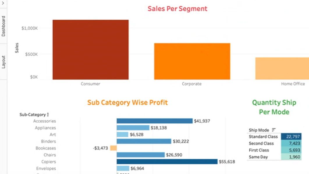
Start by identifying the visuals you want to add slicers to, such as sales per segment, subcategory-wise profit, and quantity shipped per shipping mode.
Step 2: Accessing Slicer Options
Click on one of the visuals, go to “Show and Hide Card” > “Filters” and choose “Segment.”

This creates a slicer on the right-hand side for segment filtering.
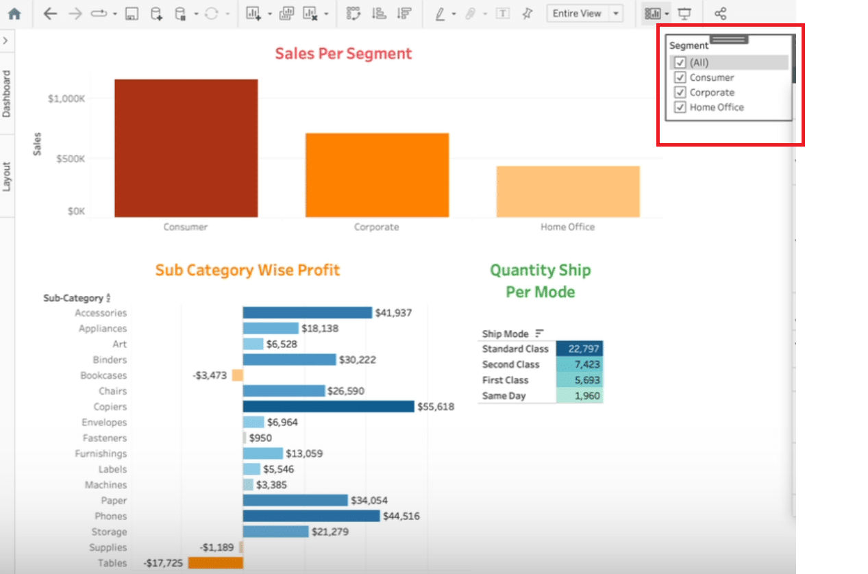
Step 3: Customizing the Slicer

Adjust the newly created slicer’s title and display format (e.g., as a drop-down list, text box, or multiple value list). For demonstrative purposes, opt for a “multiple value list.”
Step 4: Ensuring Slicer Application Across Dashboard
To make the slicer work across all visuals, go to “apply worksheet” > “selected worksheet” and then “select all on dashboard” followed by confirming with “OK.”

Note: Besides the primary method, Tableau offers alternative routes for slicer addition:

Stop exporting data manually. Sync data from your business systems into Google Sheets or Excel with Coefficient and set it on a refresh schedule.
Get Started
Navigate to the visual of choice, click on ‘more options’, and then ‘filters’ to add slicers directly.
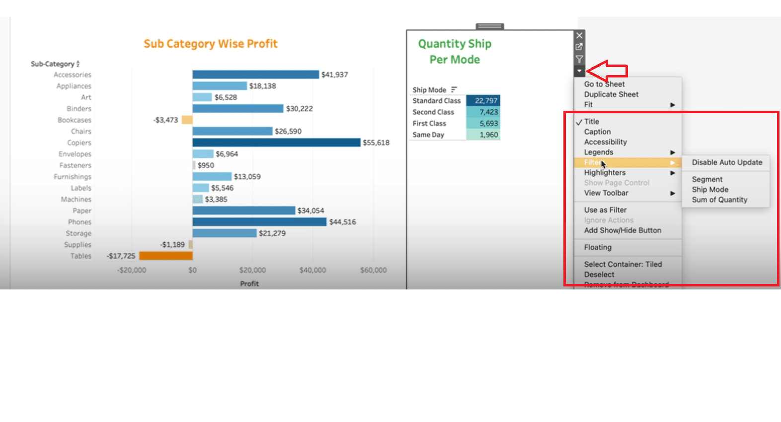
Click on a visual and choose ‘use as filter’. This way, the visual itself becomes an interactive slicer, enabling direct data filtering upon interaction.

Incorporating slicers into your Tableau dashboard enhances user engagement by allowing for dynamic data exploration. Practice these steps to skillfully create interactive Tableau dashboards tailored to diverse analytical needs.
Advanced Tips for Elevating Your Interactive Dashboards
To take your interactive Tableau dashboards to the next level, embracing advanced Tableau techniques is key. Here’s how you can make the most of Tableau’s powerful features:
- Leverage Calculated Fields: Customize your data analysis by creating new fields that are a result of calculations based on existing data in your source files.
- Master LOD Expressions: Level of Detail (LOD) expressions allow you to control the granularity of your data, regardless of the visualization’s current view. This is crucial for creating complex, multi-layered analyses.
These techniques empower you to tailor your dashboards not just for interactivity but for insightful, depth-driven data storytelling.
Common Pitfalls to Avoid
While Tableau offers a powerful platform for data visualization, there are common pitfalls to avoid:
- Overcomplicating Your Dashboard: Keep your audience in mind. A cluttered dashboard may confuse rather than enlighten.
- Ignoring Dashboard Performance: Large data sets and complex calculations can slow down your dashboards. Always optimize for performance.
- Forgetting About Mobile Users: Ensure your dashboards are accessible and readable on mobile devices by using Tableau’s device designer feature.
Navigating these challenges wisely can significantly elevate the user experience of your Tableau projects.
Conclusion and Call to Action
We’ve outlined the steps and strategies for crafting engaging interactive Tableau dashboards.
From data preparation to avoiding common challenges, you’re now equipped to transform your data into insightful narratives.
Ready to enhance your Tableau projects with live data visualization? Get started with Coefficient today and unlock the full potential of your data.


