


Table of Contents
![]()
- 1. How to Create a Salesforce Dynamic Dashboard in 2025
- 2. How Can Other Users See My Dashboard in Salesforce
- 3. How Can Reminders in Salesforce Be Shown on a Dashboard
- 4. How to Archive Dashboards in Salesforce
-
5. Salesforce KPI Dashboard Examples: Every Sales Leader must use in 2026
- Video Walkthrough: How to Leverage Your Template
- Accounts Overview Dashboard
- Pipeline Creation Dashboard
- Sales Performance KPI Dashboard
- Sales Team Leaderboard
- Win-Loss Analysis Dashboard
- Sales Opportunity Dashboard
- Opportunity History Dashboard
- How to Set Up Coefficient's Dashboard Template
- Bonus: Leverage Salesforce & HubSpot Formulas to Access Live Data in Spreadsheets
- Sales Leader Dashboards: Take the Burden Off Your Plate

For sales leaders, KPI dashboards allow them to make sense of the sales performance and chart strategy for the sales cycle.
Sales dashboards are often built in Salesforce CRM by the SalesOps team. But the inherent limitations of Salesforce reporting functionalities make it cumbersome for the SalesOps team to create and maintain dashboards.
That’s why many SalesOps turn to the flexibility of spreadsheets to build their Salesforce dashboards.
However, this requires SalesOps to not only build dashboards in their spreadsheets. SalesOps users must also continuously copy-and-paste fresh Salesforce data into their spreadsheets to keep the dashboards up-to-date.
That’s why we built our free dashboard templates for SalesOps. Our templates allow SalesOps to launch pre-built Salesforce dashboards in Google Sheets, powered by real-time data sync automation from their Salesforce CRM.
Here are the top 6 Salesforce KPI dashboards examples for sales leaders, along with pre-built Google Sheets templates for each one.
Video Walkthrough: How to Leverage Your Template
Once you’ve selected your template below, we’ve made the process incredibly simple to download your template and power it with your live data. Here’s a quick walkthrough of how it’s done.
Accounts Overview Dashboard
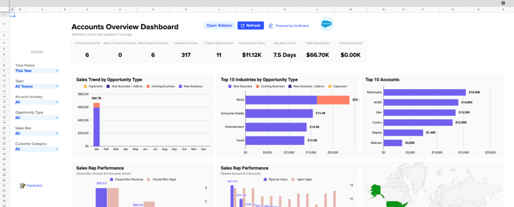
Coefficient’s Accounts Overview Dashboard for Google Sheets is a centralized dashboard for all of your customer account metrics. You can dive deep into any of your accounts, and access pre-built visualizations directly in your Google spreadsheet.
The dashboard allows you to monitor activity, track sales rep performance, and win future deals for all of your different customer accounts. See open opportunities, closed lost, closed won timeline, and more.
Download our free Salesforce Account Overview Dashboard below!
Download Salesforce Account Overview Dashboard
Pipeline Creation Dashboard
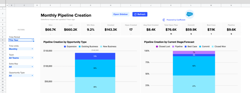
The Salesforce Pipeline Creation Dashboard offers a definitive view of pipeline creation, replete with visualizations, inside your Google spreadsheet. Now you can track how your reps and teams are generating pipe, based on your live Salesforce data, all from your Google spreadsheet.
Monitor critical sales KPIs by day, week, or month, so you can modify sales strategy, augment sales qualified opportunities, and drive more revenue. Download the free Salesforce dashboard below!
Download Salesforce Pipeline Creation Dashboard
Sales Performance KPI Dashboard
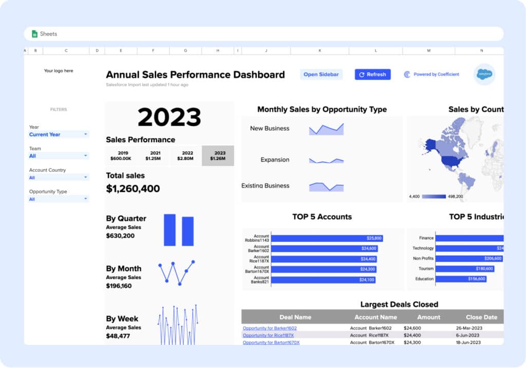
Harness charts and graphs to view sales performance by time period, opportunity type, and country. Filter visualizations by year, team, opportunity, and geolocation.
Download Sales Performance KPI Dashboard
Sales Team Leaderboard
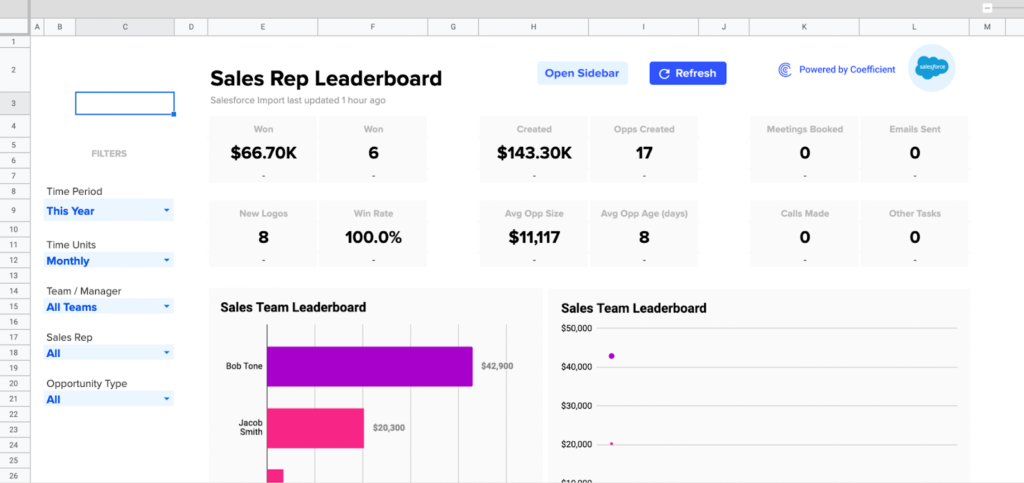
Coefficient’s Sales Team Leaderboard encourages friendly competition among your sales reps, leading to more closed deals and higher revenue. View side-by-side comparisons of all your reps for key sales metrics, such as opps created, win rate, new logos, and more. You can also easily toggle between reps, teams, years, and opportunity type. Download the Salesforce Sales Rep Leaderboard Dashboard now!
Download Salesforce Sales Rep Leaderboard Dashboard
Win-Loss Analysis Dashboard
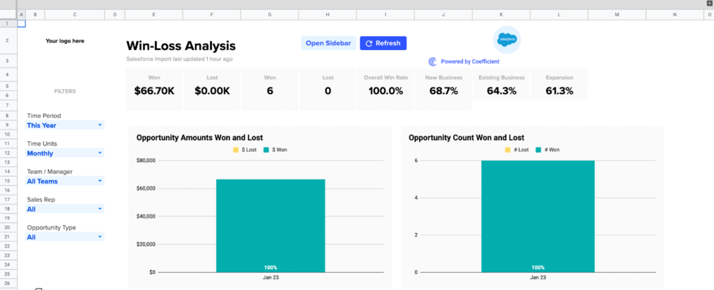
The Win-Loss Analysis Dashboard breaks down your winning and losing sales efforts in granular detail, so you can set a victorious strategy in the future. The dashboard leverages your live Salesforce data to create visualizations of win-loss KPIs.
Use this spreadsheet dashboard to monitor how company, team, and individual win rates are impacted by sales efforts. Identify performance trends early to double-down on wins or adjust strategy where you have lower win rates. Generate a clean list of recently lost opportunities and why they failed.
Download our free Win-Loss Template in one click!
Download Win-Loss Analysis Dashboard
Sales Opportunity Dashboard
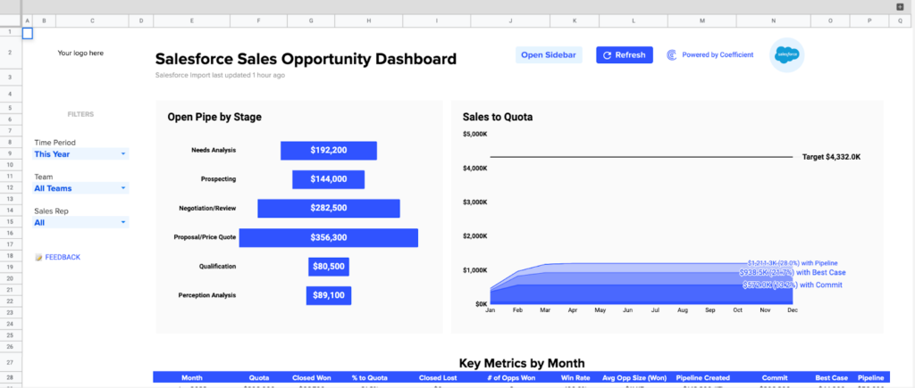
You can leverage our Salesforce Sales Opportunity Dashboard to manage the full lifecycle of your sales opportunities. Retain visibility into all stages of your opportunity pipeline by stage, for any month, quarter, or year, past or present. Track key monthly sales KPIs, such as win rate, average deal size, and value of each stage or forecast category.
Download the Salesforce Sales Opportunity Dashboard for free now to streamline your sales opportunities!
Download Salesforce Sales Opportunity Dashboard
Opportunity History Dashboard
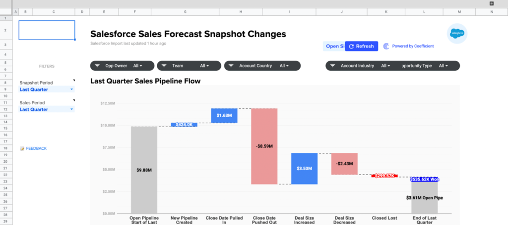
It’s difficult to access sales forecast changes in Salesforce. The CRM’s functionality prevents you from easily generating such a report. However, with our Opportunity History Template, you can view sales forecast changes directly inside Google Sheets.
The spreadsheet template measures the impact on your revenue by tracking new sales pipelines, lost opportunities, modified close dates, and upsells. Now you can track your sales pipeline over any time period, isolate opportunities that have changed in value, set custom fiscal periods, record changes to close dates, and much more.
You can launch our free Opportunity History Template in less than a minute. Give it a try!
Download Opportunity History Dashboard
How to Set Up Coefficient’s Dashboard Template
You can set up your selected dashboard in a few simple steps.
Once you select your report, submit your email to grab the template.

You’ll be routed to your dashboard in Google Sheets. Click “Use Template” to copy the sales performance dashboard.
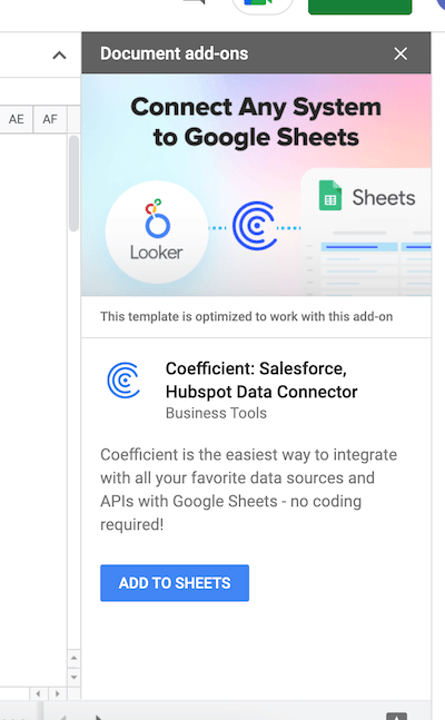
After you make a copy, you will enter the dashboard in Google Sheets. To connect your live data to the dashboard, you’ll need to install Coefficient.
A sidebar will automatically pop up once you’re inside Google Sheets. If you do not already have Coefficient installed, click “Add to Sheets” on the sidebar.
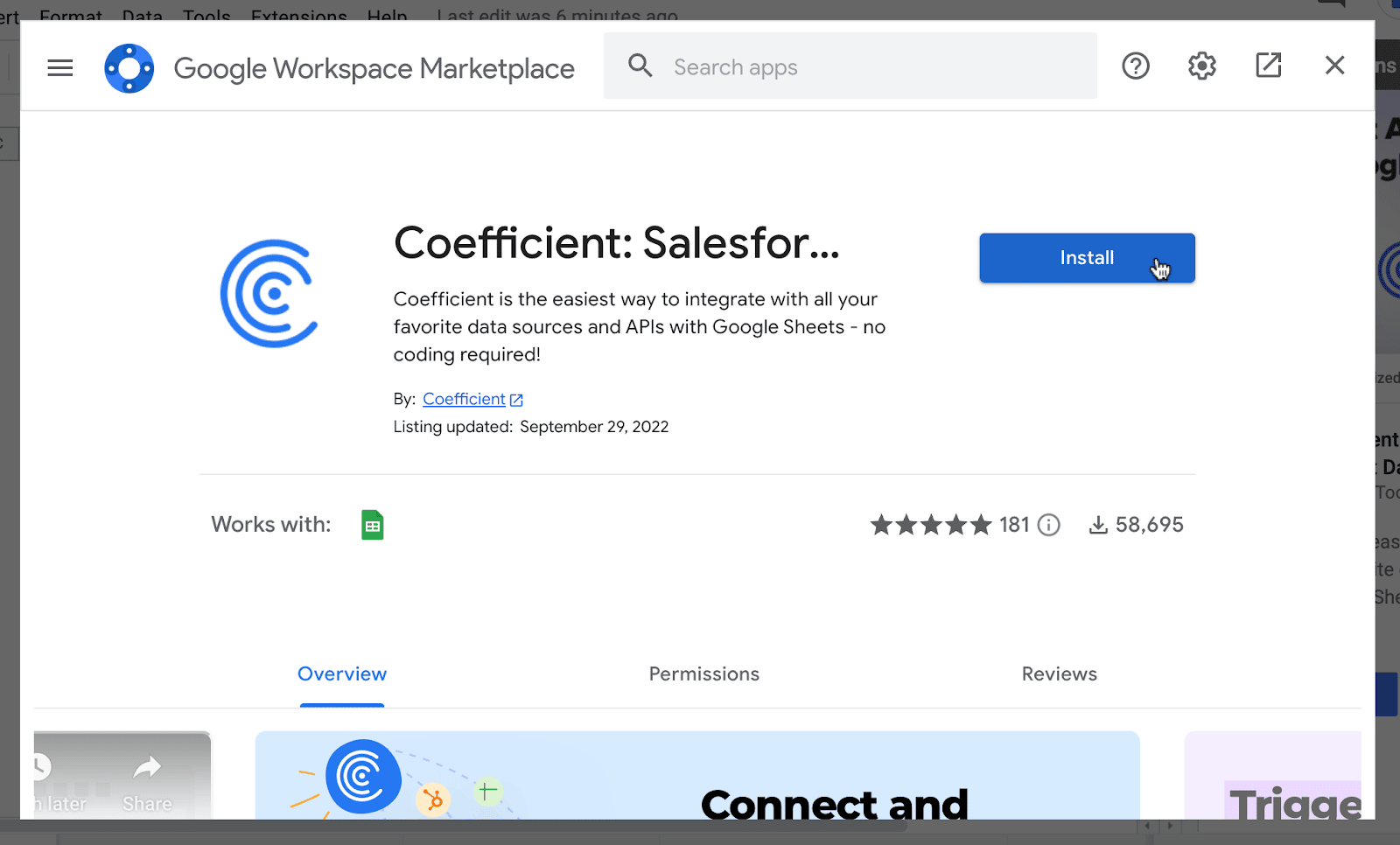
You will land on Coefficient’s page in Google Workspace Marketplace. Press “Install” to install the Coefficient add-on.
Once the install process is complete, return to the sidebar and choose the “Use” button and then press “Launch”. This will launch the Coefficient add-on.
From here, you will need to connect your Salesforce or HubSpot CRM data to power the dashboard. Follow these step-by-step walkthroughs on how to set up your data source.
Now your data will automatically populate the dashboard!
Bonus: Leverage Salesforce & HubSpot Formulas to Access Live Data in Spreadsheets
We’re recently introduced Native HubSpot & Salesforce Formulas for Google Sheets — a command-line for your CRM, right inside your spreadsheet. With functions like =salesforce_lookup, =hubspot_search, and =salesforce_report_search, you can pull live CRM data instantly, no connectors or exports required.
Filter, sort, and return exactly what you need—whether that’s passing a list of emails to a rep, surfacing top deals in a meeting, or checking the stage of a specific opportunity—all without leaving Sheets. It’s built for operators, analysts, marketers, and anyone who needs CRM answers, fast.
Sales Leader Dashboards: Take the Burden Off Your Plate
Building Salesforce dashboards for sales leaders is a time-consuming process for SalesOps users. However, with our pre-built Google Sheets dashboards, you can reproduce your most valuable Salesforce dashboard directly inside your spreadsheet. The best part is that the dashboards are free – so you can try the ones in this blog or any other in our templates gallery right now!