
Klipfolio is a capable dashboard and KPI tracking tool with a well-documented set of limitations. G2 reviewers note that approximately 78% of users flag the learning curve as a significant consideration. Building custom connections requires SQL and JavaScript, the Klip-based workflow is slower than drag-and-drop alternatives and pricing becomes restrictive as teams scale. Klips starts at $80/month annually; the most expensive plan at $900/month caps at 80 dashboards.
| Tool | Starting Price | Best For | Klipfolio Capability Traded |
|---|---|---|---|
| Coefficient | From $49/month | Live BI-quality dashboards from spreadsheet data. Ideal for ops, finance, RevOps and non-technical teams | Dedicated KPI dashboard UI |
| Databox | Free; Pro from $59/month | SMBs, marketing teams, quick KPI dashboards | SQL flexibility, custom metric depth |
| Microsoft Power BI | $14/user/month | Microsoft orgs needing enterprise BI | Simplicity, low setup time |
| Geckoboard | From $49/month | Real-time TV dashboards, office displays | Deep customisation, multi-source blending |
| Zoho Analytics | From $30/month | Budget BI for small teams and Zoho users | Dashboard refresh speed, polished visual UI |
Why Teams Move On from Klipfolio
- Capterra reviews consistently describe Klipfolio as having a steep learning curve. One G2 reviewer noted: building any custom visualisations or connecting any data source basically requires a developer.
- Slow build process: The Klip-based workflow requires building individual Klip widgets before assembling dashboards. Each Klip takes 5 minutes to an hour to build and most dashboards need several.
- Dashboard limits at scale: The highest plan caps at 80 dashboards, which is insufficient for agencies or multi-department organisations.
- Performance: Dashboards load slower than comparable tools, particularly with complex or multi-source data.
1. Coefficient
Best for: Teams that need live, BI-quality dashboards from spreadsheet data without SQL or a dedicated BI tool
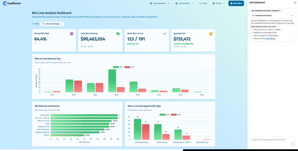
For teams using Klipfolio to pull CRM or operational data into shareable dashboards, Coefficient offers a more direct path. It connects Google Sheets and Excel to 100+ systems, including Salesforce, HubSpot, NetSuite, Snowflake and Google Analytics, with scheduled auto-refresh and two-way sync. Vibe Reporting (in early access, April 2026) generates live, shareable web dashboards from a plain-English description of what you want to see. The dashboard stays live as the underlying spreadsheet data refreshes. No Klip-building workflow, no SQL required.
Where Klipfolio requires a data team to maintain connections and build visualisations, Coefficient lets a finance manager or RevOps analyst connect a data source, describe the dashboard they want and share it as a live link in the same afternoon.
Pros
- Vibe Reporting publishes live, shareable web dashboards from spreadsheet data. Describe what you want in plain English and get a live link.
- No SQL required. Coefficient’s visual import picker and AI SQL Builder handle query generation.
- Two-way sync pushes data back to Salesforce, HubSpot or other source systems directly from the spreadsheet.
- Works inside Google Sheets and Excel with no new interface to learn.
Cons
- Not a dedicated KPI dashboard tool. Dashboards live in spreadsheets or via Vibe Reporting’s web view.
- Better suited for operational and analytical reporting than office TV wall displays.
- Vibe Reporting is in early access and some enterprise display features are still in development.
Pricing: Free plan available. Paid from $49/month. See coefficient.io/pricing.
| “I sent a live dashboard instead of a PDF. My client asked for three more.” Allison James, Nammex (Coefficient Vibe Reporting beta user) |
2. Databox
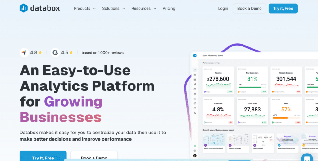
Best for: SMBs and marketing teams that need quick, self-serve KPI dashboards without SQL
Databox has one of the lowest barriers to entry in this category. Pre-built metric libraries for 100+ platforms, including Google Analytics, Facebook Ads, HubSpot and Salesforce, mean most teams can build their first dashboard in minutes. The free plan includes 3 data sources, 3 dashboards and daily refresh, enough to evaluate before committing.
Pros
- Extensive pre-built metric libraries mean no SQL or configuration for most common use cases.
- Free plan includes 3 data sources, unlimited users and core features.
- AI Analyst (Genie) on Pro plans adds natural language data queries.
Cons
- Limited depth for custom metrics. Complex calculations require workarounds.
- Genie AI Analyst is Pro-only and not available on the free tier.
- Data source limits per plan can constrain teams with many integrations.
Pricing: Free (3 data sources, daily refresh); Pro from $59/month for unlimited data sources and faster refresh.
3. Microsoft Power BI
Best for: Microsoft ecosystem organisations needing full BI depth
At $14/user/month Pro, Power BI is far cheaper than Klipfolio at comparable team sizes and offers considerably more analytical depth. Copilot AI adds natural language querying, DAX formula generation and report page creation. For organisations already on Microsoft 365, the native integration with Excel, Teams and SharePoint is a meaningful advantage.
Pros
- Lowest per-user cost of any enterprise BI platform at $14/user/month.
- Copilot AI builds report pages and summarises data from plain-language prompts.
- Native Microsoft ecosystem integration across Excel, Teams, SharePoint and Dynamics.
Cons
- DAX formula language has a meaningful learning curve for complex calculations.
- Copilot AI requires an additional $30/user/month add-on.
- Less intuitive for non-technical users than Databox or Geckoboard.
Pricing: Free Desktop; Pro at $14/user/month (annual); Copilot add-on $30/user/month.
4. Geckoboard
Best for: Teams that need real-time TV dashboards for office displays and exec reporting

Stop exporting data manually. Sync data from your business systems into Google Sheets or Excel with Coefficient and set it on a refresh schedule.
Get Started
Geckoboard is purpose-built for the office TV dashboard use case, with metrics visible to the whole team in real time. Pricing starts at $49/month for up to 3 users and 1 dashboard, with unlimited users on higher plans. Geckoboard connects to 90+ data sources including Salesforce, HubSpot, Zendesk and Shopify with no SQL required for standard metrics.
Pros
- Purpose-built for TV and office display use cases with optimised layout and large-format rendering.
- No SQL required for standard pre-built integrations.
- Clean, simple interface makes it genuinely self-serve for non-technical users.
Cons
- Limited analytical depth. Designed for monitoring rather than exploration or analysis.
- 90 integrations is far fewer than Klipfolio or Power BI.
- Custom metrics beyond pre-built integrations require Datasets API or spreadsheet uploads.
Pricing: Starter at $49/month (3 users, 1 dashboard); Essential from $99/month; Scale from $369/month.
5. Zoho Analytics
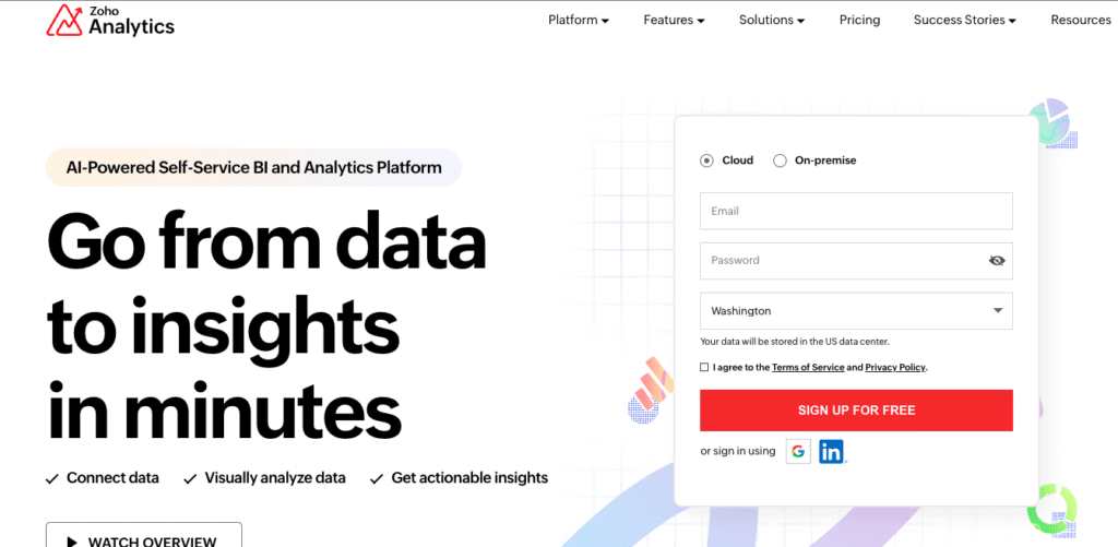
Best for: Budget BI for small teams and organisations already in the Zoho ecosystem
Zoho Analytics offers fully published pricing from $30/month (Basic) to $575/month (Enterprise) on annual billing, with unlimited reports and dashboards on all plans. Zia AI provides natural language querying across all tiers.
Pros
- Transparent, published pricing with no sales call required.
- Zia AI natural language querying included on all plans at no extra cost.
- Strong value for organisations in the Zoho ecosystem via Zoho One bundling.
Cons
- Capterra reviewers note the interface feels less polished than newer BI tools for complex visualisation work.
- Performance slows noticeably with row counts above 10 million on any plan.
- Non-Zoho integrations require more technical effort than native Zoho ecosystem connections.
Pricing: Free (2 users, 10K rows); Basic $30/month; Standard $60/month; Premium $145/month; Enterprise $575/month.
Which Tool Is Right for You?
The right Klipfolio alternative depends on what drove you to look in the first place. If the technical barrier is the main frustration, Databox removes SQL entirely for common integrations and has a functional free plan. If you need proper BI depth at a lower per-user cost, Power BI at $14/user/month is the strongest option for Microsoft-stack organisations. If office TV displays are the primary use case, Geckoboard is purpose-built for that. Zoho Analytics is the best entry point for budget-conscious teams that need published pricing and do not need Klipfolio’s customisation depth.
If you are using Klipfolio to pull live CRM or operational data into dashboards that get shared with stakeholders, Coefficient covers that workflow in Google Sheets or Excel and publishes the result as a live web dashboard via Vibe Reporting. Start free and connect your first data source in minutes.
| Coefficient connects Google Sheets and Excel to 100+ business systems with scheduled auto-refresh and two-way sync. Vibe Reporting publishes live, shareable web dashboards from your spreadsheet data. Free plan available. Paid plans from $49/month. |


