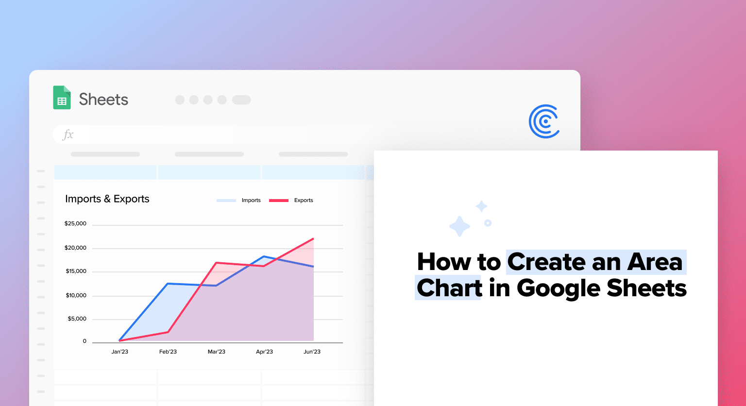
Area charts offer an intuitive way to represent data variations over time. In this tutorial, we’ll uncover how to craft an effective area chart using Google Sheets and the power of Coefficient to import data from Jira.
What is an Area Chart?
An area chart in Google Sheets is a type of chart similar to a line chart but with the area below the line filled in with color. It represents data that changes over time or other continuous variables.
Area charts are particularly useful for displaying data sets that have multiple categories, as the filled-in areas between lines can help to emphasize the differences between the categories. They can also be used to display the total value of a data set, as the filled-in area below the line represents the cumulative value of the data points.
Advantages of Using Area Charts
1. Displaying Changes Over Time
Like line charts, area charts are effective in showing changes in data over time. The filled-in areas below the lines make it easy to see the magnitude of the changes, making them ideal for visualizing data such as stock prices, website traffic, and sales figures.
2. Comparing Multiple Data Sets
Area charts allow you to plot multiple data sets on the same chart, making it easy to compare them and identify patterns and trends. The filled-in areas between the lines can also help to emphasize the differences between the categories.
3. Highlighting Data
Area charts are useful in highlighting data, as the filled-in areas can draw attention to specific data points or ranges of values. This can be important in identifying issues or opportunities.
4. Easy to Read
Area charts are simple and easy to read, even for people unfamiliar with data visualization. This makes them ideal for presentations and reports.
5. Customizable
Like other chart types in Google Sheets, area charts are highly customizable. You can change the colors, styles, and labels to match your preferences and make the chart easier to understand.
Applications of Area Charts
1. Sales Trends
Area charts can be used to track sales trends over time, showing the cumulative value of sales figures over days, weeks, months, or years.
2. Website Traffic
Area charts can be used to track website traffic, such as the cumulative number of visitors, page views, or time spent on site over time.
3. Stock Prices
Area charts can be used to track stock prices over time, showing the cumulative value of the stock prices over days, weeks, months, or years.
4. Weather Patterns
Area charts can be used to track weather patterns, such as temperature, rainfall, or wind speed over time.
5. Production Levels
Area charts can be used to track production levels over time, showing the cumulative value of daily or weekly output of a manufacturing plant.
6. Survey Results
Area charts can be used to display survey results over time, such as changes in customer satisfaction levels or employee engagement scores.
Case Study: PQR Builders
Construction firm PQR Builders was tasked with constructing seven apartment buildings in Boston over a three-year period. They purchased materials and hired three subcontractors to assist them. To forecast next year’s budget, PQR needs to review the costs associated with each subcontractor carefully.
Even though Jira is their primary project management tool, extracting information or spotting trends directly within the company can be difficult. Moving this data to Google Sheets provides a flexible solution as it is freely accessible and allows data to be accessed and analyzed across the team.
Importing data from Jira to Google Sheets using Coefficient
Connecting Jira to Google Sheets is easy with Coefficient! Simply install Coefficeint from the Google Sheets Workspace Marketplace and follow these instructions:
- Setup: Install the Coefficient extension for Google Sheets.
- Data Extraction: Navigate to Extensions > Coefficient > Launch,
- Authorize Your Account: Fill in the necessary details, authenticate with your Jira account, and decide which data you want to import
- Schedule Auto-Refreshes (Optional): Set your data refresh frequency to ensure up-to-date insights.
Note: Refer to the guide below for a detailed walkthrough.
Step-by-Step Guide: How to Connect Jira to Google Sheets

Supercharge your spreadsheets with GPT-powered AI tools for building formulas, charts, pivots, SQL and more. Simple prompts for automatic generation.

Creating an Area Chart in Google Sheets
To create the chart, you can collate the data into a pivot table and then create the area chart.

In the pivot table, we now have the cost for each project, divided into fixed, labor, material, and variable costs.
To create the area chart:
- Go to the ‘Insert’ menu and select ‘Charts.’
- Select the data range to be used in the dashboard. This will be the pivot table in the example above.
- Select the Area Chart type.
- You can customize the fields, chart titles, labels, etc., in the ‘ Setup’ and ‘Customize’ options under the Chart Editor.
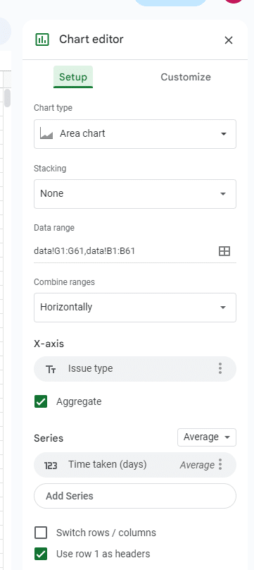
Under the Setup tab, you can:
- Choose Stacking Options: Google Sheets charts offer two distinct stacking methods:
- Standard Stacking: Here, each data series’ values are layered on top of one another, but each bar or column retains its original height or length.
- 100% Stacking: In this method, the total height or length of each bar or column is standardized to 100%. This normalization highlights the relative contribution of each data series to the total value.
- Merge Multiple Ranges: This allows you to combine several data ranges from your spreadsheet into a single chart, a valuable feature when comparing related datasets.
- Determine X-axis Content: Opt to display the projects on the X-axis for clarity.
- Define Series: This refers to the column with numerical values that can be represented as average, count, or sum in the chart. With this option, you can introduce, modify, or eliminate data series and refine each series’ appearance and format for a coherent and striking area chart.
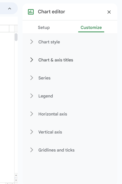
Under the Customize tab, you can:
- Style Your Chart: Browse various visual styles or themes in the Customize tab of the chart editor to enhance the appearance of your area chart.
- Title Your Elements: Set and fine-tune titles for your chart, horizontal axis, and vertical axis for better clarity.
- Adjust Series & Legend: Personalize the color, opacity, and line style of each data series. Decide whether to display or hide specific data series, and rearrange their sequence to emphasize certain trends. Modify the position and design of the legend that labels the data series.
- Format Axes: Shape the aesthetics and functionality of the horizontal and vertical chart axes for optimal presentation.
- Refine Gridlines and Ticks: Utilize gridlines and tick marks to delineate data points, aiding viewers in precise data interpretation.
Results
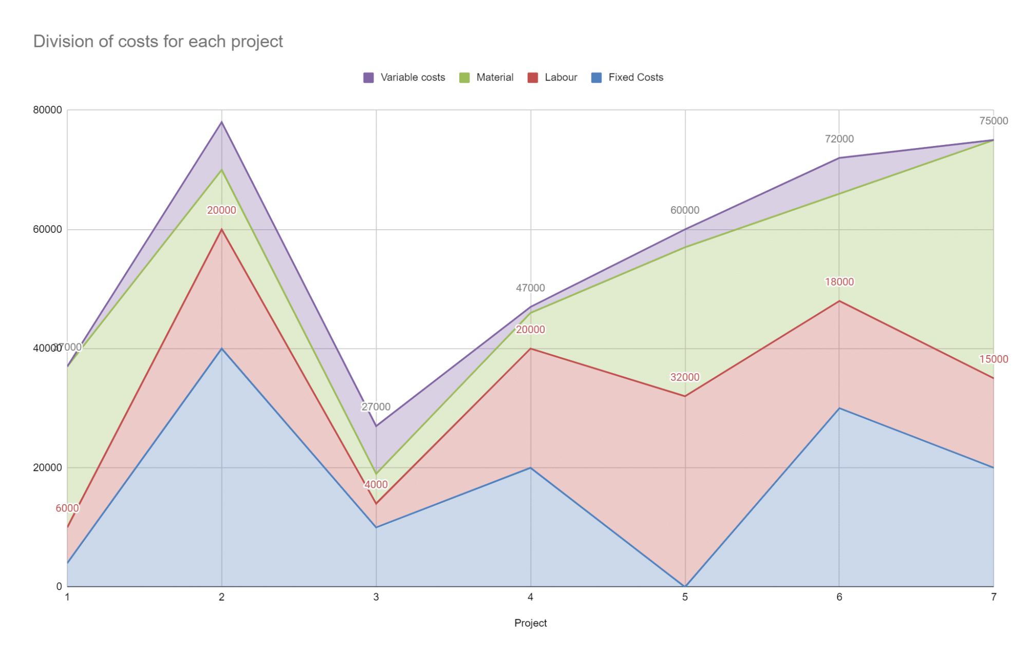
As you can see from the area chart, the total costs for Projects 2 and 7 are higher than the others. The material costs for Projects 5, 6, and 7 are higher than the other projects.
Project 2 has evenly distributed costs across variable, material, labor, and fixed, whereas Project 5 has very high labor and material but low variable costs.
Build Area Charts Faster with Coefficient
Area charts provide a dynamic method to visualize and analyze temporal data.
While the example we discussed was relatively straightforward, there will be instances when it becomes more challenging.
This is where Coefficient’s GPT Copilot Chart Builder comes in handy. The Chart Builder helps users create charts with a simple, streamlining the visualization process so you can focus more on analysis.


