Understanding and calculating the slope of a line can unlock invaluable business insights from your data.
Whether you’re analyzing website traffic trends, tracking sales growth, or optimizing conversion rates, identifying the upward or downward slope in key metrics allows you to spot changes and opportunities.
In this post, we’ll guide you step-by-step on using Google Sheets to find, interpret, and effectively display the slope, empowering you to make more informed decisions.
What is Slope and Why it Matters
In simple terms, the slope represents the rate of change between two data points, providing a numerical descriptor of a line’s steepness and direction when graphed.
The steepness of a line or steeper the slope, the more drastic the data changes. Knowing how to extract, read, and visualize slope gives you the power to set targets based on trends and drive strategic business analysis and actions.
Let’s dive in with real examples that demonstrate how calculating slope in Google Sheets can lead to data-backed presentations.
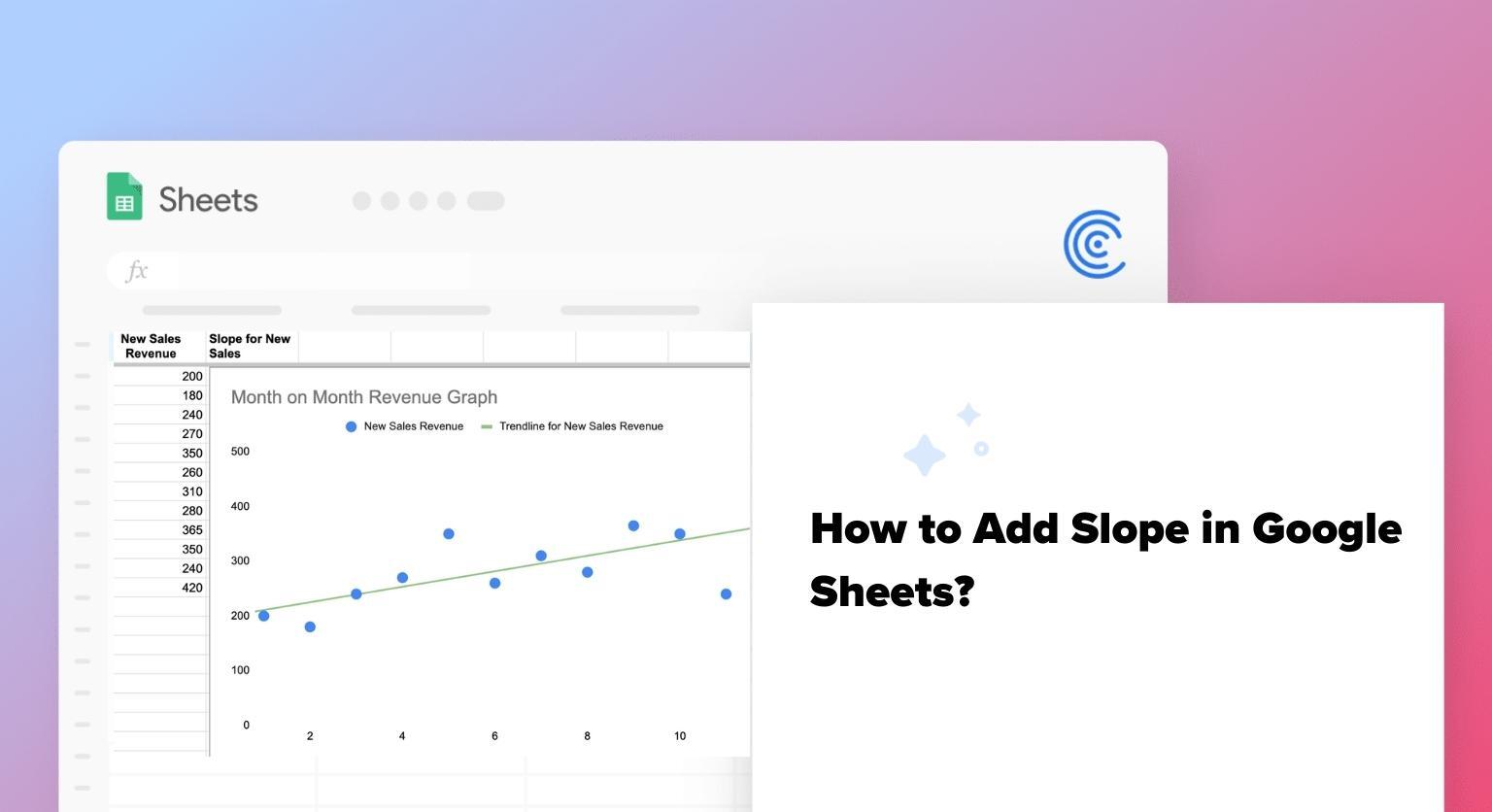
Example: Monthly Revenue Growth
Consider a sample dataset of monthly sales figures. Calculating the slope between two points will reveal an upward (positive), downward (negative), or stable (zero) trend, offering a numerical insight into sales patterns.
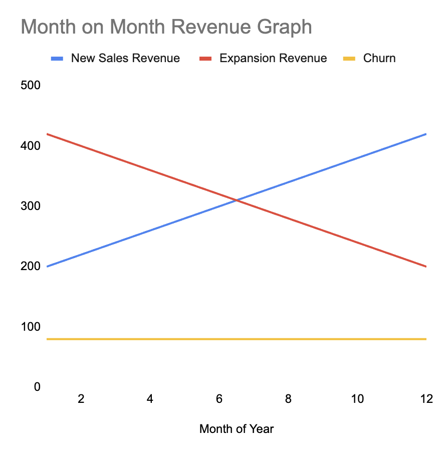
From the example graph above, you can see that:,
- New Sales Revenue (blue line) has a positive trend
- Expansion Revenue (red line) has a negative trend
- Churn (yellow line) is showcasing a stable trend.
Calculating Slope in Google Sheets: A Step-by-Step Guide
Let’s walk through finding the slope of the line using this sample sales dataset.
1. Without a Chart: Using the SLOPE Function
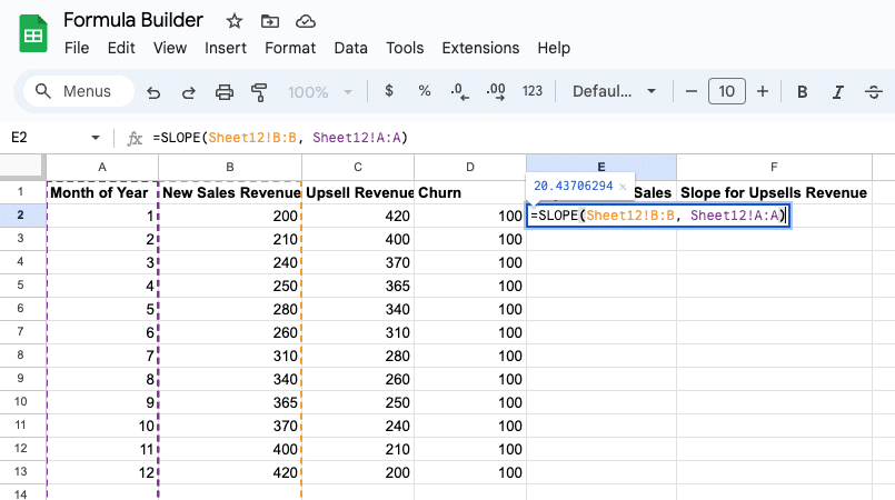
Step 1: Input month numbers in column A and new sales amounts in column B.
Step 2: Highlight cells A2:A13 and B2:B13.
Step 3: Use the formula =SLOPE(data_y, data_x) – in this example, B2:B13 & A2:A13, respectively. This returns 20.44.

Use AI to Automatically Generate Slope Formulas
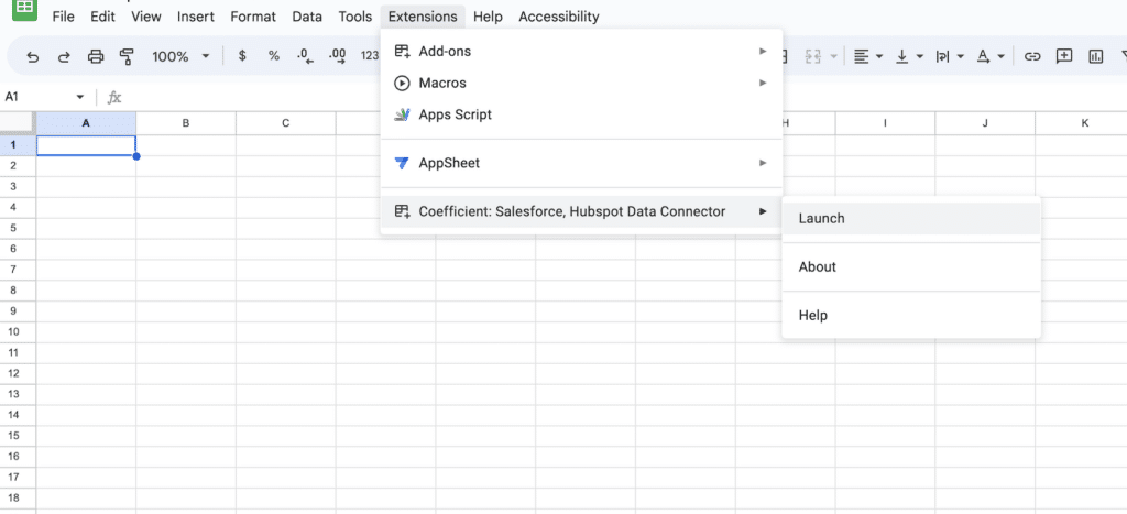
You can use Coefficient’s free GPT Copilot to automatically generate any spreadsheet formula, pivot, or chart, including your slope formulas. To use GPT Copilot, you need to install Coefficient. The install process takes less than a minute.
First, you’ll get started for free by simply submitted your email.
Follow along with the prompts to install. Once the installation is finished, return to Extensions on the Google Sheets menu. Coefficient will be available as an add-on.
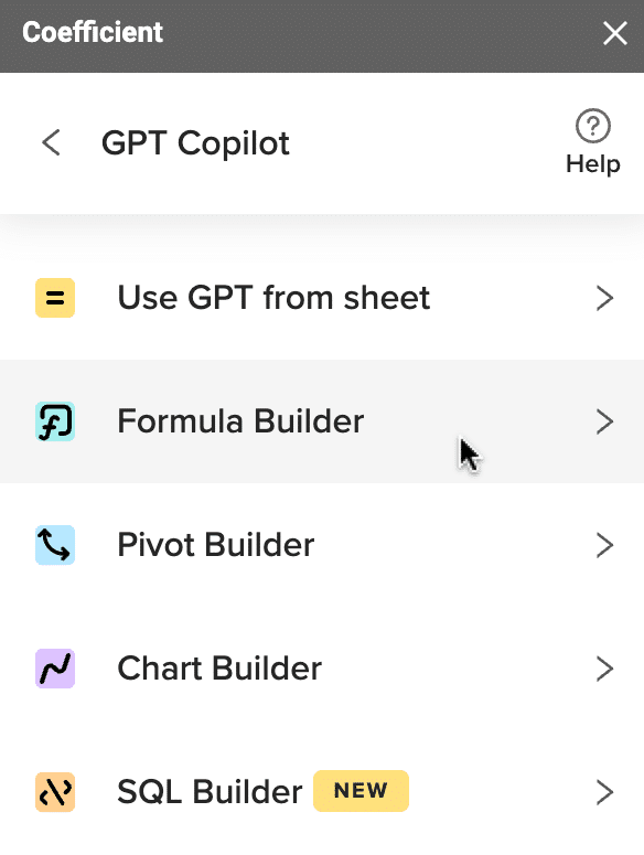
Now launch the app. Coefficient will run on the sidebar of your Google Sheet. Select GPT Copilot on the Coefficient sidebar.

Then click Formula Builder.
Type a description of a formula into the text box. For this example, let’s calculate the slope for new sales. Let’s type: write a slope formula for columns A and B in sheet12.
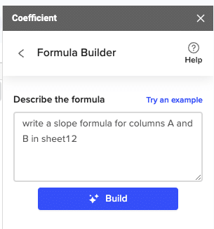
Then press ‘Build’. Formula Builder will automatically generate the slope formula from the first example.
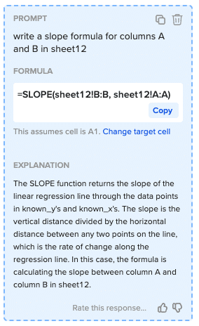
Simply paste your Google Sheets slope formula in the desired cell.
2. With a Chart: Using Trendline
Step 1: Select the range of cells from the data columns and insert a chart (Line or Scatter recommended).

Supercharge your spreadsheets with GPT-powered AI tools for building formulas, charts, pivots, SQL and more. Simple prompts for automatic generation.

Step 2: Insert a Chart: Go to Insert > Chart.

Step 3: Adjust Chart Type: Ensure the chart type is set to “Scatter chart” in the Chart Editor.

Step 4: Add a Trendline: In the Customize tab of the Chart Editor, select “Series” and check the “Trendline” box.

Step 5: Analyze the Trendline: Observe the upward trendline, visually confirming the positive slope calculated earlier.

Alt txt: Adding slope in Google Sheets scatter graph
How to Find Slope of Trendline in Google Sheets?
If you already have the trendline and want to find out the slope, you can simply use the SLOPE syntax:
=SLOPE (data in Y axis, data in X axis)
How to Add an Equation to the Graph in Google Sheets?
Now that you have the trendline choose Label -> Use Equation from the dropdown below the Trendline setting on the sidebar.

Alt txt – Adding equation to scatter plot in google sheets with slope.
Diving Deeper: Advanced Insights and Applications of Slope
Understanding the numerical value of the slope is just the starting point. The real value emerges when we interpret and apply these insights to inform decisions and strategies.
Let’s continue with the sales data example from earlier.
Implications of Different Slope Values
- Positive Slope: Indicates an upward trend. In a sales context, a consistently positive slope might suggest successful strategies or favorable market conditions.
- Negative Slope: Signifies a downward trend. Persistent negative slopes in upsell revenue data might warrant a review of product pricing, marketing strategies, or market conditions.
- Zero Slope: Represents stability, which might be positive / neutral in maintaining steady churn but could be a concern if churn reduction is the objective.
Contextualizing Slope in Decision-Making
- Strategic Planning: A positive slope in quarterly sales might validate the current marketing strategy, while a negative slope could trigger a strategy reassessment.
- Resource Allocation: If a particular product line showcases a steeper positive slope than others, it might be prudent to allocate more resources to capitalize on this upward trajectory.
- Risk Management: Identifying and understanding fluctuations in slope can be pivotal in foreseeing potential risks and implementing mitigation strategies.
Pitfalls and Considerations
- Data Accuracy: Ensure the analyzed data is accurate and reliable to derive valid insights from the slope.
- External Factors: Always consider external factors (like market conditions, seasonal variations, etc.) that might influence the data and, consequently, the slope.
- Not a Sole Indicator: While slope provides valuable insights, it should not be the sole indicator for decision-making. Integrating it with other analytical tools and insights is crucial.
Unlocking Business Insights with Slope Analysis in Google Sheets
By understanding, interpreting, and wisely applying the insights derived from the slope, you can navigate your data trends and formulate informed strategies across various domains, from sales to finance and beyond, using powerful tools like Google Sheets and Microsoft Excel.Did you know you can build charts with just text using AI in Google Sheets? Check out Coefficient’s GPT Copilot to create formulas, pivot tables, and build charts with GPT inside Google Sheets.
Or use Coefficient’s Data Connectors to connect business systems data from Salesforce, Quickbooks, MySQL, and more.


