

Select the data: Highlight the entire dataset, including the headers
Insert a chart: Go to Insert > Chart; Google Sheets will generate a chart suggestion
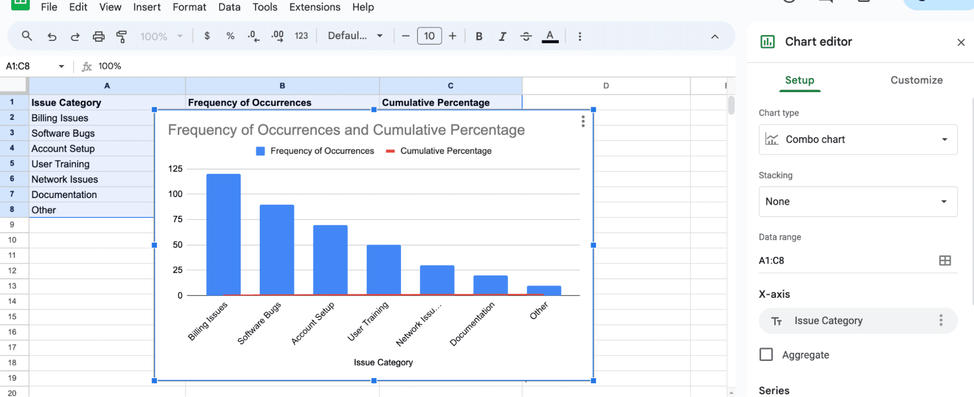
Customize the chart type: In the Chart editor, choose the Combo chart type under the Chart type dropdown
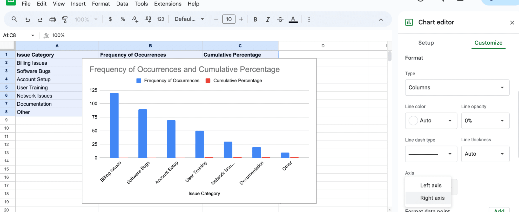
In the Chart editor, select the Customize tab > Series > Cumulative Percentage. Scroll down and change the axis from left to right
You’ve just created your first Pareto Chart. Examine the bars and the cumulative line
Pareto charts are indispensable in distilling the essence of large datasets, particularly in B2B SaaS operations. By marrying a bar chart with a line graph, these charts pinpoint key contributors to a problem, adhering to the Pareto Principle (the 80/20 rule).
In the realm of SaaS, where data-driven decisions are paramount, Pareto charts in Google Sheets can revolutionize your approach to issues like customer support tickets, feature request analysis, and sales lead evaluation.
This blog will teach in detail how to create a Pareto chart in Google Sheets.
Creating a Pareto Chart in Google Sheets
Google Sheets does not offer a built-in function to create a Pareto chart, but you can still create one by customizing a combo chart. A Pareto chart displays the individual frequencies of categories using bars and a line to display the cumulative frequencies.
Start by preparing your data. Create a 3-column dataset, including a column for issues, frequency of occurrences, and cumulative percentages.
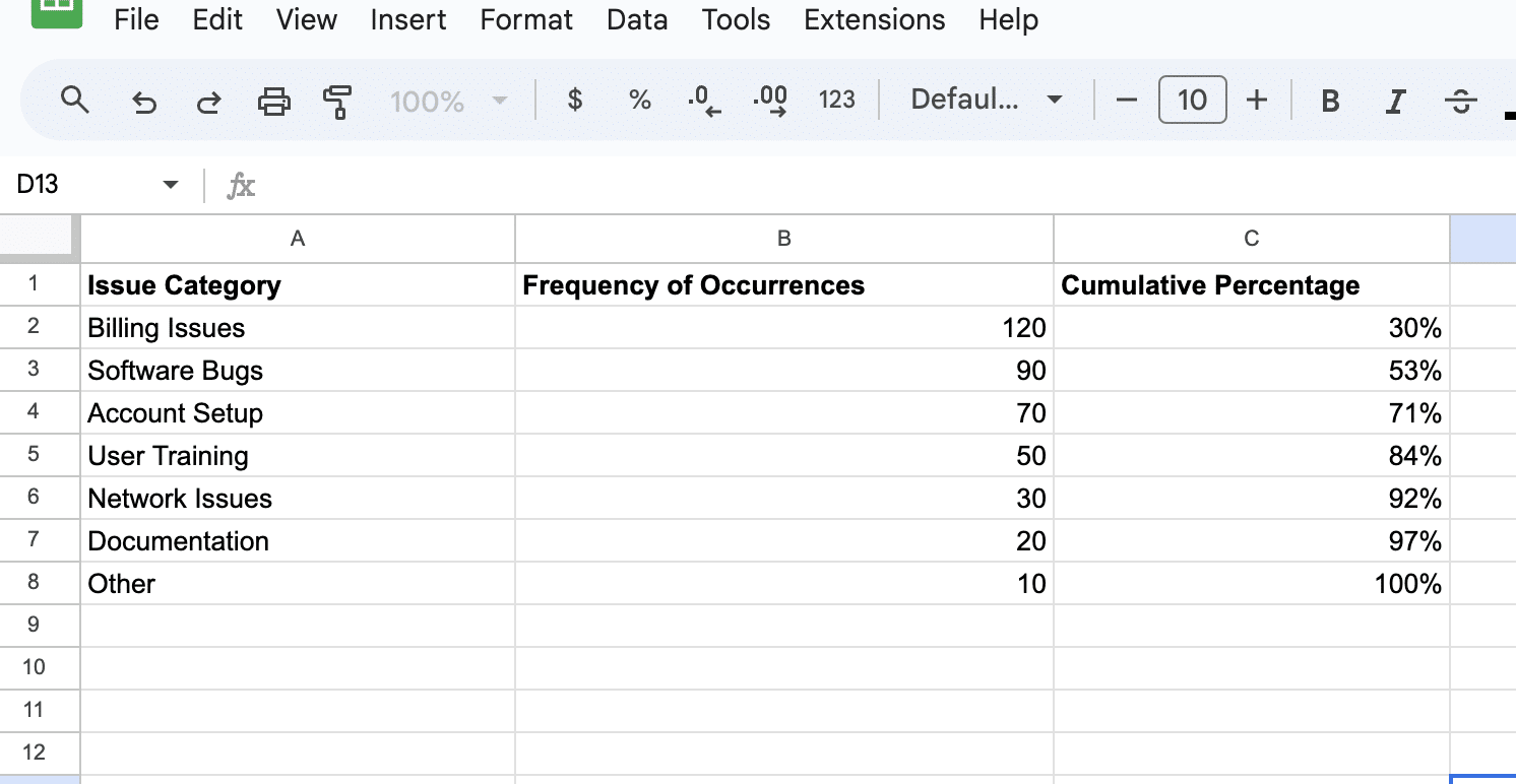
In this example:
- ‘Billing Issues’ are the most frequent, suggesting a significant area for improvement.
- ‘Software Bugs’ and ‘Account Setup’ follow, indicating other critical areas.
- The ‘Cumulative Percentage’ column helps identify the point at which 80% of the issues are covered (Pareto Principle). Here, the top three categories (Billing Issues, Software Bugs, and Account Setup) cumulatively account for 71% of all issues.
Once your data is organized, follow the steps below to create a Pareto chart:
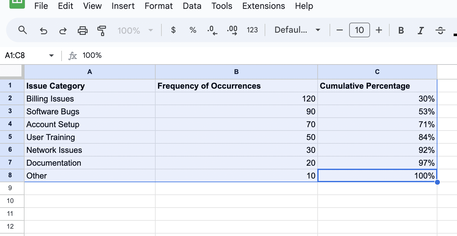
- Select the data: Highlight the entire dataset, including the headers.
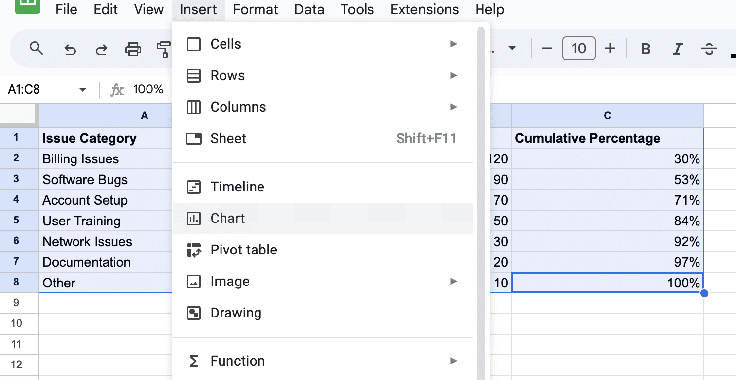
- Insert a chart: Go to Insert > Chart; Google Sheets will generate a chart suggestion.
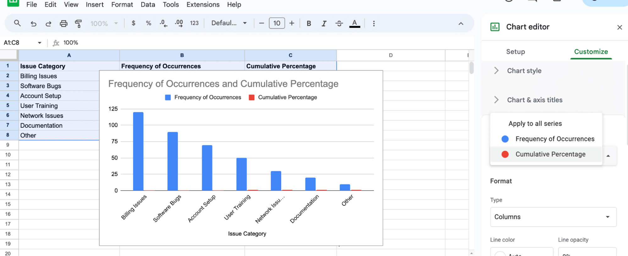
- Customize the chart type: In the Chart editor, choose the Combo chart type under the Chart type dropdown. The combo chart allows for bars and lines within the same visualization.
- Configure the chart:
In the Chart editor, select the Customize tab > Series > Cumulative Percentage.
Scroll down and change the axis from left to right.
Congratulations! You’ve just created your first Pareto Chart.
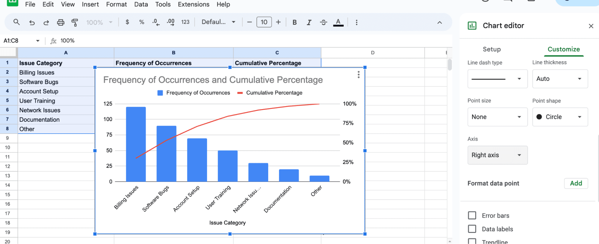
Examine the bars and the cumulative line. In our example, ‘Billing Issues’ and ‘Software Bugs’ might account for over 70% of all customer queries, signaling areas needing immediate attention.

Supercharge your spreadsheets with GPT-powered AI tools for building formulas, charts, pivots, SQL and more. Simple prompts for automatic generation.

Understanding Pareto Chart Elements
A Pareto chart is a useful visualization tool for identifying the most significant factors in a data set. It combines a bar chart and a line graph to represent both individual and cumulative frequencies.
In this section, we will discuss the main elements of a Pareto chart in Google Sheets, including the x-axis data, y-axis data, and the cumulative percentage line.
X-Axis Data
The x-axis of a Pareto chart represents the categories or factors being analyzed. These categories are usually sorted in descending order based on their frequency or importance.
In Google Sheets, you can use functions like SORT to arrange your data accordingly. The x-axis also groups the categories by their frequency or percentage to highlight the significant factors.
Y-Axis Data
The y-axis data represents the individual frequencies (or percentages) of the categories in the data set. In Google Sheets, you can calculate these frequencies using functions like COUNTIF or SUMIF, depending on the data type.
These values are displayed as bars in the chart, allowing you to easily assess each category’s contribution.
Cumulative Percentage Line
The cumulative percentage line is a crucial component of a Pareto chart. It indicates the cumulative percentages of the factors along the x-axis.
In Google Sheets, you can calculate the cumulative percentage by using simple formulas. This line graph helps to identify the most significant factors contributing to a cumulative percentage, typically around 80% or higher.
Conclusion
Pareto charts in Google Sheets are a potent tool for SaaS operations, helping prioritize tasks and allocate resources effectively. Remember, tools like Coefficient can enhance this experience by integrating live data directly into your spreadsheet.
Install Coefficient to elevate your spreadsheet game and bring real-time data insights to your fingertips.


