
Use the T.TEST function in Google Sheets to calculate p-values when comparing two groups or samples
Choose the appropriate test type: 1 for paired test, 2 for two-sample equal variance, or 3 for two-sample unequal variance
Specify whether you want a one-tailed (1) or two-tailed (2) test in the “tails” parameter of the T.TEST function
Create visualizations using charts and color-coding to represent your p-values and highlight statistically significant results
Consider using add-ons like XLMiner Analysis ToolPak for more advanced statistical analyses beyond basic p-value calculations
In the world of data analysis, understanding statistical significance is crucial. Whether you’re a student working on a research project, a scientist analyzing experimental results, or a business analyst evaluating market trends, knowing how to calculate and interpret p-values is an essential skill. This guide will walk you through the process of calculating p-values in Google Sheets, providing you with the tools you need to make informed decisions based on your data.
Mastering the T.TEST Function: Your Go-To Tool for P-Values
The T.TEST function in Google Sheets is a powerful tool for calculating p-values, especially when comparing two groups or samples. Let’s break it down and learn how to use it effectively.
Decoding the T.TEST Function: Syntax Explained
The basic syntax of the T.TEST function is:
Copy
=T.TEST(range1, range2, tails, type)
Here’s what each parameter means:
- range1: The first dataset you’re comparing.
- range2: The second dataset you’re comparing.
- tails: 1 for a one-tailed test, 2 for a two-tailed test.
- type: 1 for paired test, 2 for two-sample equal variance (homoscedastic), 3 for two-sample unequal variance (heteroscedastic).
Step-by-Step Guide: Putting T.TEST to Work
Let’s walk through an example of using T.TEST to compare test scores between two teaching methods.
- Set up your data:
- Column A: Scores from traditional method
- Column B: Scores from new method
- Choose a cell for your p-value calculation.
- Enter the T.TEST function:
Copy
=T.TEST(A2:A21, B2:B21, 2, 2)
This assumes:- Your data is in cells A2:A21 and B2:B21
- You’re conducting a two-tailed test
- You’re assuming equal variance between the groups
- Press Enter: Google Sheets will calculate the p-value.

Making Sense of the Results: Interpretation 101
Once you have your p-value, it’s time to interpret it:
- If p ≤ 0.05: This is typically considered statistically significant. It suggests strong evidence against the null hypothesis.
- If p > 0.05: This is typically not considered statistically significant. It suggests weak evidence against the null hypothesis.
Remember, these cutoffs are conventions. The actual interpretation should consider your field of study and the specific context of your research.
Example Interpretation: Let’s say your T.TEST function returned a p-value of 0.03. You might report this as:
“The difference in test scores between the traditional and new teaching methods was statistically significant (p = 0.03). This suggests that the new teaching method may have an effect on student performance.”
By mastering the T.TEST function, you’ve added a powerful tool to your statistical toolkit. But remember, it’s just one of several methods for calculating p-values in Google Sheets. Let’s explore some alternatives in the next section.
Beyond T.TEST: Alternative Methods for P-Value Calculation
While T.TEST is versatile, there are other functions in Google Sheets that can calculate p-values for different types of data and hypotheses. Let’s explore two key alternatives: Z.TEST and CHITEST.
Z.TEST: When Your Sample Size is Large
The Z.TEST function is useful when you’re working with large sample sizes (typically n > 30) and you know the population standard deviation.
Syntax:
Copy
=Z.TEST(range, x, sigma)
- range: The array or range of data to test.
- x: The value to test against.
- sigma: (Optional) The population standard deviation. If omitted, the sample standard deviation is used.
When to Use Z.TEST:
- Large sample sizes (n > 30)
- When you know the population standard deviation
- Testing a sample mean against a known population mean
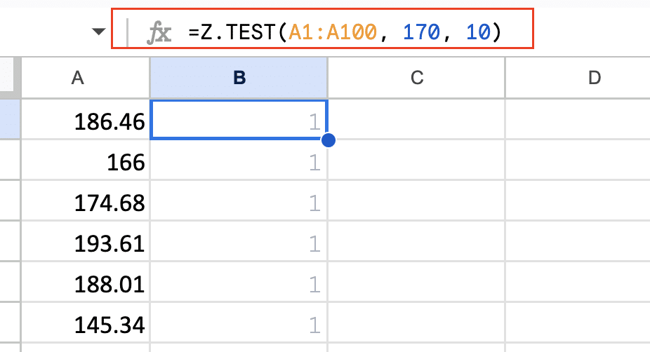
Example: Suppose you’re testing if the average height of students in your school (sample of 100 students) is significantly different from the national average of 170 cm, with a known population standard deviation of 10 cm.
Copy
=Z.TEST(A1:A100, 170, 10)
CHITEST: Analyzing Categorical Data
CHITEST is used for categorical data when you want to test if observed frequencies differ significantly from expected frequencies.
Syntax:
Copy
=CHITEST(actual_range, expected_range)
- actual_range: The range of observed frequencies.
- expected_range: The range of expected frequencies.
When to Use CHITEST:
- Working with categorical data
- Testing goodness of fit
- Testing independence in contingency tables
Example: Imagine you’re testing if the distribution of ice cream flavors sold in your shop matches the expected distribution based on a survey.
Copy
=CHITEST(A1:A4, B1:B4)
Where A1:A4 contains the observed sales for each flavor, and B1:B4 contains the expected sales based on the survey.

Choosing the Right Test: A Decision Guide
Selecting the appropriate test is crucial for accurate p-value calculation. Here’s a quick guide:
- T.TEST:
- Comparing means of two groups
- Sample size < 30
- Don’t know population standard deviation
- Z.TEST:
- Comparing a sample mean to a known population mean
- Sample size > 30
- Know population standard deviation
- CHITEST:
- Analyzing categorical data
- Testing goodness of fit or independence
Remember, the choice of test also depends on your data distribution and research question. When in doubt, consult with a statistician or refer to statistical literature for guidance.
By understanding these alternative methods, you’re equipped to handle a wider range of statistical scenarios in Google Sheets. In the next section, we’ll delve into more advanced p-value calculations to further enhance your analytical capabilities.
Taking It Up a Notch: Advanced P-Value Calculations in Google Sheets
As you become more comfortable with basic p-value calculations, it’s time to explore some advanced concepts and techniques. This section will cover one-tailed vs. two-tailed tests, paired vs. unpaired tests, and introduce you to add-ons for complex statistical analyses.
One-Tailed vs. Two-Tailed Tests: Choosing Your Direction
The choice between one-tailed and two-tailed tests depends on your hypothesis and the direction of the effect you’re looking for.
Two-Tailed Tests:
- Used when you’re interested in differences in either direction
- The null hypothesis is that there’s no difference between groups
- The alternative hypothesis is that there is a difference (could be higher or lower)
One-Tailed Tests:
- Used when you’re only interested in differences in one specific direction
- The null hypothesis is that there’s no difference or a difference in the uninteresting direction
- The alternative hypothesis is that there’s a difference in the specific direction you’re interested in
How to Implement in Google Sheets: For T.TEST, you specify 1 for one-tailed or 2 for two-tailed in the “tails” parameter:
Copy
=T.TEST(range1, range2, 1, type) // One-tailed test
=T.TEST(range1, range2, 2, type) // Two-tailed test
For Z.TEST, the function always returns the two-tailed p-value. For a one-tailed test, you need to divide the result by 2:
Copy
=Z.TEST(range, x, sigma)/2 // One-tailed test
Stop exporting data manually. Sync data from your business systems into Google Sheets or Excel with Coefficient and set it on a refresh schedule.
Get Started
Paired vs. Unpaired Tests: Recognizing Data Relationships
The choice between paired and unpaired tests depends on whether your data points are related or independent.
Paired Tests:
- Used when data points in one group are directly related to data points in the other group
- Example: Before and after measurements on the same subjects
Unpaired Tests:
- Used when data points in one group are independent of data points in the other group
- Example: Comparing two different groups of subjects
Implementing in Google Sheets: For T.TEST, you specify the test type in the last parameter:
Copy
=T.TEST(range1, range2, tails, 1) // Paired test
=T.TEST(range1, range2, tails, 2) // Unpaired test, equal variance
=T.TEST(range1, range2, tails, 3) // Unpaired test, unequal variance
Expanding Your Toolkit: Add-ons for Complex Analyses
While Google Sheets offers powerful built-in functions, sometimes you need more advanced statistical tools. Here are some add-ons that can extend your analytical capabilities:
- XLMiner Analysis ToolPak: Provides a wide range of statistical and engineering analyses.
- Awesome Table: Offers advanced filtering and visualization options.
- Power Tools: Includes features for data cleaning, manipulation, and analysis.
To install an add-on:
- Go to “Extension” > “Add-ons” in the Google Sheets menu
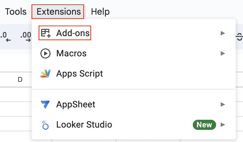
- Click “Get add-ons“

- Search for the add-on you want

- Click “Install“

These add-ons can provide additional statistical tests, more complex analyses, and enhanced visualization options to complement your p-value calculations.
By mastering these advanced concepts and tools, you’ll be well-equipped to handle a wide range of statistical scenarios in Google Sheets. In the next section, we’ll explore how to visualize your p-values and statistical significance, adding another layer of insight to your analyses.
Bringing Data to Life: Visualizing P-Values and Statistical Significance
Numbers are powerful, but visuals can often convey information more quickly and memorably. In this section, we’ll explore how to create charts that represent p-values and use color-coding to highlight statistically significant results.
Charting P-Values: From Numbers to Visuals
While p-values themselves are single numbers, we can create charts that help us visualize the data that led to these p-values or compare p-values across multiple tests.
1. Bar Chart for Multiple P-Values
If you’ve conducted multiple tests, a bar chart can help visualize the p-values:
- Create a column with your test names and another with corresponding p-values.
- Select both columns.
- Go to Insert > Chart.
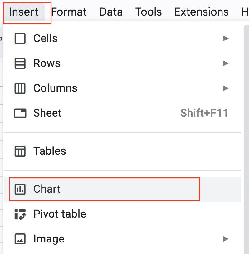
- Choose a column chart.

- Add a horizontal line at y = 0.05 to represent the typical significance threshold.
2. Scatter Plot for Original Data
To visualize the data behind your p-value:
- Create a scatter plot of your original data points.

- Add error bars to represent variability.
- Include the p-value in the chart title or as a text box.
3. Box Plot for Group Comparisons
For comparing groups:
- Select your data.
- Go to Insert > Chart.

- Choose Box Plot otherwise know as Candlestick.
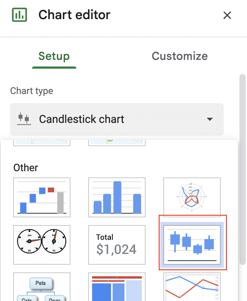
- Add the p-value to the chart title or as a text box.
Color-Coding Magic: Highlighting Significant Results
Color-coding can quickly draw attention to significant results. Here’s how to use conditional formatting to highlight significant p-values:
- Select the column containing your p-values.
- Go to Format > Conditional formatting.
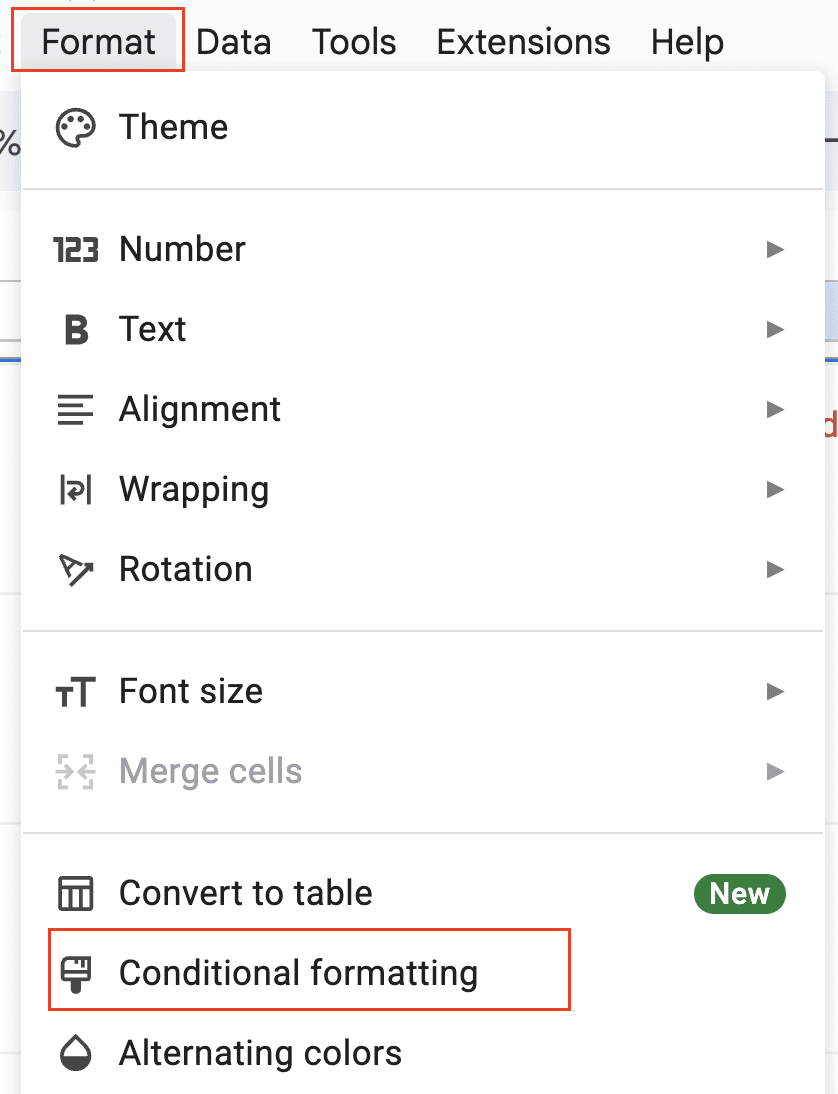
- Choose “Custom formula is” under “Format cells if…”

- Enter the formula: =$A1<=0.05 (assuming your p-values start in cell A1)

- Choose a fill color (e.g., green) for significant results.
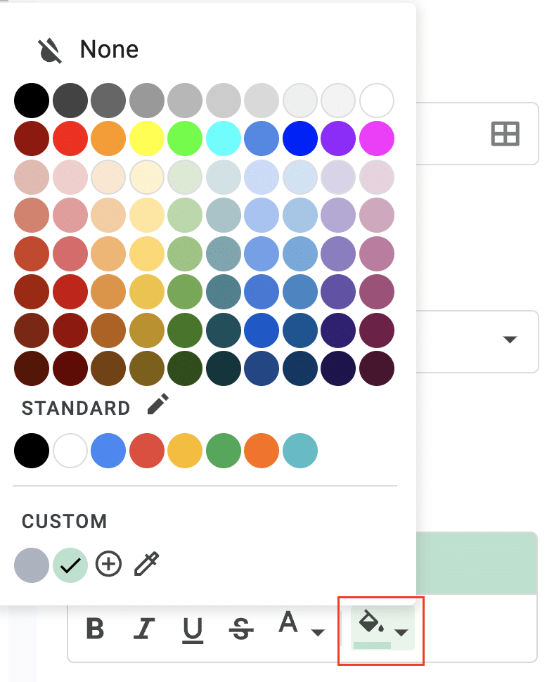
- Click “Done“.
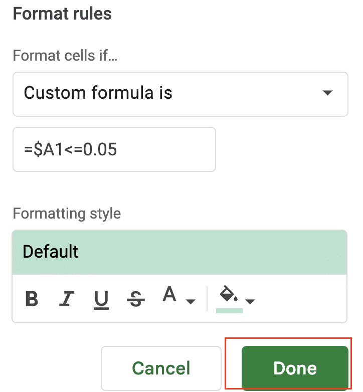
Now, all cells with p-values ≤ 0.05 will be highlighted, making it easy to spot significant results at a glance.
Creating a P-Value Heat Map
For a more advanced visualization, you can create a heat map of p-values:
- Arrange your p-values in a grid.
- Select the grid.
- Go to Format > Conditional formatting.

- Choose “Color scale“
- Customize the color scale (e.g., red for low p-values, yellow for moderate, green for high).
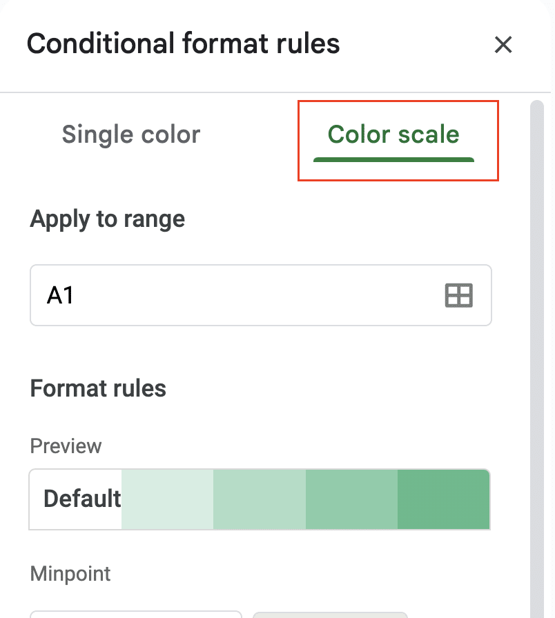

- Click “Done“.

This creates a visual representation where the color intensity corresponds to the p-value magnitude.
By incorporating these visualizations, you can make your statistical results more accessible and impactful. Remember, the goal is to communicate your findings clearly and effectively. In the final section, we’ll address some common issues and frequently asked questions about p-value calculations in Google Sheets.
What’s a P-Value, Anyway?
At its core, a p-value is a probability. It tells you how likely it is that you’d see the results you’ve observed (or more extreme results) if there were no real effect in your data. In other words, it’s a measure of the evidence against a null hypothesis.
Think of it this way: Imagine you’re flipping a coin. You expect it to land heads up about 50% of the time. But what if you flipped it 100 times and got 60 heads? Is the coin fair, or is it biased? The p-value helps answer this question by telling you how likely it is to get 60 or more heads out of 100 flips with a fair coin.
Why P-Values Matter in Statistical Analysis
P-values are the backbone of hypothesis testing. They help researchers and analysts determine whether their results are statistically significant or just due to chance. Here’s why they’re so important:
- Decision-making tool: P-values provide a standardized way to make decisions about hypotheses.
- Quantifying uncertainty: They help quantify the uncertainty in your data.
- Comparing results: P-values allow for comparison of results across different studies or experiments.
- Publication standards: Many scientific journals use p-values as a criterion for publication.
Reading Between the Numbers: Interpreting P-Values
Interpreting p-values can be tricky. Here are some key points to remember:
- A small p-value (typically ≤ 0.05) suggests strong evidence against the null hypothesis.
- A large p-value (> 0.05) indicates weak evidence against the null hypothesis.
- P-values don’t tell you about the size or importance of an effect, only about the evidence against the null hypothesis.
Common Misinterpretations to Avoid:
- P-value ≠ Probability of the null hypothesis being true
- P-value ≠ Probability that your results occurred by chance
- 1 – p-value ≠ Probability that your alternative hypothesis is true
Remember, p-values are just one tool in the statistical toolbox. They should be used in conjunction with other methods and always interpreted in the context of your specific study or analysis.
Beyond P-Values: Streamlining Statistical Analysis
Google Sheets offers functions for calculating p-values, crucial for hypothesis testing and statistical analysis. However, managing large datasets and keeping analyses current can be challenging. Coefficient connects your Google Sheets to various data sources. This allows you to automatically update your datasets, perform real-time statistical calculations, and refresh your p-values without manual data entry. To see how this can enhance your statistical workflow, try Coefficient.

