

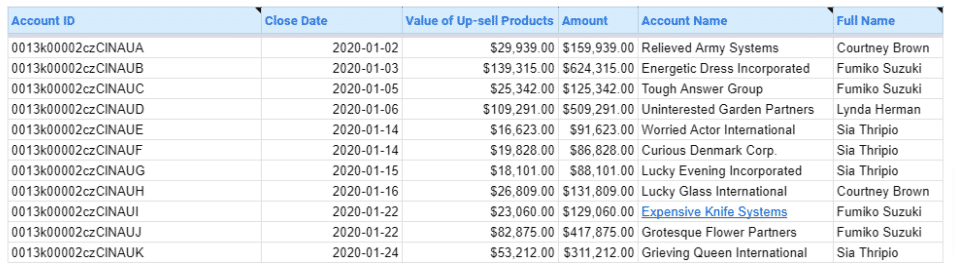
Open a new Google Sheets spreadsheet and input your data in a tabular format, with metrics in columns and time periods or categories in rows
Click the Insert tab and select Chart. You will see a blank chart and the Chart editor on the right side
To select the Scorecard chart on the Setup tab, select the down arrow under Chart type and choose Scorecard under Other
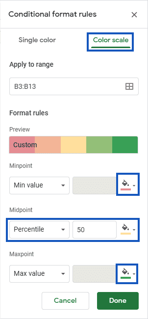
Select the data range you want to include in your scorecard chart. With your data range selected, click “Format” in the menu bar and choose “Conditional formatting”
Set up rules to highlight cells based on their values. For example, you can use a color scale to show the performance of each metric relative to its target
How to Create Impressive Scorecard Charts in Google Sheets: A Step-by-Step Guide
Scorecard charts are a powerful tool for visualizing and tracking key performance indicators (KPIs) and performance metrics in Google Sheets.
By creating a clear, concise overview of your data, scorecard charts enable you to make data-driven decisions and monitor progress towards your goals.
In this tutorial, you’ll learn how to create impressive scorecard charts that will help you stay on top of your business performance.
Understanding Scorecard Charts
A scorecard chart is a visual representation of KPIs or performance metrics, typically displayed in a tabular format with conditional formatting and sparklines to highlight trends and performance levels. Scorecard charts are beneficial for:
- Providing a quick, at-a-glance view of key metrics
- Identifying areas of success and improvement
- Facilitating data-driven decision-making
- Communicating performance to stakeholders
Scorecard charts are widely used across industries, including sales, marketing, finance, and operations.
Preparing Your Data
Before creating your scorecard chart, it’s essential to organize your data effectively. Start by structuring your data in a tabular format, with metrics in columns and time periods or categories in rows. Ensure that your data is accurate, consistent, and up-to-date. Consider using formulas to calculate performance metrics, such as percentages or variances, to provide additional insights.

Supercharge your spreadsheets with GPT-powered AI tools for building formulas, charts, pivots, SQL and more. Simple prompts for automatic generation.

Step-by-Step Guide: Creating a Basic Scorecard Chart
Step 1: Set up your data range
- Open a new Google Sheets spreadsheet and input your data in a tabular format, with metrics in columns and time periods or categories in rows.
- Select the data range you want to include in your scorecard chart.
Step 2: Apply conditional formatting
- With your data range selected, click “Format” in the menu bar and choose “Conditional formatting.”
- Set up rules to highlight cells based on their values. For example, you can use a color scale to show the performance of each metric relative to its target.
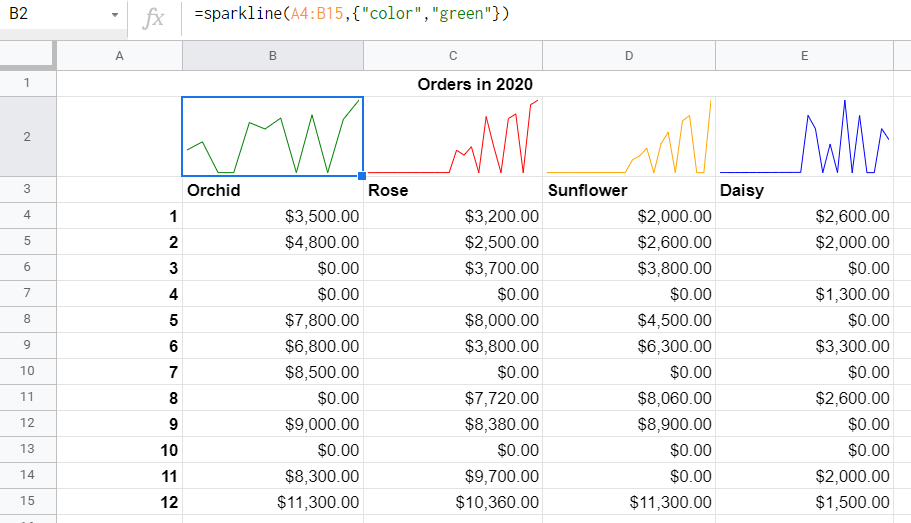
Step 3: Add sparklines to show trends
- In a new column, use the SPARKLINE function to create mini-charts that display the trend for each metric over time.
- Customize the sparkline appearance by adjusting the chart type, color, and axis settings.
Step 4: Customize colors, fonts, and layout
- Format your scorecard chart by adjusting cell colors, borders, and fonts to create a visually appealing and easy-to-read layout.
- Consider using a heat map-style color scheme to quickly identify high and low-performing metrics.
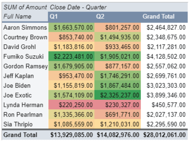
Leveraging Scorecard Charts for Sales Rep Performance
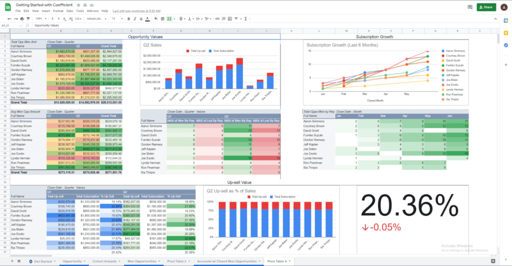
Sales rep scorecards are a specific type of scorecard chart designed to track the performance of individual sales team members. By monitoring key sales metrics, such as closed opportunities, average deal size, up-sell value, and subscription growth, sales managers can:
- Keep their team accountable and motivated
- Identify top performers and areas for improvement
- Foster healthy competition among team members
- Make data-driven decisions to optimize the sales process
For a detailed, step-by-step guide on creating sales rep scorecards in Google Sheets using Salesforce data and Coefficient, check out our comprehensive blog post. This is what you’ll have the opportunity to build along with.
Advanced Customization Options
To further enhance your scorecard charts, consider:
- Adjusting conditional formatting rules to better suit your data and preferences
- Incorporating icons or symbols to visually represent performance levels
- Creating a dashboard with multiple scorecards to track different aspects of your business
Scorecard Chart Best Practices
To ensure your scorecard charts are effective and informative:
- Choose the right metrics to track, focusing on those that align with your business goals and objectives
- Ensure data accuracy and consistency by regularly validating and updating your data sources
- Regularly review and update your scorecards to reflect changes in your business and priorities
Coefficient: Enhancing Your Scorecard Charts
Coefficient is a powerful tool that streamlines data management for scorecard charts in Google Sheets. By connecting your spreadsheets to various data sources, Coefficient enables you to:
- Automatically update your scorecards with the latest data
- Combine data from multiple sources for a comprehensive view of your performance
- Set up automated alerts to notify you of significant changes or trends
With Coefficient, you can save time, reduce errors, and make more informed decisions based on real-time data.
Conclusion
Creating impressive scorecard charts in Google Sheets is a straightforward process that can significantly improve your ability to track and communicate business performance. By following the steps outlined in this tutorial and leveraging the power of Coefficient for enhanced data management, you’ll be well on your way to making data-driven decisions and achieving your goals. Start creating your own scorecard charts today and experience the benefits firsthand. Sign up for Coefficient for free to take your scorecard charts to the next level.


