Creating graphs and charts in Google Sheets can help users visualize and represent data in a more efficient and meaningful way.
This powerful tool offers various chart types, such as line, bar, and pie charts, enabling users to choose the most fitting representation for their data. With just a few simple steps, anyone can transform their data into a visual masterpiece for presentations, reports, or analysis.
Throughout this article, we will cover essential steps and tips for creating graphs in Google Sheets. From selecting the appropriate data to fine-tuning the appearance of the graph, users can expect a comprehensive guide that will enhance their ability to effectively communicate their data through visually appealing graphs.
Getting Started with Google Sheets
Google Sheets’ user-friendly interface makes it easy for users with any level of expertise to produce professional-looking graphs. Customizing these graphs is just as straightforward, allowing users to adjust colors, labels, and other elements effortlessly.
Moreover, as part of the Google suite, Google Sheets can be seamlessly integrated with other Google applications, providing a more collaborative and dynamic experience.
In this section, we will cover the basics of creating a new Google Sheet and understanding its interface.
Create a New Google Sheet
To begin working with Google Sheets, you’ll need to create a new sheet. Here’s how:
- Open Google Drive and sign in with your Google account.
- Click the +New button in the top left corner of the screen.
- Select Google Sheets from the dropdown menu. This will open a new Google Sheet in a separate browser tab.
You can also create a new Google Sheet by typing sheets.new into your browser’s address bar and pressing Enter.
Understanding the Google Sheets Interface
Once you’ve created a new Google Sheet, it’s important to become familiar with its interface and features.
Here are some key elements to help you get started:
- Toolbar: At the top of the screen, the toolbar contains options for formatting text, adding functions, and other common spreadsheet actions.
- Formula Bar: Located below the toolbar, the formula bar displays the content of the currently selected cell. It allows you to enter or edit data, as well as create formulas.
- Cells: The main area of the Google Sheets interface is comprised of cells organized into rows and columns. Click on a cell to select it or enter data.
- Row and Column Headers: Labeled with numbers and letters, row and column headers help you navigate the sheet and select specific rows or columns.
- Sheet Tabs: Located toward the bottom of the interface, sheet tabs allow you to switch between multiple sheets within the same Google Sheets document.
Now that you have a basic understanding of the Google Sheets interface, you’re ready to start creating graphs and charts. The next step is to input your data and begin constructing your desired chart. This process will be covered in the subsequent sections.
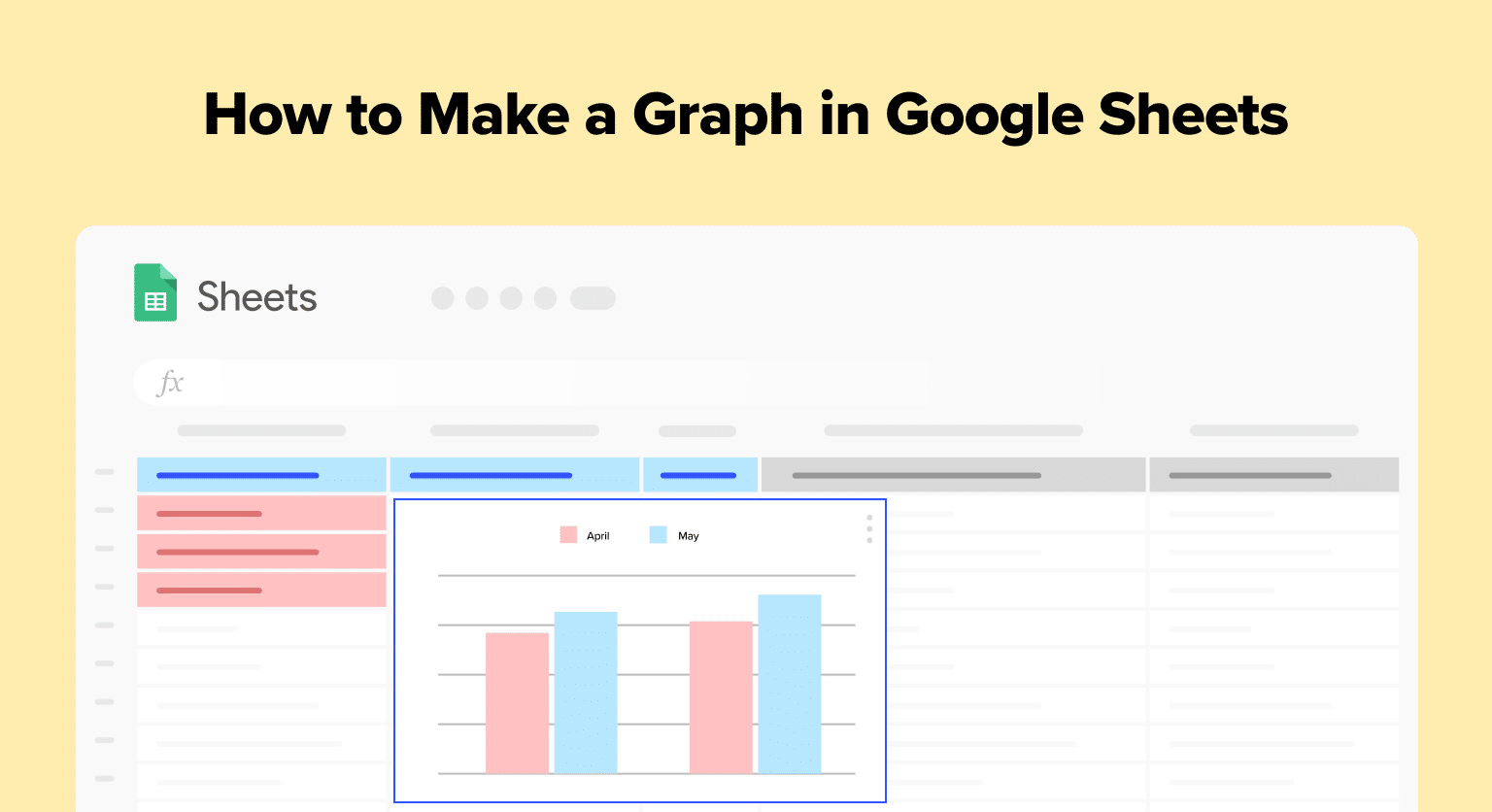
How to Create a Graph in Google Sheets
Step 1: Input Your Data
To begin creating a graph in Google Sheets, you first need to input your data into the spreadsheet. Type or paste your data into the cells, ensuring that the data is organized in rows and columns.
In this example, we’re building a graph to represent representing monthly sales figures over a six-month period.

Make sure that your data set includes headings for each column in the first row to identify the different categories, as this will make it easier to visualize the information in your graph later on.
Step 2: Select the Data to Be Graphed
Once your data is in place, highlight the cells you’d like to include in your chart, referred to as the “data range.”

This may involve selecting a single column or multiple columns depending on the relationships you want to display in your graph. Be sure to include your column headings when selecting your data range so that Google Sheets can properly label your graph’s axes.
Step 3: Choose the Appropriate Graph Type
Next, click on “Insert” and then “Chart” to begin customizing the appearance of your graph.

Google Sheets automatically creates a chart based on the format of your data and its suggestion for the best visualization type, but you can adjust the chart type using the Chart Editor tool on the right side of the screen.

Some common graph types include line, bar, pie, and scatterplots, but consider your data’s specific characteristics when deciding which option is most suitable for your needs.

Supercharge your spreadsheets with GPT-powered AI tools for building formulas, charts, pivots, SQL and more. Simple prompts for automatic generation.

For our sales data, a bar or line chart would be most suitable. Change the chart type using the Chart Editor on the right side of the screen.
Open the drop-down and select a Bar chart.

Google Sheets will automatically generate a bar chart.

Step 4: Customize Your Graph
With the chart type selected, you can further customize your graph using the Chart Editor tool. You can modify the chart’s title, legend, gridlines, and axes labels, as well as apply various chart styles and colors to make your graphic visually appealing.
For example, we’ll change the chart’s title to something like “Monthly Sales Figures.”
Navigate to the Chart editor and select the ‘Customize’ tab.

Click the ‘Chart & axis titles drop-down.’
Enter “Monthly Sales Figures” under ‘Title text.’
Your bar chart title will change automatically.

If needed, you can also arrange your data in different formats, such as stacked or clustered bars and control the level of detail displayed by adjusting the axis scale.
Conclusion
In conclusion, creating a graph in Google Sheets is a simple and effective way to visualize data. By following these steps, you can create a graph that is tailored to your specific needs and helps you make informed decisions.


