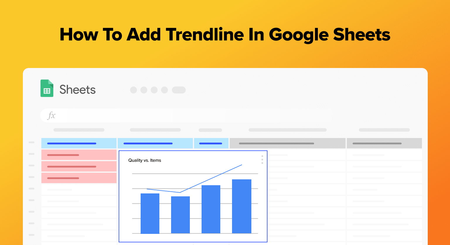
Trendlines in Google Sheets are essential for visualizing data trends, making predictions, and streamlining business operations.
This guide will walk you through adding a trendline to your charts, specifically focusing on business data like sales trends or budget forecasts.
Accessing Google Sheets
Log into your Google Account and navigate to Google Sheets.
Plotting a Graph
Inputting Data
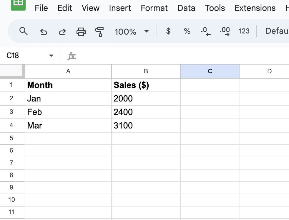
Before creating a graph with a trendline in Google Sheets, the first step is to input the data.
Organize the data in two columns, with the independent variable (e.g., Month) in the first column and the dependent variable (e.g., sales) in the second column.
For example:
|
Month |
Sales ($) |
|---|---|
|
Jan |
2000 |
|
Feb |
2400 |
|
Mar |
3100 
Free AI-Powered Tools Right Within Your Spreadsheet
Supercharge your spreadsheets with GPT-powered AI tools for building formulas, charts, pivots, SQL and more. Simple prompts for automatic generation.  |
Creating a Chart
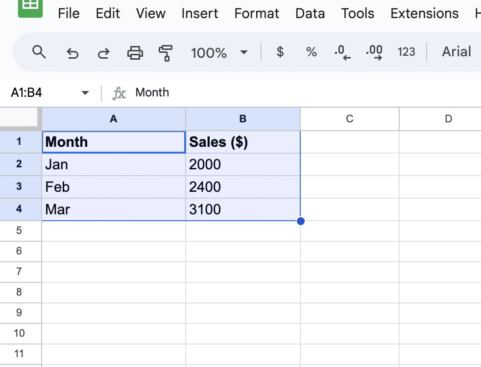
Once the data is inputted, it’s time to create a chart.
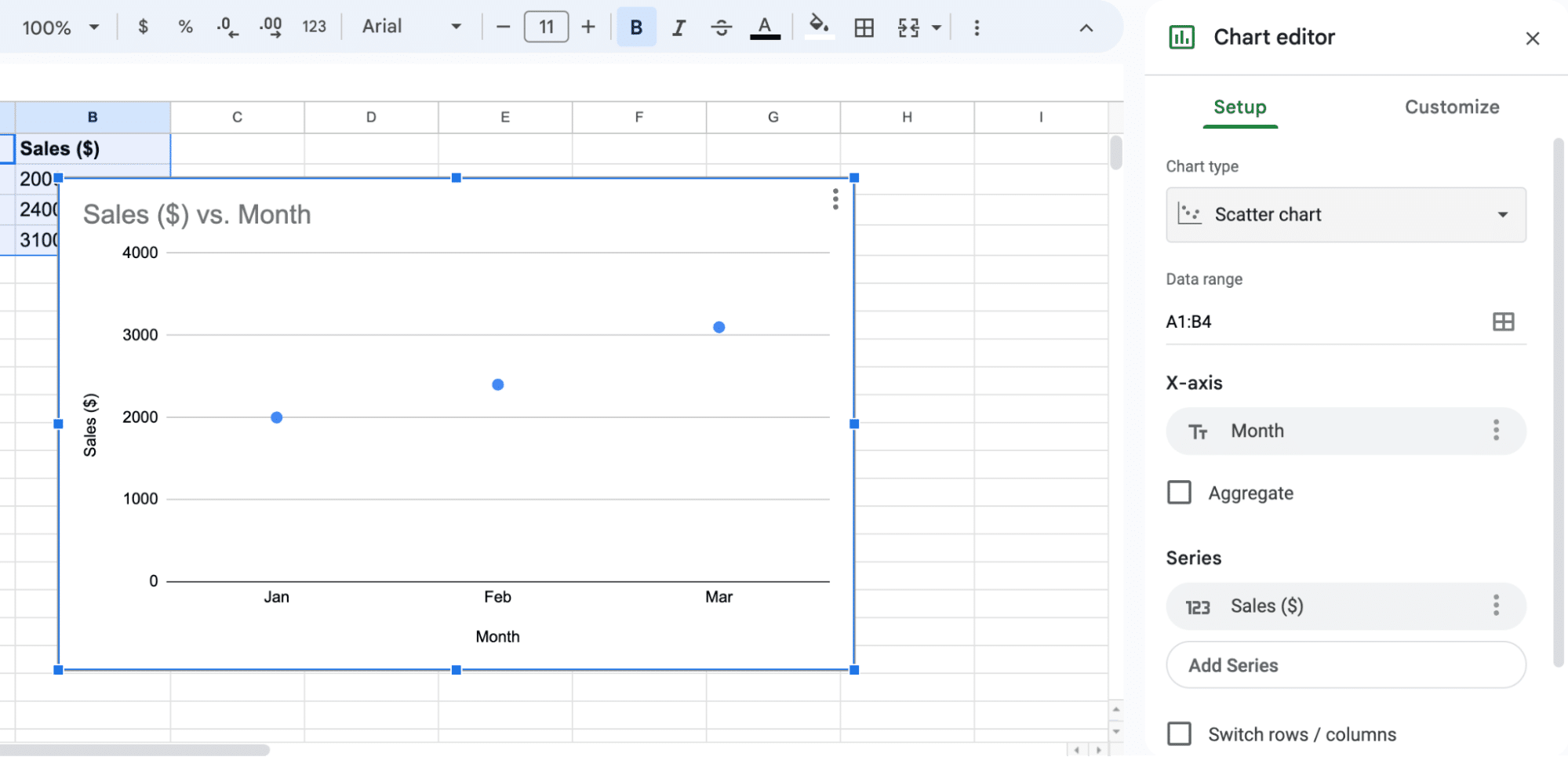
Follow these steps to create a scatterplot chart:
- Select the data: Click and drag over the data cells to select the entire range of data.
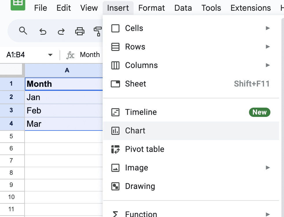
2. Insert a chart: Go to Insert in the menu bar and choose Chart from the dropdown menu. A default chart will be created.
3. Choose scatterplot: In the Chart Editor sidebar that appears on the right, click the Chart type dropdown and select Scatter chart.
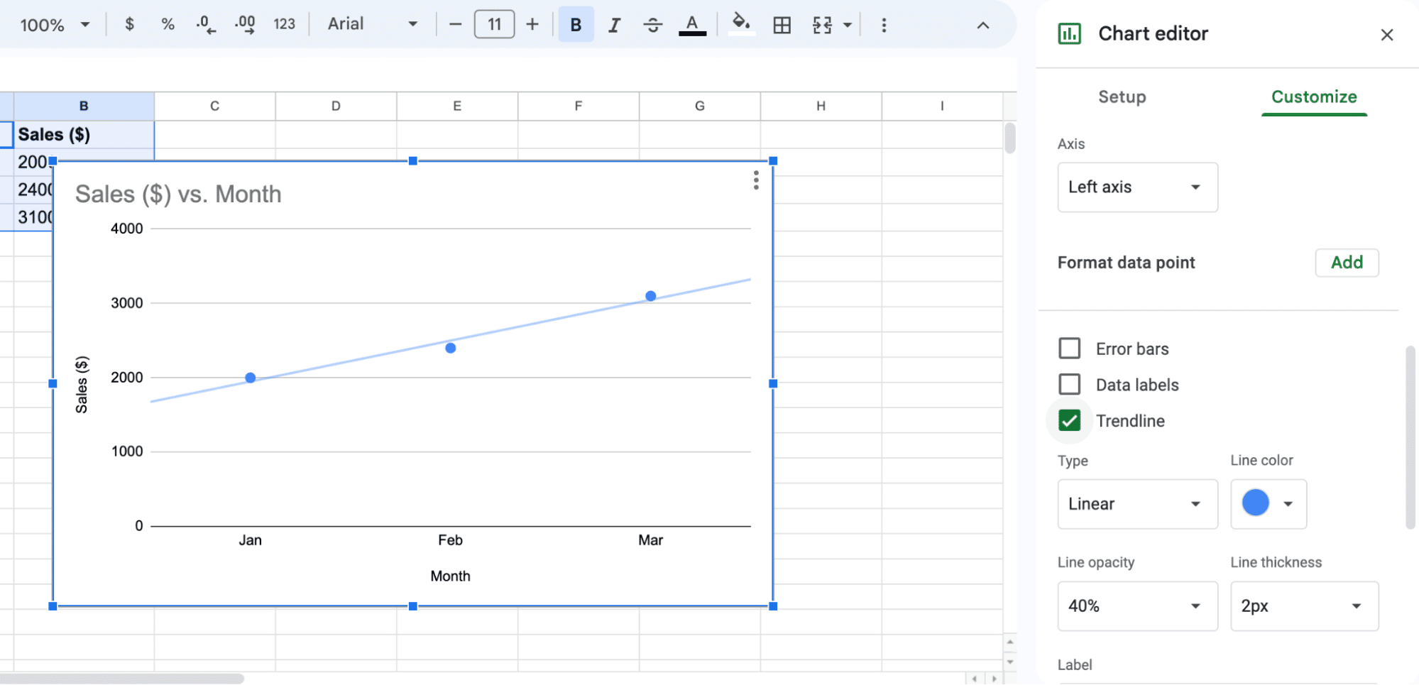
4. Add a trendline: In the Chart Editor sidebar, click on the Customize tab. Then, click on Series and check the Trendline checkbox.
Conclusion
Trendlines in Google Sheets offer a powerful way to visualize data trends, crucial for strategic planning in business operations.
Integrating tools like Coefficient can further enhance your data analysis capabilities by connecting live data from various business solutions directly to your spreadsheets.


