
Adding a line of best fit to a chart in Google Sheets can be a useful way to visualize trends and relationships in your data. A line of best fit is a straight line that represents the general trend in a dataset, and it can help you make predictions and identify patterns that might not be immediately obvious.
Whether you’re analyzing sales data, tracking social media metrics, or trying to understand the relationship between two variables, adding a line of best fit to your chart in Google Sheets can help you gain insights and make informed decisions.
This blog will examine how to add a line of best fit in Google Sheets.
Understanding the Basics of a Line of Best Fit
A line of best fit, also known as a trendline or regression line, is crucial for representing trends in a scatter plot. It simplifies identifying data patterns and relationships, aiding in predictions and insightful decision-making.
Purpose of a Line of Best Fit
The line of best fit is essential for identifying data patterns. It helps evaluate relationships between variables, enhancing your understanding of data trends and aiding in accurate predictions.
Interpreting the Line of Best Fit
Interpreting this line involves understanding its slope and y-intercept. The slope indicates the relationship between variables – positive for direct relationships, negative for inverse ones. The y-intercept denotes the dependent variable’s value when the independent variable is zero.
Step-by-Step Guide to Adding a Line of Best Fit in Google Sheets
Adding a line of best fit in Google Sheets is a useful tool for analyzing data and identifying trends. Follow this step-by-step guide to add a line of best fit to your data in Google Sheets.
Data Input
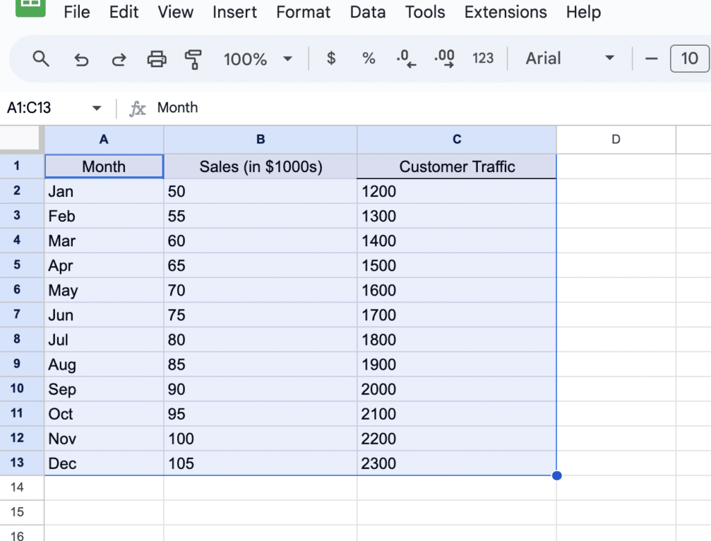
The first step is to input your data into a Google Sheets spreadsheet. Make sure to organize your data properly before adding a line of best fit.
The data should be in two columns, with the independent variable in the first column and the dependent variable in the second column.

Creating a Scatter Plot
After inputting your data, the next step is creating a scatter plot.
Select your data, including headers.

Supercharge your spreadsheets with GPT-powered AI tools for building formulas, charts, pivots, SQL and more. Simple prompts for automatic generation.

Navigate to the menu of your spreadsheet and click “Insert” > “Chart.”
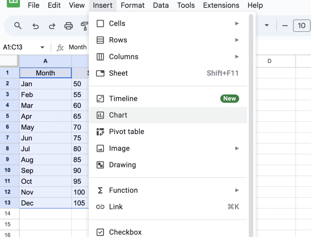
Open the Chart type drop-down and select “Scatter.”

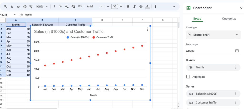
Your graph will automatically update to a scatter plot.
Implementing the Line of Best Fit
Click on the scatter plot and navigate to “Customize” > “Series” > “Trendline” > “Linear” to add the line of best fit.

Conclusion
Adding a line of best fit in Google Sheets is a simple and useful tool for analyzing data. By following this step-by-step guide, you can easily add a line of best fit to your data and identify trends.
For more advanced data analytics with your business data, consider exploring Coefficient!


