
Pie charts are a visually appealing and easy-to-understand way to present data in Google Slides presentations. However, editing and keeping these charts up-to-date can be a challenge.
In this blog post, you’ll learn how to embed pie charts in Google Slides and keep them live using Coefficient, ensuring your data is always current and accurate.
Why Use Pie Charts in Google Slides?
Before diving into the embedding process, let’s explore the benefits of using pie charts in your Google Slides presentations:
- Visual Appeal: Pie charts are eye-catching and can make your data more engaging and memorable for your audience.
- Easy to Understand: The circular nature of pie charts makes it simple for viewers to grasp the proportions and relationships between different categories or segments.
- Quick Comparisons: Pie charts enable your audience to make quick comparisons between various data points, helping them identify key insights at a glance.
- Storytelling: By emphasizing specific slices or using colors strategically, you can use pie charts to tell a compelling story with your data.
Step-By-Step Guide: How To Embed And Edit A Pie Chart In Google Slides
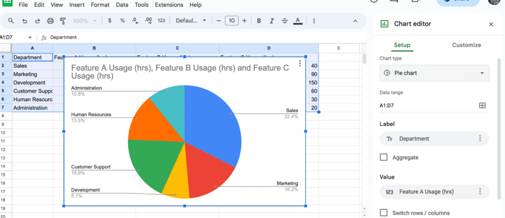
Step 1. Create a pie chart in Google Sheets
Open a new or existing Google Sheets spreadsheet and enter your data.
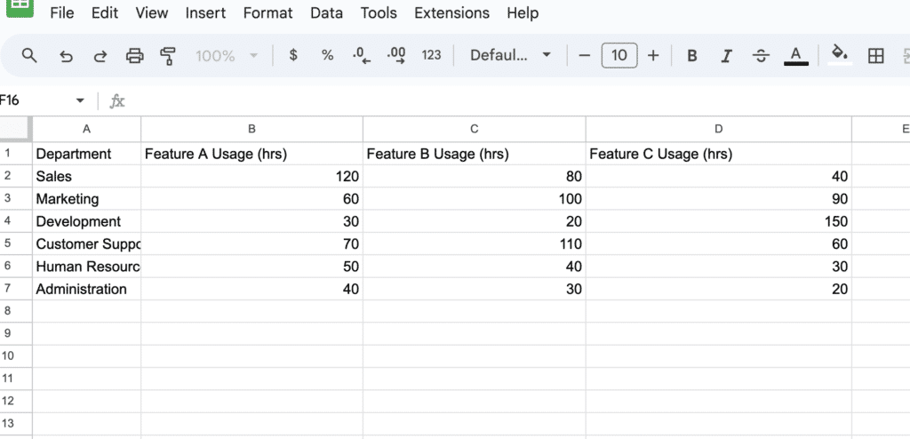
Select the data and click “Insert” > “Chart.”

Choose “Pie chart” from the chart types.
Step 2. Embed the pie chart in Google Slides
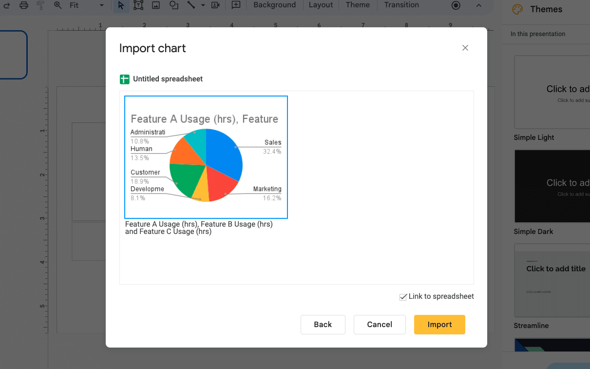
Open Google Slides, head to the top navigation and click “Insert” > “Chart” > “From Sheets.”
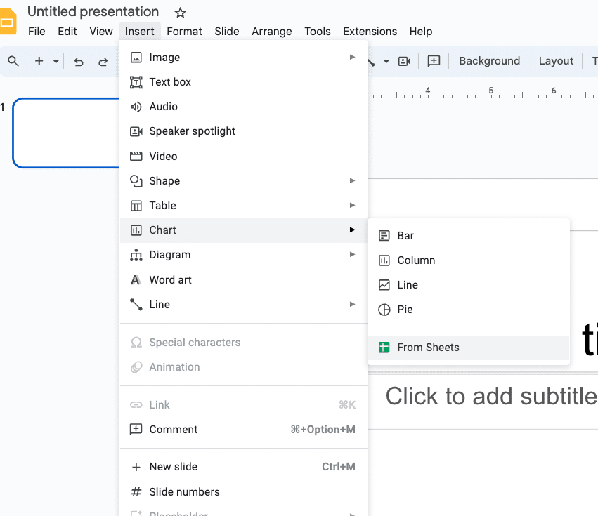
Select the Google Sheets file and the pie chart you want to embed.
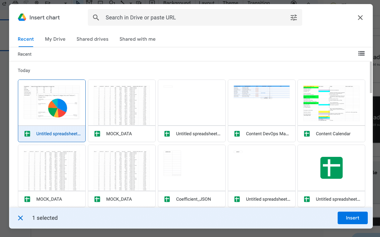
Select “Insert” > “Import” to continue.
Step 3. Edit chart data
Click the embedded pie chart in Google Slides and select “Open source.”
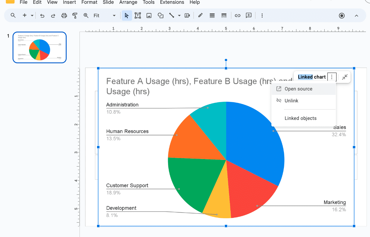
Open the Google Sheets spreadsheet you created in step 1.
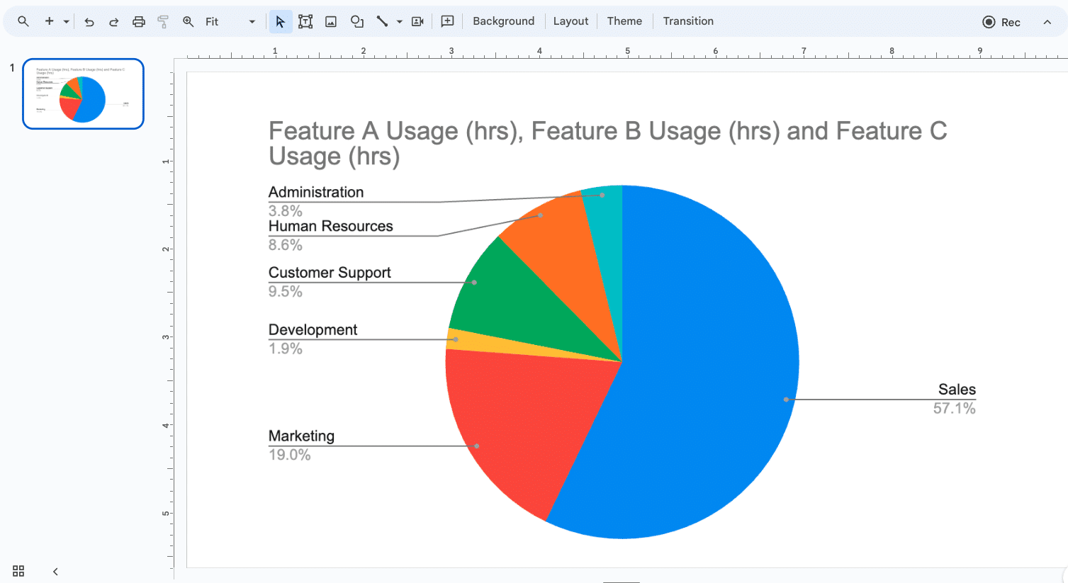
Make the necessary changes to the data in the spreadsheet. Once you’re done, go back to your Google Slides presentation. You’ll see that the chart has been automatically updated to reflect the changes you made in the spreadsheet.
Step 4. Keep your pie chart live with Coefficient
Scenario: The night before, a few high-value deals unexpectedly close. You forget to update your Google Slides charts, leading to awkward questions from the CEO.

Stop exporting data manually. Sync data from your business systems into Google Sheets or Excel with Coefficient and set it on a refresh schedule.
Get Started
Ouch.
With Coefficient, your embedded pie chart in Google Slides will automatically update whenever your linked data changes, ensuring you can present with confidence. Here’s how it works.
Install the Coefficient add-on for Google Sheets and connect to your desired data source, such as Salesforce or HubSpot.
Import the relevant data set into the Google Sheets spreadsheet linked to your pie chart.
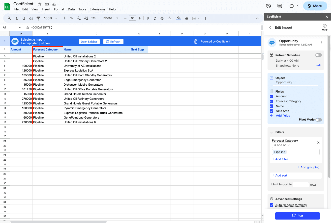
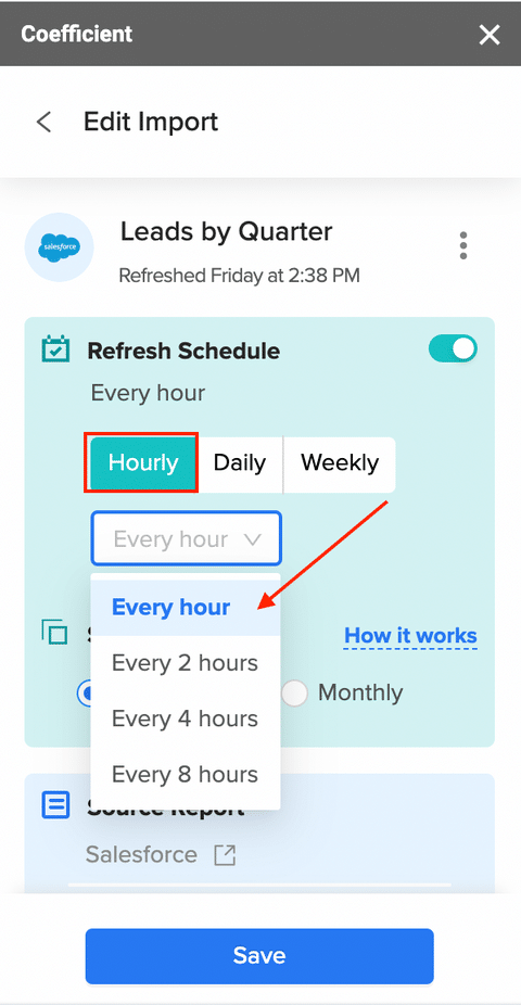
Set up an automatic data refresh schedule: hourly, daily, or weekly.
Create a pie chart and embed it into your Google Slides presentation like above.
Your embedded pie chart in Google Slides will now update automatically whenever the linked data changes
Tips For Creating Effective Pie Charts In Google Slides
- Keep it simple: Limit the number of slices to make your pie chart easy to read
- Use contrasting colors: Ensure each slice is distinguishable from the others
- Include data labels and percentages: Make it easy for your audience to understand the data
- Highlight the most important slice: Draw attention to the key takeaway from your data
Embed Charts in Googles Slides and Keep Them Live with Coefficient
Embedding and editing pie charts in Google Slides is a straightforward process that can greatly enhance your presentations. By following the steps outlined in this blog post and using Coefficient to keep your charts live, you’ll ensure that your data is always accurate and up-to-date.
Start creating compelling, data-driven presentations today with Google Slides and Coefficient. Get started with Coefficient now.


