Understanding Heatmaps in Google Sheets
Concept and Purpose
Heatmaps in Google Sheets use color gradients to represent data values visually. They are essential for businesses to quickly highlight key data points in large datasets, such as customer engagement levels or sales performance across different regions.
In Google Sheets, heatmaps can be created using the conditional formatting feature, which alters the color of cells based on their values. This helps users to identify high and low values as well as outliers in their data that might require attention.
There are two common types of heatmaps in Google Sheets: single color and multi-color heatmaps.
Single-color heatmaps use a single color gradient that becomes darker or lighter based on data values, while multi-color heatmaps utilize a range of colors to emphasize variations within the dataset.
Diverging heatmaps, a subtype of multi-color heatmaps, generally have a midpoint or central value, with lower values represented by one color and higher values represented by another.
Creating a Heatmap in Google Sheets
To create a heatmap in Google Sheets, follow these steps:
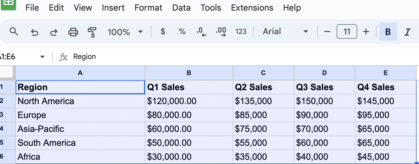
Select the cells where you want to apply the heatmap. This can include the entire data range or specific clusters of cells.
Here, our dataset represents quarterly sales data across different regions.

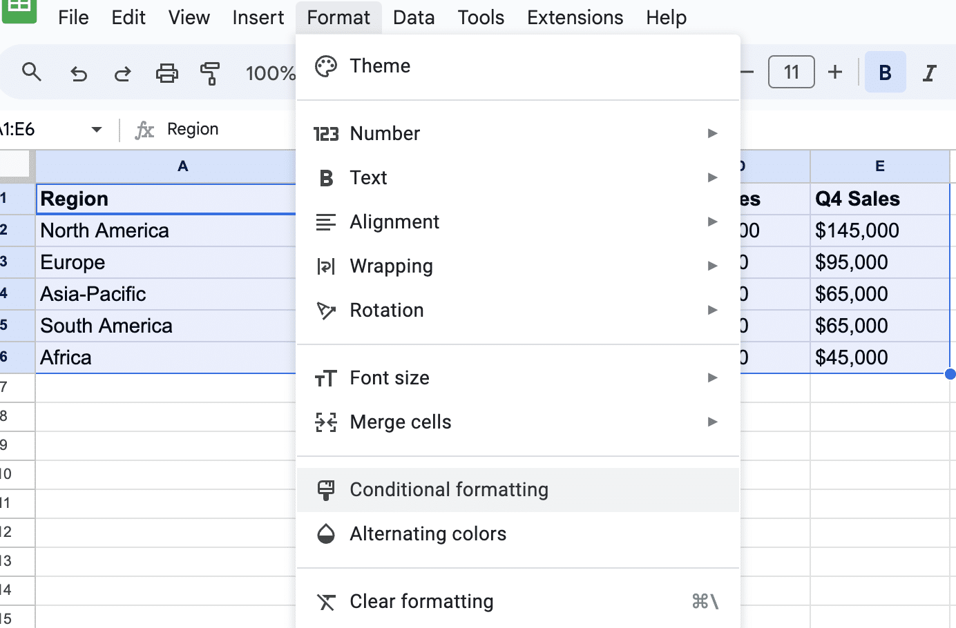
Navigate to Format > Conditional formatting in the menu bar. This will open the Conditional Formatting sidebar.

Supercharge your spreadsheets with GPT-powered AI tools for building formulas, charts, pivots, SQL and more. Simple prompts for automatic generation.


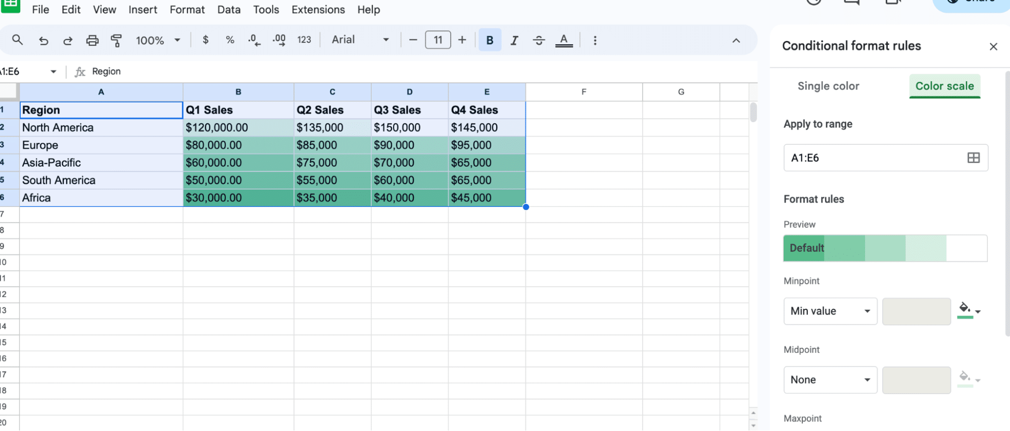
Choose between Single color or Color scale depending on whether you want to create a single color heatmap or a multi-color heatmap. In this example, we chose Color scale.

Google Sheets will automatically generate a default color gradient for your heatmap.
Note: You can also choose a custom color scale by clicking the Minpoint, Midpoint, and Maxpoint color selectors. These colors represent the lowest, middle, and highest values in your selected data range, respectively
Conclusion
Understand trends in customer behavior, sales performance, or product popularity. Use these insights to drive targeted marketing campaigns, product development strategies, or resource allocation.
Ready to leverage the full potential of Google Sheets for your business operations? Install Coefficient for seamless integration of live data from your business pla tforms in your spreadsheets.


