Are you looking to elevate your data visualization skills? Donut charts in Google Sheets offer a compelling solution for presenting proportional data. This guide will walk you through every aspect of creating and customizing donut charts, from basic setup to advanced techniques.
Step-by-Step Guide: Creating a Basic Donut Chart
Preparing your data for a donut chart
- Open your Google Sheets document.
- Organize your data into two columns:
- Column A: Categories or labels
- Column B: Corresponding values or percentages
Example:
|
Product |
Sales |
|---|---|
|
Apples |
250 |
|
Oranges |
150 |
|
Bananas |
200 |
|
Grapes |
100 |
Selecting your data range
- Click and drag to select both columns, including headers.
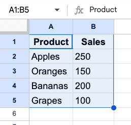
- Ensure you’ve selected all relevant data points. In this case, you’d select cells A1:B5.
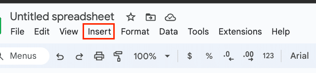
Inserting a donut chart
- Click “Insert” in the top menu.
- Select “Chart” from the dropdown menu.
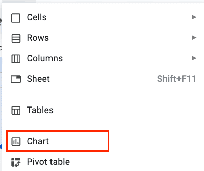
- In the Chart Editor sidebar that appears on the right, under “Chart type,” scroll to find “Donut chart.”
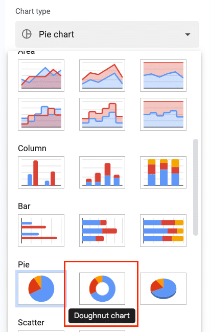
- Click on the donut chart icon to select it.
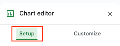
Adjusting chart type and basic settings
- In the Chart Editor, go to the “Setup” tab.
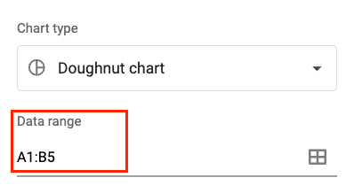
- Verify that the correct data range is selected. It should show “A1:B5” or your specific range.
- Ensure “Use row 1 as headers” is checked if your data includes headers.
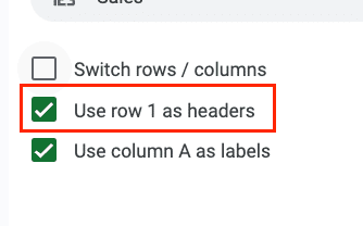
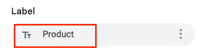
- Under “Label,” select the column containing your categories (e.g., “Product”).
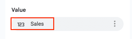
- Under “Value,” choose the column with your numerical data (e.g., “Sales”).
- You can also adjust the “Slice order” to arrange your data clockwise or counterclockwise based on value.
Your basic donut chart is now created. You should see a circular chart with colored segments representing each product’s sales proportion.
Customizing Your Donut Chart
Modifying colors and styles
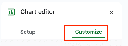
- In the Chart Editor, switch to the “Customize” tab.
- Expand the “Chart style” section.
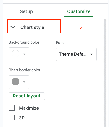
- Adjust the following:
- Background color: Choose a color that complements your data. A neutral color like light gray (#f1f1f1) often works well.
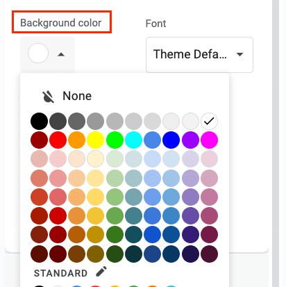
-
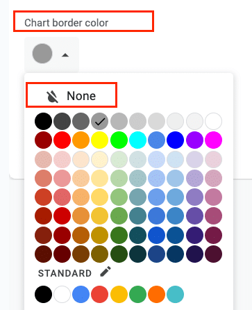
- Chart border color: Set to “None” for a cleaner look, or choose a subtle color if you want to define the chart’s boundaries.
-
- Donut hole size: Adjust the slider to change the size of the center hole. A size between 50-60% often provides a good balance.
- Expand the “Pie Slice” section to modify individual slice colors:


-
- Click on each slice in the color palette
- Choose a custom color or enter a hex code for precise control
- Consider using a color scheme that aligns with your brand or enhances data readability
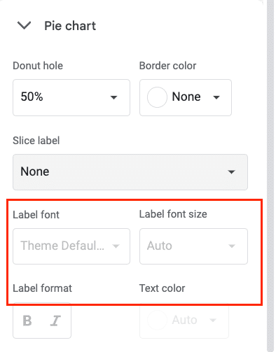
Adjusting slice sizes and labels
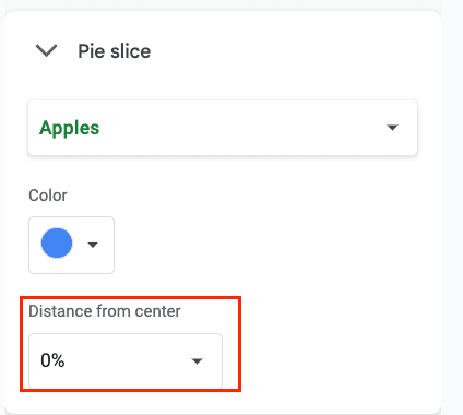
- In the “Pie slice” section of the Customize tab:
- Adjust “Distance from center” to create a starburst effect. Try setting this to 0.1 for all slices to give your chart more dimension.
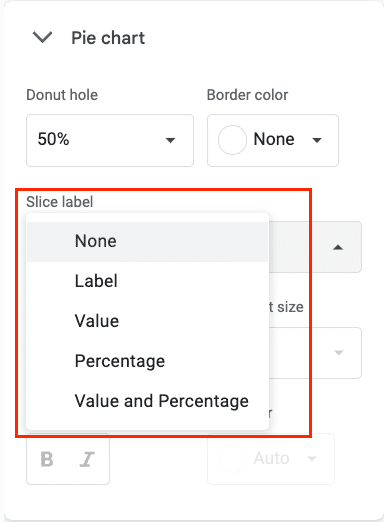
- In the “Pie Chart” section:
- Choose label type: Percentage, Value, or Category
-
- Modify label font, size, and color. For example:
-
-
- Font: Arial or Helvetica for clarity
- Size: 10-12pt for readability
- Color: Choose a high-contrast color against your slice colors
- Position labels inside or outside the slices. Outside often works best for legibility, especially with smaller slices.
-
Adding and formatting a chart title
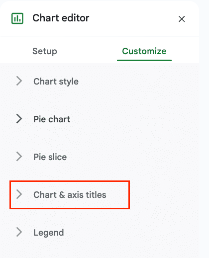
- Expand the “Chart & axis titles” section.
- Enter your desired title in the “Title text” field. For example: “Product Sales Distribution”
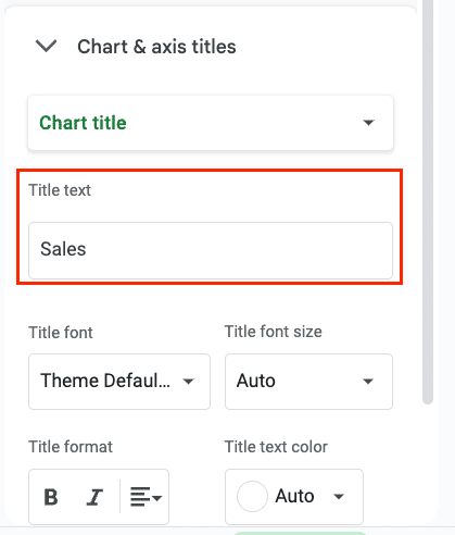
- Customize the title:
- Font: Choose a clear, readable font like Arial or Roboto
- Font size: Set to 18-20pt for prominence
- Text color: Use a dark color for contrast, like #333333
- Alignment: Center alignment often works best for donut charts
- Consider adding a subtitle for additional context
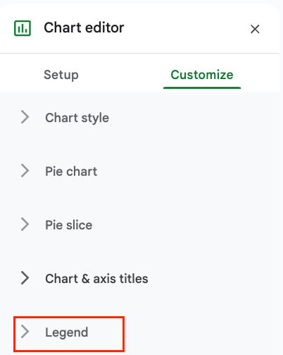
Customizing the legend
- In the “Legend” section:
-
- Position: Choose where to place the legend. “Right” often works well as it doesn’t interfere with the chart itself.

-
- Font: Select a font that matches your chart title for consistency
- Font size: Set to 10-12pt, slightly smaller than your data labels
- Format: Adjust legend entries to be vertical for a clean look
- If your slice labels are comprehensive, consider removing the legend entirely for a cleaner design. You can do this by unchecking “Show legend” in the Legend section.
Understanding Donut Charts in Google Sheets
What is a donut chart?
A donut chart is a circular graph that displays data in ring-shaped segments. Similar to a pie chart, it represents parts of a whole, but with a distinctive hollow center. This unique design allows for additional information or metrics to be displayed in the middle, making it a versatile choice for data visualization.
Benefits of using donut charts for data visualization
Donut charts excel at showing proportional relationships within a dataset. They offer several advantages:
- Visual appeal: The circular design is aesthetically pleasing and can make data more engaging for viewers.
- Compact representation: Donut charts can display multiple data points in a small space, making them ideal for dashboards or presentations with limited real estate.
- Emphasis on relationships: The ring shape helps viewers focus on the proportions between different categories, making it easier to compare relative sizes.
- Center space utility: The hollow center can be used to display additional information, such as totals, averages, or key metrics, adding context to the data presented.
- Customization options: Donut charts offer various customization possibilities, including multiple rings for hierarchical data, color coding, and interactive elements.
Donut charts vs. pie charts: Key differences and use cases
While donut charts and pie charts share similarities, they have distinct features that make them suitable for different scenarios. Here’s a comparison table to highlight the key differences:
|
Feature |
Donut Chart |
Pie Chart 
Try the Free Spreadsheet Extension Over 500,000 Pros Are Raving About
Stop exporting data manually. Sync data from your business systems into Google Sheets or Excel with Coefficient and set it on a refresh schedule. Get Started |
|---|---|---|
|
Center |
Hollow |
Filled |
|
Data perception |
Slightly harder to compare exact proportions |
Easier to compare slice sizes |
|
Additional information |
Can display extra data or metrics in center |
Limited to slice data only |
|
Multiple levels |
Can show hierarchical data with concentric rings |
Limited to single-level data |
|
Visual appeal |
Modern, sleek appearance |
Traditional, familiar look |
|
Best for |
Complex data sets, multiple metrics |
Simple proportions, fewer categories |
|
Emphasis |
Relationships between categories |
Individual slice sizes |
Choose a donut chart when you want to show proportional data with added complexity or when you need to highlight a central metric. Opt for a pie chart when simplicity and easy comparison of slice sizes are your primary goals.
Donut Charts are Better with Live Data
By mastering donut charts and understanding their alternatives, you’ll be well-equipped to choose the best visualization for your data. Remember, the goal is to present information clearly and effectively, enhancing understanding and decision-making.
Ready to take your data visualization skills to the next level? Start creating stunning donut charts in Google Sheets today. For even more powerful data integration and visualization options, check out Coefficient for free today!


