Prepare your data by organizing it into a table with the following columns: date, open, high, low, and close
Select the entire data range, including the headers
Navigate to Insert > Chart from the menu
Scroll down and select the Candlestick chart option
Customize the chart style, colors, and labels to improve its readability
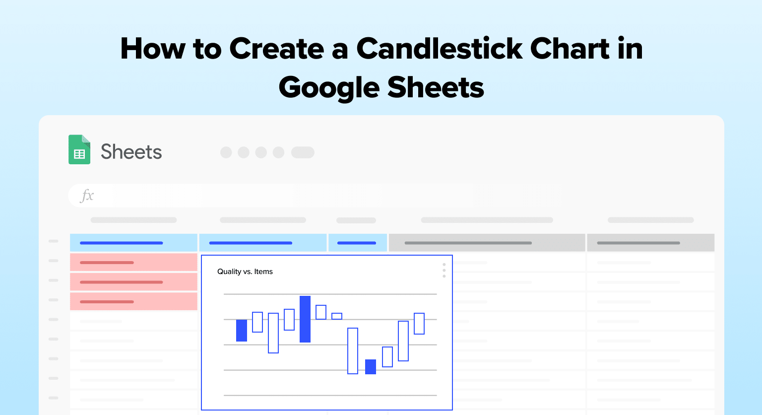
Candlestick charts are a crucial tool for business operations teams in B2B SaaS companies.
They provide a clear visual representation of financial data, such as quarterly sales performance, enabling teams to make informed decisions based on market trends.
Google Sheets offers a user-friendly platform to create these charts, making it an ideal choice for professionals without specialized software.
In this guide, we’ll walk you through the process of creating a candlestick chart in Google Sheets, using a business operations scenario to make the tutorial more relevant and practical.
Understanding Candlestick Chart
Importance of Candlestick Chart
Candlestick charts are invaluable in financial analysis, offering a detailed view of price movements within a specified time frame. Their primary benefits include:
- Visual Clarity: Present complex financial data in an easily digestible format.
- Quick Interpretation: Enable rapid analysis of market trends and potential opportunities.
- Pattern Identification: Assist in spotting market behavior patterns, crucial for strategic planning.
Understanding Candlestick Components
A candlestick chart consists of several elements to help users better comprehend the data being represented. The main components of a candlestick chart are:
- Candlestick body: The body of the candle represents the range between the opening and closing prices during a specific time period. If the closing price is higher than the opening price, the body will be hollow or unfilled. If the closing price is lower than the opening price, the body will be filled or colored in.
- Wicks: Two lines, or wicks, extend from the top and bottom edges of the candle body. The upper wick shows the highest price point during the period, and the lower wick shows the lowest price point during the period.
Creating Candlestick Chart in Google Sheets
Data Preparation
To create a candlestick chart in Google Sheets, you must first prepare the data by organizing it into a table with the following columns: date, open, high, low, and close.
These columns represent the essential information needed for a candlestick chart.
For example:
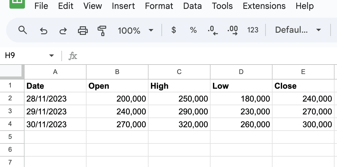
Make sure to format your date column as plain text and the numerical columns as financial format.
Supercharge your spreadsheets with GPT-powered AI tools for building formulas, charts, pivots, SQL and more. Simple prompts for automatic generation.

This can be done by selecting the corresponding cells, then navigating to the Format menu and choosing the appropriate option (e.g., “Number > Financial” for numerical columns).
Chart Creation
Once your data is prepared, follow these steps to create a candlestick chart:
- Select the entire data range, including the headers.
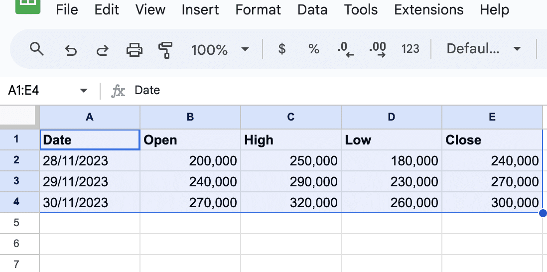
Click on the Insert tab and choose Chart.
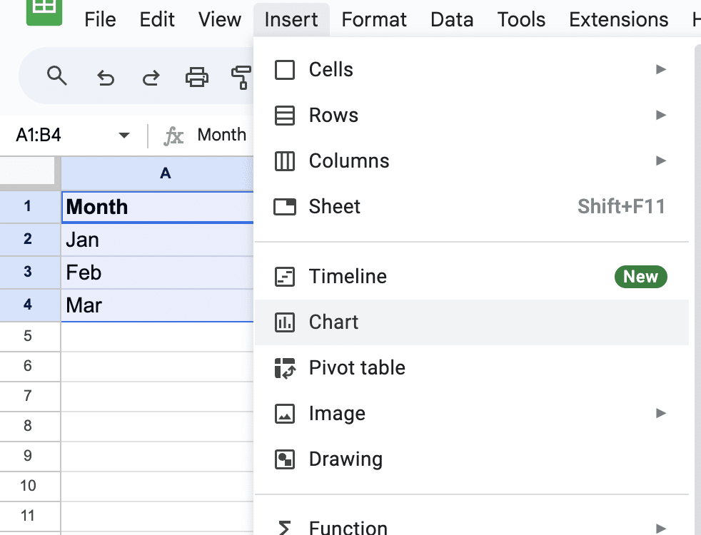
In the chart editor, click on the Chart type dropdown menu.
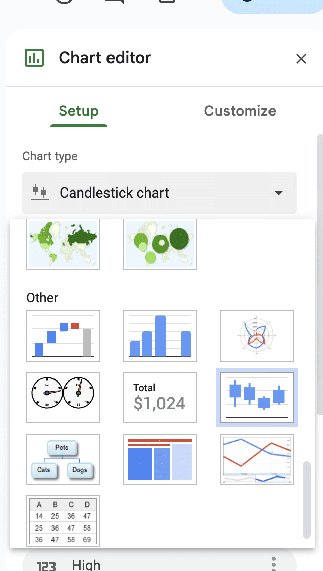
Scroll down and select the Candlestick chart option.
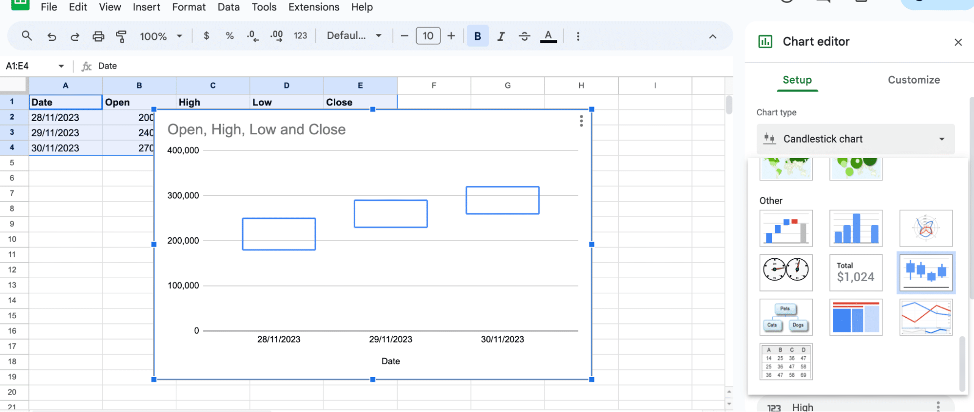
If Google Sheets creates a different type of chart by default, simply follow steps 3 and 4 to switch it to a candlestick chart. You may also customize the chart style, colors, and labels to improve its readability.
Interpreting the Chart
Understanding a candlestick chart requires knowing how to read the individual candlesticks.
- Green/White Candlestick: Indicates a quarter where sales closed higher than they opened.
- Red/Black Candlestick: Shows a quarter where sales closed lower than they opened.
Conclusion
Candlestick charts are an essential tool for business operations teams in B2B SaaS companies. By following this guide, you can effectively use Google Sheets to visualize financial data, aiding in strategic decision-making.
Ready to streamline your business operations with advanced data integration? Install Coefficient today for seamless data connectivity in your spreadsheets.
