Are you struggling to effectively track and visualize your company’s performance over time? Year-over-year (YOY) growth charts are powerful tools for analyzing business trends and making data-driven decisions. This comprehensive guide will walk you through creating, understanding, and leveraging YOY growth charts in Excel.
Step-by-Step Guide: Creating YOY Growth Charts in Excel
Now that we understand the basics, let’s create a YOY growth chart in Excel using PivotTables and PivotCharts.
Preparing your data
- Open Excel and create a new worksheet.
- Set up your data with the following columns:
- Date (in a format Excel recognizes as dates)
- Metric (e.g., Sales, Revenue, Units Sold)
- Value
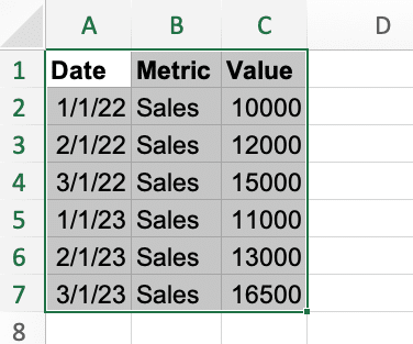
- Enter your data, ensuring each row represents a single data point. For example:
| Date | Metric | Value |
| 1/1/2022 | Sales | 10000 |
| 2/1/2022 | Sales | 12000 |
| 3/1/2022 | Sales | 15000 |
| 1/1/2023 | Sales | 11000 |
| 2/1/2023 | Sales | 13000 |
| 3/1/2023 | Sales | 16500 |
Using PivotTables and PivotCharts
- Select your data range.
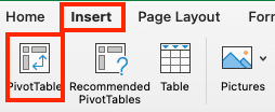
- Go to Insert > PivotTable.
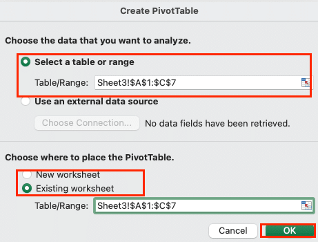
- In the Create PivotTable dialog, ensure your data range is correct and choose where to place the PivotTable. Click OK.
- In the PivotTable Fields pane:
- Drag ‘Date’ to the Rows area.
- Drag ‘Metric’ to the Filters area (if you have multiple metrics).
- Drag ‘Value’ to the Values area.
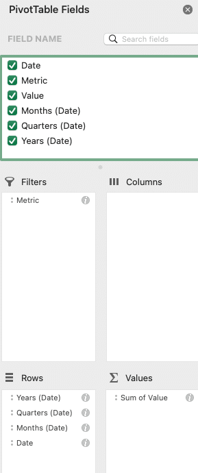
- Right-click on any date in the PivotTable and select Group > Years & Quarters.
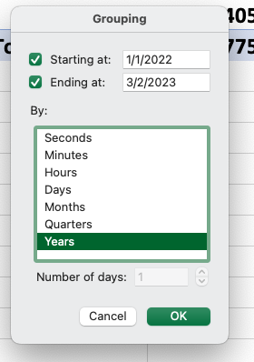
- In the PivotTable, right-click on the ‘Sum of Value‘ cell and select ‘Value Field Settings‘.
- In the ‘Show Values As’ tab, select ‘% difference from’ and choose ‘(previous year)’ in the Base field. Click OK.
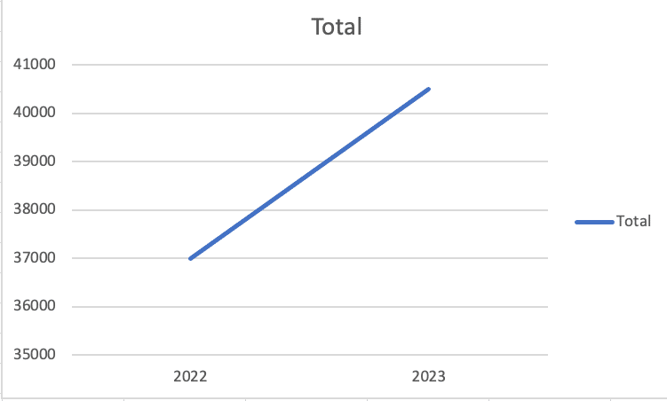
- Select your PivotTable and go to Insert > PivotChart.

- Choose a line chart type and click OK.
Formatting and customizing your chart
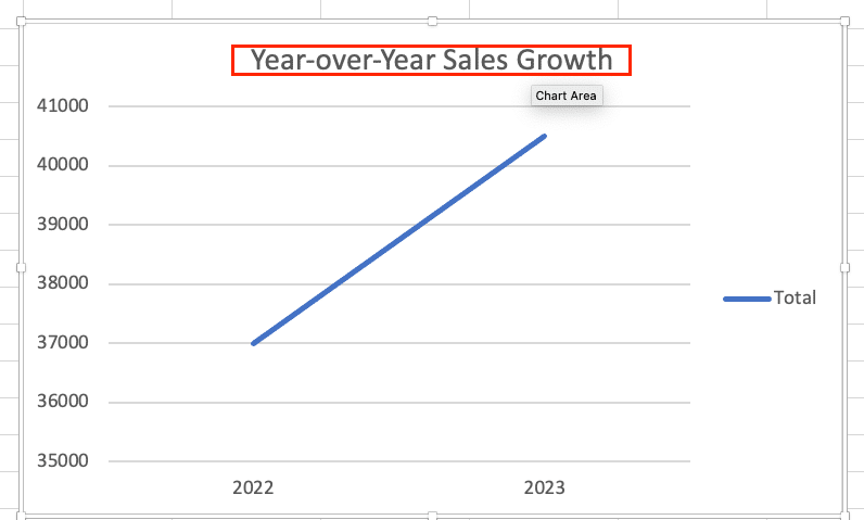
- Add a title: Click on the chart title and enter “Year-over-Year Sales Growth”.
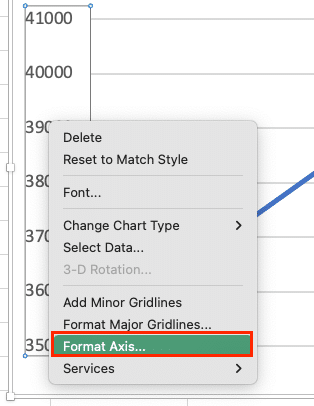
- Format the Y-axis: Right-click on the Y-axis, select ‘Format Axis‘, and set the ‘Number’ format to ‘Percentage’.
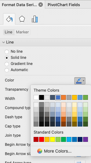
- Adjust colors: Click on the data series and choose a color that matches your brand or preferences in the sidebar.
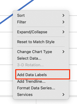
- Add data labels: Right-click on the data series, select ‘Add Data Labels’, and format them to show percentages.
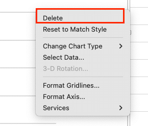
- Remove gridlines: Select gridlines and press Delete for a cleaner look.
- Add a legend: If comparing multiple metrics, ensure the legend is visible and clearly labeled.

Your chart should now clearly show the YOY growth percentage for each quarter across different years.
Advanced YOY Growth Analysis Techniques
To gain deeper insights from your YOY growth data, consider these advanced techniques:
Comparing multiple metrics
- In your PivotTable, add another metric to the Values area.
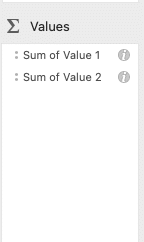
- Adjust the Value Field Settings for each metric as needed.
- In your PivotChart, you’ll now see multiple lines representing different metrics.
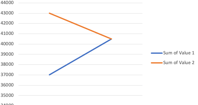
This allows you to compare, for example, YOY growth in sales versus profit margins.
Analyzing seasonality and trends
- Create a line chart showing absolute values alongside YOY growth percentages.
- Look for recurring patterns in specific months or quarters to identify seasonal trends.
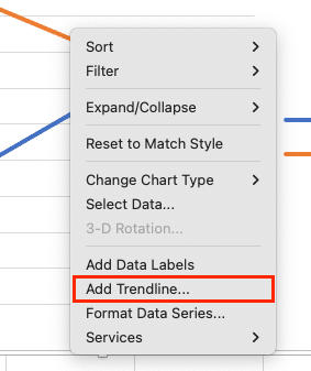
- Use Excel’s trend line feature to visualize long-term trends:
- Right-click on your data series
- Select ‘Add Trendline‘
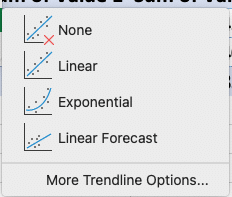
- Choose the appropriate trend type (linear for steady growth, polynomial for more complex patterns)
Understanding Year-Over-Year Growth Charts
Year-over-year growth charts are visual representations of how a specific metric changes from one year to the next. These charts help businesses track performance, identify trends, and make informed decisions based on historical data.
What is a YOY growth chart?
A YOY growth chart compares data points from the same period across different years. For example, it might show sales figures for Q1 across multiple years, allowing you to see how Q1 performance has changed over time.
Importance of tracking YOY growth
Tracking YOY growth is crucial for several reasons:
- Performance evaluation: It provides a clear picture of how your business is progressing over time.
- Trend identification: YOY charts help spot long-term trends that might be obscured by short-term fluctuations.
- Goal setting: Historical YOY data informs realistic future growth targets.
- Seasonal adjustments: By comparing the same periods year-over-year, you can account for seasonal variations in your business.
Common use cases for YOY analysis
YOY growth charts are versatile tools used across various industries and departments:
- Sales teams use them to track revenue growth and identify successful products or regions.
- Marketing departments analyze the effectiveness of campaigns over time.
- Finance teams use YOY charts for budgeting and forecasting.
- HR departments track employee retention and recruitment metrics.
- Operations teams monitor efficiency improvements and cost reductions.
Choosing the Right Chart Type for YOY Growth Visualization
Selecting the appropriate chart type is crucial for effective data visualization. Let’s explore the most common options for YOY growth charts.
Line charts
Line charts are excellent for showing trends over time and are particularly useful for YOY growth visualization.
Pros:
- Clearly show trends and patterns over multiple years
- Easy to compare multiple metrics on the same chart
- Work well with continuous data
Cons:
- Can become cluttered with too many data series
- May not be ideal for showing exact values
Bar charts
Bar charts are versatile and can be used effectively for YOY comparisons, especially when dealing with discrete categories.
Stop exporting data manually. Sync data from your business systems into Google Sheets or Excel with Coefficient and set it on a refresh schedule.
Get Started
Pros:
- Easy to read and compare specific values
- Work well for comparing a small number of years or categories
- Can be arranged vertically or horizontally
Cons:
- Can become overwhelming with too many categories or years
- May not show subtle trends as clearly as line charts
Dual-axis charts
Dual-axis charts combine two chart types (usually a line and a bar) to display related metrics with different scales.
Pros:
- Allow comparison of metrics with different magnitudes
- Can show both absolute values and growth rates on the same chart
- Provide a comprehensive view of performance
Cons:
- Can be confusing if not designed carefully
- Require careful scale selection to avoid misrepresentation
Choosing the best chart type
Consider these factors when selecting a chart type:
- Number of data points: Line charts work well for many data points, while bar charts are better for fewer comparisons.
- Type of comparison: Use bar charts for side-by-side comparisons and line charts for trend analysis.
- Audience: Choose simpler charts for general audiences and more complex visualizations for data-savvy stakeholders.
- Story you want to tell: Select a chart type that best highlights the insights you want to convey.
Year-Over-Year Growth Charts in Excel
Mastering year-over-year growth charts in Excel is a valuable skill for any data-driven business professional. By understanding the principles behind YOY analysis, choosing the right visualization techniques, and following best practices, you can turn raw data into actionable insights that guide your company’s strategy and growth.
Ready to take your data analysis to the next level? Explore how Coefficient can enhance your Excel and Google Sheets capabilities with real-time data integration and automated reporting. Get started with Coefficient today and transform the way you visualize and analyze your business data.

