Are you looking to visualize relationships between variables in your data? A scatter plot in Excel is an excellent tool for this purpose. This guide will walk you through creating, customizing, and analyzing scatter plots to uncover valuable insights from your data.
Step-by-Step Guide to Creating a Basic Scatter Plot
Now that your data is prepared, let’s create a basic scatter plot in Excel.
Selecting your data
- Open your Excel spreadsheet containing the prepared data.
- Click and drag to highlight the columns containing your X and Y variables.
- Include the header row if you want to use these labels in your chart.
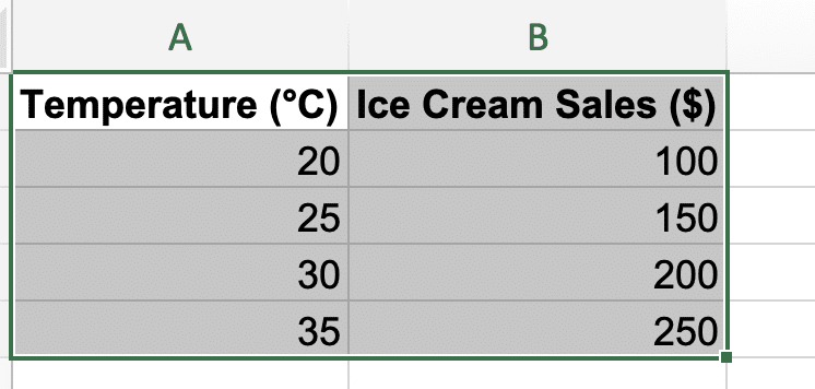
Tip: If your data columns are not adjacent, hold the Ctrl key while selecting to choose non-contiguous ranges.
Inserting a scatter chart
- With your data selected, click the “Insert” tab on the Excel ribbon.

- In the “Charts” section, click on the “Scatter” or “X Y (Scatter)” button.

- Choose the basic scatter plot option (usually the first one) from the dropdown menu.
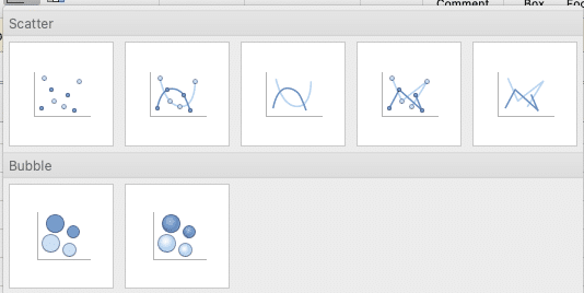
Excel will now create a basic scatter plot based on your selected data.
Choosing the right scatter plot type for your data
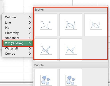
Excel offers several scatter plot subtypes to suit different data scenarios:
- Scatter with only markers: Best for showing individual data points without connecting lines.
- Scatter with smooth lines and markers: Ideal for visualizing trends in continuous data.
- Scatter with straight lines and markers: Useful for showing linear relationships or step changes.
- Scatter with smooth lines: Good for emphasizing overall trends without individual data points.
- Scatter with straight lines: Suitable for displaying linear progressions or piecewise functions.
To change the scatter plot type:
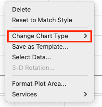
- Click on your chart to select it.
- Right-click on the chart and select “Change Chart Type.”
- In the “X Y (Scatter)” section, choose the subtype that best fits your data.
Customizing Your Scatter Plot
A well-customized scatter plot enhances data interpretation and visual appeal. Let’s explore how to refine your chart.
Adding chart titles and axis labels
- Chart Title:
- Click on the chart to select it.
- Go to the “Chart Design” tab and click “Add Chart Element.”

- Select “Chart Title” and choose your preferred position.

- Click on the title text box and enter a descriptive title.
- Axis Labels:
- Using the same “Add Chart Element” menu, select “Axis Titles.”
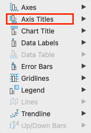
- Choose “Primary Horizontal” for the X-axis and “Primary Vertical” for the Y-axis.

- Click each axis title and enter appropriate labels.
Formatting data points and series
- Change Marker Style:
- Right-click on any data point and select “Format Data Series.”
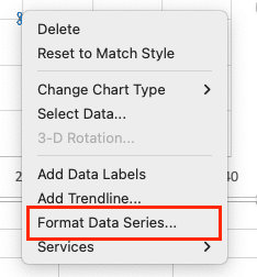
- In the Format Data Series pane, click on “Marker Options.
- Choose your preferred marker type, size, and color.
- Adjust Data Point Colors:
- To change all points, use the steps above and select a fill color.
- For individual points, right-click the specific point and choose “Format Data Point.”
- Add Data Labels:
- Go to “Add Chart Element” > “Data Labels” and choose your preferred position.
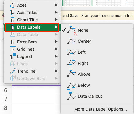
- To customize, right-click a label and select “Format Data Labels.”

Adjusting chart area and plot area
- Resize the Chart:
- Click and drag the chart corners to adjust its overall size.
- Format Chart Area:
- Right-click the chart area (the space around the plot) and select “Format Chart Area.”
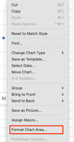
- Experiment with fill colors, borders, and effects to enhance visual appeal.

- Customize Plot Area:
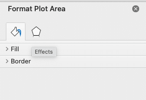
- Right-click within the plot area and choose “Format Plot Area.”

- Adjust fill, border, and other properties to highlight your data effectively.
Adding and customizing gridlines
- Add Gridlines:
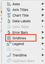
- Use the “Add Chart Element” menu and select “Gridlines.”
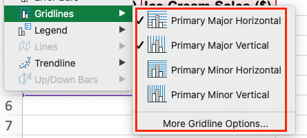
- Choose “Primary Major Horizontal” and/or “Primary Major Vertical” as needed.
- Customize Gridlines:
- Right-click on a gridline and select “Format Gridlines.”
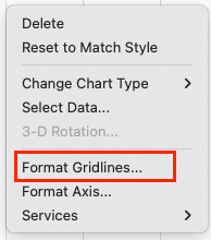
- Adjust the line color, style, and transparency to balance visibility and data focus.

Advanced Scatter Plot Techniques
Once you’ve mastered the basics, try these advanced techniques to extract more insights from your data.
Creating a scatter plot with multiple data series
- Prepare Your Data:
- Organize multiple series in adjacent columns, each with its own X and Y values.
- Select Data:
- Highlight all series data, including headers.
- Insert Scatter Plot:
- Follow the same steps as for a basic scatter plot.
- Customize Series:
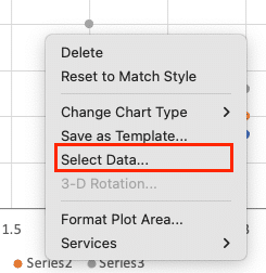
- Right-click the chart and choose “Select Data.”
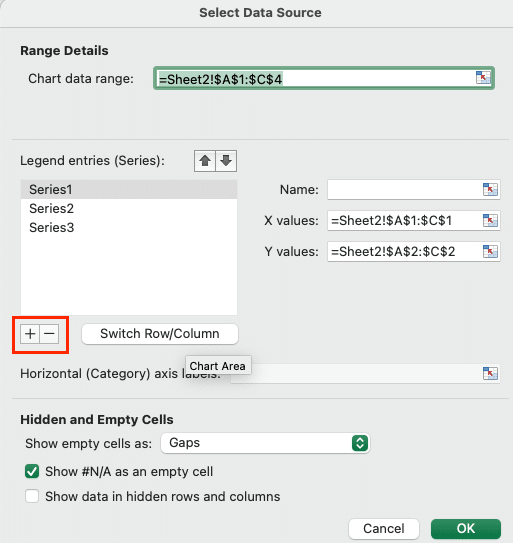
- Use the “Add” and “Edit” buttons to refine series names and data ranges.
Example:
| Temperature | Ice Cream Sales | Soda Sales |
| 20 | 100 | 80 |
| 25 | 150 | 100 |
| 30 | 200 | 130 |
Adding trendlines and equations
- Add a Trendline:
- Right-click on a data series and select “Add Trendline.”

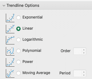
- Choose the trendline type (linear, exponential, polynomial, etc.) that best fits your data.
- Display Equation and R-squared Value:
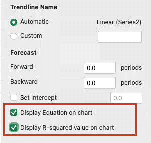
- In the “Format Trendline” pane, check the boxes for “Display Equation on chart” and “Display R-squared value on chart.”
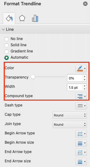
- Customize Trendline Appearance:
- Use the Format Trendline pane to adjust line color, style, and transparency.
Using error bars and data labels
- Add Error Bars:
- Go to “Add Chart Element” > “Error Bars” and choose a preset option.
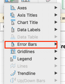
- For custom error bars, select “More Error Bar Options” and specify your preferences.
- Customize Data Labels:
- Right-click on data labels and select “Format Data Labels.”
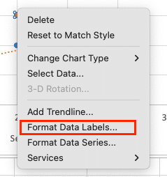
- Choose which information to display (series name, Y value, X value, etc.).

- Adjust position, font, and color for optimal readability.
Creating a 3D scatter plot
- Right-click on the chart and select ‘Format Data Series’
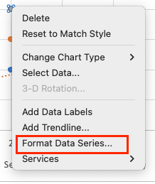
- Select ‘Effect’ on the ‘Format Data Series’ window and click ‘3D-Format.’
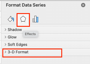
- Select the ‘top bevel’ and ‘bottom bevel’ format you want from the dropdown

- Go to ‘Fill & Line’ and select ‘Marker.’
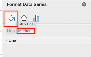
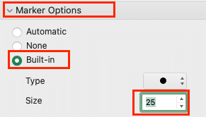
- Click the ‘Marker Option’ and select ‘Built-in.’ Then increase the size to about ‘25’
- Format 3D Elements:
- Customize markers, axes, and gridlines using the Format pane as with 2D scatter plots.
Understanding Scatter Plots in Excel
Scatter plots, also known as XY charts, are powerful data visualization tools that display the relationship between two numerical variables. Each data point on the chart represents a pair of values, with one plotted on the X-axis and the other on the Y-axis.
What is a scatter plot?
A scatter plot is a type of chart that uses Cartesian coordinates to display values for two variables. The position of each point on the horizontal and vertical axis indicates values for an individual data point. Scatter plots are particularly useful for visualizing:
- Correlation between variables
- Distribution of data points
- Clusters or groupings within data
- Outliers or anomalies
When to use a scatter plot
Scatter plots are ideal for situations where you want to:
- Examine the relationship between two continuous variables
- Identify potential cause-and-effect relationships
- Detect patterns or trends in data
- Compare large numbers of data points without regard to time
For example, you might use a scatter plot to visualize:
- The relationship between advertising spend and sales
- Correlation between study time and test scores
- The impact of temperature on product defects
- Distribution of height and weight in a population
Benefits of using scatter plots for data analysis
Scatter plots offer several advantages for data analysis:
- Visual representation: They provide an immediate visual understanding of data relationships.
- Pattern identification: Easily spot trends, clusters, or outliers in your data.
- Correlation analysis: Quickly assess the strength and direction of relationships between variables.
- Large data sets: Effectively display hundreds or thousands of data points simultaneously.
- Predictive insights: Help in forecasting future trends based on observed patterns.
Preparing Your Data for a Scatter Plot
Before creating a scatter plot, it’s crucial to organize your data correctly in Excel. Proper data preparation ensures accurate visualization and analysis.
Stop exporting data manually. Sync data from your business systems into Google Sheets or Excel with Coefficient and set it on a refresh schedule.
Get Started
Organizing your data in Excel
Follow these best practices when organizing your data:
- Use a tabular format: Arrange your data in columns, with each variable in a separate column.
- Include headers: Use clear, descriptive column headers to identify your variables.
- Ensure data consistency: Use the same units and formats throughout your dataset.
- Remove blank cells: Eliminate any empty cells within your data range.
- Sort data if necessary: Arrange data points in ascending or descending order if it aids analysis.
Example table structure:
| Temperature (°C) | Ice Cream Sales ($) |
| 20 | 100 |
| 25 | 150 |
| 30 | 200 |
| 35 | 250 |
Selecting the right variables for X and Y axes
Choosing appropriate variables for your scatter plot is crucial for meaningful analysis:
- Independent variable (X-axis): This is typically the variable you control or the potential cause.
- Dependent variable (Y-axis): This is usually the outcome or effect you’re measuring.
For example:
- X-axis: Temperature (independent variable)
- Y-axis: Ice Cream Sales (dependent variable)
Consider the following when selecting variables:
- Relevance: Choose variables that are logically related to your analysis.
- Scale: Ensure both variables use compatible scales for meaningful comparison.
- Range: Select variables with sufficient variation to show patterns.
Formatting considerations for optimal results
Proper data formatting enhances the accuracy and readability of your scatter plot:
- Number format: Use consistent decimal places and thousand separators.
- Date format: Ensure dates are in a format Excel recognizes (e.g., MM/DD/YYYY).
- Text consistency: Use consistent capitalization and spelling for categorical data.
- Special characters: Avoid using special characters that might interfere with Excel’s functions.
- Data types: Ensure all cells in a column contain the same data type (e.g., all numbers or all text).
Master Excel Scatter Plots
By mastering these techniques for creating, customizing, and troubleshooting scatter plots in Excel, you’ll be well-equipped to visualize and analyze relationships in your data effectively. Remember, the key to a great scatter plot is not just in its creation, but in how you interpret and apply the insights it reveals.
Ready to take your data analysis to the next level? Coefficient can help you create dynamic, real-time scatter plots and other visualizations directly in your spreadsheets. Get started with Coefficient today and unlock the full potential of your data!

