
Enter your percentage data into a column or row in your Excel spreadsheet and ensure that the cells are formatted as percentages
Use the AVERAGE function by clicking on the cell where you want the average percentage to appear
For weighted averages, use the SUMPRODUCT function with your percentages and weights ranges
To exclude blank cells, use the AVERAGEIF function which calculates the average of non-zero values in the specified range
For calculations across multiple sheets, extend your formulas to reference data from different worksheets
Calculating average percentages in Excel is a crucial skill for data analysis and reporting. Whether you’re tracking sales performance, analyzing student grades, or measuring growth rates, understanding how to compute and interpret average percentages can provide valuable insights. This guide will walk you through various methods to calculate average percentages in Excel, from basic techniques to advanced approaches.
Understanding Average Percentages in Excel
What is an average percentage?
An average percentage is the mean value of a set of percentage data points. It provides a single representative figure for a group of percentages, allowing you to summarize and compare data more easily. In Excel, calculating average percentages involves using specific functions and formatting options to ensure accurate results.
Common use cases for average percentages
Average percentages are widely used in various fields:
- Business: Analyzing sales performance, growth rates, and market share
- Education: Calculating class averages and overall grade point averages
- Finance: Evaluating investment returns and interest rates
- Marketing: Measuring campaign success rates and conversion percentages
Basic Method: Using the AVERAGE Function
The AVERAGE function is the simplest way to calculate an average percentage in Excel. Here’s how to use it:
Step 1: Enter your percentage data
Enter your percentage data into a column or row in your Excel spreadsheet. Ensure that the cells are formatted as percentages.
Step 2: Use the AVERAGE function
- Click on the cell where you want the average percentage to appear
- Type “=AVERAGE( into the cell
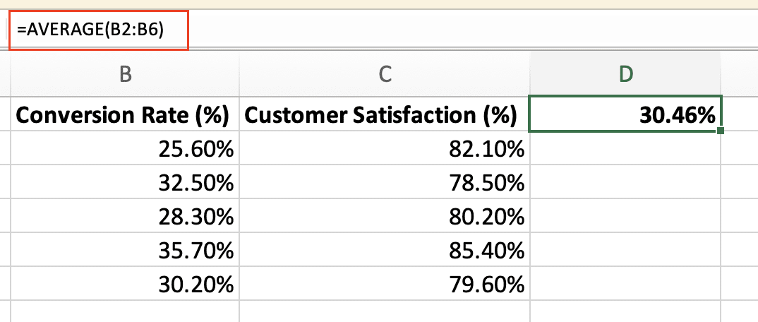
- Select the range of cells containing your percentage data
- Close the parenthesis and press Enter
For example, if your percentage data is in cells A1:A10, your formula would look like this:
Copy
=AVERAGE(A1:A10)
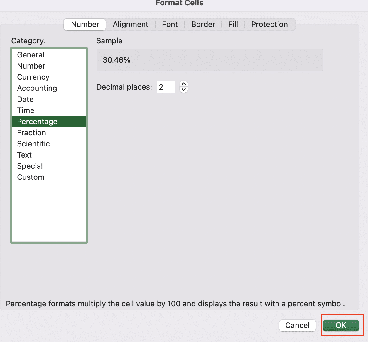
Step 3: Format the result as a percentage
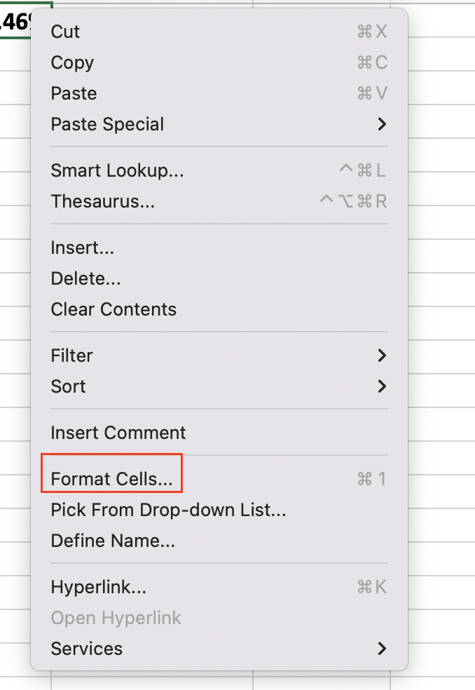
- Right-click on the cell with the average result
- Select “Format Cells“
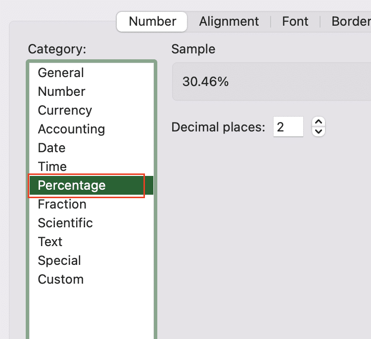
- Choose “Percentage” from the Number tab
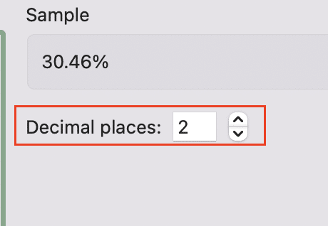
- Select the desired number of decimal places
- Click “OK“
Advanced Method: SUMPRODUCT for Weighted Averages
Sometimes, you need to calculate an average percentage where each value has a different weight or importance. This is where weighted averages come in handy.
Understanding weighted averages
A weighted average takes into account the relative importance of each value in a dataset. For example, when calculating a student’s overall grade, different assignments might contribute different percentages to the final grade.
Using SUMPRODUCT for weighted average percentages
The SUMPRODUCT function allows you to calculate weighted averages efficiently. Here’s how to use it:
Step 1: Prepare your data
Set up your spreadsheet with columns for:
- Percentage values
- Corresponding weights
Step 2: Apply the SUMPRODUCT function
- Click on the cell where you want the weighted average percentage to appear
- Enter the following formula:
Copy
=SUMPRODUCT(percentage_range, weight_range) / SUM(weight_range)
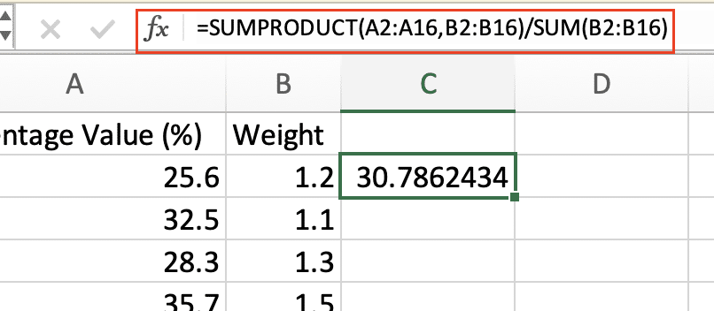
For example, if your percentages are in cells A2:A10 and weights in B2:B10, your formula would look like this:
Copy
=SUMPRODUCT(A2:A10, B2:B10) / SUM(B2:B10)
Stop exporting data manually. Sync data from your business systems into Google Sheets or Excel with Coefficient and set it on a refresh schedule.
Get Started
Step 3: Format the result as a percentage
Follow the same formatting steps as in the basic method to display the result as a percentage.
Dealing with Special Cases
Calculating average percentages with blank cells
To exclude blank cells when calculating average percentages, use the AVERAGEIF function:
Copy
=AVERAGEIF(range, “<>0”)
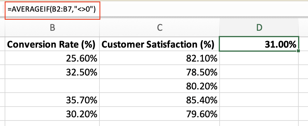
This formula calculates the average of non-zero values in the specified range.
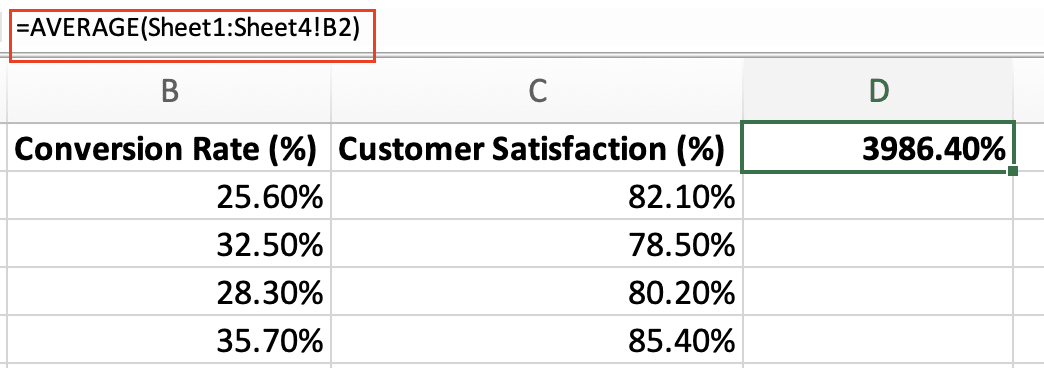
Average percentages across multiple sheets
To calculate average percentages across multiple sheets:
- Use the AVERAGE function with 3D references
- Specify the range of sheets and cells
For example, to average cells A1 on Sheet1 through Sheet10:
Copy
=AVERAGE(Sheet1:Sheet10!A1)
Visualizing Average Percentages
Creating charts and graphs
Excel offers various chart types to visualize average percentages:
Bar charts for comparing average percentages
- Select your data range
- Go to the “Insert” tab

- Choose “Column Chart” from the Charts group

- Select the desired chart style

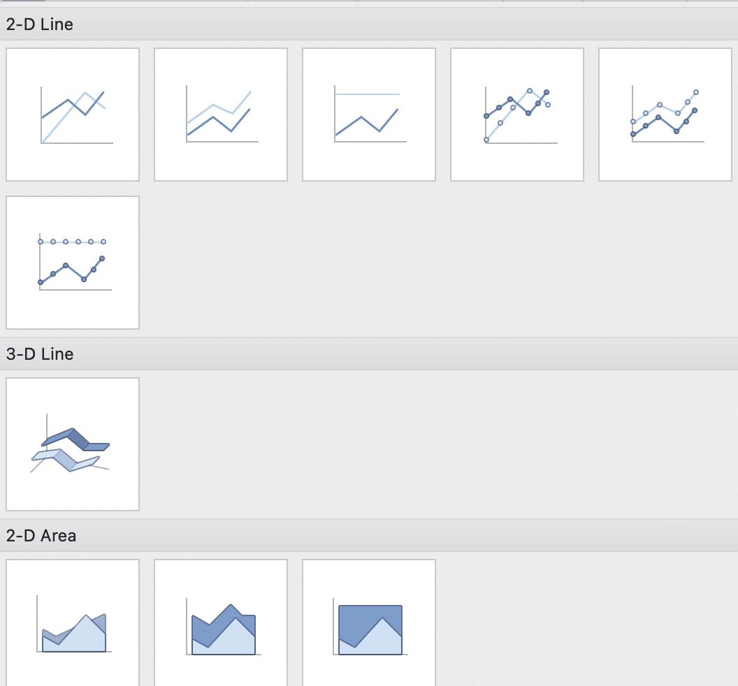
Line graphs for tracking trends over time
- Arrange your data with time periods in one column and percentages in another
- Select both columns
- Go to the “Insert” tab

- Choose “Line Chart” from the Charts group

- Select the appropriate chart style
Using conditional formatting
Conditional formatting helps highlight cells based on their values:
Step 1: Select the range of cells with percentage data
Step 2: Go to the “Home” tab and click “Conditional Formatting“

Step 3: Choose “Color Scales” or “Icon Sets“
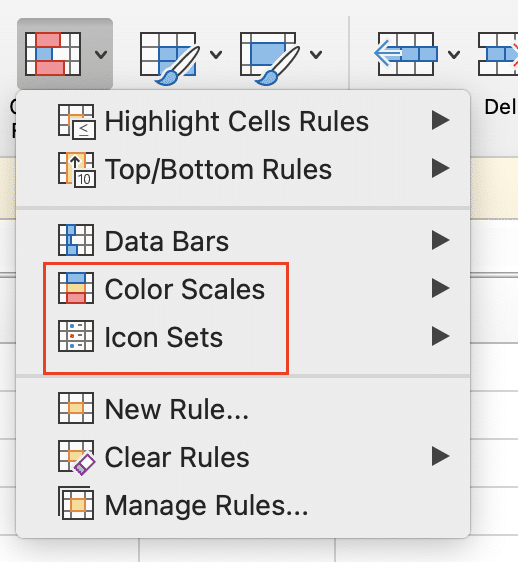
Step 4: Select a predefined rule or create a custom one
For example, you might use a three-color scale where low percentages are red, average percentages are yellow, and high percentages are green.
Conclusion
Mastering average percentage calculations in Excel empowers you to analyze data more effectively and make informed decisions. From basic AVERAGE functions to advanced weighted averages using SUMPRODUCT, you now have the tools to handle various scenarios. Remember to visualize your data, troubleshoot common issues, and always double-check your results for accuracy.
Ready to take your Excel data analysis to the next level? Get started with Coefficient (https://coefficient.io/get-started) to unlock powerful data integration and real-time reporting capabilities that complement your Excel skills.


