
What are Doughnut Charts?
Doughnut charts in Excel visually represent data segments within a circular format. They provide a concise portrayal by utilizing data from rows or columns, making them effective for a limited number of categories. Essentially, a doughnut chart resembles a pie chart with a central hole, where segments depict different data components, each representing a category’s share of the whole. The size of each segment corresponds to its proportionate contribution to the overall dataset.
With their natural design, doughnut charts facilitate easy comparison of data categories. They excel at concisely conveying information, making them ideal for situations involving a modest number of data categories. Whether showcasing budget allocations or sales distribution, doughnut charts provide a clear visualization, enabling quick insights into the composition of the dataset at hand.
How to Create a Doughnut Chart in Excel?
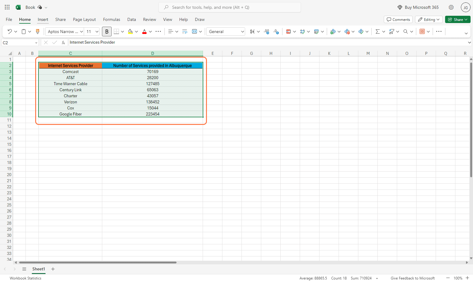
Step 1: Input & Select Data into Worksheet
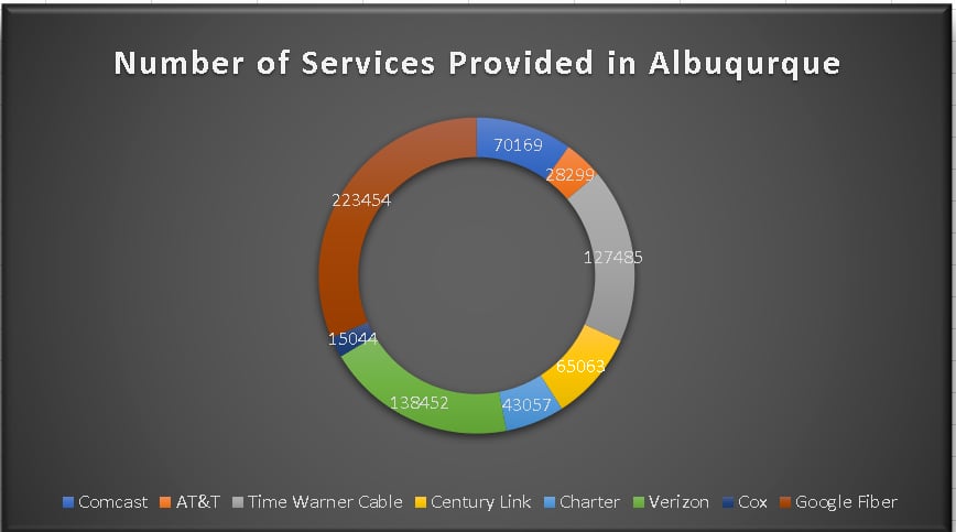
To start, select the full data range. If you have none yet, you may follow the same table we have as an example, or feel free to create depending on your use-case. In this example, we have data from different Internet service providers in the town of Albuquerque.
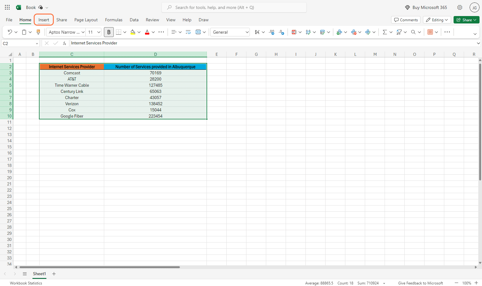
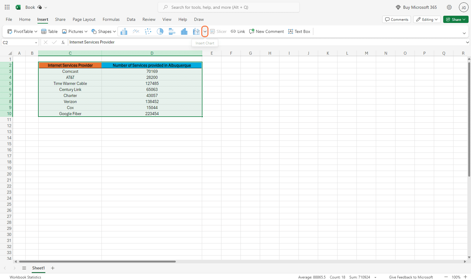
Step 2: Upon selecting the data range, go to the Insert tab via the menu bar. From there, try to locate “Chart” under the list of options on the dropdown menu.
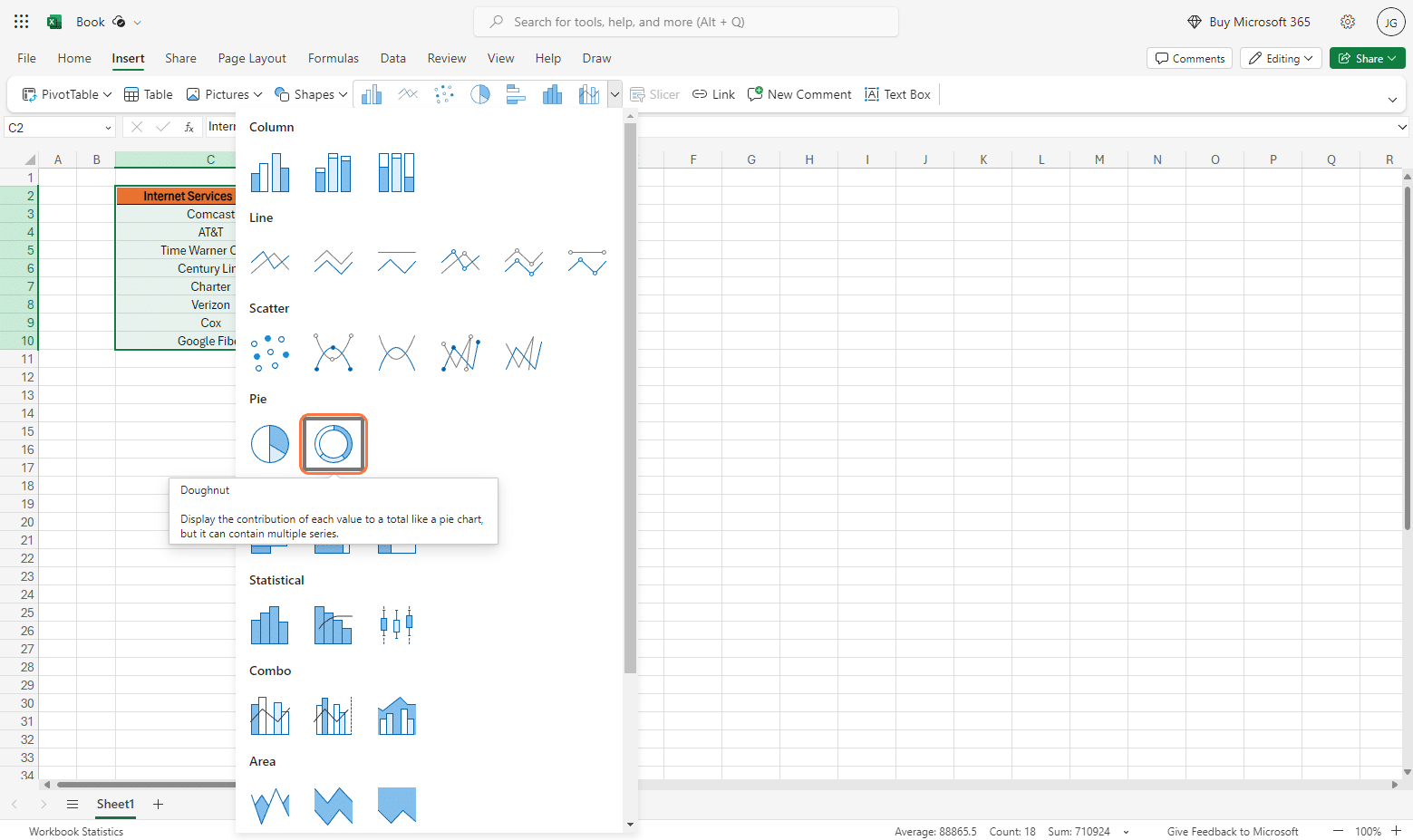
Step 3: A dropdown menu will open, allowing you to select your chart. From there go to Pie > Select Doughnut Chart
Step 4: Your Doughnut chart should now be added on your workbook. From here, you’ll be able to customise your Doughnut Chart as needed through the side window that is opened by clicking on your doughnut chart.
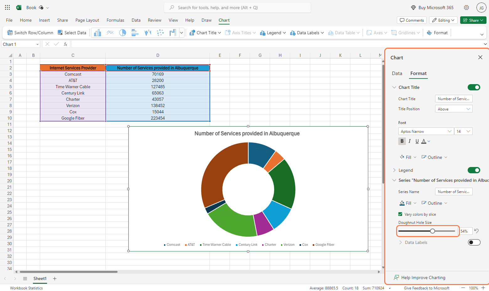
Step 5: After customizing accordingly, you’ll then be presented with your final Doughnut Chart. On customization, you may edit the font, font color, label, outline of the doughnut chart, values presented and even the title itself.
Interpreting Doughnut Charts
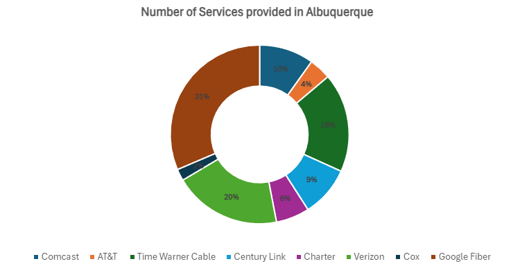
Understanding doughnut chart data is straightforward. Each section of the chart represents a category or group, and the size of each section shows how much of the whole it represents.
In our example, Google Fiber dominates other categories, comprising a larger portion of the total, allowing for us to quickly identify significant and smaller categories, facilitating pattern recognition.
Things to consider when creating/working on your Doughnut Chart
- Unlike pie charts, doughnut charts can only accommodate a single data set; they do not support multiple data series.
- Doughnut charts work best at comparing performance across different seasons or facilitating one-to-many comparisons within a single chart.
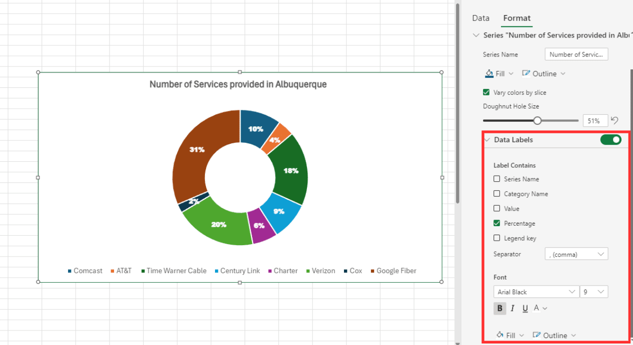
- Display data labels as percentages to maximize readability within each doughnut slice.
- You may utilize the empty center space of the doughnut to present additional values or calculations, enhancing the chart’s utility and information density.
- Try to keep the number of categories limited, ideally to 5 or 8, as overcrowding the chart can diminish its effectiveness.
- Avoid adding unnecessary category lists to maintain the chart’s clarity and visual appeal.
Enhancing Your Chart
Doughnut charts are a popular choice for visualizing proportional data, but to truly make them stand out and convey information effectively, you can employ several enhancements. Here are a few tips from us to even further enhance your doughnut chart:

Stop exporting data manually. Sync data from your business systems into Google Sheets or Excel with Coefficient and set it on a refresh schedule.
Get Started
Step 1: Add Data Labels – You can try Including data labels can make your chart more informative by displaying the exact values of each segment. This helps viewers quickly grasp the details without needing to refer to a legend.
Step 2 : Use Contrasting Colors – Choose colors that are distinct and contrast well with each other. This makes each segment of the chart easily distinguishable, improving readability.
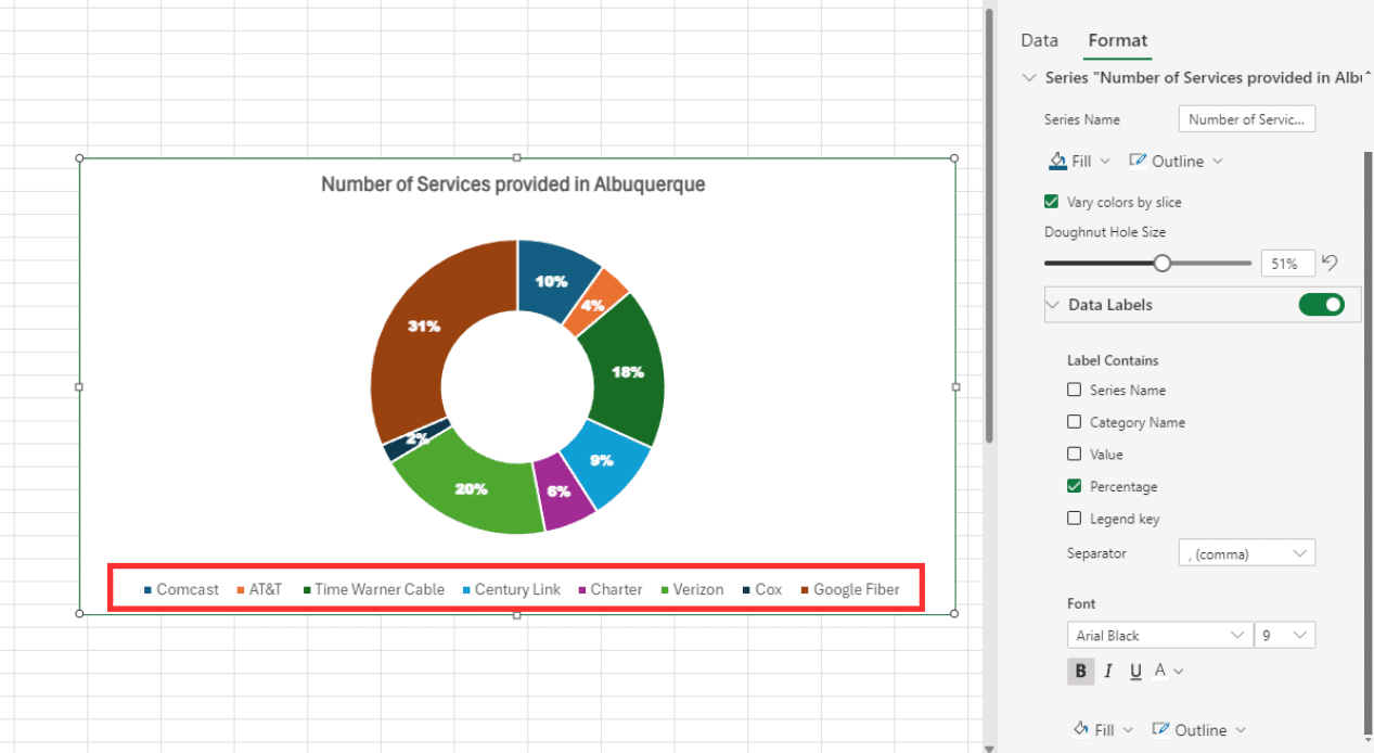
Step 3: Include Legends – While data labels provide specifics, legends offer a quick reference for what each color represents. Ensure your legend is clearly positioned and easy to read.
Step 4: Add Interactive Elements – In digital presentations, adding interactive elements such as tooltips or clickable segments can enhance user engagement and provide additional information on demand.
Advanced Visual Enhancements
For more sophisticated data presentations, advanced visual enhancements can transform a standard chart into a compelling and insightful visual tool. Here are some advanced techniques:
- 3D Effects: Applying 3D effects can add depth to your charts. However, use this sparingly to avoid clutter and ensure it doesn’t hinder readability.
- Gradients and Shadows: Utilizing gradients and shadows can give a modern look and highlight important segments. This can also help in drawing attention to specific parts of the data.
- Dynamic Data: Incorporating dynamic data that updates in real-time can be incredibly powerful for presentations that need to reflect current conditions, such as financial dashboards or live performance tracking.
Doughnut Charts: Your Data’s Visual Key
Doughnut charts in Excel offer a simple yet powerful way to visualize data and communicate insights effectively. By breaking down data into easily digestible segments within a circular format, doughnut charts allow for quick comparisons and identification of patterns. From comparing different categories to highlighting key trends, these charts serve as valuable tools for data analysis and presentation. Whether you’re analyzing sales data, budget allocations, or survey responses, mastering the creation and interpretation of doughnut charts empowers you to make informed decisions and convey your message with clarity.
So, next time you need to showcase your data in a clear and concise manner, consider using a doughnut chart in Excel to bring your insights to life. Also, did we mention that Coefficient helps in streamlining your data preparation process? This ensures that your doughnut charts always reflect the most up-to-date and specific information. Experience the power of Coefficient at no cost today and unleash the full potential of your data visualization capabilities.


