
Define your dashboard purpose and audience, then gather and organize your data from reliable sources
Create visual elements including charts and graphs for trends, tables for raw data, and key performance indicators (KPIs) to track business objectives
Add interactive features like slicers and timelines to allow users to filter and segment data for deeper exploration
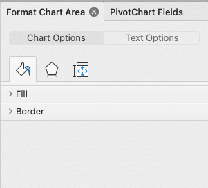
Apply conditional formatting with color scales, data bars, and icon sets to highlight important data points and trends
Connect to external data sources and set up automatic refresh schedules to keep your dashboard information current
Want to learn how to create dashboards in Excel? You’re in the right place!
This guide will walk you through building effective Excel dashboards. We’ll cover the basics, highlight useful features, and share tips for clear data presentation. By the end, you’ll know how to craft dashboards that make complex information easy to understand and act on.
Let’s dive in!
Planning Your Excel Dashboard: Key Considerations
Before diving into dashboard creation, it’s crucial to understand who will use the dashboard and what they need from it. Consider the following:
- Audience: Who are the primary users? Are they executives, managers, or analysts?
- Purpose: Is the dashboard for tracking performance, guiding strategic decisions, or something else?
- Usage: How frequently will the dashboard be used? Will users need real-time data?
Additionally, the backbone of any dashboard is its data. Here are some tips to ensure that you gather and organize your data effectively:
- Data Sources: Identify all potential data sources and ensure they are reliable and up-to-date.
- Data Relevance: Filter out irrelevant data to focus on information that aligns with your objectives.
- Data Structure: Organize your data logically, making it easy to analyze and interpret.
- Automation: Where possible, automate data collection and updating processes to save time and reduce errors.
Step-by-Step Guide to Creating a Dashboard in Excel
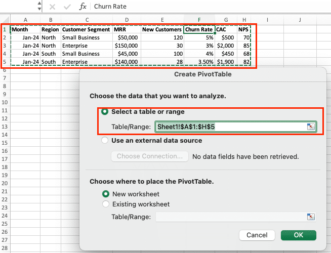
Step 1: Organize Your Data
- Consolidate your data into a single worksheet or workbook. Remove unnecessary columns or rows.
- Handle missing or inconsistent data:
- Identify and resolve any missing values or inconsistencies in your data.
- Use data validation techniques to ensure data integrity and minimize errors.
- Format Consistently:
- Ensure data types (e.g., dates, numbers) are consistent throughout your dataset.
- Use tables to organize related data for better readability and easier management.
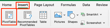
Step 2: Utilize Pivot Tables
- Go to the “Insert” tab and select “PivotTable.”
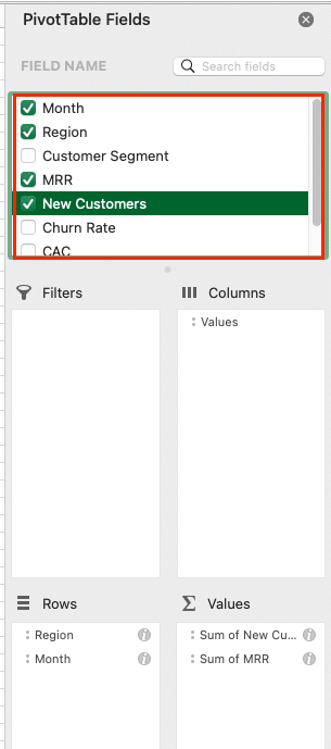
- Configure Pivot Table:
- Drag and drop fields into the “Rows,” “Columns,” and “Values” areas to summarize and analyze your data.
- Adjust filters to focus on specific subsets of data.
- Use calculated fields and measures to perform custom calculations within the pivot table.
- Explore Configurations:
- Experiment with different layouts and settings to uncover key insights and patterns in your data.
- Group data by different time periods (e.g., months, quarters) for more granular analysis.
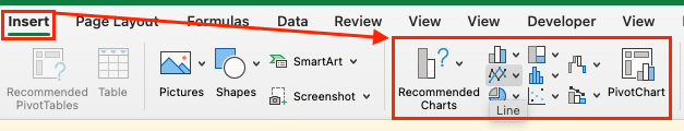
Step 3: Visualize with Charts and Graphs
- Select Data Range:
- Highlight the data you want to visualize, ensuring it is clean and properly formatted.

- Insert Chart:
- Go to the “Insert” tab and choose the desired chart type (e.g., line chart, bar graph, pie chart) based on the nature of your data and the insights you want to convey.
- Customize Chart:
- Use the “Chart Design” tab to modify the chart format, add titles, labels, and legends.
- Enhance the informative value of your charts by adding trend lines, data labels, and error bars when applicable.
- Consider using secondary axes for combining multiple data series with different scales.
Step 4: Enhance with Interactivity
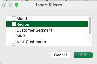
- Add Slicers:
- Select a Pivot Table or Table, then go to the “Insert” tab and click on “Slicer.”
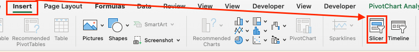
- Choose the fields you want to use as filters, allowing users to dynamically interact with the data.
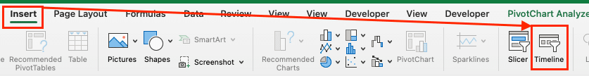
- Insert Timelines:
- For date fields in Pivot Tables, use the “Insert” tab to add a “Timeline” for easy date-based filtering.
- Create Dynamic Visuals:
- Use formulas and conditional formatting to highlight important data points or trends.
- Employ VBA macros to automate repetitive tasks or create custom functions for enhanced interactivity.
Step 5: Optimize Layout and Design
- Place charts, tables, and slicers logically on your dashboard, ensuring the layout is intuitive and information flows naturally.
- Apply consistent formatting, colors, and fonts throughout the dashboard for a professional and cohesive look.
- Align elements neatly and use ample white space to improve readability and visual appeal.
- Highlight the most important data points and make them easily accessible for quick insights.
- Simplify complex data by using clear labels, tooltips, and concise summaries.
Step 6: Finalize and Test
- Check for any errors or inconsistencies in formulas, data, and visualizations.
- Ensure all interactive elements, such as slicers and timelines, function correctly and provide the desired user experience.
- Share the dashboard with stakeholders for input and gather feedback for potential improvements.
- Make necessary adjustments based on the feedback received to refine the dashboard’s effectiveness.
- Save your dashboard and distribute it in the desired format (e.g., Excel file, PDF) for easy access and sharing.

Stop exporting data manually. Sync data from your business systems into Google Sheets or Excel with Coefficient and set it on a refresh schedule.
Get Started
What is an Excel Dashboard?
An Excel dashboard is a one-stop overview that provides users with critical information at a glance. It’s a visual representation of key metrics and data points, typically created within Microsoft Excel.
The key components of an Excel dashboard include:
- Charts and Graphs: Visual representations of data that help to quickly identify trends and outliers.
- Tables: Used to display raw data and summary statistics.
- Metrics: Key performance indicators (KPIs) that track the progress of various business objectives.
- Filters: Allow users to customize data views according to specific criteria or time periods.
Here are some of the benefits they offer:
- Improved Decision-Making: By consolidating data into a single interface, dashboards allow for quick, informed decisions based on the latest data.
- Time Efficiency: Dashboards reduce the time spent searching for and analyzing data, allowing more time for strategic activities.
- Enhanced Communication: They provide a clear and concise format for sharing information with stakeholders, ensuring everyone is on the same page.
- Proactive Management: With real-time data, dashboards help in identifying issues before they become problems, allowing for proactive management.
Excel Dashboards: Tips & Tricks
- Slicers and Timelines: Slicers and timelines allow users to quickly filter and segment the data, enabling them to explore the information in more depth. Incorporate these interactive elements to give your dashboard users greater control and flexibility.
- Conditional Formatting: Use conditional formatting to highlight important data points, trends, and outliers. Apply color scales, data bars, and icon sets to draw attention to key insights and help users quickly identify areas of concern or opportunity.
- Formulas and Macros: Leverage Excel’s powerful formula capabilities and macros to create dynamic, responsive dashboards. Use formulas to calculate KPIs, perform complex analyses, and update data automatically. Macros can automate repetitive tasks and add advanced functionality to your dashboard.
- Data Connections and Refreshes: Connect your dashboard to external data sources, such as databases or web services, to ensure your information is always up-to-date. Configure automatic data refreshes to keep your visualizations current without manual intervention.
Keep Your Excel Dashboards Up-to-Data with Coefficient
Building effective Excel dashboards involves organizing data, choosing the right visualizations, and using Excel’s features wisely. This guide has walked you through creating dashboards that provide clear insights for data-driven decisions.
Remember, a good dashboard presents complex information in an easily digestible format. Practice with different data sets to refine your skills.
Get started with Coefficient today for free to enhance your Excel dashboard capabilities.


