Are you struggling to effectively visualize multiple data series in Excel? Combo charts might be the solution you’re looking for. This comprehensive guide will walk you through the process of creating and customizing combo charts in Excel, empowering you to present complex data clearly and insightfully.
Step-by-Step Guide to Creating a Basic Combo Chart
Now that your data is prepared, let’s walk through the process of creating a basic combo chart in Excel.
Selecting your data range
- Open your Excel spreadsheet containing the prepared data.
- Click and drag to select the entire data range, including column headers and row labels.
- Ensure you’ve included all relevant data series you want to display in your combo chart.
Inserting a combo chart
- With your data selected, navigate to the “Insert” tab on the Excel ribbon.

- In the “Charts” section, click on the “Recommended Charts” button.

- Scroll through the preview options and select a combination chart from the list from the list of recommended charts. Examples of combination chart involved are: clustered column, stacked clustered, stacked area, etc.
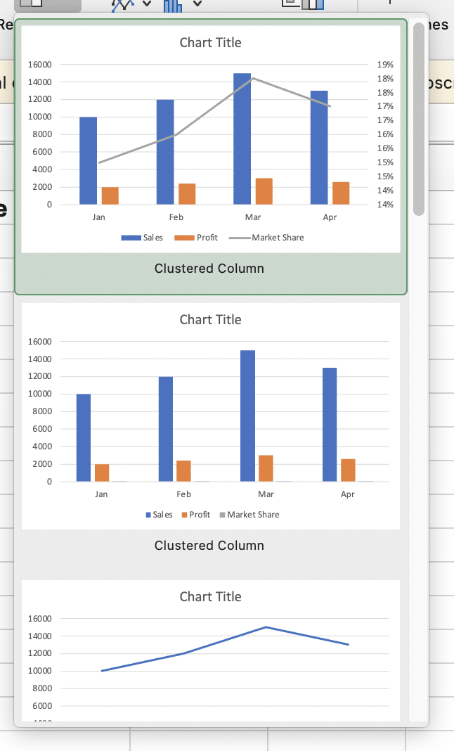
- Click your preferred chart to insert the combo chart into your worksheet.
Choosing the right chart types for your data
- If the default chart types don’t effectively represent your data, you can customize them.
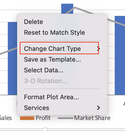
- Right-click on the chart and select “Change Chart Type” from the context menu.
- In the “Change Chart Type” dialog box, select “Combo” from the left sidebar.
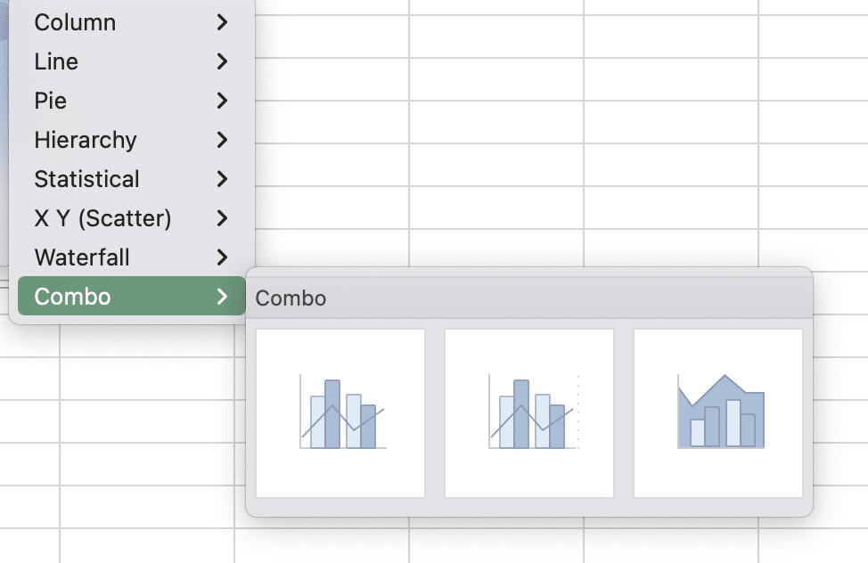
- For each data series, choose the most appropriate chart type from the dropdown menu in the “Chart Type” column.
- Consider using column charts for discrete data, line charts for continuous data or trends, and area charts for cumulative totals.
Applying the combo chart layout
- Once you’ve selected the desired chart types, click the chart type to apply the changes.
- Excel will automatically adjust the chart layout based on your selections.
- Review the resulting combo chart to ensure it accurately represents your data and effectively communicates your intended message.
Customizing Your Combo Chart
After creating your basic combo chart, you can enhance its appearance and functionality through various customization options.
Adding and formatting chart titles and labels
- Click on the chart to activate the “Chart Design” contextual tabs in the Excel ribbon.

- Click “Add Chart Element” and select “Chart Title” to add a main title.
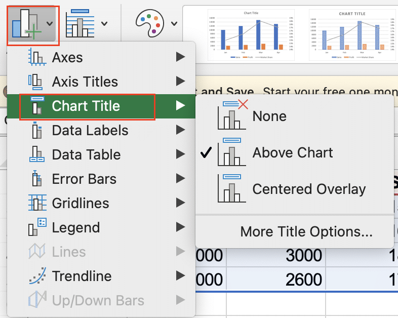
- Double-click the title to edit the text and use the “Home” tab to adjust font, size, and color.
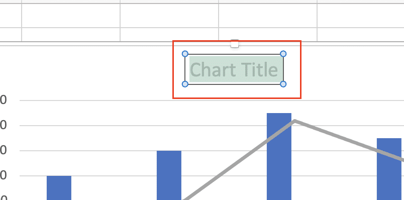
- Similarly, add and format axis titles to provide context for your data.
Modifying axis settings
- Right-click on either the vertical or horizontal axis and select “Format Axis” from the context menu.
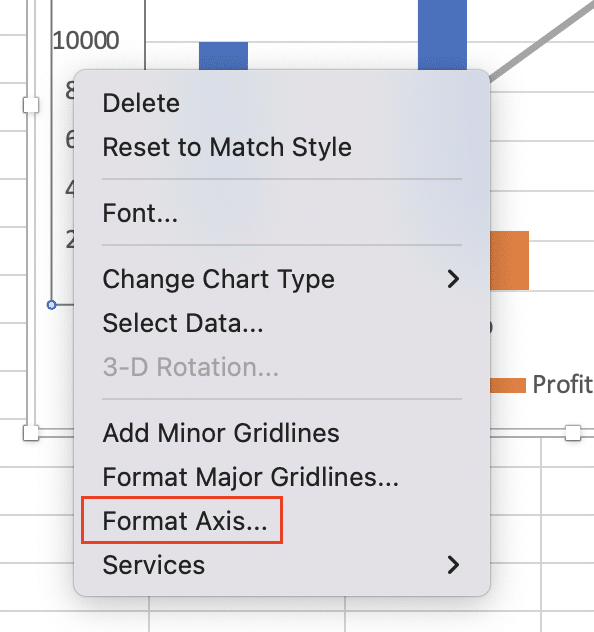
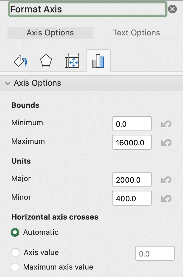
- In the “Format Axis” pane, adjust settings such as:
- Minimum and maximum values
- Major and minor units
- Axis scale (linear or logarithmic)
- Number formatting
Changing chart colors and styles
- Use the “Chart Design” tab to apply predefined color schemes and styles.

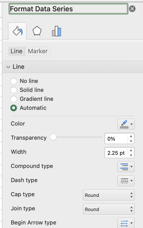
- For more control, right-click individual chart elements (e.g., columns or lines) and select “Format Data Series.”
- In the “Format Data Series” pane, customize fill color, border color, and other visual properties.
Adding data labels and legends
- Click “Add Chart Element” in the “Chart Design” tab and select “Data Labels” to show values on your chart.
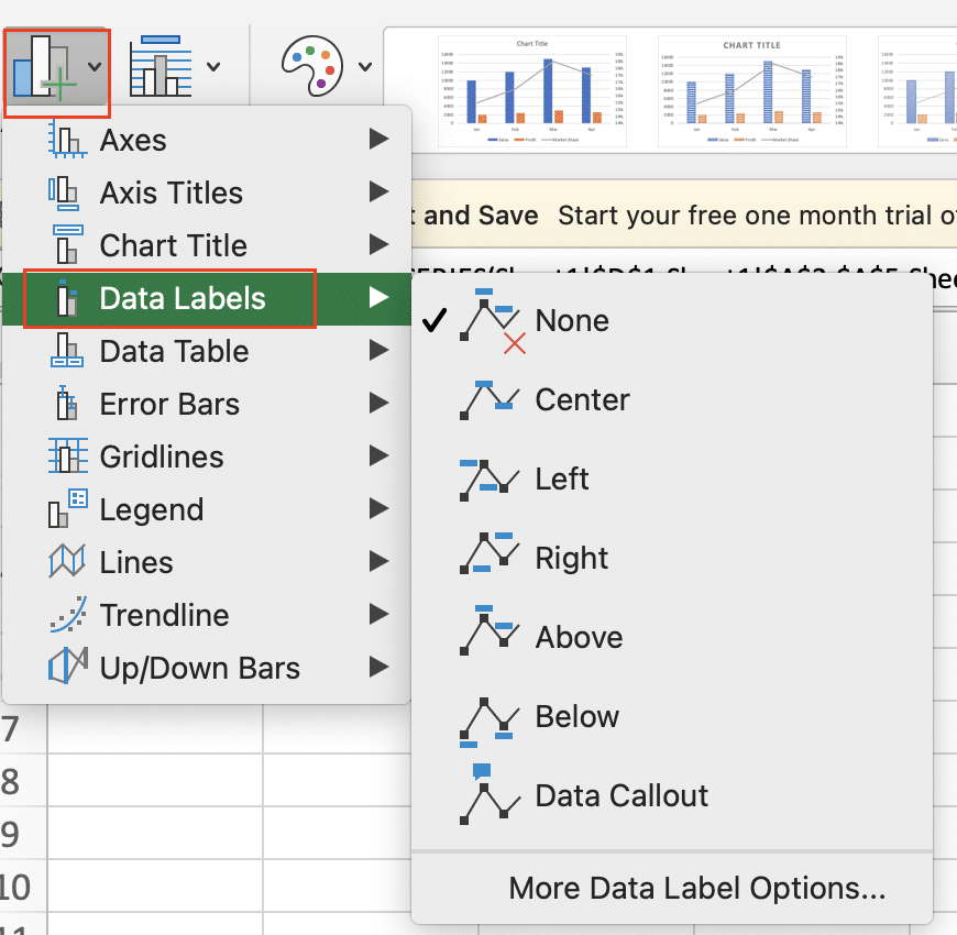
- Choose the appropriate position for your data labels (e.g., inside end, outside end, or center).
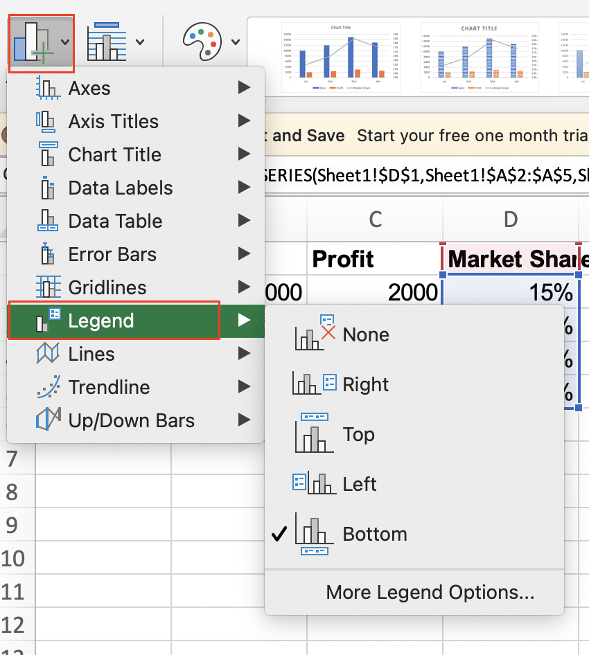
- To add or modify the legend, select “Legend” from the “Add Chart Element” menu and choose your preferred position.
Video Tutorial
Check out the tutorial below for a complete video walkthrough!
Advanced Combo Chart Techniques
To create more sophisticated and informative combo charts, consider implementing these advanced techniques.
Using secondary axes for different scales
- Right-click on a data series and select “Format Data Series.”
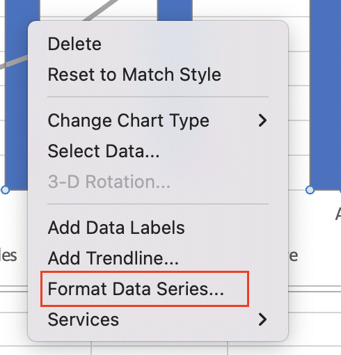
- In the “Series Options” tab, check the box next to “Secondary Axis.”
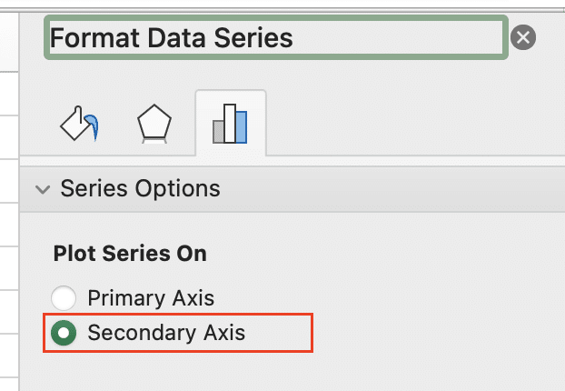
- Excel will create a new vertical axis on the right side of the chart for the selected data series.
- Adjust the scale and formatting of the secondary axis as needed to ensure clear data representation.
Combining more than two chart types
- Follow the steps for changing chart types, as described earlier.
- In the “Change Chart Type” dialog box, select different chart types for three or more data series.
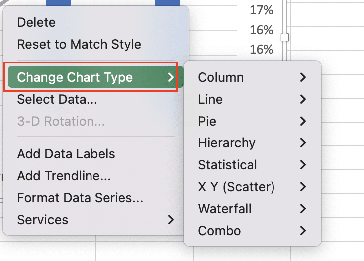
- Experiment with combinations such as columns, lines, and area charts to find the most effective visualization for your data.
Creating dynamic combo charts with formulas
- Use Excel formulas to create dynamic data ranges that update automatically.
- Implement named ranges for your data series and chart labels.
- Create a dropdown list using Data Validation to allow users to select different data views.
- Use INDEX and MATCH functions to dynamically update chart data based on user selection.
Example formula for dynamic data range:
Stop exporting data manually. Sync data from your business systems into Google Sheets or Excel with Coefficient and set it on a refresh schedule.
Get Started
=OFFSET(Sheet1!$A$1,1,0,COUNTA(Sheet1!$A:$A)-1,3)
Conclusion
By following this comprehensive guide, you’ll be well-equipped to create informative and visually appealing combo charts in Excel. Remember to practice and experiment with different data sets and chart combinations to refine your skills.
Ready to take your data visualization to the next level? Start creating powerful combo charts with Coefficient’s real-time data connection capabilities. Get started with Coefficient today and transform your Excel experience!


