
Are you struggling to visualize complex data with multiple variables? Excel’s bubble chart feature might be the solution you’re looking for. This guide will walk you through creating, customizing, and analyzing bubble charts in Excel, helping you unlock powerful insights from your data.
Step-by-Step Guide to Creating a Basic Bubble Chart
Now that your data is prepared, let’s create a basic bubble chart in Excel.
Selecting your data range
- Open your Excel spreadsheet containing the prepared data.
- Click and drag to select the entire data range, including column headers.
- Ensure you’ve selected only the columns you want to include in your chart (X-axis, Y-axis, and bubble size at minimum).
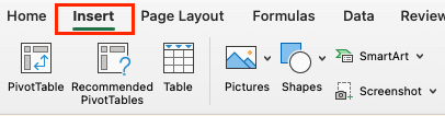
Inserting the bubble chart
- With your data selected, click the “Insert” tab on the Excel ribbon.
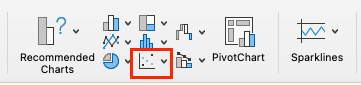
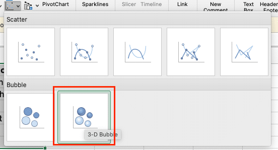
- In the “Charts” section, click on the “Insert Scatter (X, Y) or Bubble Chart” button.
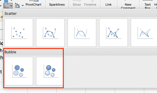
- From the dropdown menu, select “Bubble” or “3-D Bubble” depending on your preference.
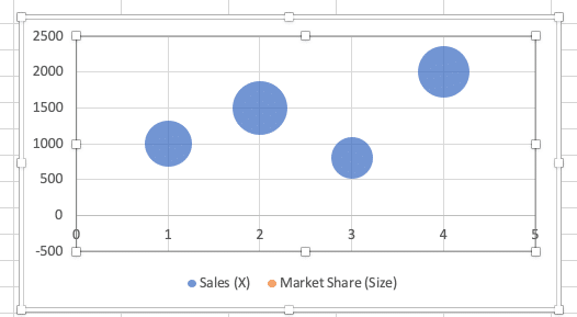
Excel will now create a basic bubble chart based on your selected data.
Customizing chart elements
To make your bubble chart more informative and visually appealing:
- Add a chart title:
- Click on the chart to select it.
- Click the “Add Chart Element” button and select “ Chart Title”
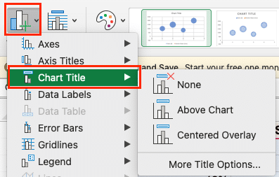
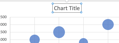
- Select “Chart Title” and enter a descriptive title.
- Label axes:
- Click on the chart to select it.
- Select click the “Add Chart Element” button and select “Axis Title.”
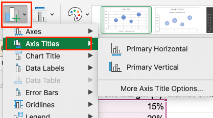
- Click on each axis title to edit the text, providing clear labels for your X and Y variables.
- Add a legend:
- If you’re using colors to represent categories, ensure the “Legend” box is checked in the chart elements menu.
- Click on the chart to select it.
- Click the “Add Chart Element” button and select “Legend”
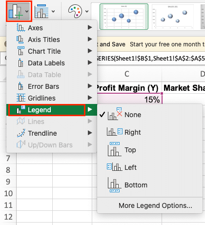
- Click and drag the legend to position it where it doesn’t obscure data points.
- Adjust axis scales:
- Right-click on either axis and select “Format Axis.”
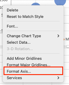
- In the panel that appears, you can set minimum and maximum values, change the scale type (e.g., to logarithmic), and adjust other axis properties.
Video Tutorial
Check out the tutorial below for a complete video walkthrough!
Advanced Bubble Chart Techniques
Once you’re comfortable with basic bubble charts, you can explore more advanced features to enhance your data visualization.
Adding a fourth variable with color
To add color-coding to your bubbles:
- Ensure you have a column in your data set for categories.
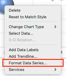
- Right-click on any bubble in your chart and select “Format Data Series.”
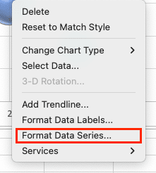
- In the “Fill” section, choose “Vary colors by point.”
- Excel will automatically assign different colors to each category.
To customize colors:
- Click on a bubble to select all bubbles in that category.
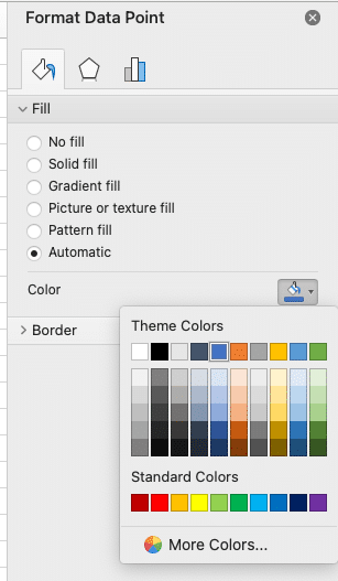
- Right-click and choose “Format Data Point.“
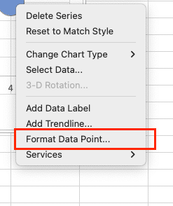
- In the “Fill” section, choose your desired color.
- Repeat for each category.
Creating a 3D bubble chart
While 3D charts can be visually striking, use them judiciously as they can sometimes make data harder to interpret accurately.

Stop exporting data manually. Sync data from your business systems into Google Sheets or Excel with Coefficient and set it on a refresh schedule.
Get Started
To create a 3D bubble chart:
- Follow the same steps as creating a regular bubble chart, but choose “3-D Bubble” from the chart options.
- To adjust the 3D view:
- Right-click on the chart and select “3-D Rotation.”
- Use the sliders to adjust the X, Y, and Z rotation angles.
- Experiment with different perspectives to find the most effective view of your data.
Using formulas to dynamically size bubbles
To create more precise bubble sizes based on your data:
- Add a new column to your data set for calculated bubble sizes.
- Use a formula to normalize your size data. For example: =($D2-MIN($D$2:$D$10))/(MAX($D$2:$D$10)-MIN($D$2:$D$10))*100 This formula scales your size values between 0 and 100.
- Create your bubble chart using this new column for bubble sizes.
Formatting and Styling Your Bubble Chart
A well-formatted bubble chart can significantly enhance data comprehension and visual appeal.
Adjusting bubble size and transparency
- Right-click on any bubble and select “Format Data Series.”
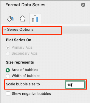
- In the “Series Options” tab:
- Adjust the “Scale Bubble Size” slider to change the overall size of all bubbles.
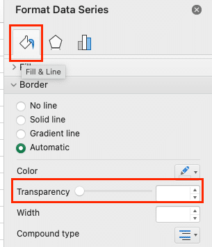
- In the “Fill & Line” section:
- Adjust the “Transparency” slider to make bubbles semi-transparent, which can help when bubbles overlap.
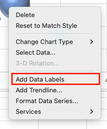
Adding data labels to bubbles
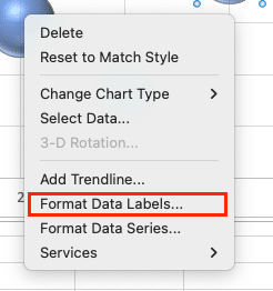
- Right-click on any bubble and select “Add Data Labels.”
- Right-click on a data label and choose “Format Data Labels.”
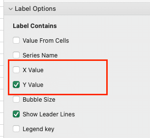
- In the panel that appears:
- Choose which values to display (e.g., X value, Y value, Bubble size)
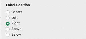
- Adjust the label position (e.g., center, left, right)
- Customize font, size, and color as needed
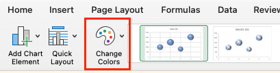
Applying custom color schemes
- Click on your chart to select it.
- Go to the “Chart Design” tab on the ribbon.
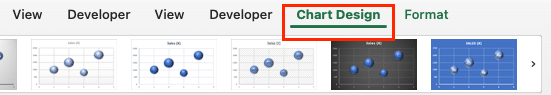
- Click “Change Colors” and select a pre-defined color scheme, or:
- For custom colors:
- Right-click on a bubble and choose “Format Data Series.”
- In the “Fill” section, select “Solid fill” and choose your desired colors.
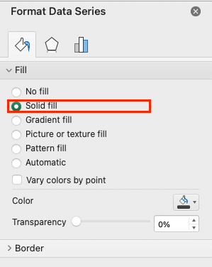
- Repeat for each data series or category.
Conclusion
By mastering these techniques, you’ll be able to create informative, visually appealing bubble charts that effectively communicate complex data relationships. Remember, the key to a great bubble chart is choosing the right variables, preparing your data carefully, and fine-tuning the visual elements to highlight your key insights.
Now that you have the tools to create powerful bubble charts in Excel, why not take your data analysis to the next level? Coefficient offers advanced data integration and automation features that can streamline your workflow and enhance your Excel capabilities. Get started with Coefficient today and unlock new possibilities for your data visualization and analysis projects.


