Are you ready to take your Excel skills to the next level? In this comprehensive guide, we’ll explore the world of area charts in Excel. From basic 2D charts to advanced stacked and 3D variations, you’ll learn how to create visually appealing charts that effectively showcase data trends. Let’s dive in and discover how to enhance your data analysis skills using Excel’s powerful charting tools.
What Are Area Charts and Why Should You Care?
Before we jump into the nitty-gritty of creating area charts, let’s take a moment to understand what they are and why they matter.
The Lowdown on Area Charts
Area charts are graphical representations of data that display how one or more quantities change over time. They’re similar to line charts, but the area between the line and the x-axis is filled with color or shading. This filling makes it easier to visualize the magnitude of each data point and compare multiple data series.
Types of Area Charts: More Than Meets the Eye
Excel offers several types of area charts to suit different data visualization needs:
- 2D Area Charts: The simplest form, ideal for showing trends in a single data series.
- 3D Area Charts: Add depth to your visualization, making it more visually striking.
- Stacked Area Charts: Perfect for comparing multiple data series and their contribution to the whole.
- 100% Stacked Area Charts: Show the relative percentage of multiple data series, always totaling 100%.
When to Use Area Charts: The Right Tool for the Job
Area charts shine in specific scenarios:
- Tracking changes over time
- Comparing multiple data series
- Showing part-to-whole relationships
- Highlighting cumulative totals
For example, an area chart could effectively display monthly sales figures for different product categories, allowing you to see how each category contributes to total sales over time.
Creating a Basic Area Chart in Excel
Let’s walk through the process of creating a simple 2D area chart in Excel.
Preparing your data
- Open a new Excel worksheet.
- Enter your data in columns, with categories (e.g., dates) in the first column and values in subsequent columns.
- Ensure your data is organized consistently, with no blank rows or columns.
Example data structure:
| Date | Product A | Product B | Product C |
| 2023-01-01 | 100 | 150 | 75 |
| 2023-02-01 | 120 | 140 | 80 |
| 2023-03-01 | 110 | 160 | 90 |
| 2023-04-01 | 130 | 155 | 85 |
Step-by-step guide to inserting an area chart
- Select the data range you want to include in your chart.
- Click the “Insert” tab on the Excel ribbon.

- In the “Charts” group, click “Insert Area or Surface Chart.“
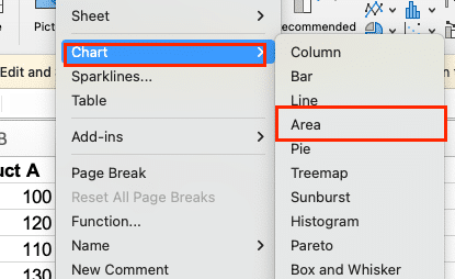
Excel will create a basic area chart based on your selected data.
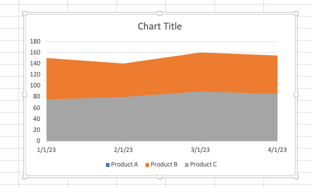
Customizing chart elements
To enhance your chart’s appearance and clarity:
- Chart Title:
- Double-click the chart title to edit it.
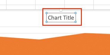
- Enter a descriptive title, e.g., “Monthly Sales by Product”
- Legend:
- Right-click the legend and select “Format Legend.”
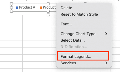
- Choose the position (e.g., right, bottom) that works best for your chart.
- Axes:
- Right-click an axis and select “Format Axis.”
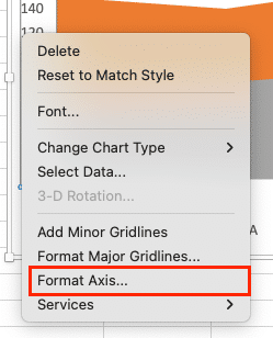
- Adjust scale, labels, and tick marks as needed.
- For the date axis, set an appropriate time unit (e.g., months, quarters).
- Data Labels:
- Right-click a data series and choose “Add Data Labels.”
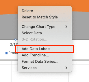
- Format labels to show values, percentages, or custom information.
Taking It Up a Notch: Advanced Area Chart Techniques
Ready to level up your area chart game? Let’s explore some advanced techniques.
Stacked Area Charts: Layering Data for Deeper Insights
Stacked area charts are great for showing how different categories contribute to a whole over time. Here’s how to create one:
- Follow the steps to create a basic area chart.
- Right-click on your chart and select “Change Chart Type.”
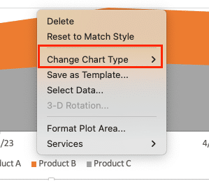
- Choose “Line > Stacked Area” from the options.
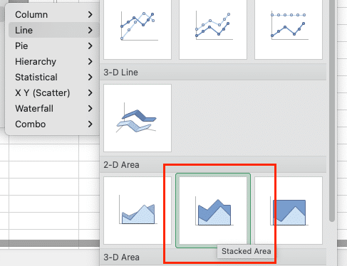
Your data series will now stack on top of each other, showing both individual values and the total.
100% Stacked Area Charts: Focusing on Proportions
When you’re more interested in the relative percentage each category contributes rather than absolute values, a 100% stacked area chart is your friend. To create one:
- Start with a stacked area chart.
- Right-click and select “Change Chart Type.”

- Choose “Line > 100% Stacked Area.”
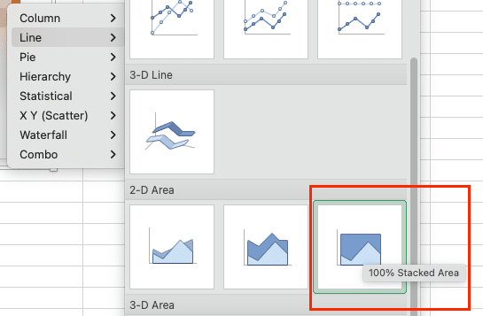
Now your chart will always total 100%, clearly showing the proportion of each category.
3D Area Charts: Adding Depth to Your Data
While 3D charts can sometimes be harder to read, they can add visual interest to your presentations. To create a 3D area chart:
- Follow the steps for a basic area chart.
- When selecting the chart type, choose “3-D Area” instead of “2-D Area.”
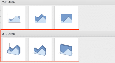
Remember, with great power comes great responsibility – use 3D charts judiciously to avoid confusing your audience.
Making Your Area Charts Pop: Design Tips and Tricks
A well-designed chart can make the difference between confusing your audience and wowing them. Let’s explore some ways to enhance your area charts.
Stop exporting data manually. Sync data from your business systems into Google Sheets or Excel with Coefficient and set it on a refresh schedule.
Get Started
Color Your World: Applying Custom Colors and Styles
Excel’s default colors are fine, but customizing your chart’s appearance can make it more engaging and on-brand. Here’s how:
- Click on your chart to select it.
- Right-click on the chart select “Format data series.”
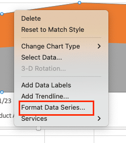
- Use the “Shape Fill” dropdown to choose custom colors for your data series.
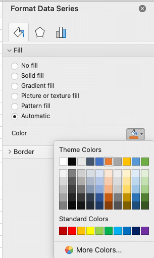
- Experiment with different chart styles in the “Chart Styles” section for a quick makeover.
Pro tip: Choose colors that contrast well and are easy to distinguish, especially if you’re using a stacked area chart.
Labels and Lines: Adding Context to Your Chart
Data labels and trendlines can provide additional context and make your chart more informative:
- To add data labels, click the “Add Chart Element” button and select “Data Labels.”
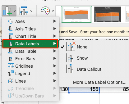
- For trendlines, use the same button but select “Trendline” instead.
Experiment with different label positions and trendline types to find what works best for your data.
Two Axes Are Better Than One: Using Secondary Axes
When you’re dealing with data series that have significantly different scales, a secondary axis can be a game-changer:
- Right-click on a data series and select “Format Data Series.”

- In the “Series Options” tab, check “Plot Series on Secondary Axis.”
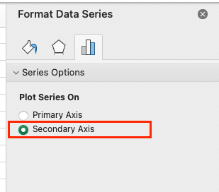
This technique is particularly useful when comparing data with different units of measurement.
Wrapping Up: Your Journey to Area Chart Mastery
Congratulations! You’ve just completed a comprehensive tour of area charts in Excel. From understanding the basics to troubleshooting common issues and applying best practices, you’re now equipped to create compelling, informative area charts that will elevate your data visualization game.
Remember, the key to mastering area charts (and any data visualization technique) is practice. Don’t be afraid to experiment with different chart types, color schemes, and data arrangements. The more you work with area charts, the more intuitive they’ll become.
Ready to put your new skills to the test? Why not start by creating an area chart with your own data? Or better yet, take a look at some of your existing charts and see if an area chart might tell the story more effectively.
For more advanced Excel techniques and data analysis tools, check out Coefficient’s solutions. We’re here to help you take your data game to the next level.

