Data visualization best practices help transform complex data into easily digestible, actionable insights. By following these guidelines, you can create compelling visuals that engage your audience, communicate key findings, and drive data-driven decision-making.
In this guide, we’ll explore essential data visualization best practices and tips for creating impactful charts and dashboards.
1. Know Your Audience
Before diving into design, take time to understand your target audience. Consider their roles, technical knowledge, and the information they need most. Tailor your language and visuals to their preferences and expertise level.
Pro Tip: Create user personas to help you better understand your audience’s needs and preferences. This will guide your design choices and ensure your visualizations resonate with your target users.
2. Choose the Right Chart Type
Selecting the appropriate chart type is crucial for effectively communicating your data story. Consider the nature of your data and the message you want to convey.
When choosing a chart type, ask yourself:
- What is the main message I want to convey?
- What type of data am I working with (categorical, time-series, etc.)?
- Which chart type will most effectively showcase the patterns or trends in my data?
3. Design with Clarity and Purpose
Simplicity is key in data visualization. Focus on making your charts easy to read and understand at a glance. Use clear labels, concise titles, and intuitive layouts to guide your audience through the information.
Pro Tip: Apply the “5-second rule” when designing your visualizations. If your audience can’t understand the main message within 5 seconds, consider simplifying your design.
4. Use Color Strategically
Color is a powerful tool in data visualization, but it should be used purposefully. Choose a color scheme that enhances comprehension and aesthetics, ensuring sufficient contrast for accessibility.
When using color in your visualizations, consider:
- Using a consistent color palette throughout your dashboard or report
- Limiting your color palette to 3-5 colors to avoid visual clutter
- Using color to highlight important patterns or trends
5. Leverage Live Data for Real-Time Insights
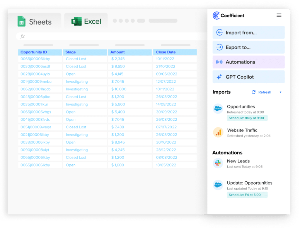
Live data connections ensure your visualizations always display the most current information. Tools like Coefficient offer seamless integration with Google Sheets, enabling automated data import and live connections.
Pro Tip: Coefficient also offers a collection of pre-built dashboards templates for various business needs, such as marketing, sales, and finance. These templates provide a solid foundation for your visualizations, saving you time and effort. Customize the templates to suit your specific requirements and data sources.
6. Ensure Data Accuracy and Integrity
Data accuracy is foundational to creating trustworthy visualizations. Before designing your charts, prioritize data cleaning and validation.
To maintain data accuracy and integrity, consider:

Stop exporting data manually. Sync data from your business systems into Google Sheets or Excel with Coefficient and set it on a refresh schedule.
Get Started
- Establishing data governance policies and procedures
- Regularly auditing your data sources and processes
- Implementing data validation checks in your workflows
7. Make It Interactive
Interactive visualizations allow users to explore data at their own pace and uncover relevant information. Coefficient’s interactive dashboards empower users to dive deeper into the data and discover meaningful trends.
Pairing interactive dashboards with auto-notifications can be incredibly powerful. This combination allows stakeholders to explore data in real time while staying informed about important changes, enabling teams to make data-driven decisions quickly and efficiently.
For example, Miro uses Coefficient to create an automated lead router integrated with Salesforce. This system enables more efficient lead management and provides the team with real-time insights into lead velocity and funnel performance.
Read more about Miro’s success story.
8. Prioritize Accessibility
Ensure your data visualizations are accessible to all users, including those with visual impairments. Use sufficient color contrast, provide alternative text for images, and design your charts to be understandable without relying solely on color.
To create accessible data visualizations, follow these guidelines:
- Use a color contrast ratio of at least 4.5:1 for text and important visual elements
- Provide alternative text for images and charts, describing their content and purpose
- Ensure your visualizations are keyboard-navigable and compatible with assistive technologies
Elevate Your Data Visualizations with Coefficient
By following data visualization best practices and leveraging tools like Coefficient, professionals can create accurate, accessible, and impactful visualizations that drive better decision-making.
Try Coefficient today and unlock the power of data visualization in Google Sheets.


