Understanding your Customer Acquisition Cost (CAC) is not only best practice, it’s also a game-changer for any business. It provides insights into your marketing efforts’ efficiency and customer relationships’ profitability so you know where to invest.
However, accurately calculating CAC can be complex, especially when the data you need resides in multiple systems, native reporting limitations arise in SaaS systems, manual spreadsheet refreshes are embedded into your workflow, or advanced spreadsheet skills are required.
In this blog, we’ll provide a step-by-step guide on how to perform a customer acquisition cost analysis using multiple data sources.
You can pull data from any of your source systems – but in this specific example, we’ll pull data from Snowflake and HubSpot, demonstrating how to calculate CAC and visualize costs and deals over time – all within the familiar environment of your spreadsheet.
Walkthrough: How to Calculate Customer Acquisition Cost in Google Sheets
Before we dive into the analysis, the first step is to install Coefficient, a free Google Sheets add-on that seamlessly connects your favorite business solutions to your spreadsheet.
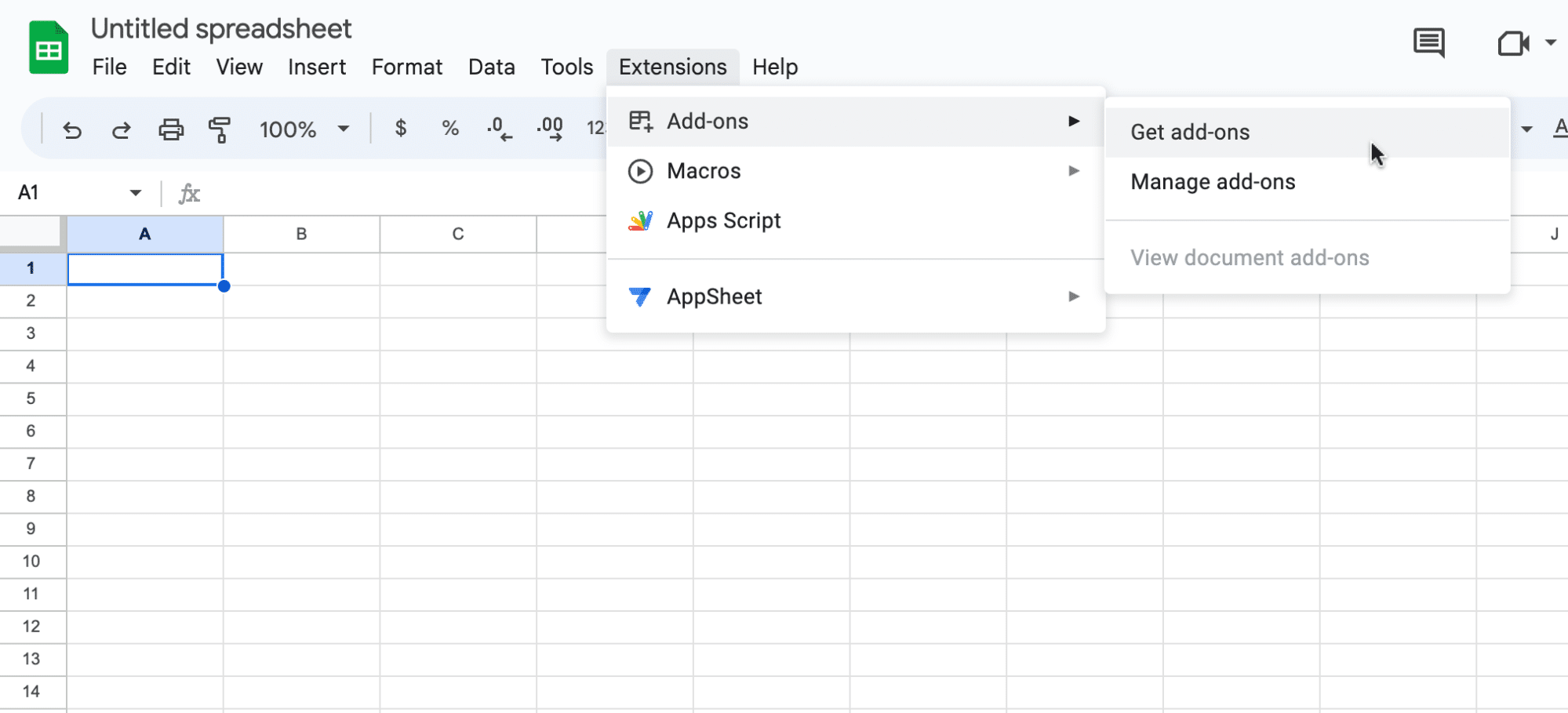
Open Google Sheets. Click Extensions on the menu bar and select ‘Add-ons’ -> ‘Get add-ons.’
![before you start your CAC analysis, install coefficient](https://coefficient.io/wp-content/uploads/2023/07/CAC-analysis-install-coefficient.png)
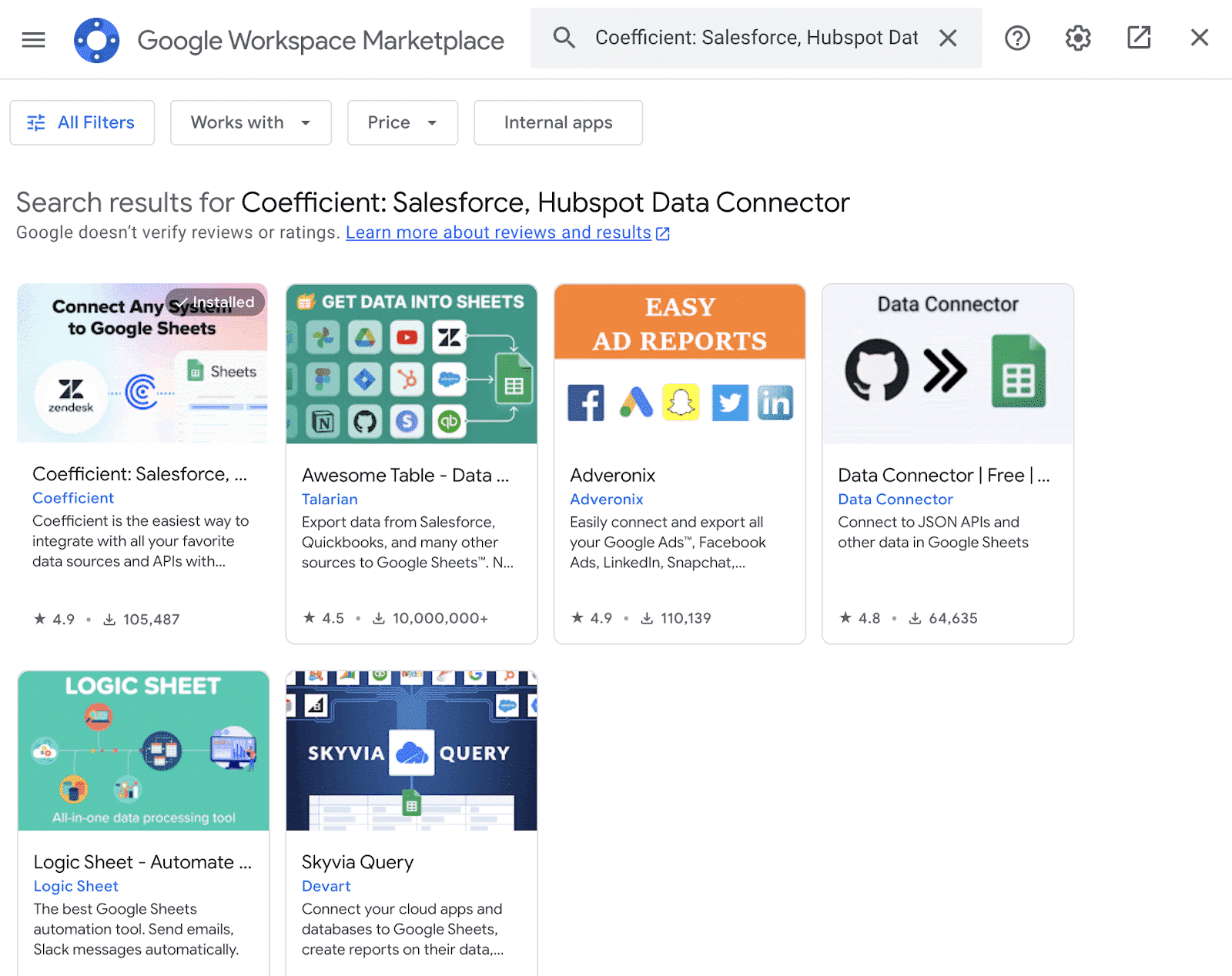
This will launch Google Workspace Marketplace. In the search bar at the top, search for “Coefficient” and select the Coefficient app.
![search for the coefficient data connector in the google workspace marketplace](https://coefficient.io/wp-content/uploads/2023/07/CAC-analysis-coefficient-google-marketplace.png)
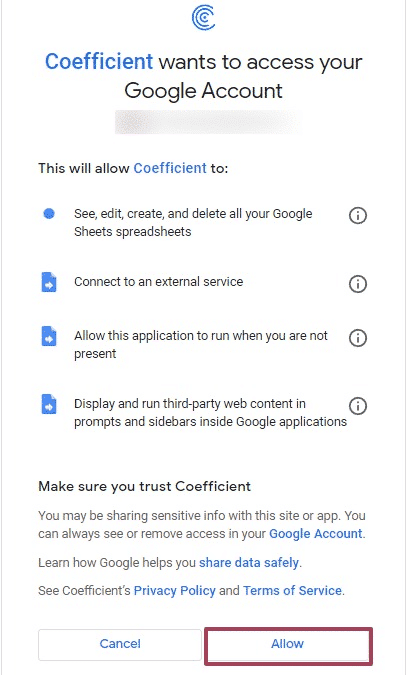
Grant Coefficient access to your Google account by pressing ‘Allow.’
![grant coefficient permission to access your google account](https://coefficient.io/wp-content/uploads/2023/07/CAC-analysis-grant-coefficient-permission.png)
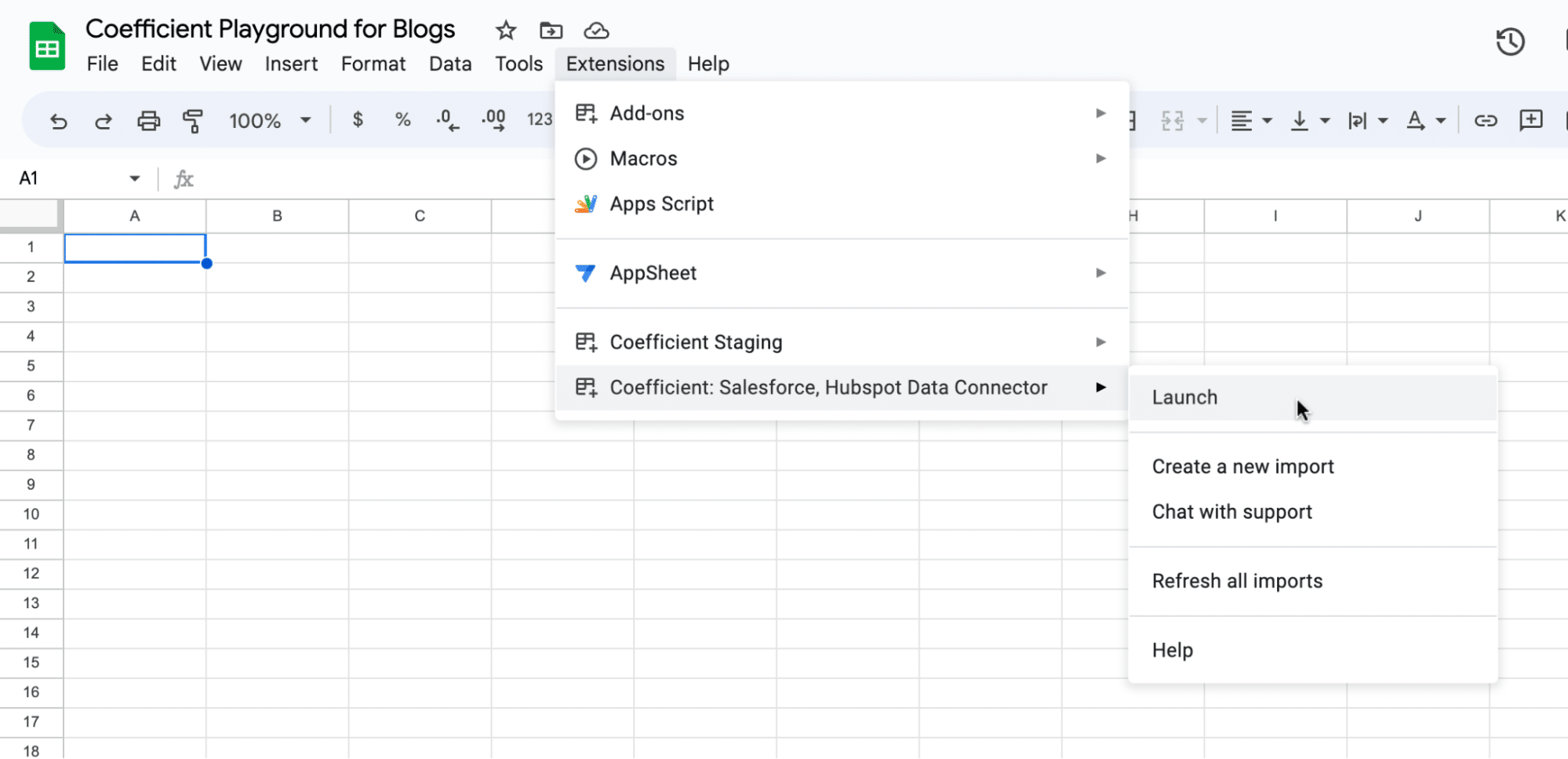
Then, return to your Google Sheets menu and click on Extensions -> Coefficient -> Launch.
![launch coefficeint through extensions in the top nav](https://coefficient.io/wp-content/uploads/2023/07/CAC-analysis-launch-coefficient.png)
Coefficient will appear on the sidebar of your Google Sheet. Now you can import your live data into Google Sheets.
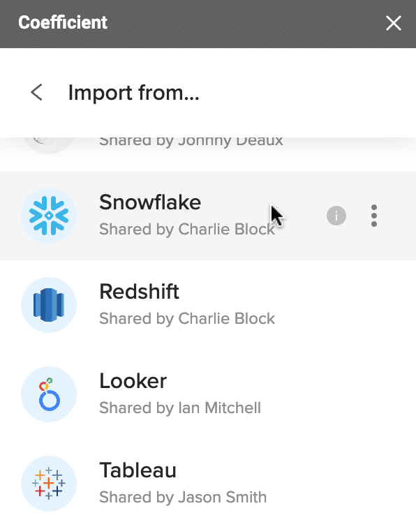
We’ll start with your Snowflake Data, to import your marketing cost by channel data.
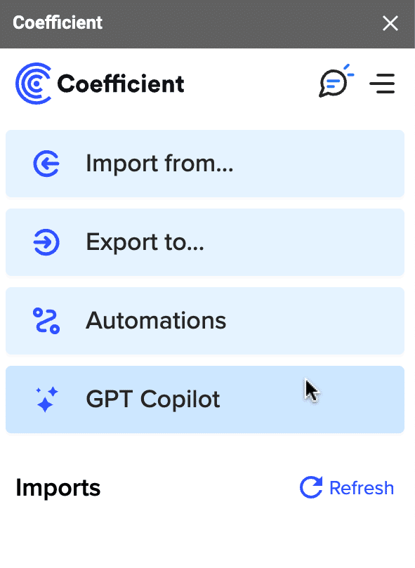
Click ‘Import from…’ on the Coefficient sidebar menu.
![import your live data google sheets](https://coefficient.io/wp-content/uploads/2023/07/CAC-analysis-import-data.png)
Scroll down the sidebar to select Snowflake as your data source.
![select snowflake as your data source](https://coefficient.io/wp-content/uploads/2023/07/CAC-analysis-snowflake-data-source.png)
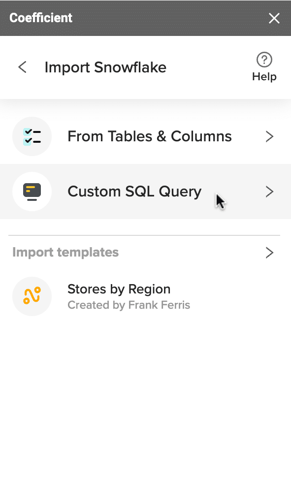
Click ‘Create a custom SQL Query.’
![click create a custom SQL query](https://coefficient.io/wp-content/uploads/2023/07/CAC-analysis-create-custom-query.png)
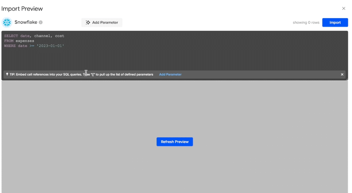
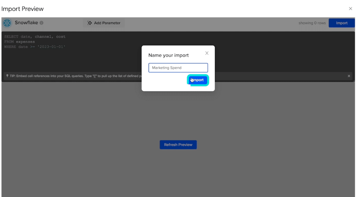
Write your query and click the ‘Import’ button at the top right corner of the window.
![write your query](https://coefficient.io/wp-content/uploads/2023/07/CAC-analysis-write-your-query-.png)
You will be prompted to name your import. In this example, “Marketing Spend.” Click the ‘Import’ button once more.
![name your query before importing](https://coefficient.io/wp-content/uploads/2023/07/CAC-analysis-name-query.png)
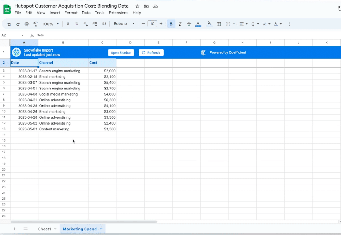
Your live data will automatically populate in your Google Sheet like below.
![your live data will automatically populate your spreadsheet](https://coefficient.io/wp-content/uploads/2023/07/CAC-analysis-automatic-data-population.png)
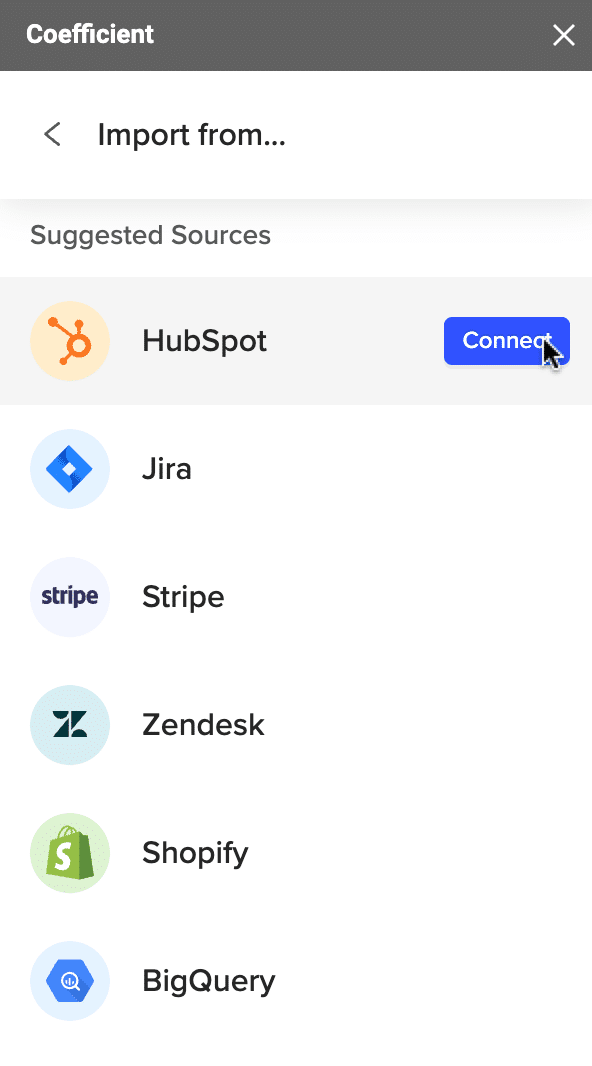
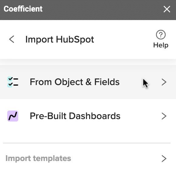
We’ll repeat this process to import your Hubspot data.
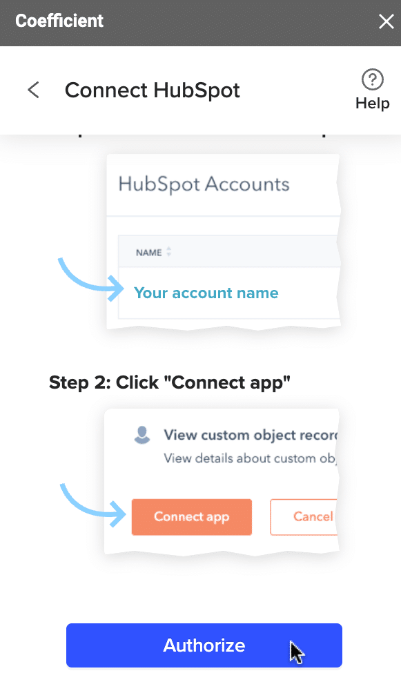
Return to the Coefficient menu -> ‘Import from..’ -> ‘Hubspot.’ Click ‘Connect.’
![import data from hubspot](https://coefficient.io/wp-content/uploads/2023/07/CAC-analysis-import-hubspot-data.png)
Now click ‘Authorize’ to grant Coefficient permission to access your HubSpot account.
![grant coefficient permission to access your hubspot account](https://coefficient.io/wp-content/uploads/2023/07/CAC-analysis-authorize-hubspot-access.png)
Click ‘From Objects & Fields.’
![select which objects and fields you want to import](https://coefficient.io/wp-content/uploads/2023/07/CAC-analysis-objects-fields-hubspot.png)
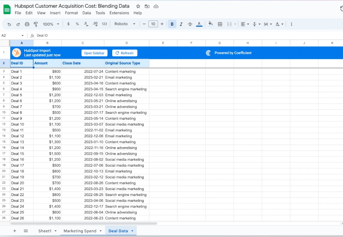
Select ‘Deals’ from the list of objects.
![select deals as your object](https://coefficient.io/wp-content/uploads/2023/07/CAC-analysis-deals-object.png)
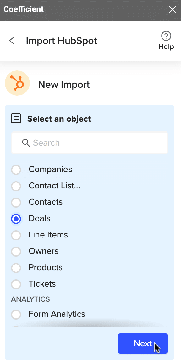
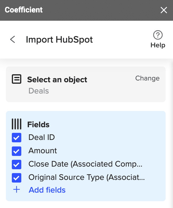
Click ‘Next’ and select your desired fields into the search bar: ‘Deal ID,’ ‘Amount,’ ‘Close Date,’ and ‘Original Source Type.’
![select deal ID, amount, close data and original source type as fields](https://coefficient.io/wp-content/uploads/2023/07/CAC-analysis-choose-hubspot-fields.png)
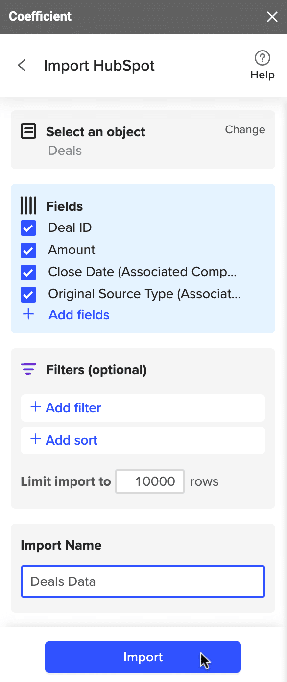
Name your import and click ‘Import.’
![name your import and click import](https://coefficient.io/wp-content/uploads/2023/07/CAC-analysis-name-hubspot-import.png)
Your deal data will automatically import to your spreadsheet in a separate tab.
![hubspot data will now populate your spreadsheet in a new tab](https://coefficient.io/wp-content/uploads/2023/07/CAC-analysis-hubspot-data-tab.png)
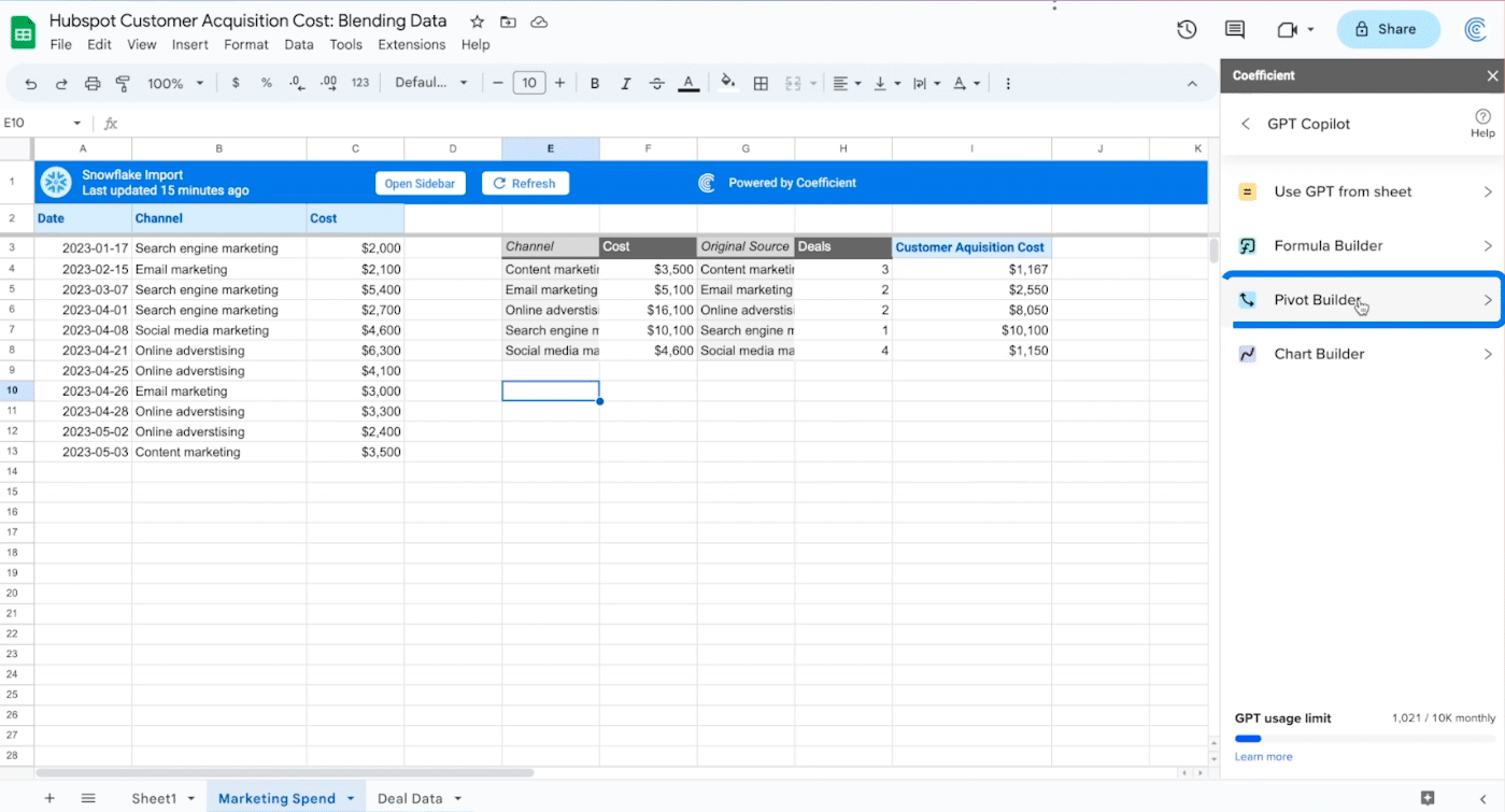
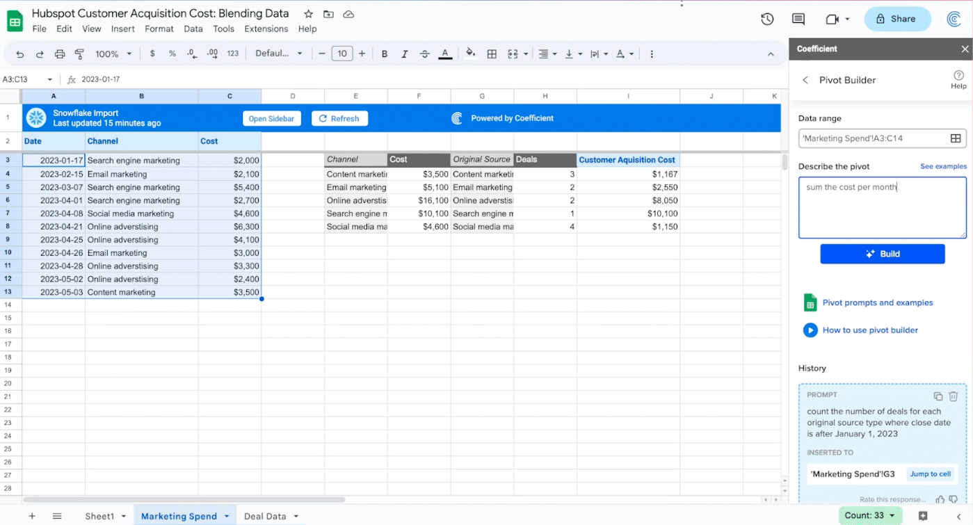
Next, we’ll walk through calculating CAC using two pivot tables: one to sum the cost for each channel, and another to count the number of deals from each channel source.
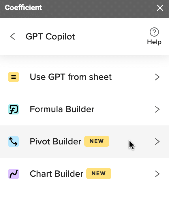
Return to the Coefficient menus and click ‘GPT Copilot.’
![return to the main menu and choose gpt copilot](https://coefficient.io/wp-content/uploads/2023/07/CAC-analysis-gpt-copilot.png)
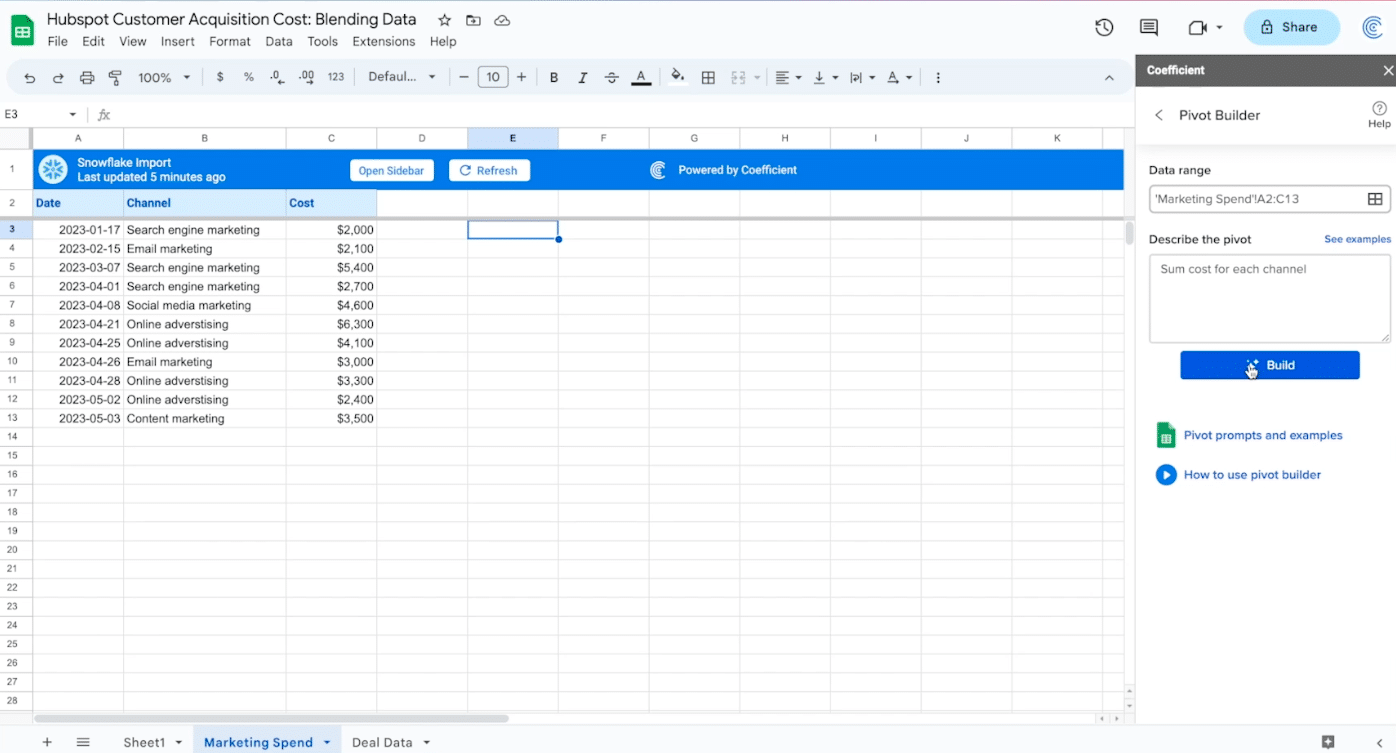
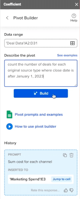
Select ‘Pivot Builder.’
![select pivot builder from the menu](https://coefficient.io/wp-content/uploads/2023/07/CAC-analysis-pivot-builder.png)
Select the data range for the table.
![choose the data range for analysis](https://coefficient.io/wp-content/uploads/2023/07/CAC-analysis-choose-data-range.png)
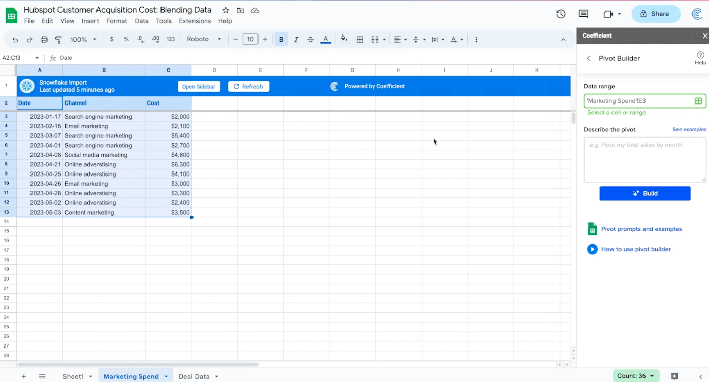
Now describe the pivot you want the Pivot Builder to create: “Sum the cost for each channel.”
Click the ‘Build’ button.
![describe the pivot you want to build](https://coefficient.io/wp-content/uploads/2023/07/CAC-analysis-describe-pivot.png)
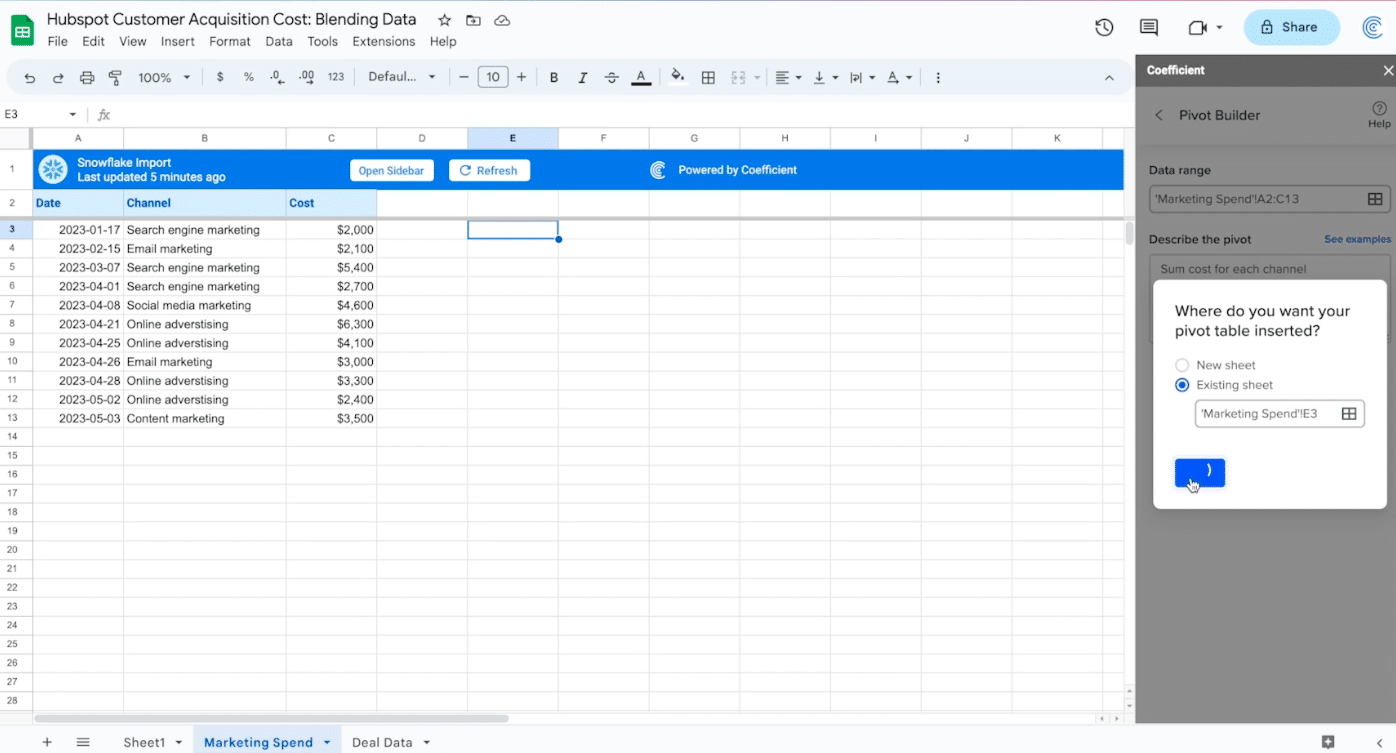
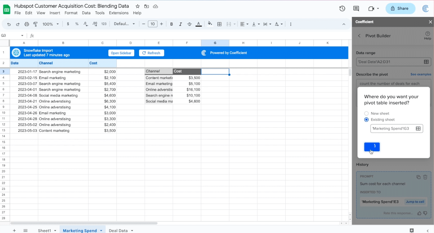
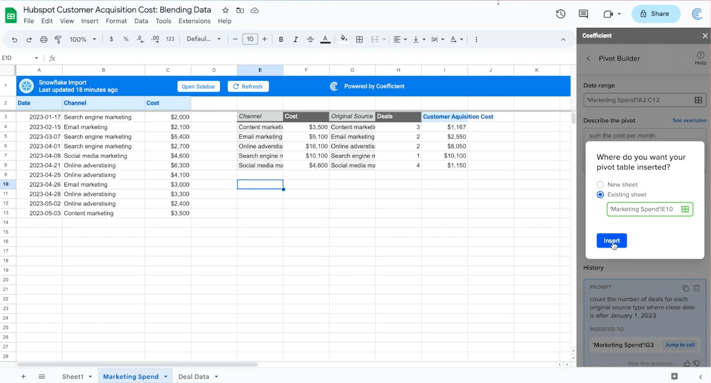
Insert your pivot table into the existing sheet by selecting an empty cell.
![import the pivot into your existing sheet](https://coefficient.io/wp-content/uploads/2023/07/CAC-analysis-import-pivot.png)
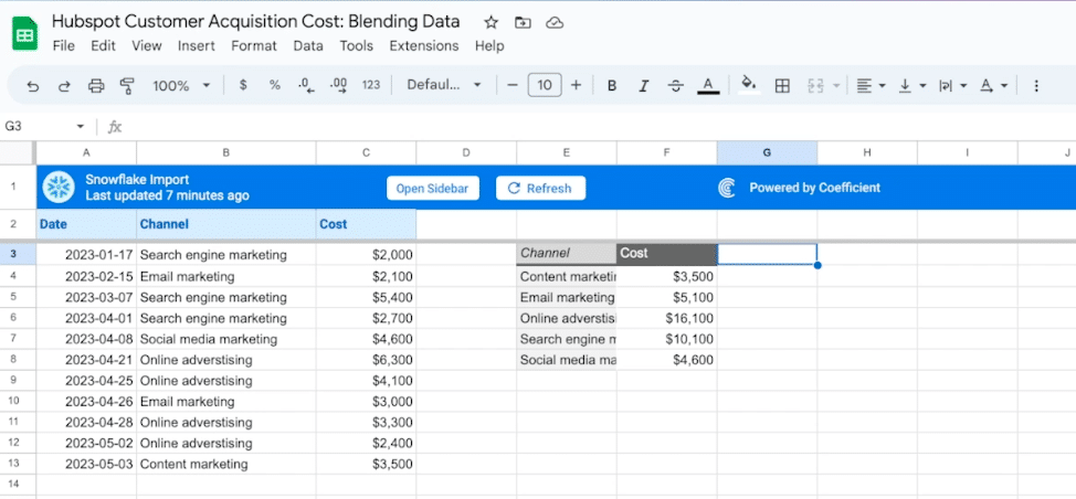
Wait a few seconds and your pivot table will automatically populate your spreadsheet.
![now we'll create a new pivot table](https://coefficient.io/wp-content/uploads/2023/07/CAC-analysis-create-new-pivot.png)
We’ll repeat this process for the deal data.
![select the data range for analysis once again](https://coefficient.io/wp-content/uploads/2023/07/CAC-analysis-select-new-pivot-range.png)
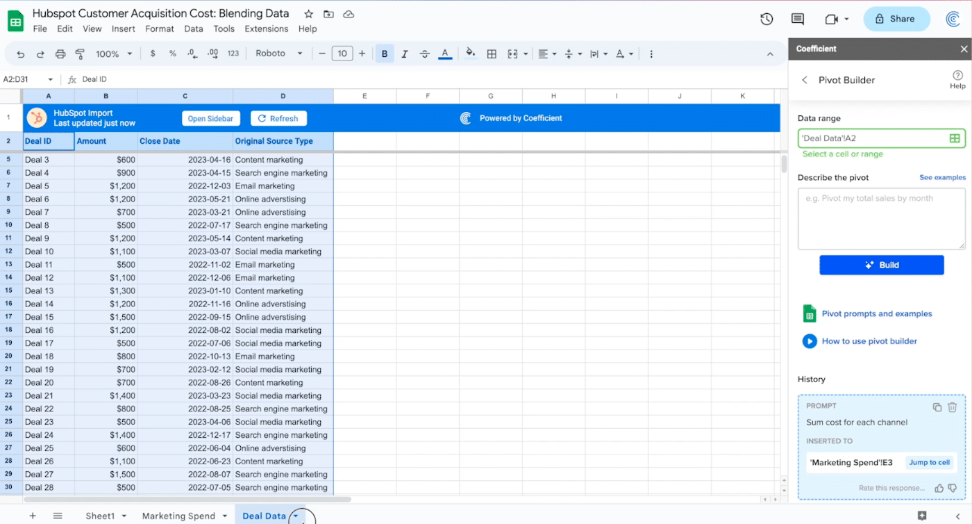
After selecting the data range, describe the formula you want to build: “count the number of deals for each original source type where the close date is after January 1, 2023.”
Click ‘Build.’
![describe the next pivot as before](https://coefficient.io/wp-content/uploads/2023/07/CAC-analysis-describe-new-pivot.png)
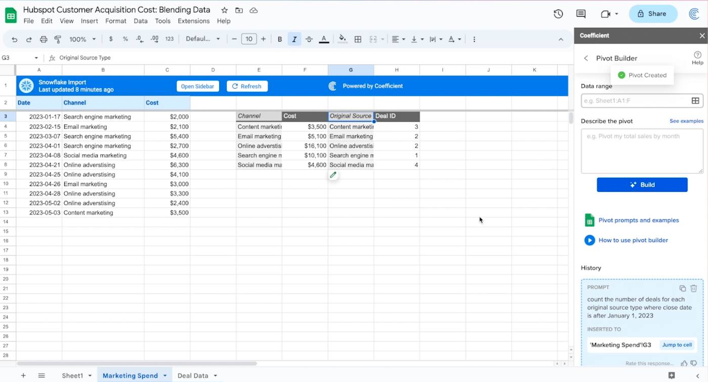
Insert your new pivot table in the Marketing Spend tab beside your first pivot table.
![insert this pivot table besides the first](https://coefficient.io/wp-content/uploads/2023/07/CAC-analysis-insert-new-pivot.png)
The output should like this:
![you should now have two pivots next to one another](https://coefficient.io/wp-content/uploads/2023/07/CAC-analysis-two-pivots.png)
Now you can calculate the customer acquisition costs.
![Coefficient Excel Google Sheets Connectors](https://coefficient.io/wp-content/uploads/2024/02/Coefficient-Excel-Google-Sheets-Connectors-1024x783.png)
Stop exporting data manually. Sync data from your business systems into Google Sheets or Excel with Coefficient and set it on a refresh schedule.
![](https://coefficient.io/wp-content/uploads/2024/02/blog-form-cta.png)
Create a new column next to your two pivot tables and label it ‘Customer Acquisition Cost.’
![calculate CAC by dividing the cost by the number of deals made](https://coefficient.io/wp-content/uploads/2023/07/CAC-analysis-calculate-CAC.png)
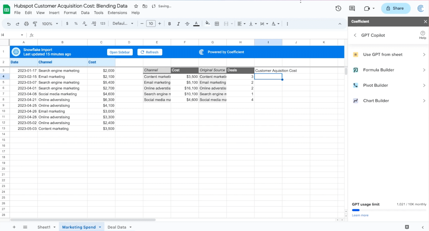
Customer Acquisition Cost is calculated by cost divided by the number of deals made: “=F4/H4”
![apply the previous formula to each cell](https://coefficient.io/wp-content/uploads/2023/07/CAC-analysis-apply-formula.png)
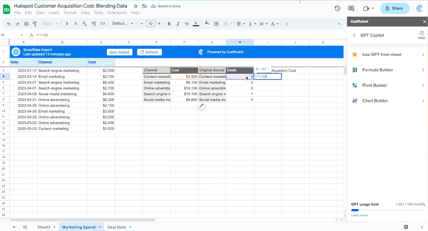
Apply the formula down the column.
![create a third pivot table](https://coefficient.io/wp-content/uploads/2023/07/CAC-analysis-create-third-pivot.png)
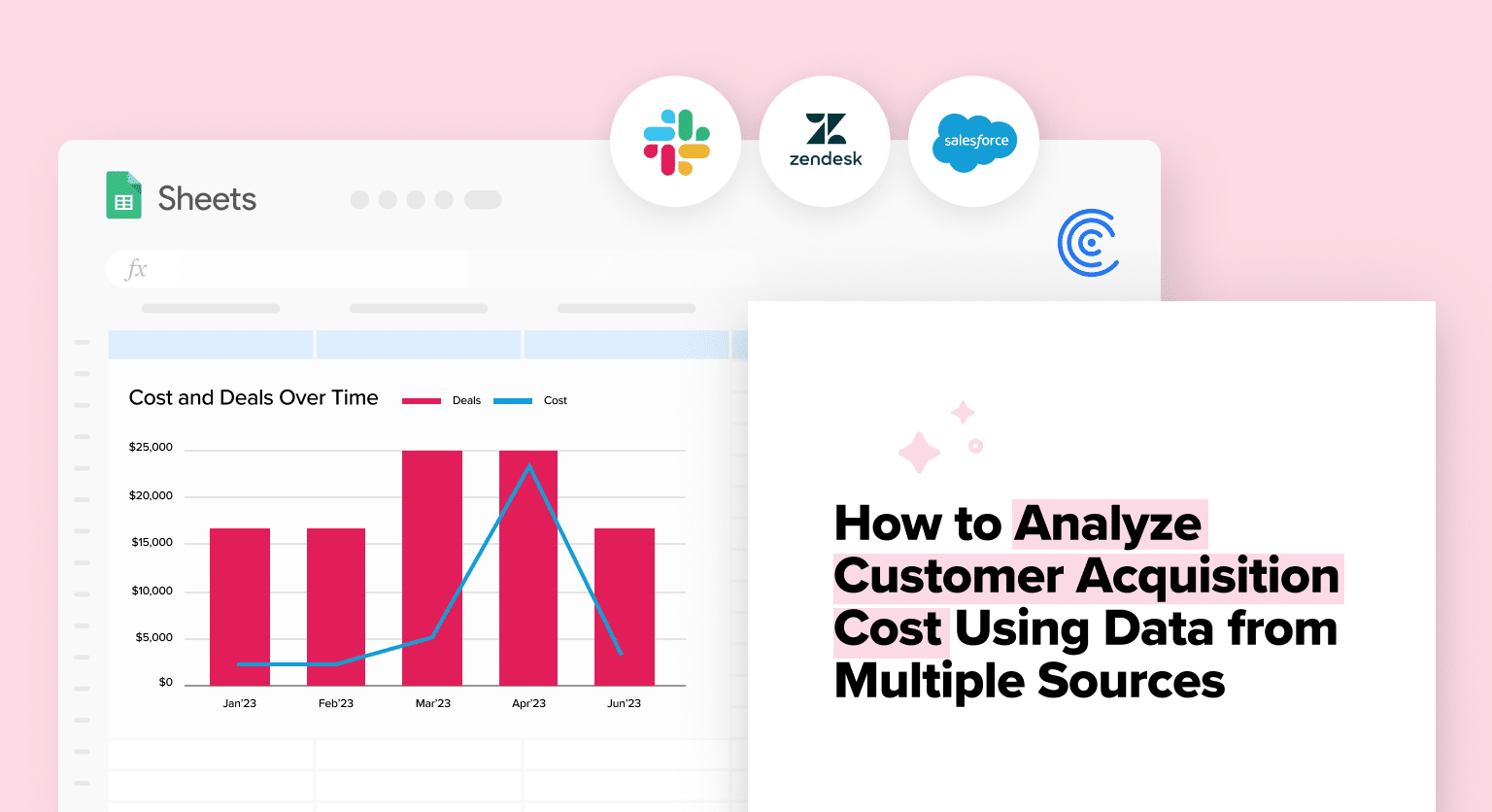
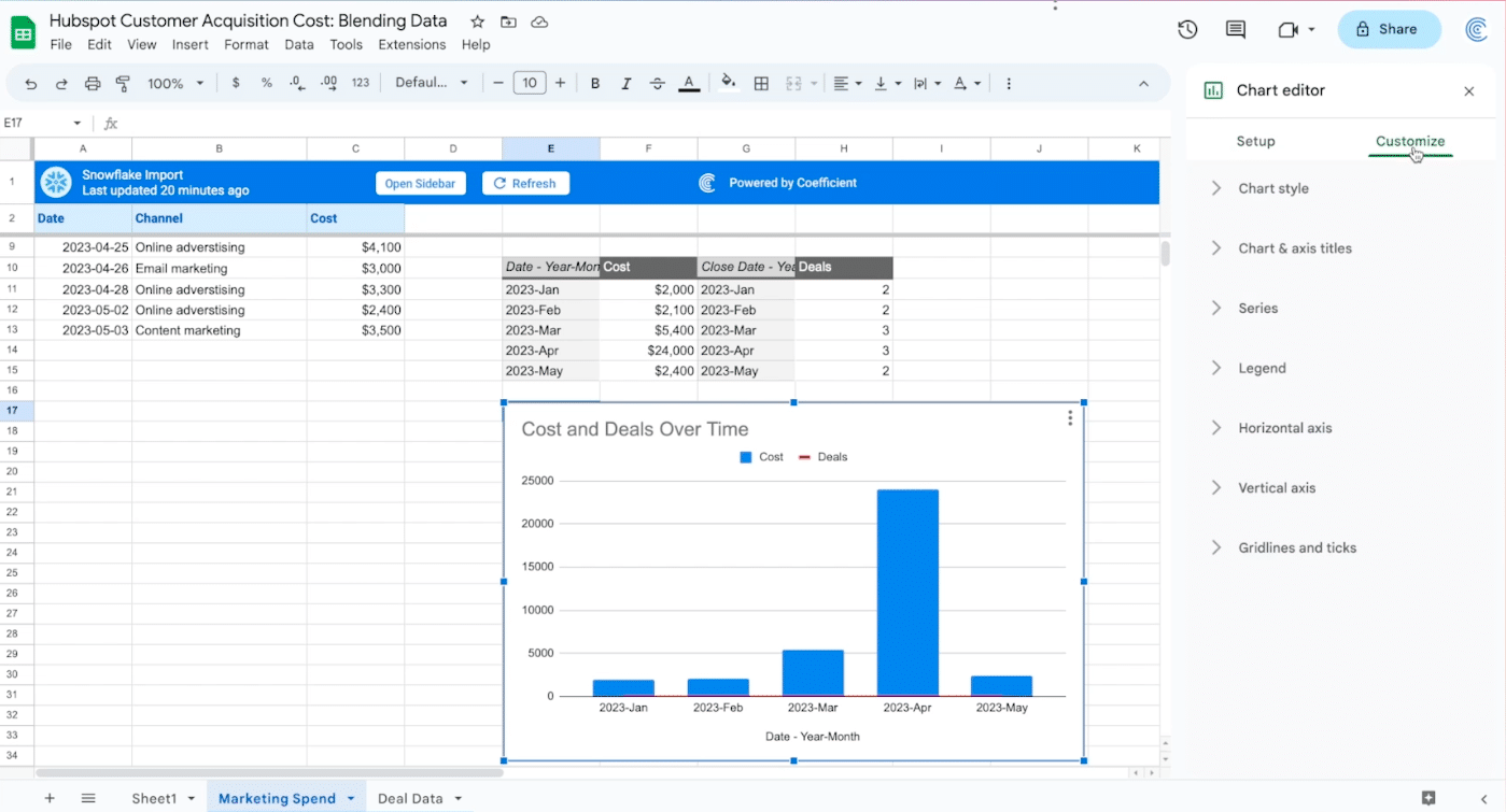
Finally, we visualize costs and deals over time with a combo chart, providing a clear visual representation of your CAC over time.
Return to the GPT Copilot menu and select ‘Pivot Builder.’
![select pivot builder from the menu](https://coefficient.io/wp-content/uploads/2023/07/CAC-analysis-pivot-builder.png)
Describe the Pivot you want to build from each data set: “Sum the cost per month.”
![describe the pivot to build](https://coefficient.io/wp-content/uploads/2023/07/CAC-analysis-describe-third-pivot.png)
Insert the table in the existing sheet.
![insert the new pivot into an empty cell below the other two](https://coefficient.io/wp-content/uploads/2023/07/CAC-analysis-insert-third-pivot.png)
Return to the pivot builder and describe the last pivot table, this time using your deal data: “count the number of deals per month close data starting in January 1, 2023.”
![build your fourth pivot table next to the third](https://coefficient.io/wp-content/uploads/2023/07/CAC-analysis-fourth-pivot-table.png)
Your output will look like this.
![create a combo chart](https://coefficient.io/wp-content/uploads/2023/07/CAC-analysis-create-combo-chart.png)
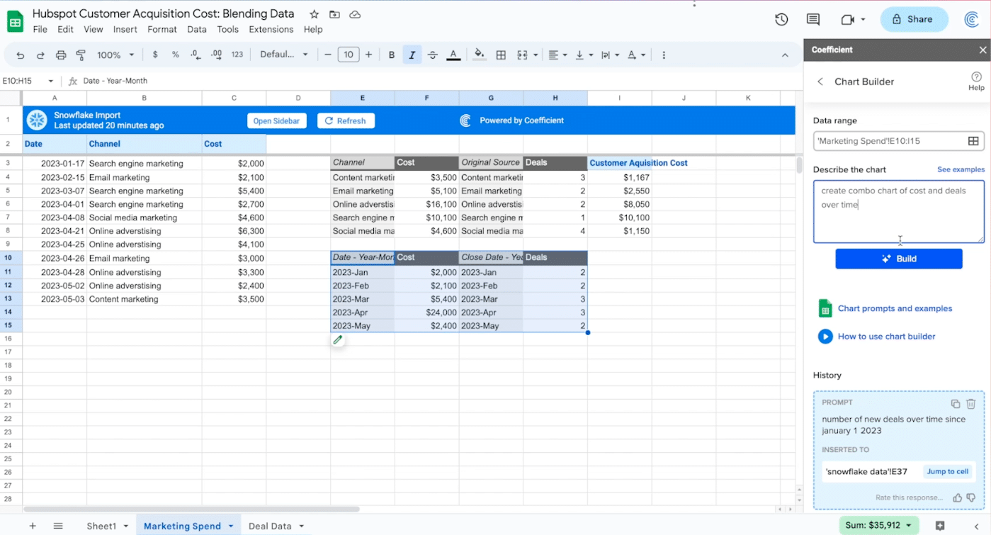
Finally, you’ll make a combo table: “create a combo chart of cost and deals over time.”
![describe the chart you wish to build](https://coefficient.io/wp-content/uploads/2023/07/CAC-analysis-chart-builder.png)
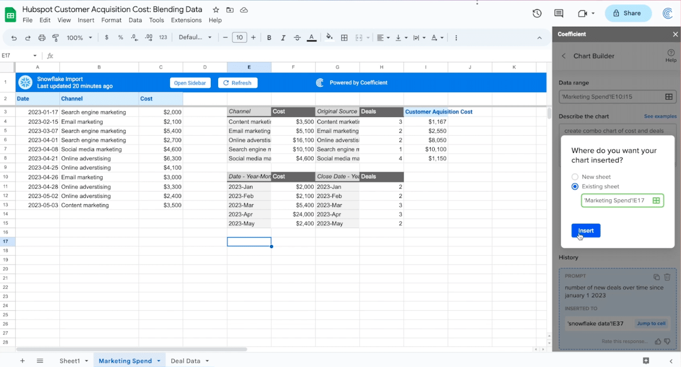
Insert your chart into an empty cell in the existing sheet.
![insert the chart into the existing spreadsheet](https://coefficient.io/wp-content/uploads/2023/07/CAC-analysis-insert-combo-chart.png)
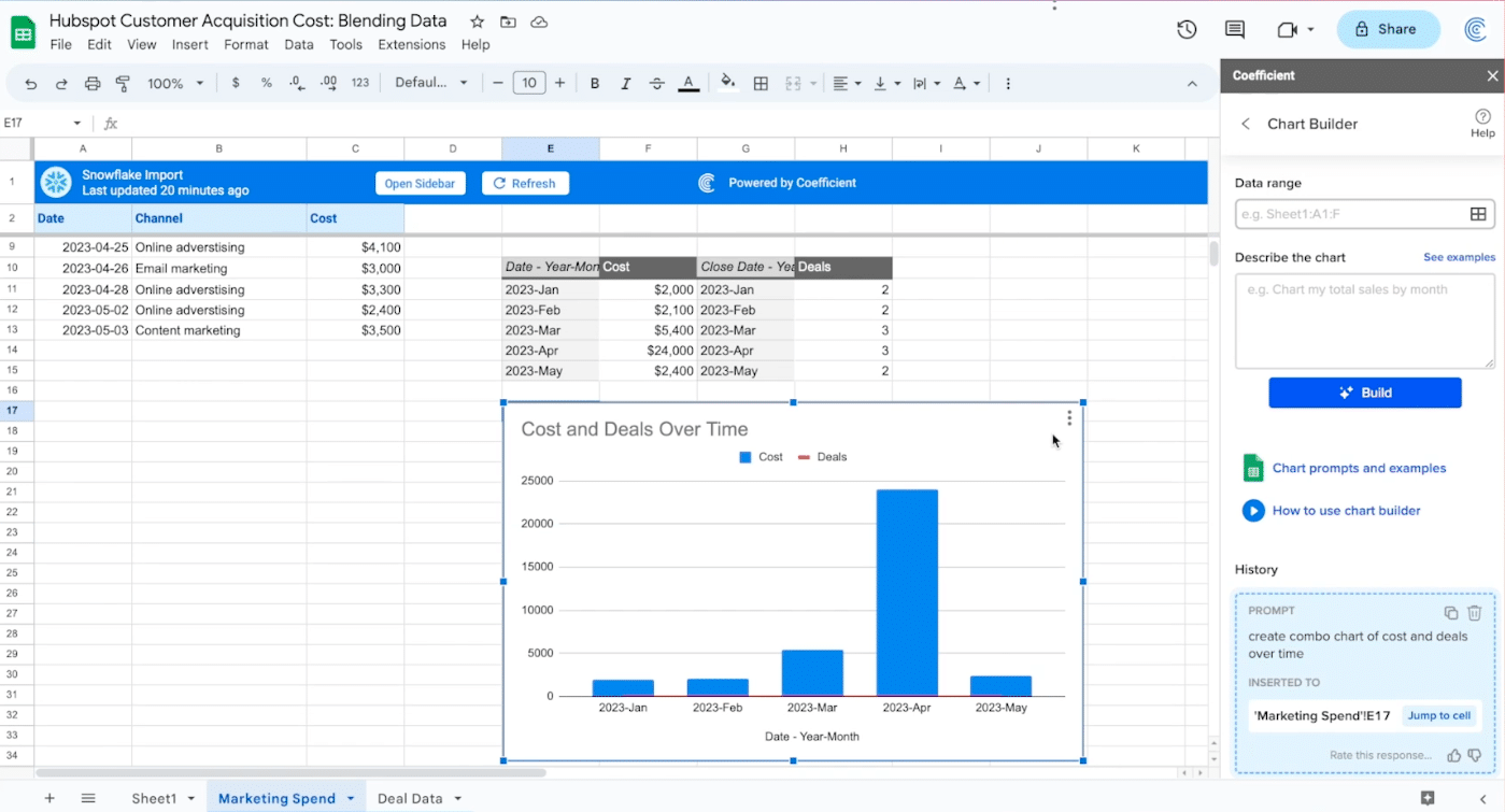
Your chart will appear in your sheet.
![the chart will automatically populate your spreadsheet](https://coefficient.io/wp-content/uploads/2023/07/CAC-analysis-chart-in-spreadsheet.png)
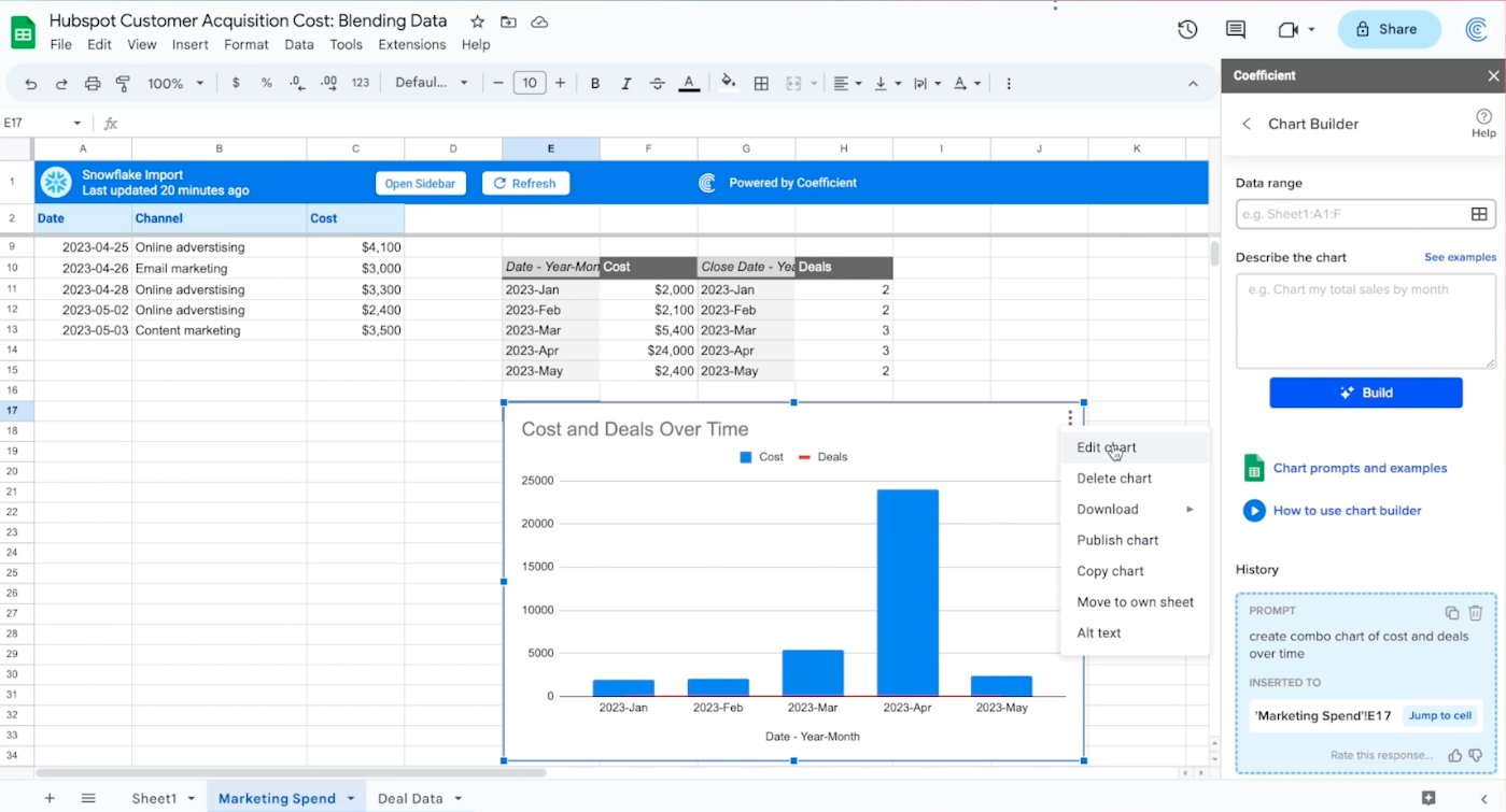
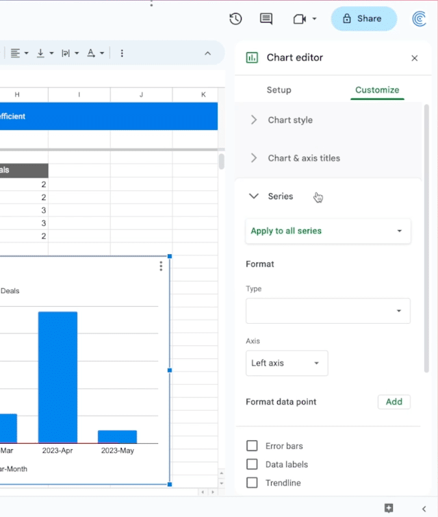
Finally, you’ll edit your chart to make it easier to read.
Click the top right corner -> ‘Edit chart.’
![edit the chart to make it easier to interpret](https://coefficient.io/wp-content/uploads/2023/07/CAC-analysis-edit-chart.png)
Select the Customize tab.
![select the customize tab](https://coefficient.io/wp-content/uploads/2023/07/CAC-analysis-customize-chart.png)
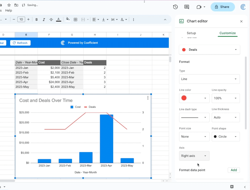
Click the ‘Series’ drop-down.
![open the series dropdown](https://coefficient.io/wp-content/uploads/2023/07/CAC-analysis-series-dropdown.png)
Choose ‘Deals’ in the ‘Apply to all series’ menu.
![select deals in the drop down](https://coefficient.io/wp-content/uploads/2023/07/CAC-analysis-deals.png)
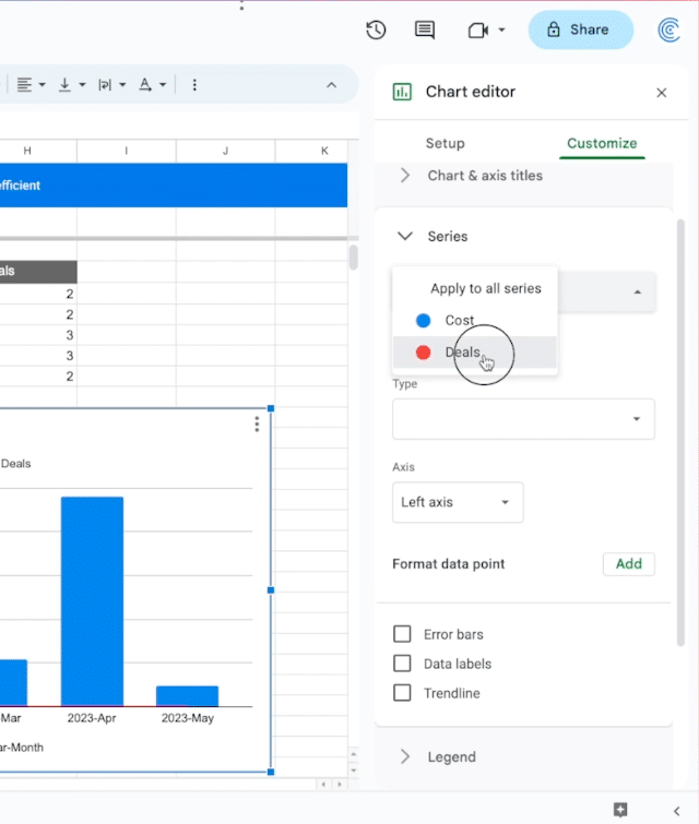
Scroll down and change the axis to ‘Right axis.’
![change the axis to right axis](https://coefficient.io/wp-content/uploads/2023/07/CAC-analysis-chart-axis.png)
Your output should look something like this.
![deals will now appear as a line](https://coefficient.io/wp-content/uploads/2023/07/CAC-analysis-deals-line.png)
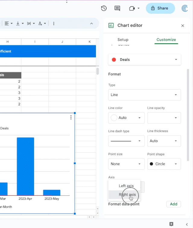
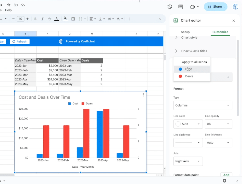
Scroll back up to the ‘Apply to all series’ drop-down and select ‘Cost.’
![now select cost](https://coefficient.io/wp-content/uploads/2023/07/CAC-analysis-cost.png)
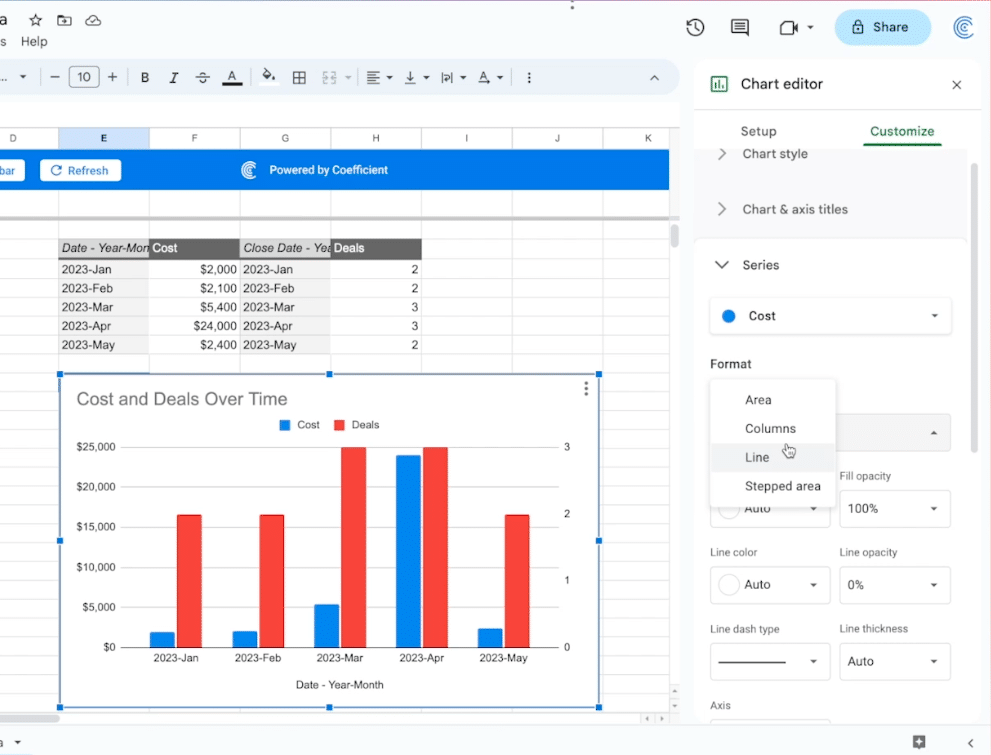
Click ‘Format’ -> Type -> ‘Line’
![change the format to line](https://coefficient.io/wp-content/uploads/2023/07/CAC-analysis-change-to-line.png)
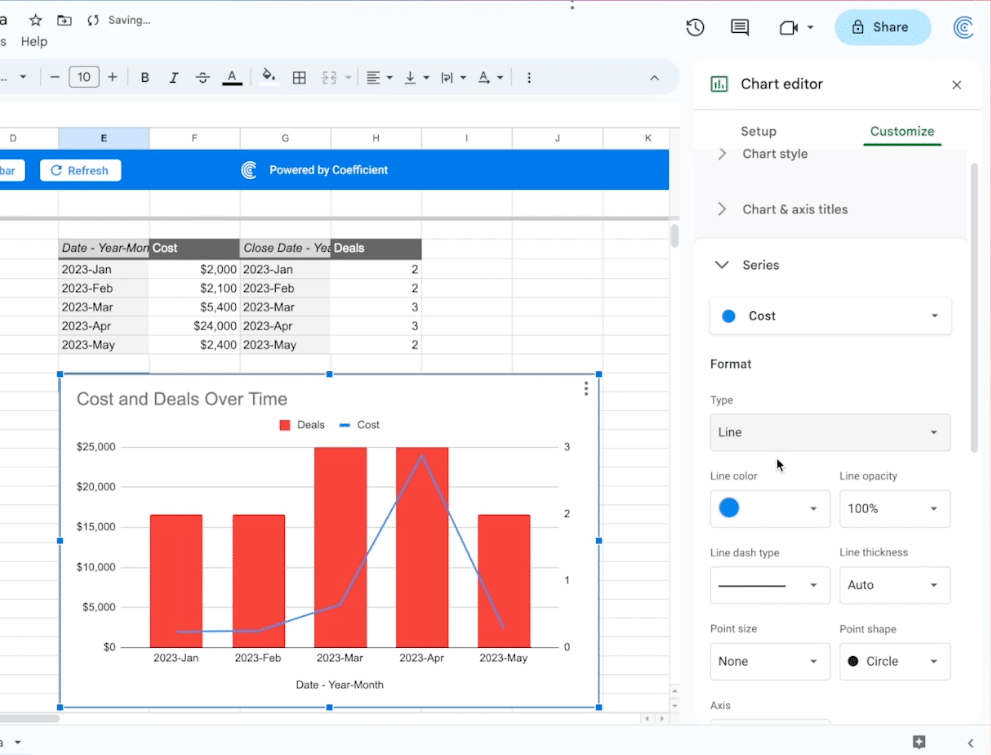
And just like that, you have a clear visualization of costs and deals over time!
![you will now be able to see costs and deals over time](https://coefficient.io/wp-content/uploads/2023/07/CAC-analysis-cost-deals-time.png)
Simplify CAC Analysis from Multiple Sources With Coefficient
Coefficient makes it easy for marketers to get a comprehensive view of customer acquisition costs by easily integrating their data directly into Google Sheets.
Install Coefficient for free and start optimizing your spend today!