Looker is a widely used Business Intelligence (BI) and analytics tool known for its attractive data visualizations, data exploration, and sophisticated data modeling capabilities.
It’s also known as one of the most expensive and difficult-to-use BI tools, accessible only to large businesses and enterprises.
So, where does that leave everyone else?
The good news is there’s no shortage of Looker alternatives that are both powerful and more user-friendly. Whether you’re a startup, a data-driven SaaS owner, or a business seeking an edge, the right BI tool is out there, waiting for you.
This article will explore 10 of the best Looker alternatives in 2023.
Let’s dive in!
Limitations of Using Looker – Why Look for Alternatives?
1. Steep Learning Curve
Looker offers a wide range of features, but for most users, these come with a steep learning curve – even for seasoned analytics experts.
In today’s fast-paced, data-driven business landscape, some organizations can’t afford to overcome it.
2. Requires Technical Resources
Looker’s complex data modeling functionality can be a barrier for organizations with small organizations.
This is because building and maintaining Looker dashboards requires a team of technical experts who are proficient in its proprietary querying language, LookML.
3. Closed System
Organizations seeking high flexibility and the ability to connect with various data sources and applications seamlessly may find it restricting.
That’s because of the Looker’s limited integrations with tools outside the Google Ecosystem.
4. Can Get Expensive at Scale
While Looker’s pricing may be a cost-effective choice for larger organizations, its pricing structure can become a significant concern for growing businesses.
As companies expand to accommodate more datasets, users, and advanced features, the associated costs can escalate. For businesses aiming to enhance their BI capabilities without straining their budgets, this can become a point of contention.
Top 10 Best Looker Alternatives to Fit Your Business Perfectly
The type of BI tool you need for your business depends on your current size, data workflows, and more.
This list will give you all the information you need to compare business intelligence software and choose the best fit!
Google Sheets + Coefficient
Ideal for startups and small businesses that need to move fast, iterate, and ensure data is easily accessible for teams.
Google Sheets and Coefficient combine to form a no-code analytics powerhouse, bringing the power of live data directly to your spreadsheet.
As a spreadsheet connector, Coefficient integrates with a variety of data sources like Salesforce, Hubspot, and more!
Today, over 20K companies featuring giants like Miro, Zendesk, Spotify, and Unity, rely on this powerful combination for their data needs.
Pros:
- Chart Builder: Leverage the power of ChatGPT to create charts with a simple prompt.
- Spreadsheet automations: Auto-refresh data on your schedule, eliminating the need for manual spreadsheet updates.
- Auto-write Backs: Automatically bulk export updated data from Sheets into your source systems.
- Automated Alerting: Keep stakeholders informed with real-time data updates, delivered directly to team members through Slack or email.
Cons:
- Limited Auto-Formatting: Some manual formatting is needed after transferring data from spreadsheets.
- Limited free automations: The only downside to Coefficient is that any scheduled automations are not free forever.
Overall rating: 5.0 with 189K+ users.
Good Reviews:
“After 4 weeks of using the Coefficient, I am genuinely impressed. Connecting data sources and APIs to Google Sheets has never been this seamless. 100% recommend.”
– Lachlan McLean
“Coefficient is very easy to use. I have automated it with Slack and email. The report was posted every day at a particular time, which is amazing. Rest Automation and GPTX are also very nice features…”
– Abhishek Misra
Critical Reviews:
“I used Coefficient to gather information from Stripe’s Sigma database. I liked the speed of the delivery and the accuracy of the data. The only issue is the timeframe I couldn’t properly set up, which could match my database. That’s why I had some difficulties with the hours. Overall, it’s a great product…”
– Gevorg Petrosyan
Beginner Tip: Coefficient offers a robust library of free dashboards and templates to help your visualize your data in justa few simple clicks.
Tableau

Suited for businesses seeking advanced data visualization tools for data-driven decision-making.
Tableau is a robust data visualization and business analytics platform. It offers advanced data visualization, reporting, and analytics capabilities.
- Template Library: Extensive library of templates and extensions.
- Robust Data Visualization: Powerful predictive analytics and visualization capabilities
- Community Support: Active community for troubleshooting and knowledge sharing.
- Integration: Seamlessly integrates with various data sources.
- Scalability: Suitable for both small teams and large enterprises.
Cons:
- Learning Curve: Learning Tableau’s advanced features may take time.
- Cost for Advanced Features: Some advanced features come at an additional cost.
Good Reviews:
“Has support for almost all the data source connectors like Snowflake, Redshift and even supports CSV for creating visualizations. Easily able to handle large data sets at quite a fast pace…”
– User on G2 Reviews
Critical Reviews:
“Extremely time-consuming and difficult to learn. UI isn’t the greatest. Salesforce connection should be a LOT better…”
– User on G2 Reviews
Beginner Tip: If you wish to make the most of Tableau, Google Sheets, and the ultimate fix using Coefficient, combine them all in one workflow! Coefficient connects to Tableau and Google Sheets, allowing you to use the power of 3-in-1!
Domo
Best for businesses requiring real-time data insights and collaboration among teams.
Domo is a cloud-based BI platform known for data integration and analytics. It offers a wide range of connectors and real-time data updates.
Pros:
- Intuitive Interface: User-friendly drag-and-drop interface.
- Data Connectivity: Extensive data connector library.
- Collaboration: Features for real-time collaboration.
- Mobile-Friendly: Access and analyze data on the go.
- Customizable Dashboards: Tailor dashboards to your needs.
Cons:
- Pricing: Can be on the higher side for smaller businesses.
- Limited functionality: Reportedly some occasional bugs and a lack of features.
Good Reviews:
“The most helpful thing about Domo is how intuitive and user-friendly it is for both the content creator and the end user. I also love the community Domo is working to build.”
– User on G2 Reviews
Critical Reviews:
“I don’t like that it’s limited regarding functionality. We cannot use this as a full-on project management system in line with the Lean methodology.”
– User on G2 Reviews
Beginner Tips: Leverage Domo’s drag-and-drop interface to create custom dashboards quickly. Focus on real-time data updates for timely decision-making.
Microsoft Power BI
Ideal for organizations deeply embedded in the Microsoft ecosystem seeking data analytics and reporting.
Microsoft Power BI is an integrated analytics platform that seamlessly connects to various Microsoft products. It provides advanced data visualization and reporting.
Pros:
- Native Integration: Seamlessly integrates with Microsoft products.
- User-Friendly: Easy-to-use interface for beginners.
- Customization: Offers extensive customization options.
- Security: Robust security features to protect your data.
- Affordability: Competitive pricing compared to some alternatives.
Cons:
- Learning Curve: Some advanced features may require time to master.
Good Reviews:
“Another strong point is the ease of data integration that Power BI offers. It seamlessly connects to various data sources, including Excel, SQL Server, Azure, and SharePoint.”
– User on G2 Reviews
Critical Reviews:
“Power BI is a repackaged Excel and uses Microsoft’s frustrating M language. This prevents users from using proven languages and methods and obfuscates truly understanding the data.”
– User on G2 Reviews
Beginner Tips: Explore Power BI’s native integration with Microsoft tools for a smoother workflow. Customize your dashboards to align with your brand.
Qlik Sense
Suited for businesses requiring dynamic data analysis and exploration.
Qlik Sense is known for its associative data model, providing interactive data analysis and visualization. It’s also an open API allowing diverse integrations within your workflows.
Pros:
- Associative Data Model: Dynamic data analysis with associations.
- User-Friendly: Drag-and-drop interface for ease of use.
- Data Storytelling: Tools for compelling data narratives.
- Open API: Customize and extend functionalities.
- Scalable: Suitable for growing businesses.
Cons:
- Pricing: Cost can be a barrier for startups.
- Learning curve: Has its own syntax and programming requirements.
Good Reviews:
“Ease of use to get started. Love the customization from the online community and available 3rd parties that add functionality into the platform.”
– User on G2 Reviews
Critical Reviews:
“App development is tremendously difficult/expensive. Qlik uses its proprietary scripting language to design load scripts, which is a tremendous pain to learn and use.”
– User on G2 Reviews
Beginner Tip: Capitalize on Qlik Sense’s associative data model for dynamic insights. Utilize storytelling features for impactful presentations. This will help your team be more productive.
Sisense
Suitable for organizations seeking to simplify complex data integration tasks and embed analytics into products.
Sisense is a notable contender in Business Intelligence (BI) and analytics solutions. Renowned for its data integration and analytics capabilities, it caters to organizations seeking robust insights.
Pros:
- Data Integration: Easily connect various data sources.
- Embedded Analytics: Seamless integration of analytics into your products.
- Dashboard Builder: For non-technical users to create informative dashboards.
- Strong Customer Support: Assisting users in navigating any challenges.
Cons:
- Pricing: Pricing can be on the higher side.
- Learning Curve: While user-friendly, new users may still require some learning.
Good Reviews:

Stop exporting data manually. Sync data from your business systems into Google Sheets or Excel with Coefficient and set it on a refresh schedule.

“It is at par with other visualization software such as Tableau and Power BI. It is a more user-friendly option for those who want to work in BI.”
– User on G2 Reviews
Critical Reviews:
“It is not a low-code BI solution. Most dashboard and widget customizations have very few WYSIWYG options, mostly all customizing code.”
– User on G2 Reviews
Beginner Tip: Explore the dashboard builder to create customized, user-friendly dashboards. Even BI tools need to be aligned with branding!
Redash
Ideal for startups and smaller teams with limited budgets looking for tailored data visualization.
Redash stands out as an open-source dashboard framework, offering flexibility and customization options for businesses aiming to tailor their analytics solutions.
Pros:
- Open Source: Suitable for organizations with unique requirements.
- Lightweight and Fast: Fast performance, ensuring quick data visualization.
- Multiple Data Source Support: Versatility in data analysis.
- Community-Driven Development: Regular updates and improvements.
- Budget-Friendly: Cost-effective choice, particularly for startups and smaller teams.
Cons:
- Technical Knowledge: Technical expertise in advanced configurations.
- Limited Advanced Features: Lack some of the advanced features offered by other proprietary BI tools.
Good Reviews:
“Redash is a powerful data visualization and exploration platform allowing me to create interactive dashboards and analyze ad-hoc data.”
– User on G2 Reviews
Critical Reviews:
“When you reach >1000 queries and >100 dashboards in Redash, it becomes very challenging to manage all of them. I wish there were more data management features in Redash.”
– User on G2 Reviews
Beginner Tip: Assess your technical capabilities and resources to determine if Redash aligns with your organization’s skill set. Consider training your team before completing the integration.
Looker Studio
For Looker users seeking a simplified and budget-friendly approach to visualize data.
Looker Studio is a free-to-use analytics solution that is part of the Looker ecosystem. It is designed for users seeking a simplified and user-friendly approach to data visualization.
Pros:
- Ease of Use: Suitable for users who prefer a straightforward approach.
- Fast Setup: Quick setup and is user-friendly.
- Familiarity: Dashboard creation capabilities within the familiar Looker interface.
Cons:
- Limited Advanced Features: No advanced analytics features as the core Looker.
Good Reviews:
“East to use for beginners, user-friendly interface”
– User on G2 Reviews
Critical Reviews:
“Unfortunately, as a performance marketer, I found Looker Studio quite limited in meeting my specific needs. While the interface is visually appealing and offers some customization options, it lacks the depth and functionality required for in-depth performance analysis.”
– User on G2 Reviews
Beginner Tip: Consider Looker Studio if you wish to stick to Looker. Use it as a learning source to get used to the platform. Great for solopreneurs and small teams.
Mode Analytics
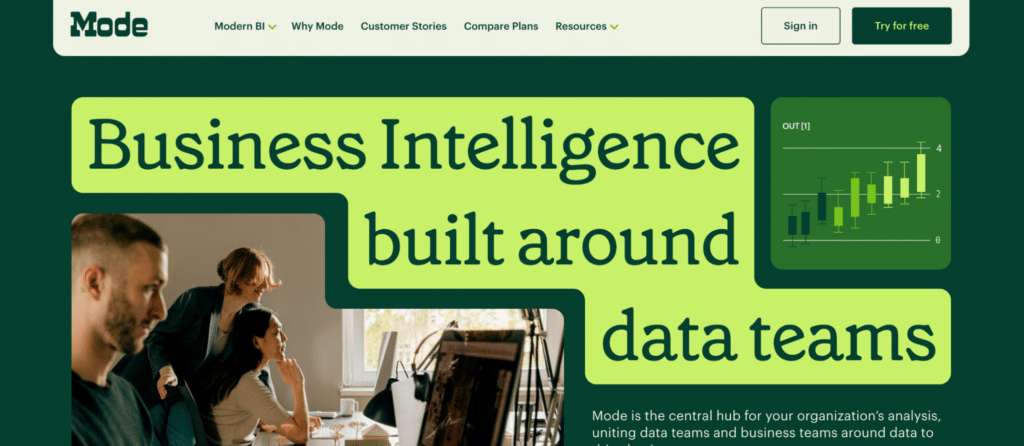
Suited for teams comfortable with SQL, collaborating on data analysis and reporting.
Mode Analytics is a collaborative BI platform known for its SQL-based querying and analysis capabilities. It works mainly on SQL-based querying, a collaborative environment, version control, and integrated Python and R.
Pros:
- SQL-Based Querying: Perfect choice for teams comfortable with SQL.
- Version Control: Analysis ensuring data consistency and reproducibility.
- Integrated Python and R: Advanced analytics, graphs, and data science tasks.
- Customizable Reporting: Tailored to specific business needs.
Cons:
- SQL Expertise: Even more technical than Looker.
- Require Training: Teams need training to use collaborative features effectively.
Good Reviews:
“I like Mode because it’s a versatile tool and provides me with the information required about our customers’ orders. The filtration options are amazing. I can filter with the customer’s e-mail, name, or order number!”
– User on G2 Reviews
Critical Reviews:
“While Mode can be very insightful for data analysis, it’s cumbersome and not extremely intuitive.”
– User on G2 Reviews
Beginner Tip: If your team is SQL-savvy, Mode Analytics can be a powerful tool for in-depth data analysis. Leverage it for extremely tech-based, data-centric, and team-oriented data analysis.
Reveal
Ideal for businesses looking for straightforward, cost-effective data analysis and embedding dashboards in applications.
Reveal is a self-service BI platform known for its simplicity and ease of use. This is yet another platform that will work on a budget and with simplicity if everything else doesn’t work for your team.
Pros:
- User-Friendly Interface: Accessible to non-technical users.
- Quick Setup and Deployment: Reduce onboarding time.
- Embeddable Dashboards: Embed Reveal’s dashboards into applications and products.
- Affordable Pricing: Its pricing is competitive.
Cons:
- Limited Advanced Analytics Features: More complex BI solutions do not have the same advanced analytics capabilities.
Good Reviews:
“Excellent professional software to understand and learn more about our business data. The panel environment is perfect for synergizing between developers and users.”
– User on G2 Reviews
Critical Reviews:
“Due to its high flexibility, some groundwork and design thinking are required. Implementing a production-ready instance takes a little longer as you will likely need to implement a couple of providers depending on your needs..”
– User on G2 Reviews
Beginner Tip: Consider embedding Reveal’s dashboards into your products. The platform then provides real-time data insights to your customers.
Top Looker Alternatives? Look No Further Than Coefficient.
Whether you’re a startup looking for budget-friendly data consolidation or a team deeply embedded in the Microsoft ecosystem, there’s a business intelligence platform designed to fit your needs.
At the very least, look for a solution that offers an intuitive interface, a robust integration ecosystem, and has the ability to scale as your business grows.
Enter Coefficeint: a spreadsheet connector that brings the power of live data from data sources like Snowflake, Tableau, and more, to Google Sheets and Excel.
Get started with Coefficient for free today to experience it for yourself.


