Understanding Tableau trend lines is critical for those looking to interpret data and its potential impact on business decisions.
This guide dives deep into the use of Tableau trend lines, a pivotal feature for identifying patterns in data and forecasting future trends. You’ll be equipped to not only create and analyze trend lines in Tableau but also to extract actionable insights that can guide your strategic planning and operational adjustments.
Understanding Trend Lines in Tableau
Trend lines in Tableau are powerful tools for statistical analysis, allowing users to easily identify and visualize compelling patterns in their data sets.
Here’s a quick overview of the different types of trend lines available in Tableau and when to use them:
- Linear Trend Lines: Perfect for data demonstrating a consistent trend of growth or decline, these trend lines sort through the noise to highlight simple, direct relationships over time.
- Logarithmic Trend Lines: When your data expands or contracts at decreasing rates, logarithmic trend lines are your ally. They shine in scenarios where growth dynamics, such as population increases, need a nuanced representation.
- Exponential Trend Lines: Opt for exponential trend lines when your dataset shows a pattern of rapid acceleration or deceleration. This type is a staple in financial forecasting, aiding in projections of interest or growth rates.
- Polynomial Trend Lines: When faced with data that shows multiple peaks and valleys, polynomial trend lines offer a way to capture these complex patterns accurately.
Step-by-Step Guide to Adding and Customizing Trend Lines
[insert piositioning statement about coefficient (1-3 sentencves]. Should be relevant to the content in this piece and focus around getting teh most accurate data into tableau
Step 1: Open Tableau and Load Your Data
Open Tableau and load the dataset you want to analyze. Here, we use video game sales performance.

Step 2: Create a Basic Line Plot
Select the data points you want to visualize. We want to plot sales trends over time, choosing “Year” and “North American Sales.”

Step 3: Insert a Trend Line
Add a trend line to your plot by right-clicking on the data in the view and selecting “Add Trend Line” from the context menu.

Step 4: Customize Your Trend Line
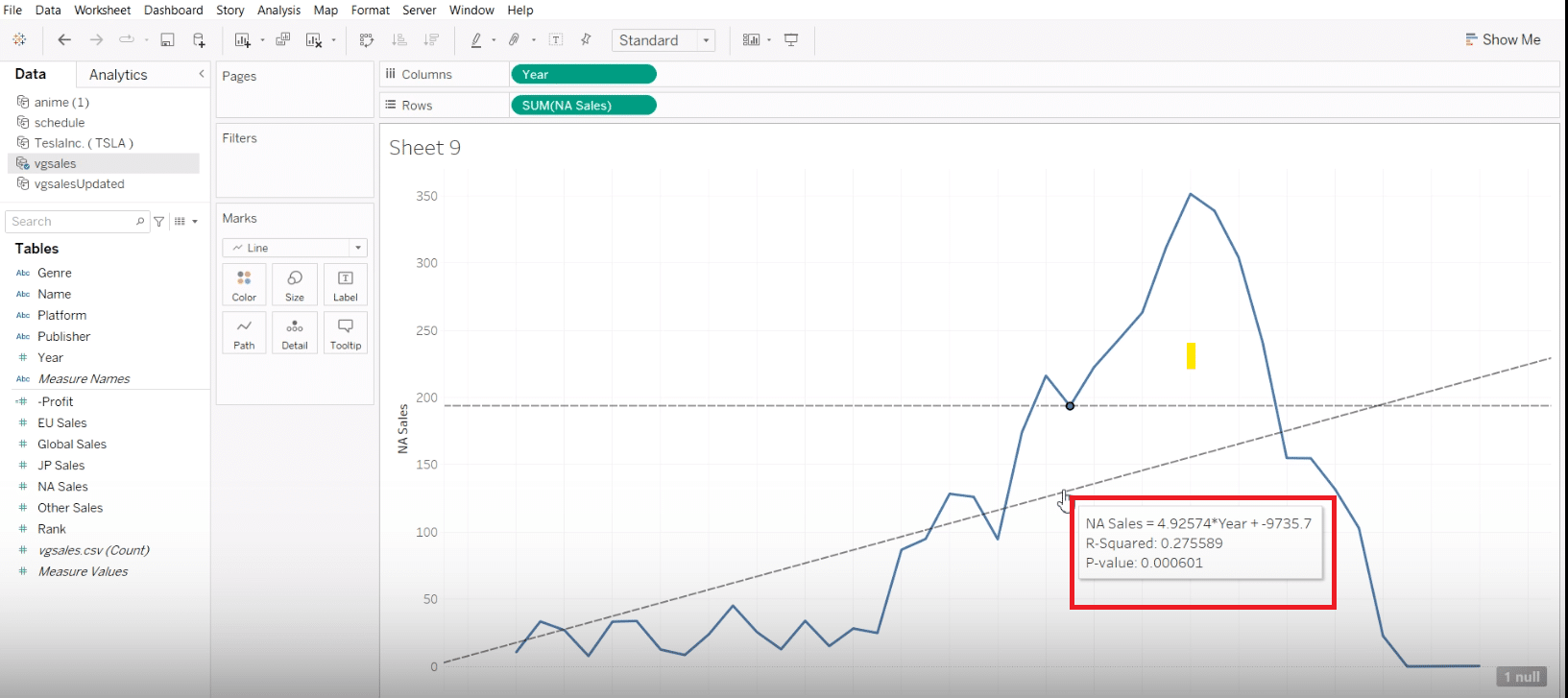
Click on the trend line to see its slope and R-squared value for insights.

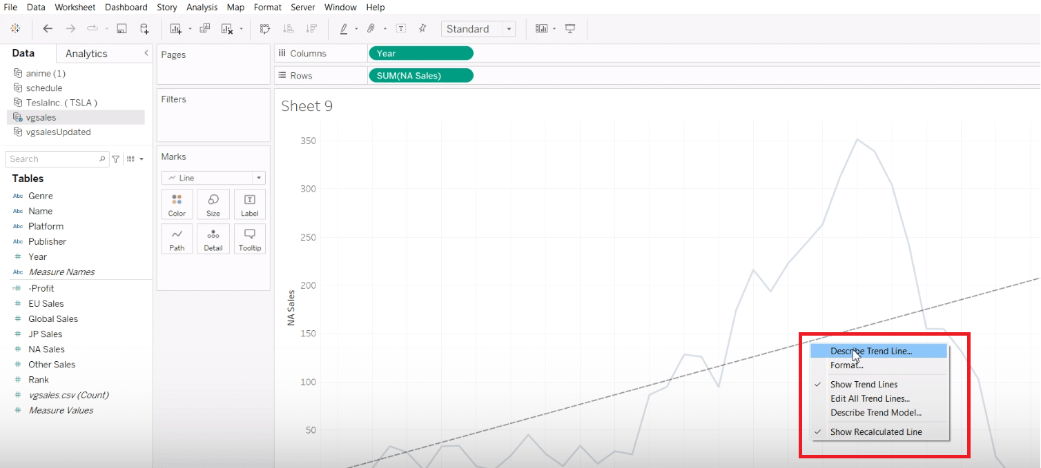
To customize the trend line’s appearance, click on your line and select ‘Discover Trend Lines’ from the menu.

Step 5: Enrich Analysis with Comparative Data
To adjust the trend line’s path, right-click and select “Edit,” tweaking its shape to closely align with your data’s pattern.

Stop exporting data manually. Sync data from your business systems into Google Sheets or Excel with Coefficient and set it on a refresh schedule.
Get Started

To make a direct comparison, we’ll add “Japan Sales” as a new data series next to “North American Sales.” This enables a straightforward analysis of the two markets.

Step 6: Forecast Future Trends
Utilize Tableau’s forecasting feature by right-clicking on the chart to predict future trends.

Note: Forecasts are only as accurate as the data they’re based on. With Coefficient, your data is always accurate because it automatically updates your data sources. This keeps your analysis accurate and helps you make reliable forecasts in Tableau.
Overcoming Challenges with Trend Lines in Tableau
Working with trend lines can be straightforward, but users occasionally face specific challenges. Here are common issues and how to navigate them:
- Incorrect Trend Line Type: One common pitfall is using an inappropriate type of trend line for your data. Ensure you understand the nature of your data to choose between linear, logarithmic, or polynomial trends correctly.
- Misinterpreting the Data: Misinterpretation of what trend lines indicate can lead to incorrect conclusions. Always consider the context of your data and the limitations of trend analysis.
- Overfitting and Underfitting: These occur when the trend line is too complex or too simple for the data, respectively. Striking a balance is key—ensure your model is complex enough to capture the trends without becoming overly fitted to minor fluctuations in the dataset.
Conclusion
Mastering Tableau trend lines unlocks the door to deep data insights, fostering informed decisions and unveiling underlying patterns. Leverage these techniques in your Tableau endeavors to elevate your analytical capabilities.
Consider integrating your Tableau visualizations with Coefficient’s enhanced data connectivity features to augment your analytical journey. Begin this upgrade today at Get Started with Coefficient.


