Scatter plots are powerful methods for visualizing data because they offer quick insights into the relationship between two numerical variables.
Creating an insightful scatter plot in Tableau can uncover trends, patterns, and outliers in your data. This guide walks you through the process, from preparing your data to customizing your visualization for impactful insights.
Tableau Scatter Plot: Getting Started
Before diving into Tableau, it’s essential to understand the journey of your data. Teams often update spreadsheets or databases to keep data fresh.A few considerations for a smooth data visualization process include:
- Ensuring Data Compatibility: Make sure your new data aligns with your Tableau workbook’s setup and dashboards.
- Updating Calculations and Relationships: Adjust calculations, parameters, filters, and relationships for the new data source.
- Automating Updates: Utilize tools like Coefficient to routinely refresh your data, ensuring it’s always ready for analysis in Tableau or spreadsheets.
Coefficient seamlessly integrates your source spreadsheets in Excel or Google Sheets with your broader data ecosystem, including Tableau.

Klaviyo revolutionized their reporting by leveraging Coefficient to automate their analytics, eliminating manual data requests and reporting. This seamless integration into their workflows resulted in significant time savings.
Now, let’s create a scatter plot in Tableau.
Step-by-Step Tutorial: Creating a Basic Scatter Plot Graph in Tableau
Creating a scatter plot in Tableau allows you to visualize the relationship between two continuous variables, enhanced with customization options for color, text, size, and shapes.
Follow along with the video for a detailed walkthrough.
Step 1. Inserting a Scatter Plot
Navigate to the workspace, and select the ‘Shape’ chart option.
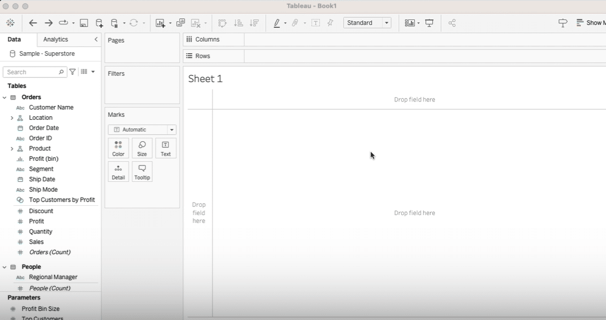
Step 2. Inputting Data Fields
Drag and drop two continuous values: Sales and Profit into the workspace.
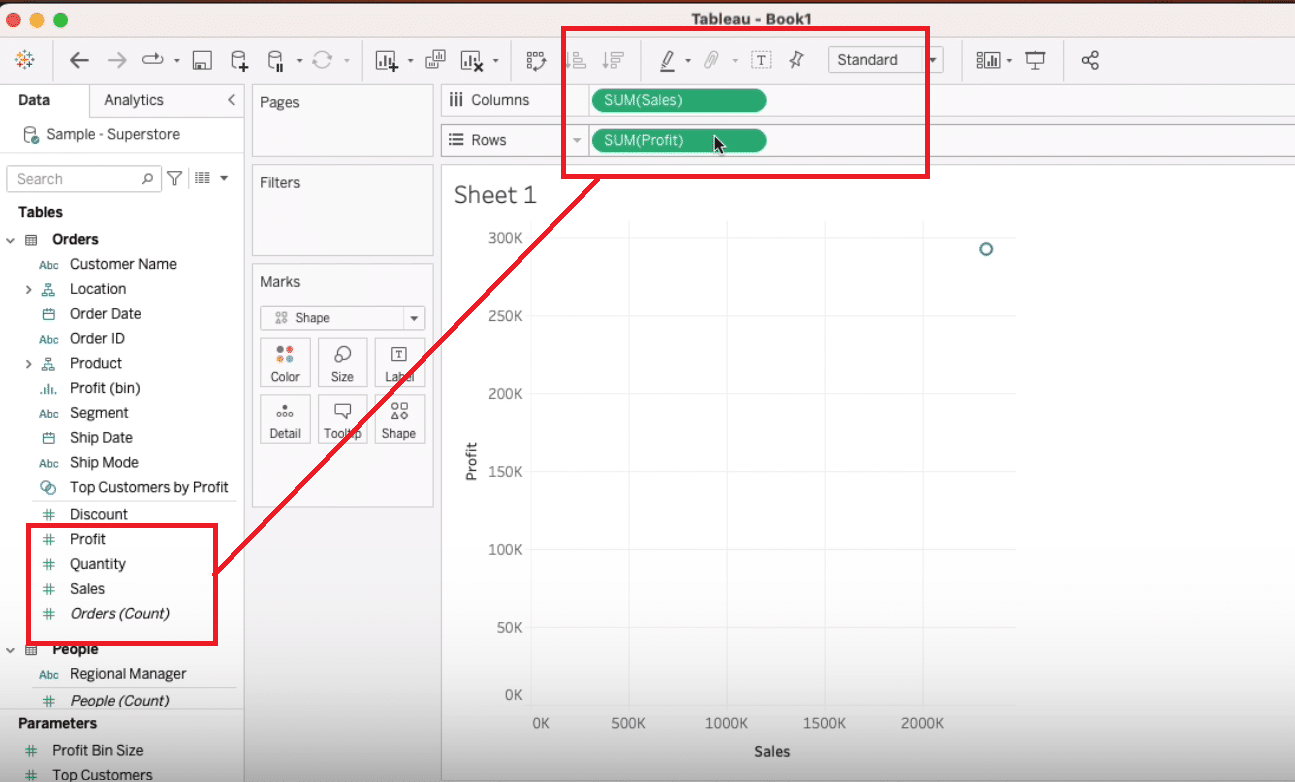
Step 3. Categorizing Data
To visualize categories by color, drag the ‘Category’ field to the color option.
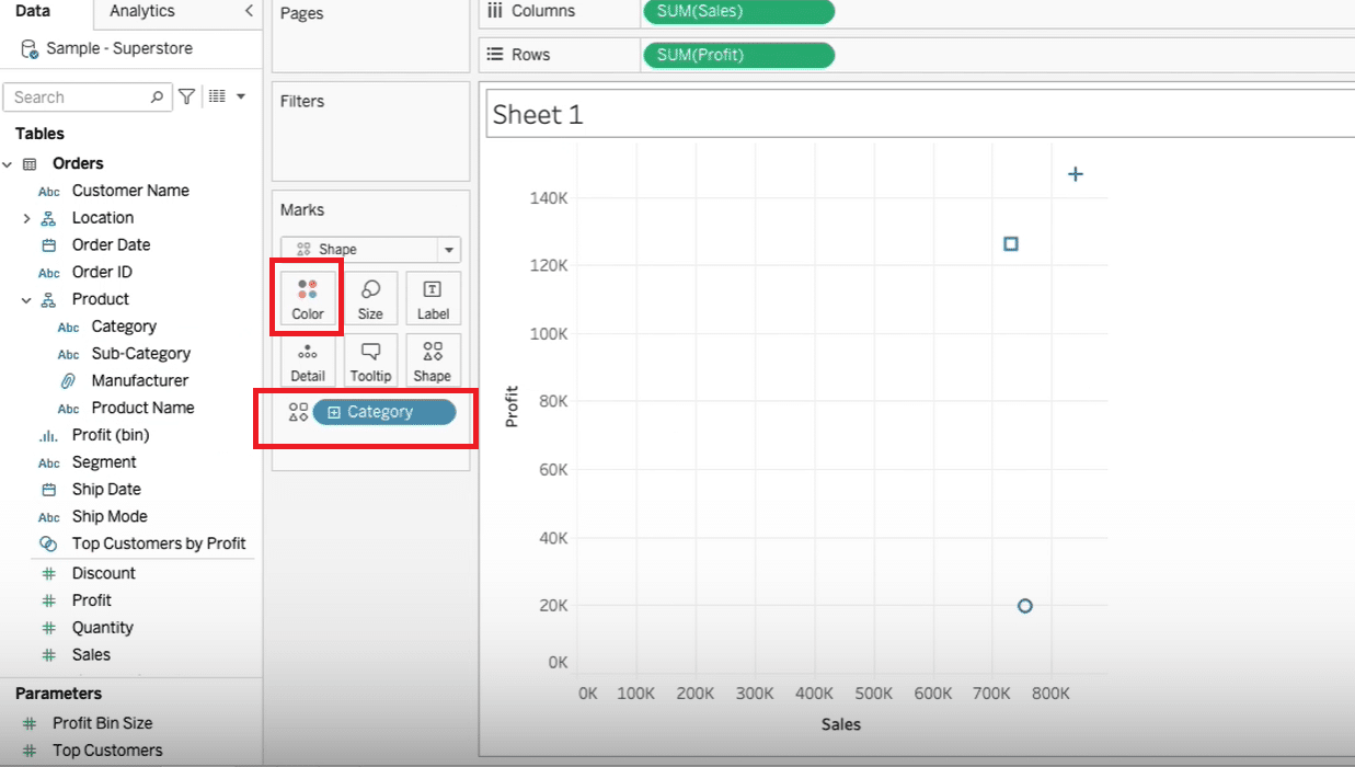
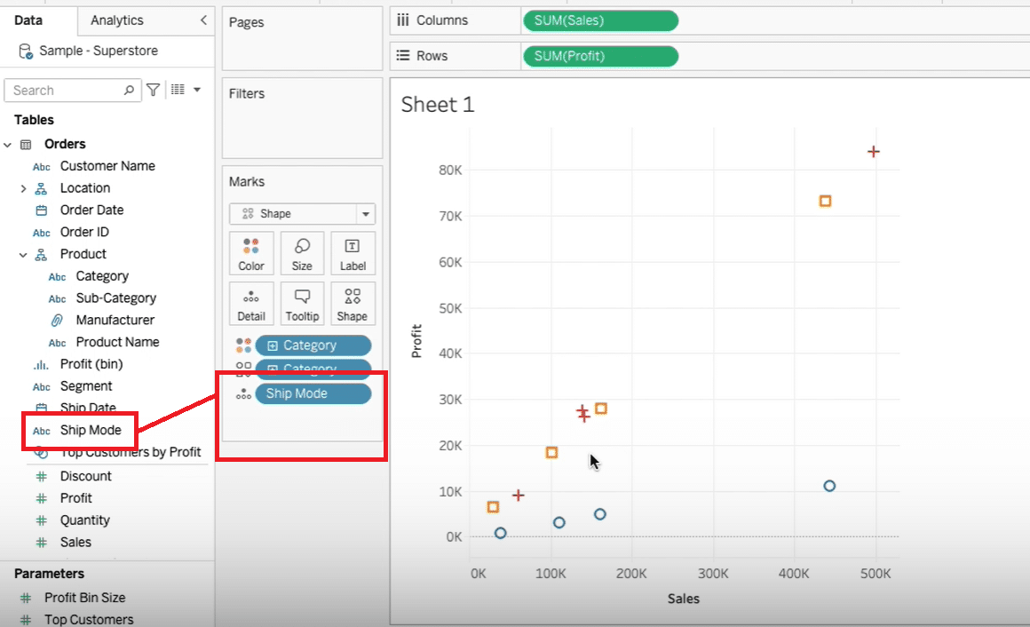
Step 4. Drilling Down with Details
Enhance your scatter plot by adding the ‘Ship Mode’ to the detail box to see the data at a more granular level.
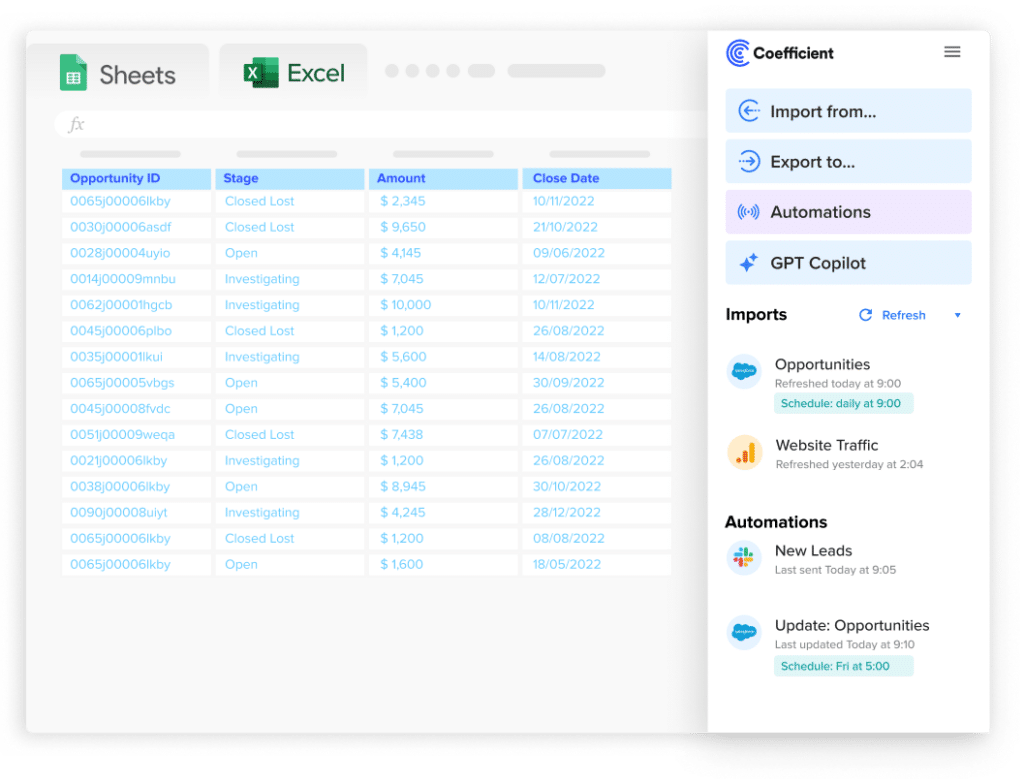
Stop exporting data manually. Sync data from your business systems into Google Sheets or Excel with Coefficient and set it on a refresh schedule.
Get Started
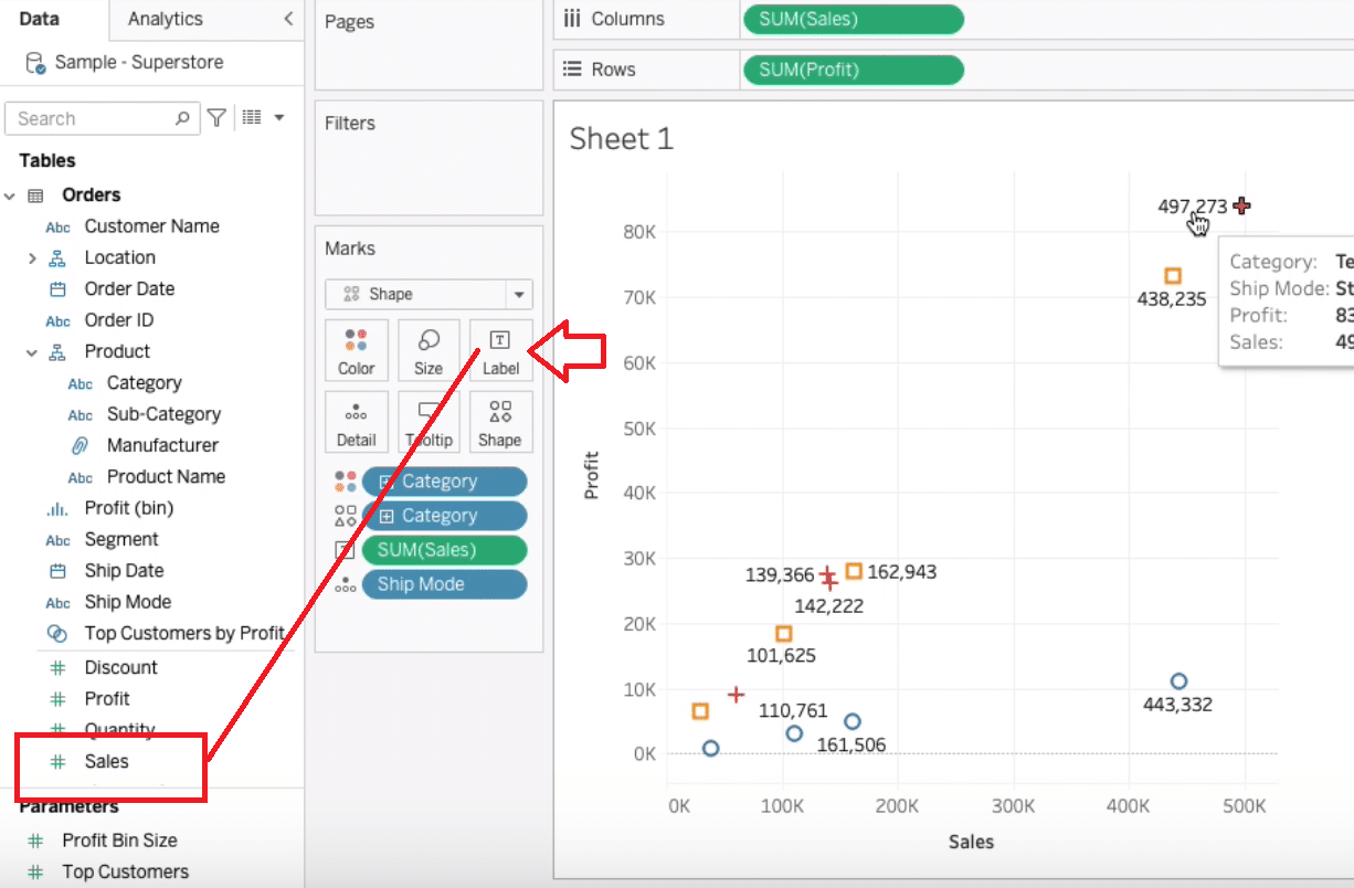
Step 5. Adding and Formatting Labels
Drag ‘Sales’ to the label field for displaying sales figures on the scatter plot.
Customize label formatting by selecting format options to adjust the display of the sales values.
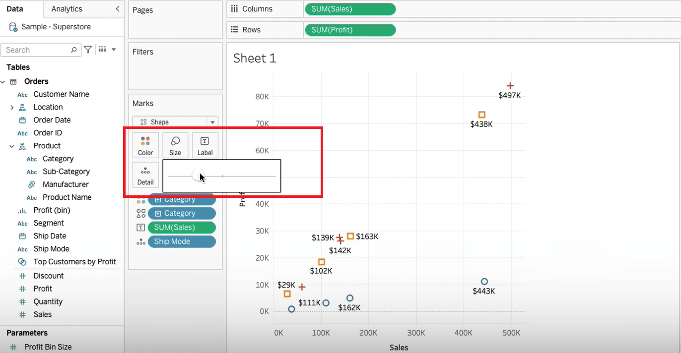
Step 6. Adjusting Sizes and Shapes
Increase or decrease the size of the marks for better visualization.
Then, explore more shapes for differentiating data points.
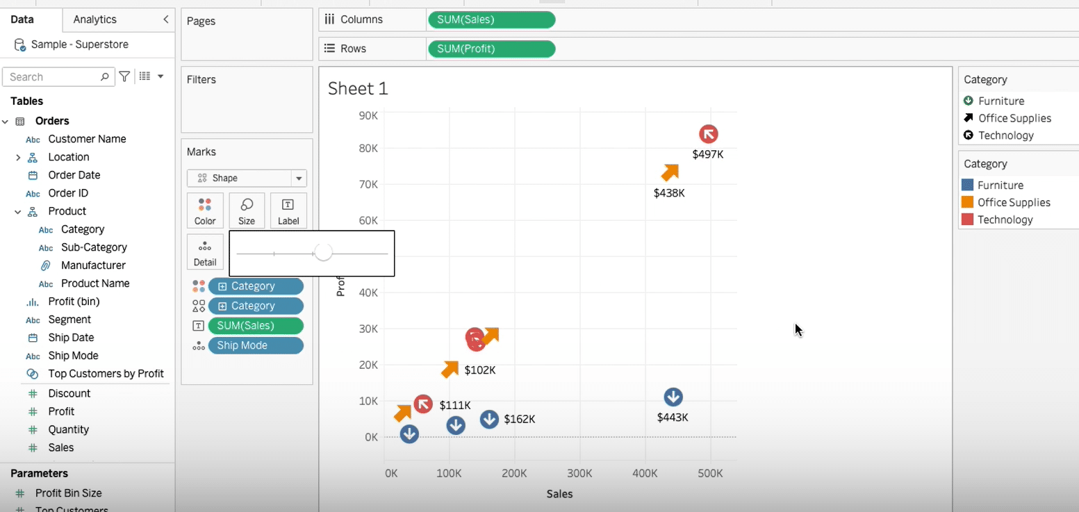
Step 7. Customizing with Arrows
Assign custom arrow shapes to emphasize direction or trends within the scatter plot.
Tips and Tricks for Perfecting Your Tableau Scatter Plots
- Start with Clean Data: Ensure your dataset is clean and well-structured before you begin. This will save you time in the long run and lead to more accurate visualizations.
- Utilize Color Wisely: Use color to highlight differences between categories or to show density when data points overlap.
- Employ Tooltips Wisely: Make the most out of tooltips to provide additional information on hover without cluttering your scatter plot.
- Customize for Clarity: Don’t shy away from adjusting sizes, shapes, and labels to make your scatter plot as clear and informative as possible.
- Explore Trend Lines: When applicable, add trend lines to your scatter plots to easily identify patterns and relationships.
- Iterate and Experiment: Don’t hesitate to try different configurations. Sometimes, the best insights come from iterating on your visual design.
Master Tableau Scatter Plots
Learning how to create scatter plots in Tableau is a valuable skill for analyzing and presenting data. By following the steps and tips provided, you can create effective scatter plots that provide meaningful insights.
Ready to leap further into data visualization? Try Coefficient for free today to Start today for free!.


