Heat maps are a powerful tool in business analytics, offering a clear, visually engaging way to interpret complex datasets. By using variations in color intensity, heat maps can highlight trends, anomalies, and patterns, making them invaluable for businesses looking to derive actionable insights from their data.
This guide is designed to help you leverage Tableau for creating heat maps that showcase the nuances in your business data.
Preparing Data for Tableau Heat Maps
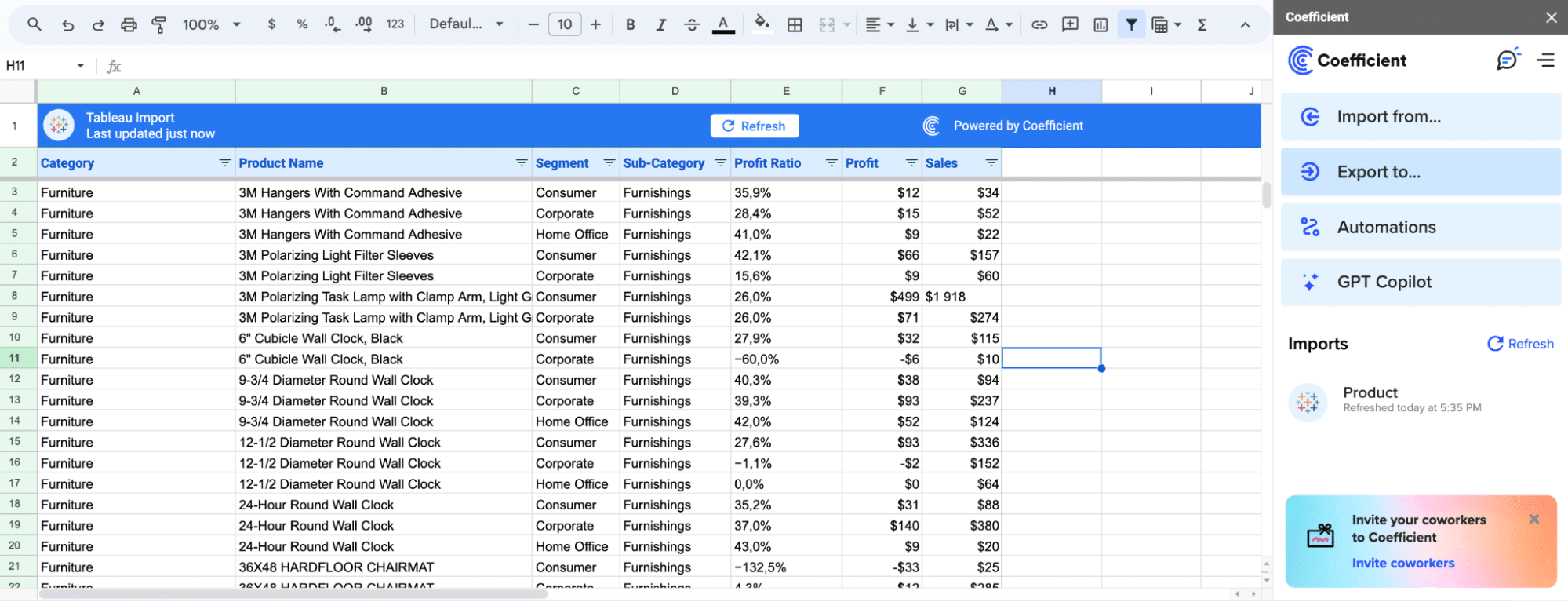
Getting your data structured is key before using Tableau’s heat maps. This involves arranging your dataset so each row is a unique observation, and each column, a variable or attribute of those observations.
Coefficient simplifies this with its no-code interface, allowing users to manage data directly in their spreadsheet of choice: Google Sheets or Excel.
This approach empowers business users to take ownership of their data, performing comprehensive analyses by seamlessly blending datasets from various sources like Salesforce, HubSpot, etc.
Take Klaviyo’s experience, for example. Read their story here.
Facing challenges from ad hoc data requests and the absence of automated reporting, they needed a solution that integrated with spreadsheets as they scaled.
Coefficient helped Klaviyo make self-serve analytics a reality by centralizing and automating reporting, and helping the data team reclaim months of their time previously lost to manual data extracts
Visualizing Data through Tableau Heat Maps: A Step-by-Step Guide
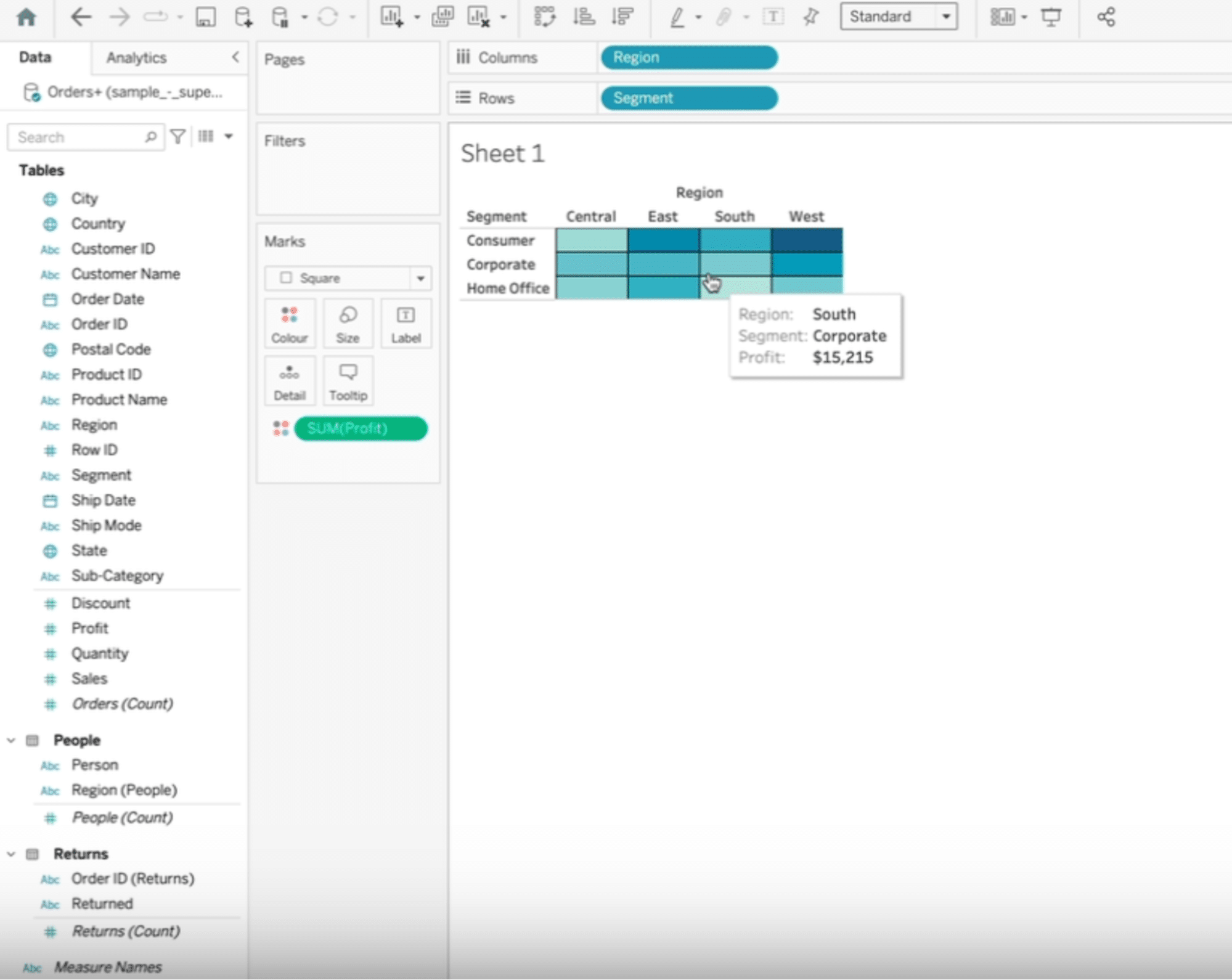
Heat maps utilize color intensity to showcase data values across dimensions. This guide will explore profit variations by segment and region.
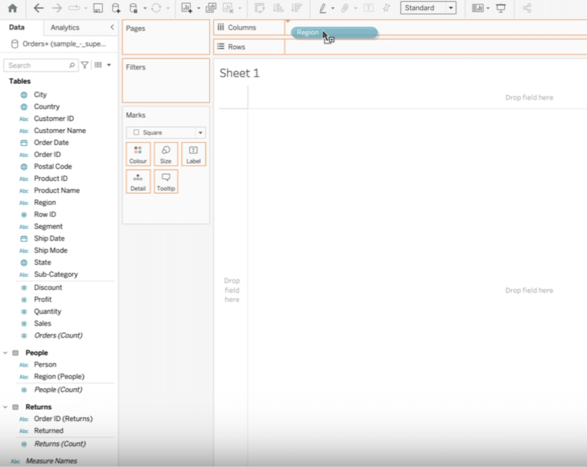
Start by navigating to ‘Data’ > ‘Tables’ in Tableau.
Then select your table (in this example, ‘Region’) and drag it into the column section.
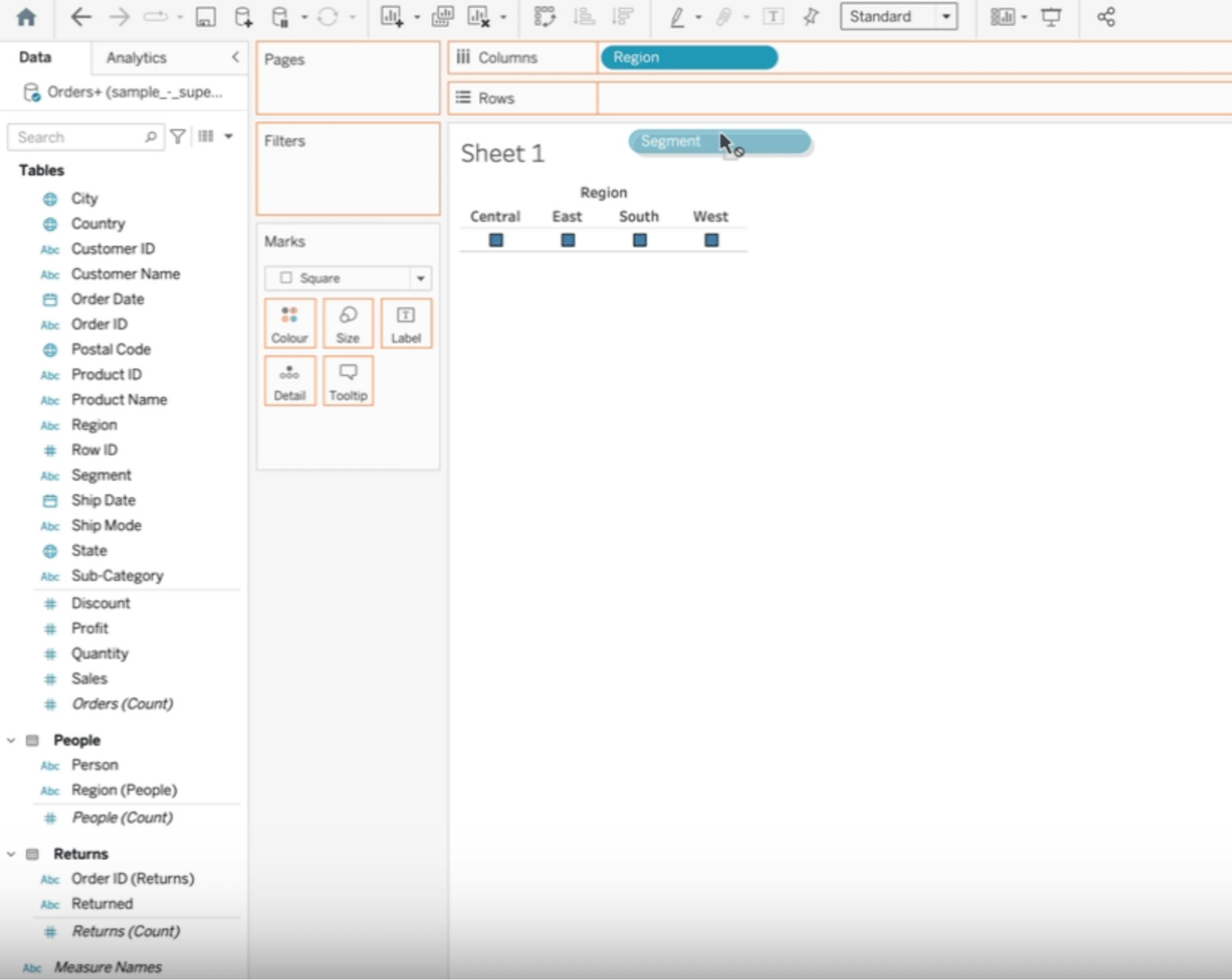
Next, drag ‘Segment’ to the row section.
Finally, drag the ‘Profit’ table into the color section.
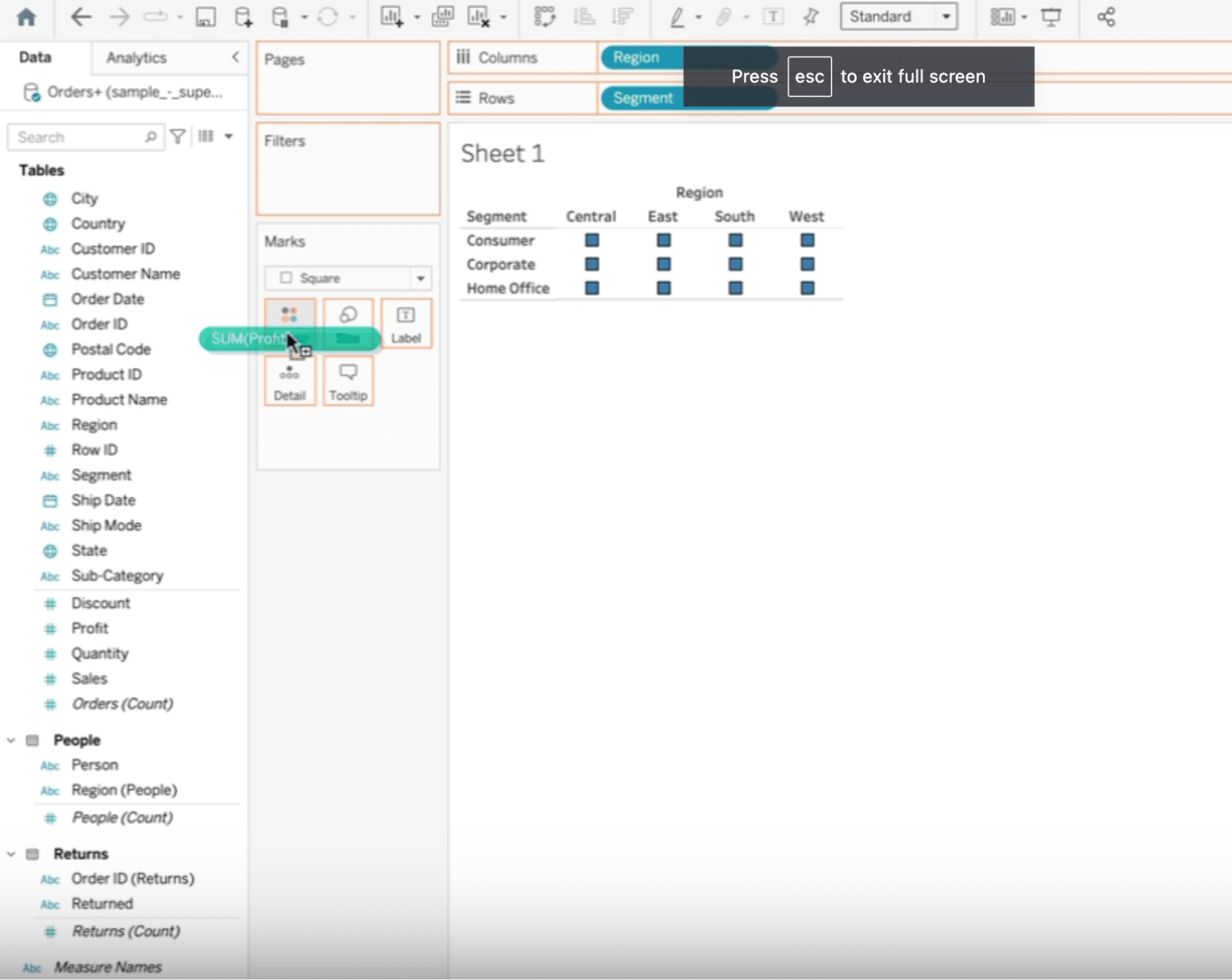
This produces a heat map where color intensity signals profit levels.
Color intensity on the heat map helps identify profit trends, showing areas of high and low profitability.
Customize your heat map in Tableau by navigating to ‘Marks’ and selecting from the dropdown menu to change shapes, add labels, and modify color schemes
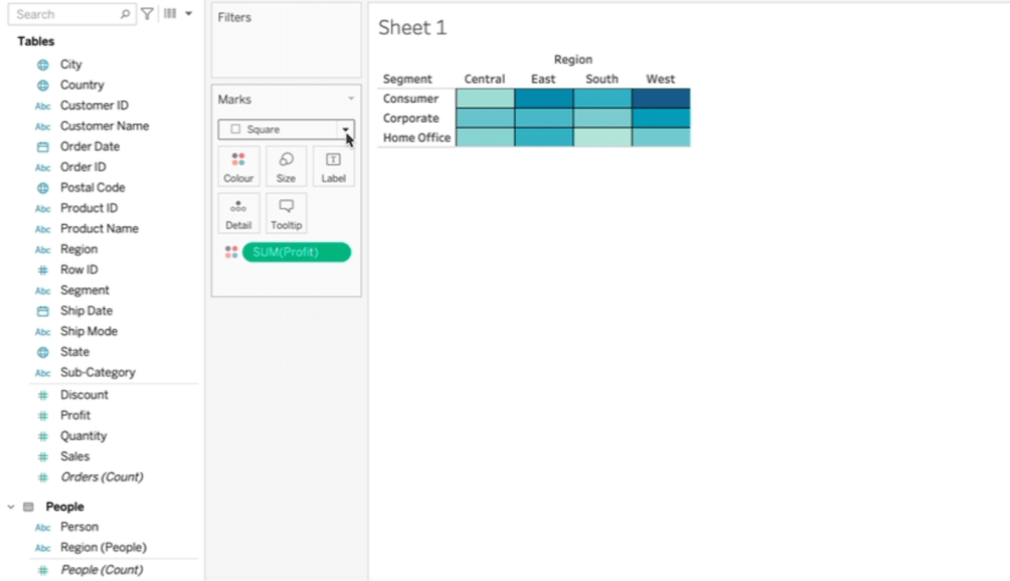
Click ‘Label’ to display profits.
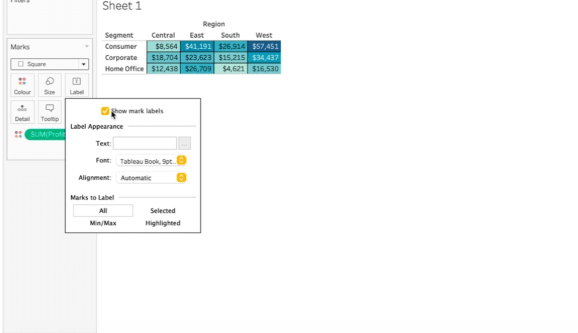
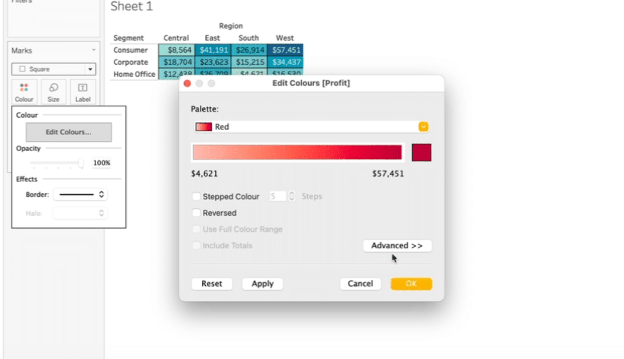
You can also change the color scheme (and so on).

Stop exporting data manually. Sync data from your business systems into Google Sheets or Excel with Coefficient and set it on a refresh schedule.
Get Started
Tableau Heat Maps: Advanced Techniques
Heat maps in Tableau provide a visual representation of data, making complex information easily understandable at a glance. Adding dynamic filters and tooltips significantly enhance the interactivity and analytical depth of Tableau visualizations.
- Dynamic filters allow Tableau users to adjust visualizations based on criteria such as time periods, regions, or specific metrics.
- Tooltips provide additional information when users hover over elements in a Tableau visualization.
While these features are user-friendly, their effectiveness largely depends on the availability of continuously updated, diverse data sources.
Coefficient automates the process of feeding live data from spreadsheets into Tableau, directly addressing these challenges.
This guarantees that both dynamic filters and tooltips in Tableau are powered by the most current data available, enhancing user engagement and the precision of insights.
Maximizing Tableau Heat Map Effectiveness: Best Practices and Pitfalls to Avoid
Limit the Number of Categories
Heat maps are most effective when they’re easy to read. Overloading a heat map with too many categories or dimensions can lead to clutter, making it difficult for the viewer to discern meaningful patterns. Aim for simplicity by focusing on key data points that convey your narrative clearly.
Use a Consistent Color Scheme
The choice of color plays a critical role in the readability and interpretability of your heat map.
Utilize a consistent color scheme across similar visualizations to facilitate easier comparison and analysis. Additionally, consider the use of colorblind-friendly palettes to ensure accessibility for all viewers.
Apply Labels with Caution
While labels can enhance the readability of a heat map by providing context, too many labels or poorly placed ones can detract from the visualization’s effectiveness.
Use labels sparingly and strategically to highlight key insights or data points without overcrowding the visual space.
Leveraging Tableau Heat Maps: Real-World Scenarios
- E-Commerce: An online retailer could use heat maps to analyze customer purchase behavior across different regions, identifying hotspots for particular products. This insight enables targeted marketing campaigns and inventory management to maximize sales in high-demand areas.
- Healthcare: Public health organizations might employ heat maps to track the spread of infectious diseases, visualizing outbreaks and trends over time. Such visualizations can inform public health strategies and direct resources where they’re most needed.
- Urban Planning: City planners can use heat maps to understand traffic patterns, highlighting areas of congestion. This information is crucial for infrastructure development, helping to guide decisions on where to build new roads, bridges, or public transport systems.
- Finance: Financial institutions might use heat maps to monitor credit card fraud, with areas of heightened activity signaling potential security breaches. This rapid visual assessment allows for swift action to mitigate risks.
Tableau Heat Maps Made Easy with Coefficient
Tableau heat maps are invaluable for uncovering patterns and insights in your data.
Coefficient makes it better by allowing users to blend live data from different platforms’ datasets directly from their spreadsheets, enabling businesses to make informed decisions based on current trends and data.


