
Key Performance Indicators (KPIs) are crucial for measuring the success of your business objectives. Tableau dashboards provide an excellent platform for visualizing and monitoring KPIs, enabling you to make data-driven decisions.
In this step-by-step guide, we’ll explain how to create KPIs in Tableau dashboards using a sales target example.
Getting Started with KPIs in Tableau Dashboards
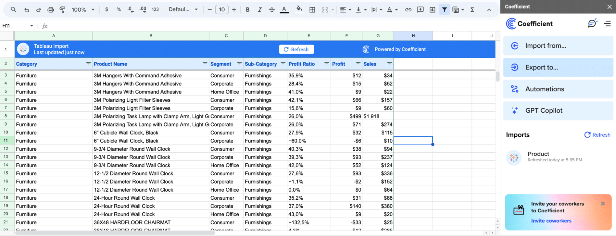
Before diving into the KPI creation process, it’s essential to consider how your data is structured and flows into Tableau. Many teams rely on data from various sources, such as spreadsheets or databases, which may require cleaning and preparation before creating KPIs.
Tools like Coefficient can streamline this process by automating data updates and transformations directly within your spreadsheets. Coefficient ensures that your data is always analysis-ready, seamlessly integrating with your broader data ecosystem, including Tableau.
Klaviyo, for example, revolutionized their reporting process by embracing Coefficient. By leveraging Coefficient’s power directly within their spreadsheets, they eliminated the challenges of ad-hoc data requests and manual reporting that required building in their BI system, Tableau.
This transition to automated analytics, integrated seamlessly into their Excel and Google Sheets workflows, led to significant time and effort savings for the team. Learn more about Klaviyo’s success story here: https://coefficient.io/customer-stories/klaviyo
Now, let’s dive into the step-by-step process of creating KPIs in Tableau dashboards.
Step-by-Step Guide to Creating KPIs in Tableau Dashboards
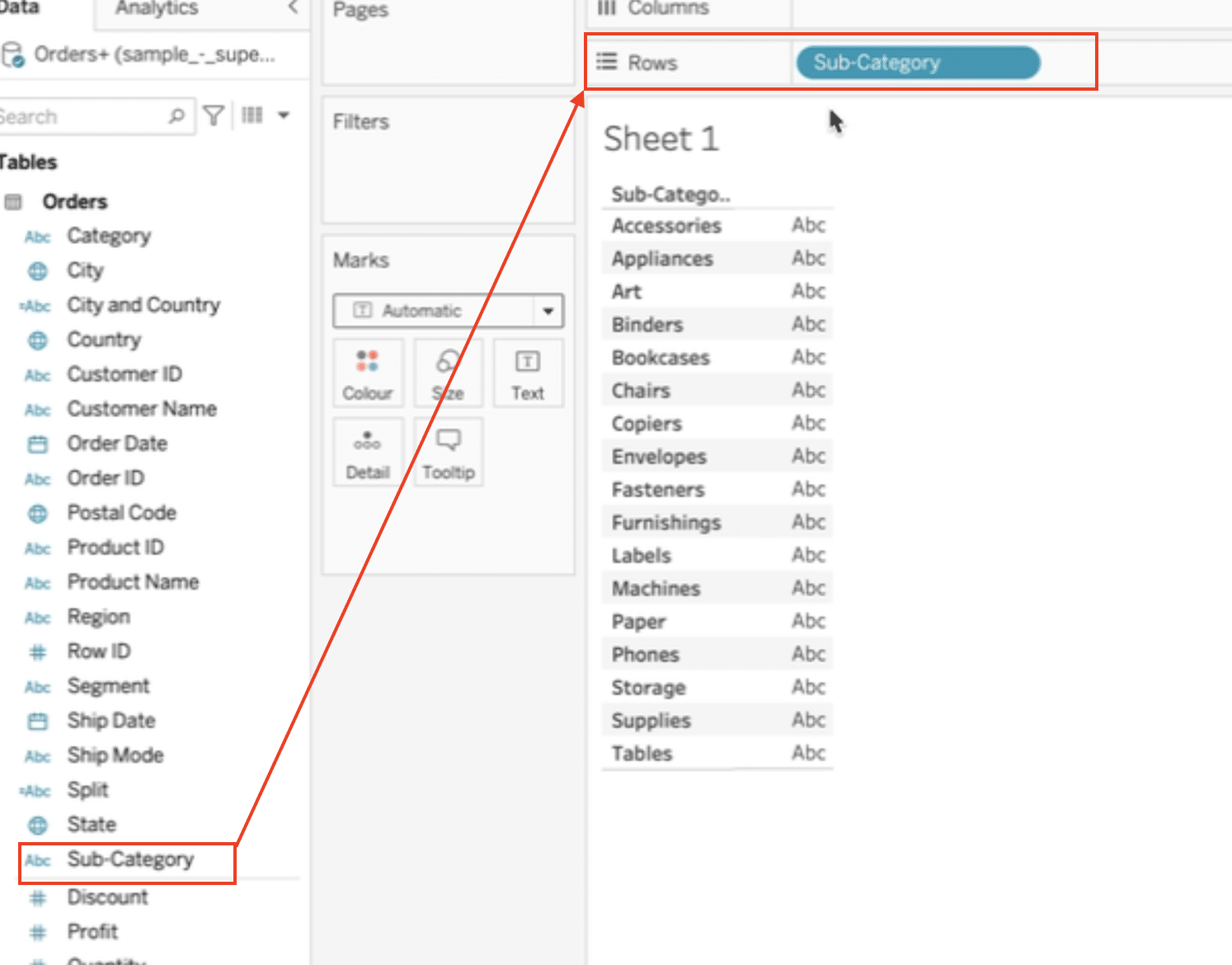
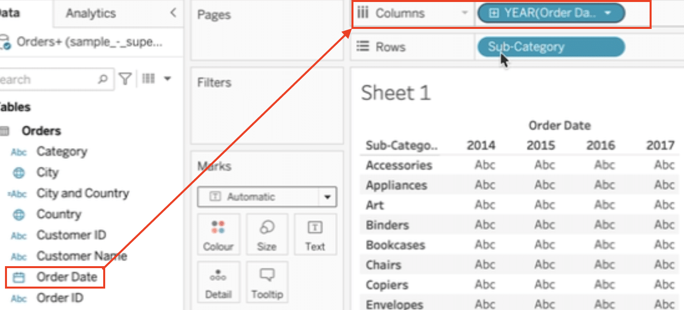
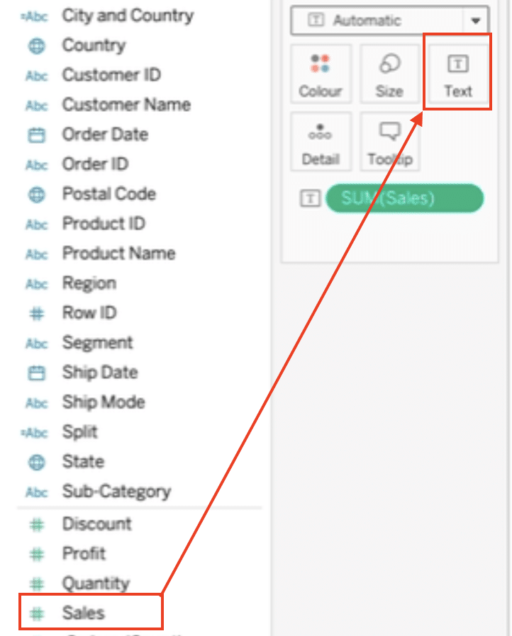
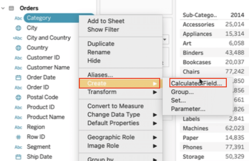
Step 1: Set up your Tableau worksheet
Drag the “Sub-Category” dimension to the Rows shelf.
Drag the “Order Date” dimension to the Columns shelf.
Drag the “Sales” measure to the Text mark.
Step 2: Create a KPI calculated field
Create a new calculated field by right-clicking in the Data pane and selecting “Create Calculated Field.”
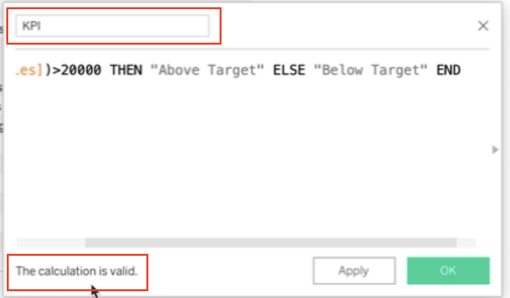
Name the calculated field “KPI” and enter the following formula: IF SUM([Sales]) > 20000 THEN “Above Target” ELSE “Below Target” END.
Ensure the calculation is valid in the left-hand corner.

Stop exporting data manually. Sync data from your business systems into Google Sheets or Excel with Coefficient and set it on a refresh schedule.
Get Started
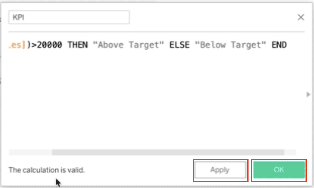
Click “Apply” and “OK” to create the KPI calculated field.
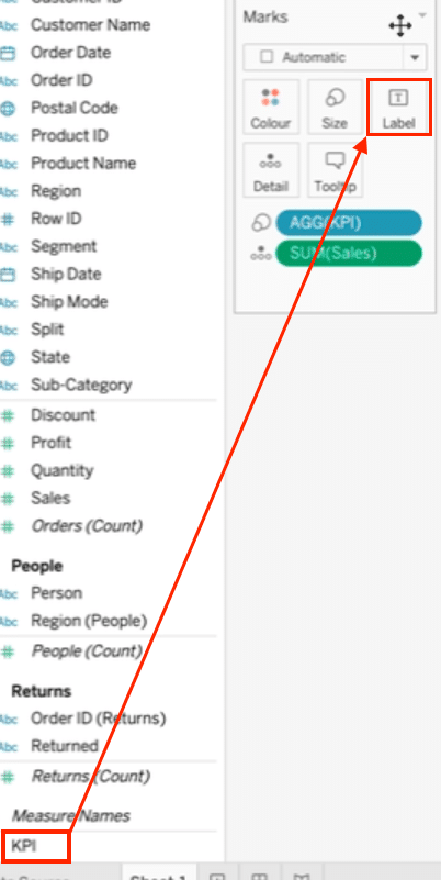
Step 3: Visualize the KPI on your dashboard
Drag the “KPI” calculated field to the Size mark.
Change the mark type to Shape.
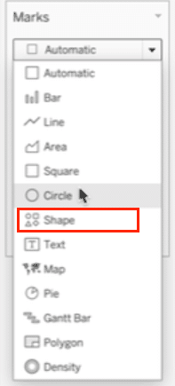
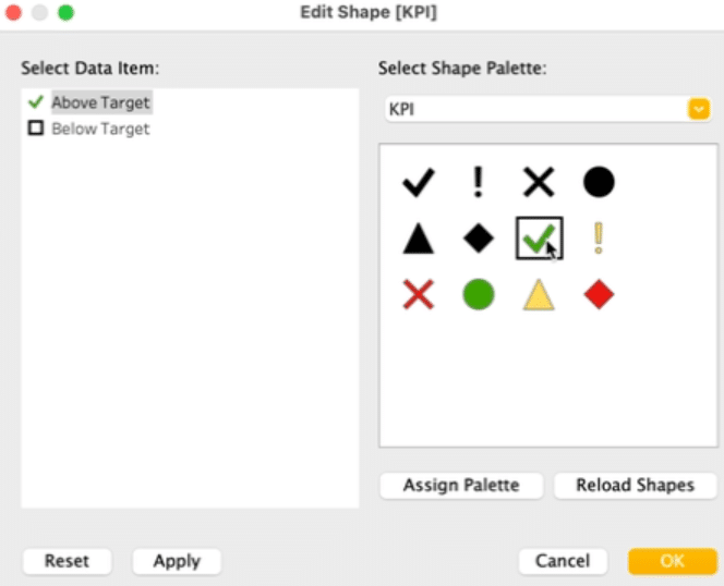
Customize the shapes and colors for the “Above Target” and “Below Target” KPI values.
Overcoming Challenges with KPIs in Tableau Dashboards
- Define clear KPI targets: Ensure that your KPI targets are well-defined and aligned with your business objectives to provide meaningful insights.
- Normalize KPI scales: When comparing multiple KPIs, consider normalizing their scales to ensure fair comparisons and avoid misinterpretation.
- Use context filters: Apply context filters to your KPIs to allow users to explore different dimensions and levels of granularity.
Best Practices for Creating KPIs in Tableau Dashboards
- Keep KPIs simple and focused: Limit the number of KPIs on a single dashboard to maintain clarity and avoid information overload.
- Use clear and concise labels: Provide clear labels and descriptions for your KPIs to ensure that users understand their meaning and context.
- Combine KPIs with other visualizations: Supplement your KPIs with other relevant visualizations, such as trend lines or bar charts, to provide a more comprehensive view of performance.
Get Real-Time Insights into Performance with KPIs in Tableau Dashboards
By following this step-by-step guide, you now have the knowledge and tools to create effective KPIs in your Tableau dashboards. Monitoring KPIs is crucial for making data-driven decisions and achieving your business objectives.
Remember to leverage data preparation best practices and tools like Coefficient to streamline your workflow and ensure that your data is always analysis-ready.
Get started with Coefficient today to take your Tableau dashboard creation and analysis to the next level.


