Wondering how forecasting works in Tableau? This guide is for you.
Forecasting is a powerful analysis method that allows users to predict future trends and values based on historical data. By leveraging Tableau’s forecasting capabilities, businesses can make informed decisions, anticipate market changes, and plan for the future with greater confidence.
In this tutorial, we will explore how forecasting works in Tableau and walk you through the process of creating a forecast visualization using the Superstore dataset.
Let’s dive in!
Getting Started with Forecasting in Tableau
Before diving into creating forecasts in Tableau, it’s important to consider the data preparation process.
Many teams rely on spreadsheets or databases that require regular updates. This is where tools like Coefficient can be incredibly helpful. Coefficient ensures that your source data in Excel or Google Sheets remains live and up-to-date, integrating seamlessly with your broader data ecosystem, including Tableau.
To ensure a smooth data integration process for forecasting, consider the following:
- Data Requirements: Ensure your dataset spans a minimum of two to three years, with data points recorded at monthly intervals, and is in a time series format with a clear time dimension, such as a date field.
- Data Compatibility: Make sure the structure, types, and formats of your data align with your Tableau workbook’s current setup and dashboards, and adapt calculations, parameters, filters, and relationships to work with the updated data source.
- Automated Updates: Use a tool like Coefficient that automatically refreshes your data, keeping everything current without manual effort, ensuring your data is always ready for analysis in Tableau or spreadsheets.
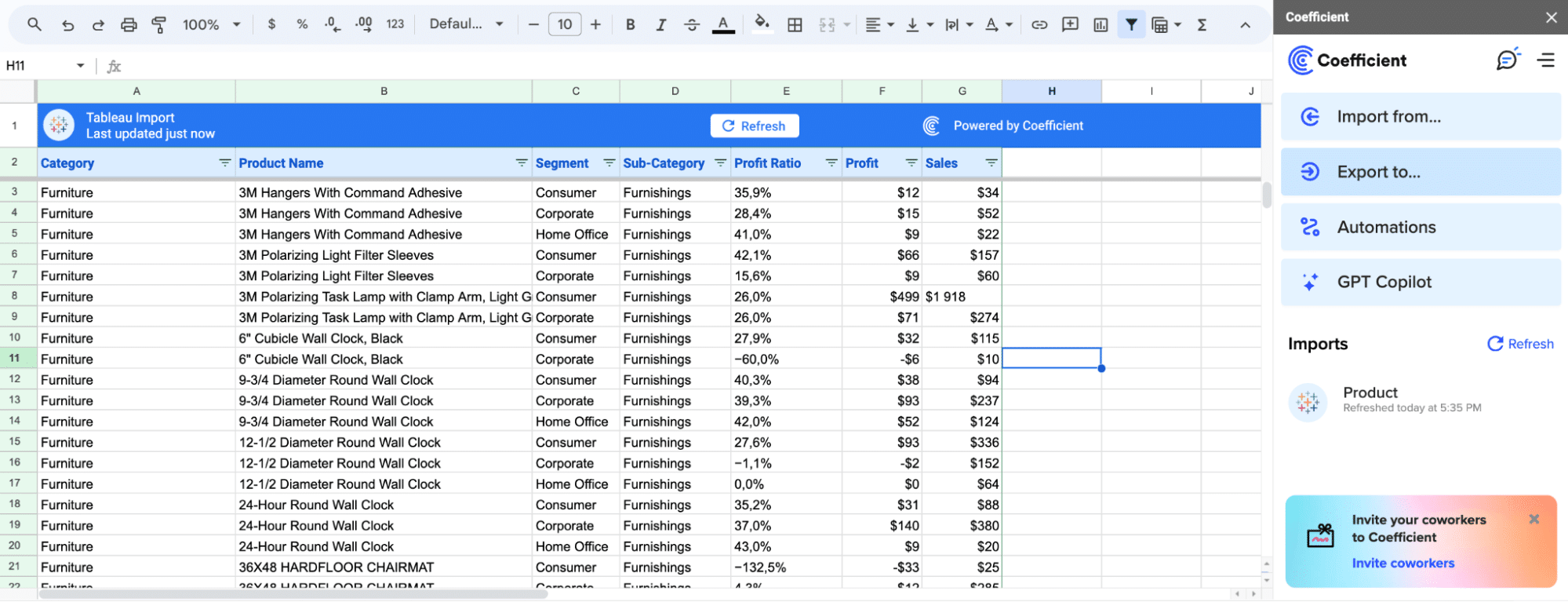
Klaviyo, for instance, streamlined their reporting process with Coefficient.
By leveraging Coefficient’s capabilities directly within their spreadsheets, they eliminated the need for ad-hoc data requests and manual reporting that would otherwise be required in Tableau.
Step-by-Step Tutorial: Creating a Forecast Visualization in Tableau
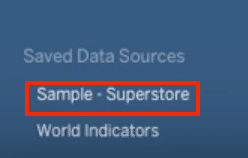
Step 1. Connect to your data source
Open Tableau and connect to your dataset. In this example, ‘Superstore.’
Step 2. Create a time series view
Drag the time dimension (e.g., “Ship Date”) to the Columns shelf and ensure it is set to a ‘continuous’ date level, displaying both the year and month.
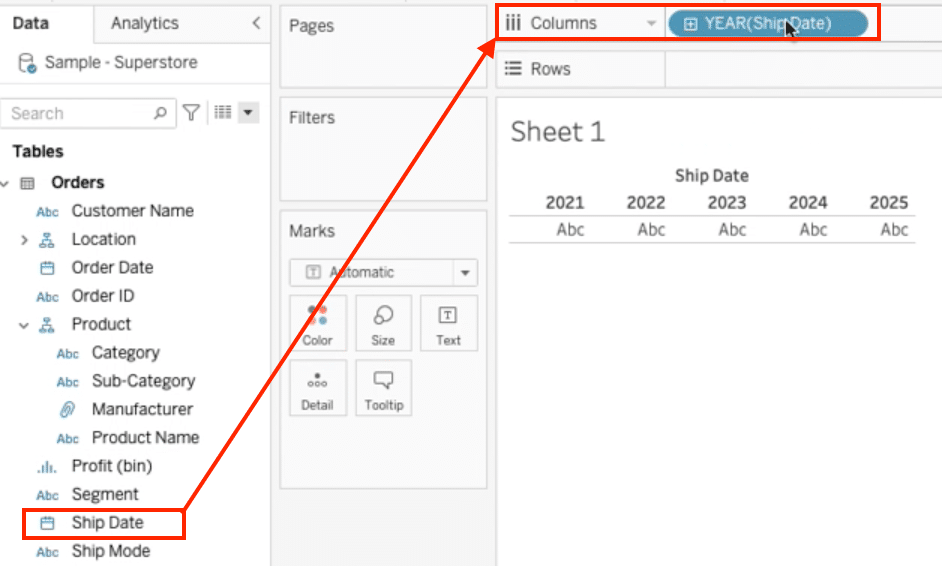
Click the ‘ship date’ in the Columns shelf to select ‘continuous’ in the dropdown list.
Step 3. Add a measure to the view
Drag a measure (e.g., “Sales”) to the Rows shelf to create a line graph showing the measure’s values over time.

Step 4. Enable forecasting
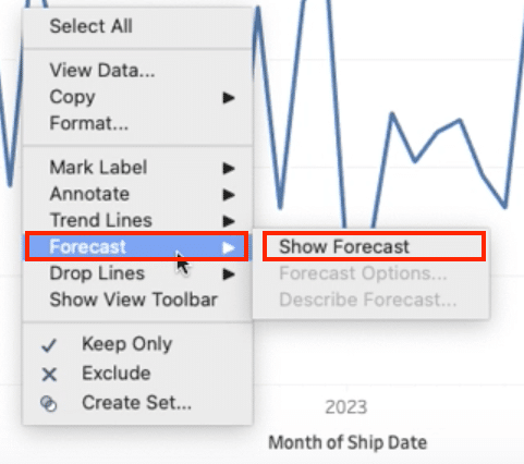
Right-click on the time dimension on the Columns shelf and select “Forecast” > “Show Forecast”.
Step 5. Customize the forecast visualization
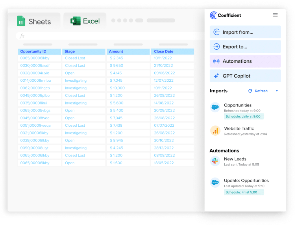
Stop exporting data manually. Sync data from your business systems into Google Sheets or Excel with Coefficient and set it on a refresh schedule.
Get Started
Tableau will display the actual and forecasted values in the view. You can customize the colors and other visual properties to differentiate between the actual and forecasted data.
1:20-1:36

Step 6. Explore additional forecast options
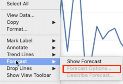
Tableau provides various options to fine-tune your forecast. You can access these options by right-clicking on the forecast line and selecting “Forecast Options”.
Step 7. Analyze the forecast results
Tableau offers several ways to analyze the forecast results, such as displaying the trend, precision, and other statistical measures.
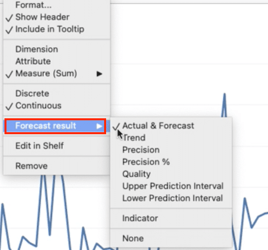
Experiment with these options to gain deeper insights into your forecasted values.
Tips and Best Practices for Forecasting in Tableau
- Ensure your data is clean, consistent, and covers a sufficient time period for accurate forecasting.
- Choose the appropriate time granularity (e.g., monthly, quarterly) based on your business needs and data availability.
- Experiment with different forecast models and parameters to find the best fit for your data.
- Use Tableau’s built-in forecast quality metrics to assess the reliability of your forecasts.
- Regularly update your data and refresh your forecasts to incorporate the latest information.
- Leverage Coefficient to automate data updates and ensure your forecasts are always based on the most current data.
- Validate your forecasts against actual results and make adjustments as needed to improve accuracy over time.
- Communicate the assumptions and limitations of your forecasts to stakeholders to set appropriate expectations.
Unlock the Power of Forecasting in Tableau
Forecasting in Tableau is a valuable tool for businesses looking to make data-driven decisions and plan for the future. By following the step-by-step tutorial and adhering to best practices, you can create insightful forecast visualizations that help you anticipate trends and make informed predictions.
Remember to leverage tools like Coefficient to streamline your data management process and ensure your forecasts are always based on the most up-to-date information.
With Coefficient, you can seamlessly integrate your data sources with Tableau, saving time and effort in data preparation and analysis.


