
Donut charts are a great way to show parts of a whole, like sales per region or product category. They’re a modern take on pie charts, with a hole in the middle for extra information.
In this guide, we’ll walk you through making a donut chart in Tableau from start to finish. You’ll have an eye-catching chart ready to share in no time.
Donut Charts in Tableau: Getting Started
Before you start building in Tableau, make sure your data is prepped and ready to go.
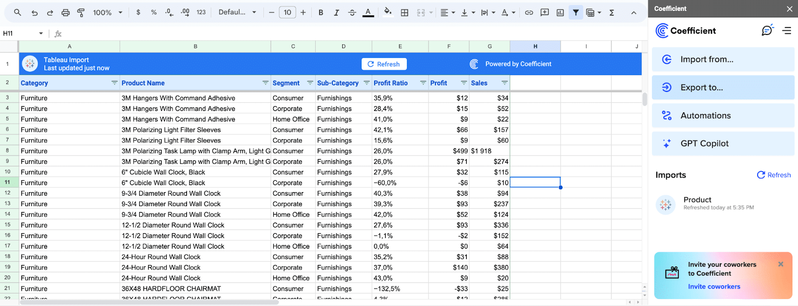
- Clean Up Your Data: Check that your data is accurate, consistent, and in the right format for Tableau. Tools like Coefficient can help keep your data in Excel or Google Sheets synced and fresh.
- Connect Your Data to Tableau: Once your data is squeaky clean, connect it to Tableau. Double-check that everything looks good and matches up with your data source.
- Keep Your Data Fresh: Set up automatic data refreshes so your donut chart always shows the latest numbers. Coefficient makes this a breeze, so you don’t have to manually update every time.
Klaviyo, an email marketing platform, revolutionized their reporting process by leveraging Coefficient.
By integrating Coefficient directly within their spreadsheets, they eliminated manual data requests and saved substantial time and effort, seamlessly integrating with Tableau for enhanced data visualization.
By taking the time to properly prepare your data and utilizing tools like Coefficient, you’ll set yourself up for success when creating your donut chart and avoid potential issues down the line.
Create Donut Charts in Tableau: Step-by-Step Guide
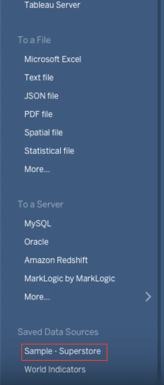
Step 1. Launch Tableau and select your dataset
Begin by opening Tableau and choosing your dataset in the side tab (in this example ‘Superstore’) to start creating your donut chart.
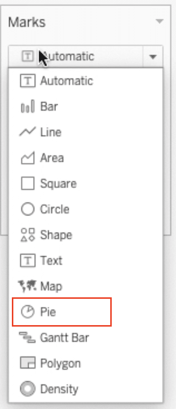
Step 2. Convert to a pie chart
Change the automatic visualization to a pie chart to lay the foundation for your donut chart.
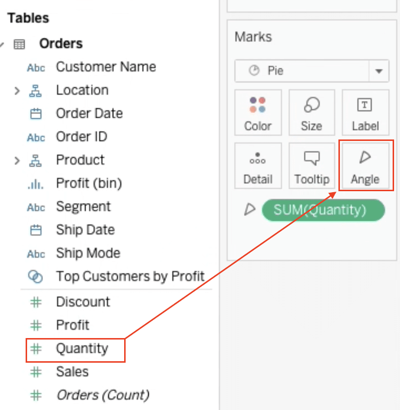
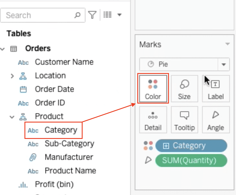
Step 3. Assign quantity to the angle
Drag the “Quantity” measure to the “Angle” mark to create the segments of your pie chart.
Step 4. Color-code the segments by category
Drag the “Category” dimension to the “Color” mark to distinguish the segments by their respective categories.
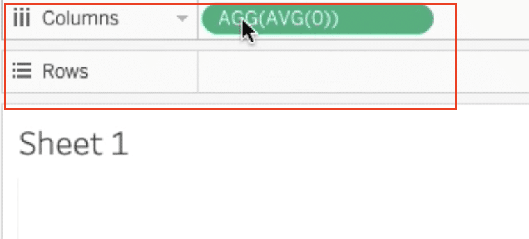
Step 5. Create a separate field for the donut hole
Double-click the workspace and type “AVG(0)” to create a separate field for the donut hole.
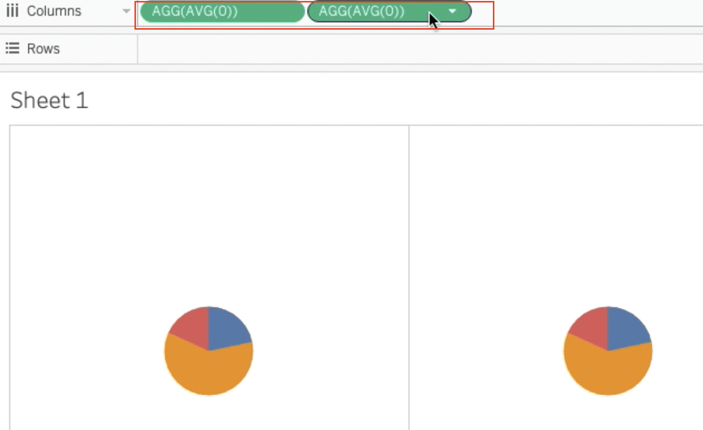
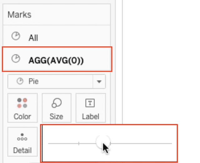
Step 6. Duplicate the pie chart
Hold the Ctrl key and drag the ‘AVG(0)’ field in the workspace to duplicate the pie chart, creating two identical pie charts.
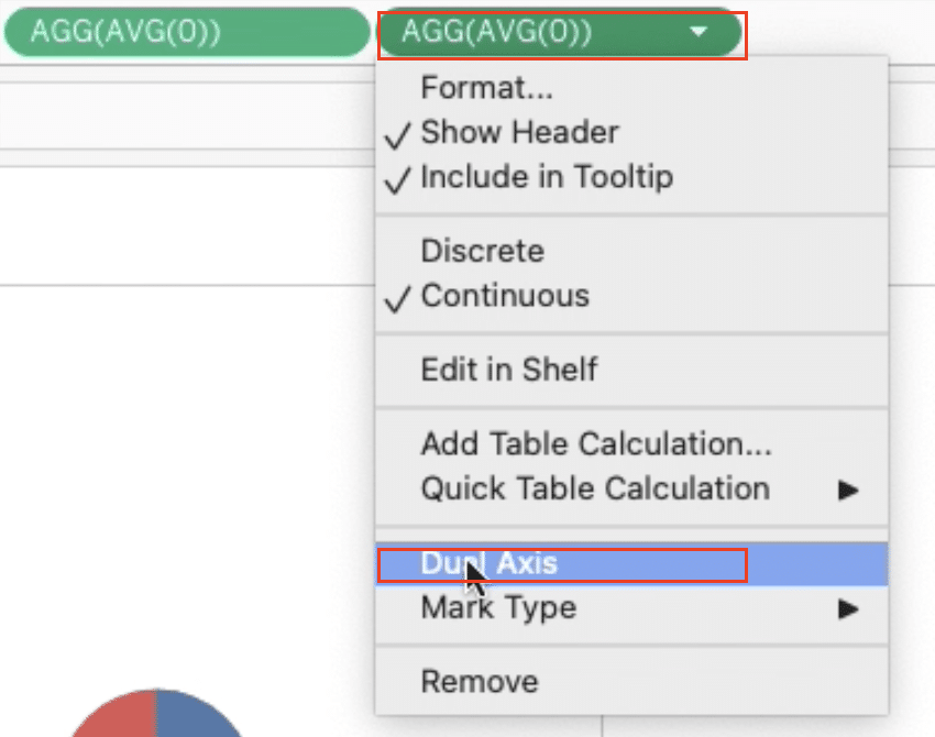
Step 7. Create a dual-axis
Select the second pie chart and choose “Dual Axis” to overlay the two charts.
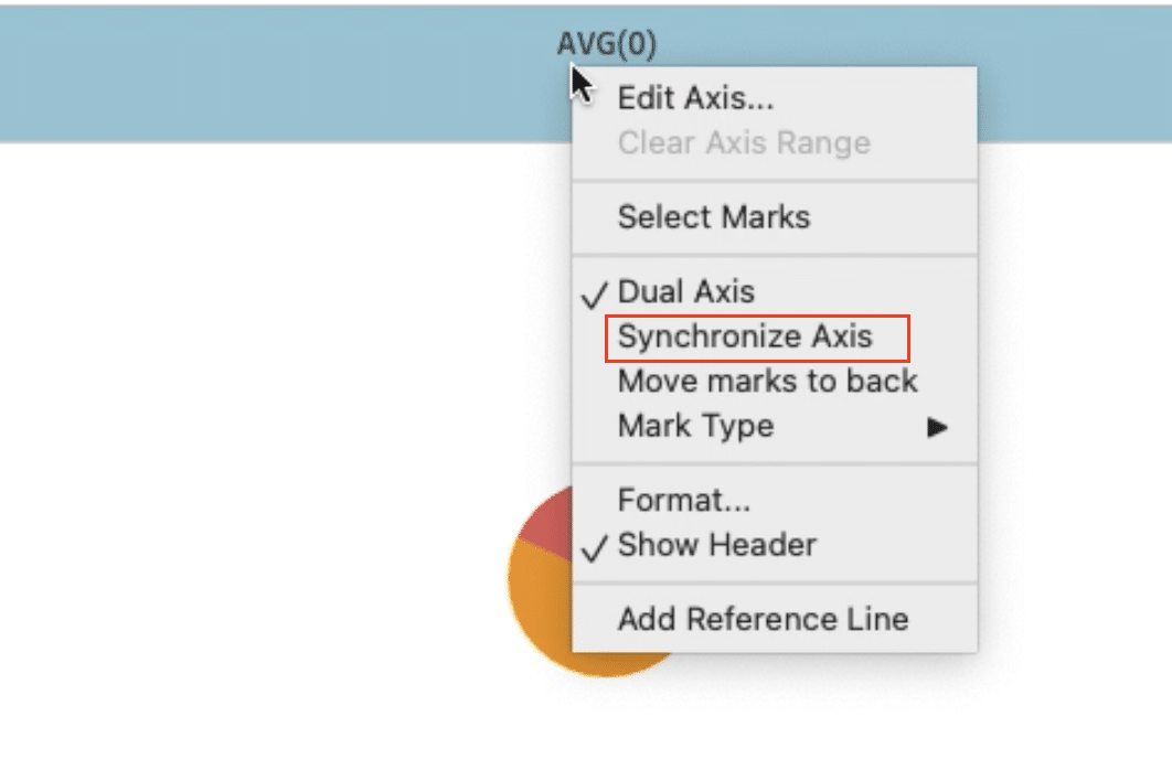
Step 8. Synchronize the axes

Stop exporting data manually. Sync data from your business systems into Google Sheets or Excel with Coefficient and set it on a refresh schedule.
Get Started
Click the top pie chart and select “Synchronize Axis” to ensure both charts display the same values.
Step 9. Adjust the size and remove the axes
Increase the size of the second pie chart to create the donut hole effect and remove the axis headers for a cleaner look.
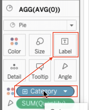
Step 10. Add category labels
Hold the Ctrl key and drag the “Category” dimension to the “Label” mark to display the category labels on the donut chart.
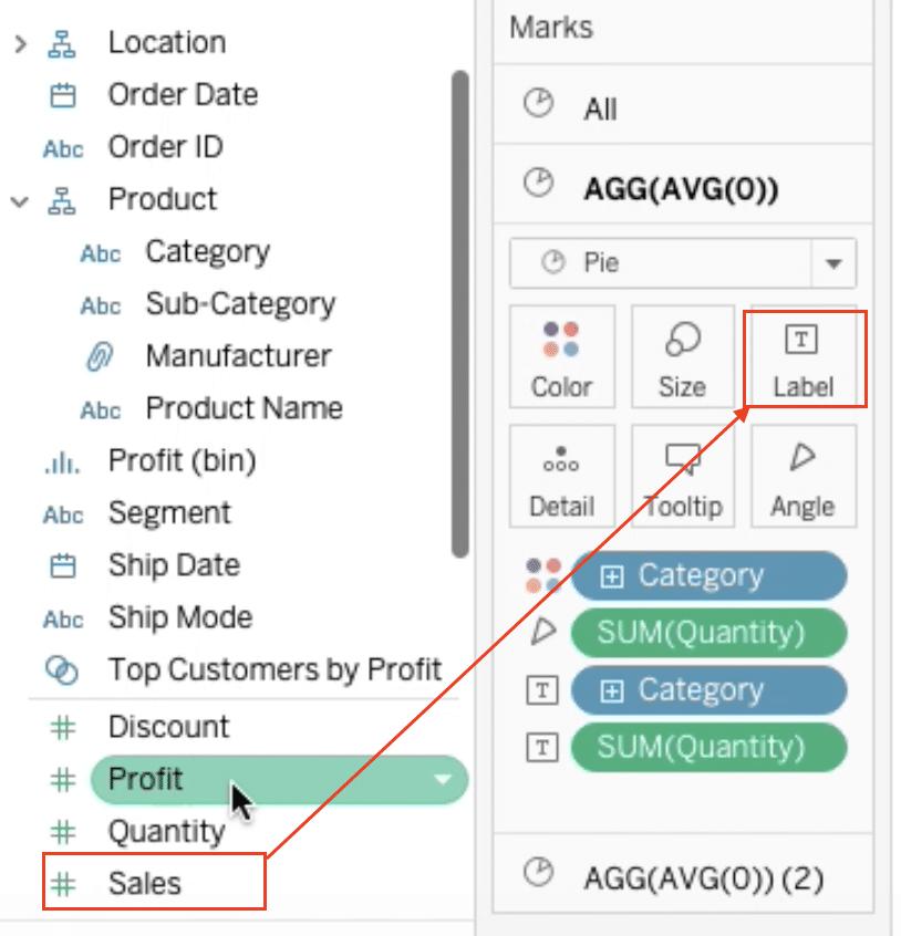
Step 11. Add sales values
Hold the Ctrl key and drag the “Sales” measure to the “Label” mark to display the sales values on the donut chart.
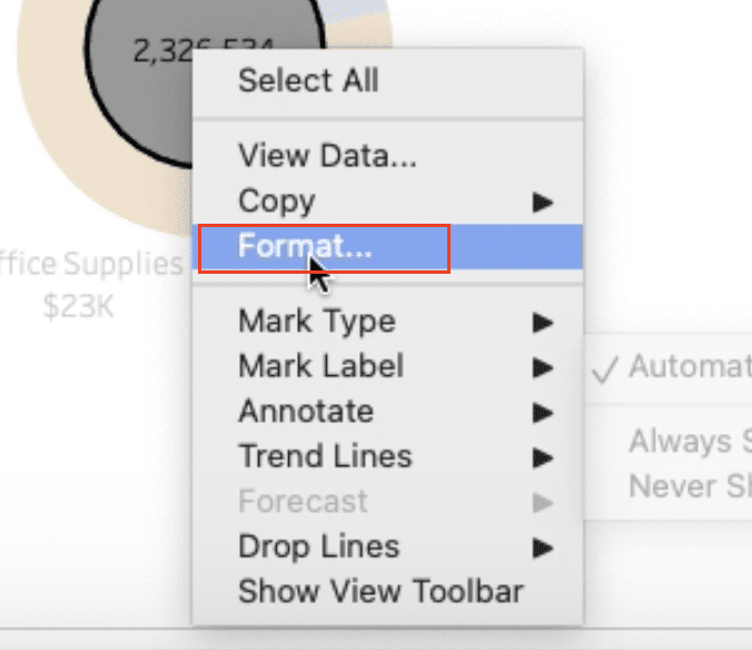
Step 12. Format the sales labels
Format the sales labels by selecting the label and choosing “Format.”
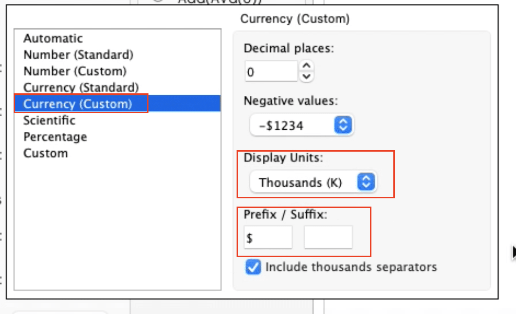
Format the Field to ‘Sales,’ and customizing the number format to display as currency.
Tips and Tricks for Creating Donut Charts in Tableau
- Simplify Complex Data: Use pie charts to break down complex datasets into digestible visual pieces, making it easier for viewers to understand.
- Limit Pie Slices: Too many slices can clutter your pie chart. Consider grouping smaller categories into an ‘Other’ slice for clarity.
- Use Color Wisely: Colors can significantly enhance the storytelling capability of your pie charts. Use distinct, contrasting colors for different categories for optimal visual differentiation.
- Interactive Dashboard Features: Take advantage of Tableau’s interactive features, such as tooltips and filters, to allow users to engage with your pie chart on a deeper level.
Transform Data into Decisions with Tableau
You now have the power to create compelling donut charts in Tableau that drive data-driven decisions.
Coefficient streamlines your data preparation process, ensuring your donut charts always reflect the most current and accurate information.
Try Coefficient for free today and unlock the full potential of your data visualization capabilities in Tableau.


