


Table of Contents
![]()
- 1. 10 B2B Sales Dashboards for RevOps Teams in 2026
- 2. How to build a lead generation dashboard in Google Sheets
-
3. Sales Performance Dashboard: Free Spreadsheet Template
- Sales Performance Dashboard for Salesforce
- Sales Performance Dashboard for HubSpot
- What is a Sales Performance Dashboard?
- Video Walkthrough: How to Use Your Template
- How to Build a Dashboard to Track Sales Performance
- How to Set Up Coefficient's Dashboard Template
- Sales Performance Dashboard: Features & Capabilities
- Try Our Free Google Sheets Dashboard Now!
- 4. How to Build a Sales Dashboard in Google Sheets
- 5. Sales KPIs Dashboard: 4 Free Google Sheets Templates
- 6. Free Sales Templates: SalesOps Dashboards for Google Sheets
- 7. 5 Sales Tracking Spreadsheet Templates for Reporting
- 8. Opportunity History Template: Track Sales Forecast Changes


For SalesOps managers, building and maintaining a sales performance dashboard is often an ongoing headache.
But with our free sales performance dashboards for Google Sheets, you can visualize the performance of your sales teams in real time without ever leaving your spreadsheet.
Coefficient’s sales performance dashboard works with your HubSpot or Salesforce data. You’ll simply connect your CRM to Google Sheets with Coefficient and, voila, the dashboard will automatically populate with your data.
You can grab your free dashboard just below. For a full overview of the dashboard, including how to set it up and leverage it, you’ll have a full video and text walkthrough below.
Sales Performance Dashboard for Salesforce

Sales Performance Dashboard for HubSpot

What is a Sales Performance Dashboard?
A sales performance dashboard is a critical tool for SalesOps managers. Over the past several years, we’ve worked with hundreds of sales teams across the world, and we’ve seen firsthand how essential this dashboard is for sales operations.
Sales performance dashboards track sales team performance over time, typically on a yearly, quarterly, monthly, and weekly basis. The dashboard gives an overview of sales by opportunity type, top accounts, and closed deals. A sales performance dashboard can also sort by country, industry, and other segments.
Although specific KPIs can vary based on use case, most companies employ these dashboards to gain a birds-eye view of bottom-line results across different teams and time periods. That’s why the dashboard is such an indispensable part of a SalesOps manager’s arsenal.
Video Walkthrough: How to Use Your Template
We’ve made the process incredibly simple to download your template and power it with your live data. Here’s a quick walkthrough of how it’s done.
How to Build a Dashboard to Track Sales Performance
As crucial as sales performance dashboards are, the CRM systems that SalesOps managers typically build them in are clunky, limited, and rigid. Popular CRM systems, such as Salesforce and HubSpot, are not flexible enough and cannot blend data between different systems in an efficient fashion.
The result is that many SalesOps managers design their dashboards in spreadsheets. With spreadsheets, SalesOps managers can import data from multiple sources, easily format data, and visualize outputs, all within the interface that many SalesOps managers prefer.
However, even with the right data, traditional spreadsheets suffer from problems of their own. They can break in some cases, and the data can quickly go stale, unless you manually update the spreadsheet consistently. But this requires a significant amount of time and effort.
That’s why we created our sales performance dashboard for Google Sheets. We want SalesOps managers to focus on analysis and insights, rather than creating dashboards.
Our pre-built sales performance dashboard automates all the steps in the dashboarding process, from scoping, to building, to maintenance:
- Scoping – Our dashboard tracks best-in-class KPIs. We’ve helped hundreds of sales teams build dashboards for all kinds of use cases, so we know what works, and what doesn’t.
- Building – The dashboards themselves are entirely pre-built. We’ve already implemented all the logic, formulae, and functions in Google Sheets to output beautiful dashboards.
- Maintenance – Coefficient automatically updates your CRM data in Google Sheets, so your dashboards are always up-to-date. No more manually copying-and-pasting data into your spreadsheet.
Here’s an overview of how to set up the dashboard, along with the various features and capabilities.
How to Set Up Coefficient’s Dashboard Template
You can set up our sales performance dashboard in a few simple steps. First, click the button below for the CRM that you use.
Launch the Salesforce Sales Performance DashboardOnce you click the button, you’ll enter a landing page. Submit your email to grab the template.
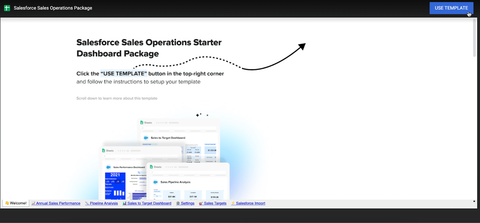
Once you enter your email, you will be routed to your dashboard in Google Sheets. Click “Use Template” to copy the sales performance dashboard.
After you make a copy, you will enter the dashboard in Google Sheets. To connect your live data to the dashboard, you’ll need to install Coefficient.
A sidebar will automatically pop up once you’re inside Google Sheets. If you do not already have Coefficient installed, click “Add to Sheets” on the sidebar.
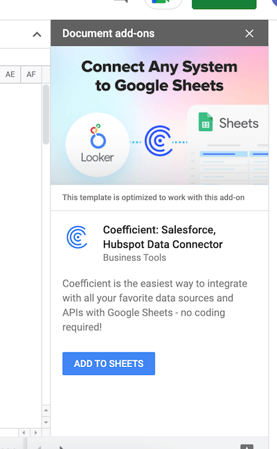
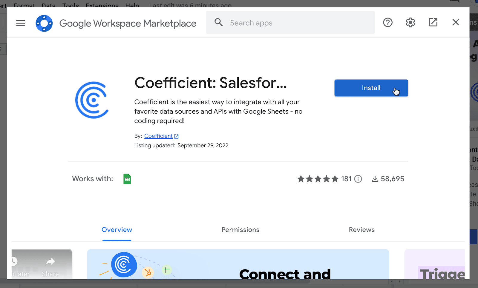
You will land on Coefficient’s page in Google Workspace Marketplace. Press “Install” to install the Coefficient add-on.
Once the install process is complete, return to the sidebar and choose the “Use” button and then press “Launch”. This will launch the Coefficient add-on.
From here, you will need to connect your Salesforce or HubSpot CRM data to power the dashboard. Follow these step-by-step walkthroughs on how to set up each CRM data source.
Now your Salesforce or HubSpot data will automatically populate the dashboard!
Sales Performance Dashboard: Features & Capabilities
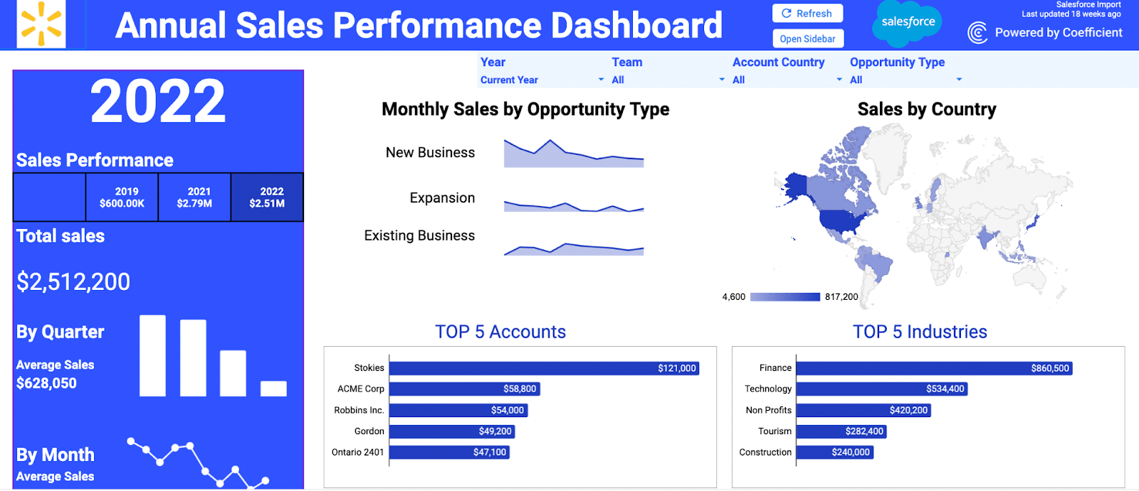
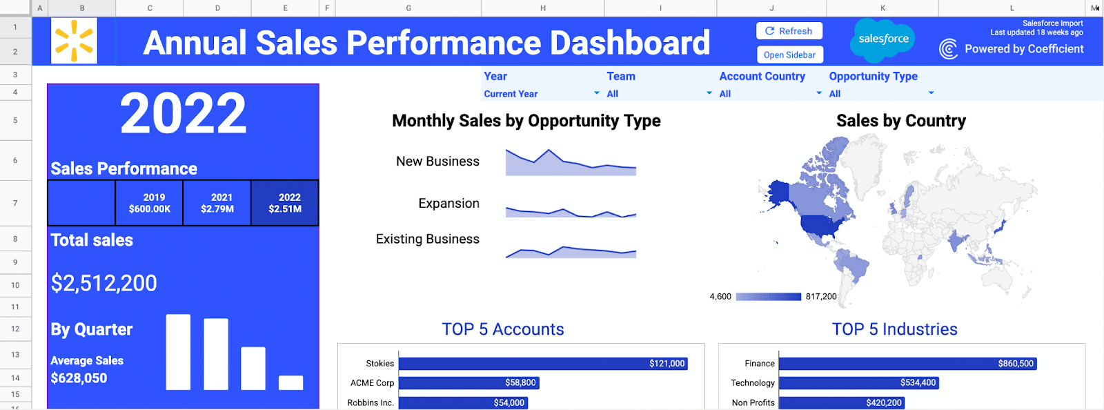
Our sales performance dashboard allows sales leaders to compare year-over-year sales performance by industry, region, and account.
At the top of the dashboard, you can toggle between year, team, country, and opportunity. This will make the visualizations in the dashboard display these segments.

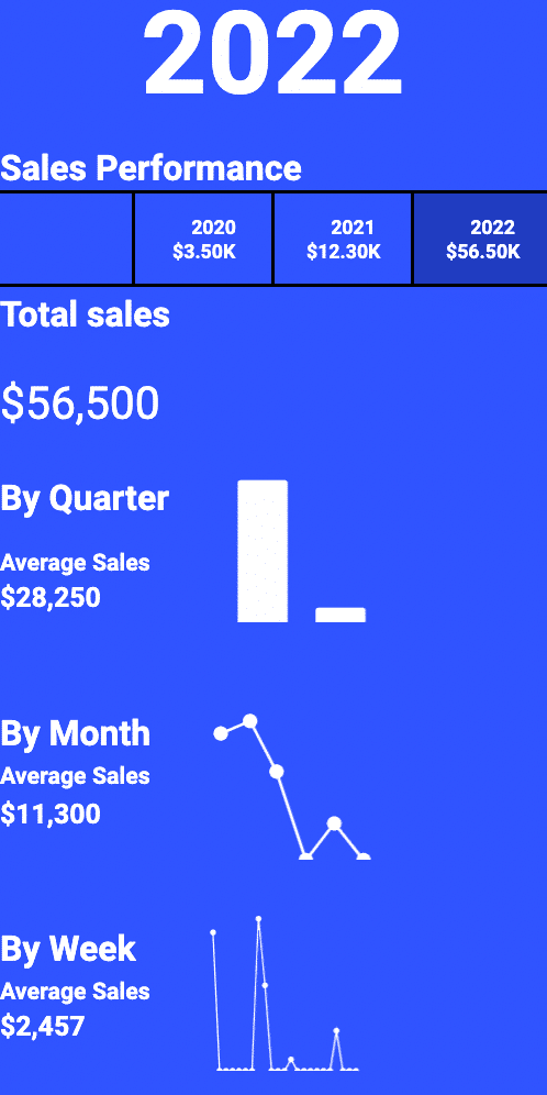
The top-line visualizations in the dashboard show critical sales performance KPIs, including yearly historic revenue, and total sales by year, quarter, month, and week.
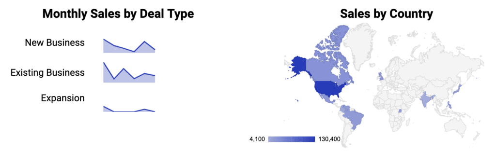
See a high-level overview of monthly sales by deal type — including new business, existing business, and expansion — and sales by country with a geographic gradient map.
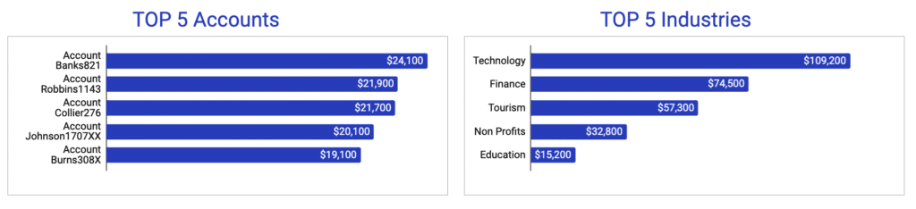
Keep track of your top 5 accounts and industries with up-to-date graphs powered by real-time CRM data.
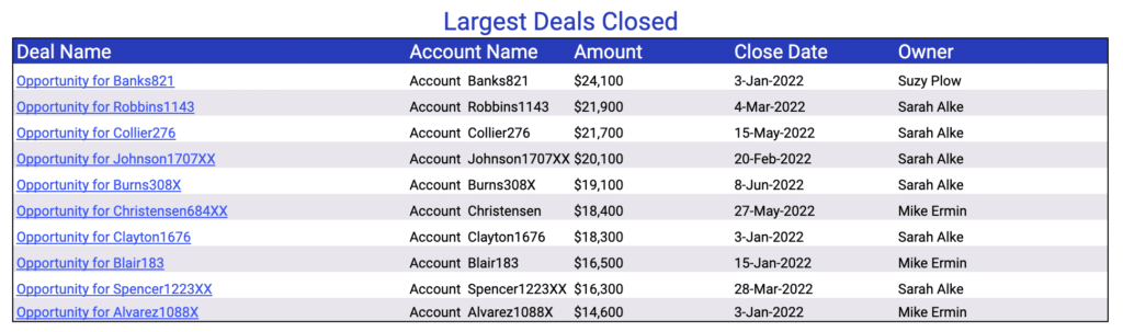
You can also view the largest deals closed in a pre-designed report, including deal name, account name, amount, close date, and owner.
The dashboard offers all the visualizations and reports your team needs to measure yearly, monthly, weekly, and daily growth. Give it a try — it only takes a few clicks to launch the dashboard.
Try Our Free Google Sheets Dashboard Now!
With our sales performance dashboard, you can track how your sales teams are executing at any given point in time. And now you can launch Coefficient’s free sales performance dashboard in Google Sheets, with pre-built visualizations and automatic data updates, so all the hard work is taken off your plate.
Like this template? We have an entire library pre-built dashboards built by RevOps experts surrounding popular Salesforce and HubSpot reporting use cases.
Launch the Salesforce Sales Performance Dashboard