Table of Contents
![]()
- 1. 10 Best CRM Reporting Tools for 2026
- 2. Sales Velocity Tracking: How to Calculate and Track Overtime in Google Sheets
- 3. Average Deal Size: How to Measure + Optimize Forecasting (With Template)
- 4. How You Can Measure and Optimize Pipeline Velocity
- 5. How You Can Measure and Optimize Win Rate Today (2024 Guide)
- 6. Quota Attainment: How to Measure in 2026 (With Template)
- 7. Top 10 Sales Metrics to Track in 2025
- 8. How to Analyze Sales Rep Performance in Google Sheets
- 9. 5 Sales Revenue Metrics to Measure Success in 2024 (With Templates)


Accurate sales forecasting and process optimization rely on understanding your pipeline velocity or speed.
Coefficient’s Pipeline Analysis Dashboard for Google Sheets gives you live data insights to effectively manage your pipeline.
In this guide, we’ll explore pipeline velocity, how to calculate it, and how Coefficient can help you maximize its potential.
Understanding Pipeline Velocity
Pipeline velocity measures your sales team’s efficiency in converting opportunities into wins within a specific timeframe. It provides a clear picture of your team’s productivity and your organization’s revenue growth potential.
Pipeline velocity is influenced by several critical factors, including:
- Lead Quality and Qualification Process: Higher-quality leads that are properly qualified move through the pipeline faster, as they are more likely to convert into successful sales.
- Sales Team Skills and Training: Well-trained sales professionals who understand your products, target market, and sales process can more effectively navigate opportunities through the pipeline.
- Sales and Marketing Alignment: Strong alignment between sales and marketing teams, including seamless handoffs and effective communication, is essential for optimizing pipeline velocity.
How to Calculate Pipeline Velocity
To calculate pipeline velocity, use this formula:
Pipeline Velocity = (Number of Opportunities x Win Rate x Average Deal Size) / Length of Sales Cycle
- Number of Opportunities: The total count of potential deals in your pipeline.
- Win Rate: The percentage of opportunities that successfully convert into sales.
- Average Deal Size: The average monetary value of each deal in your pipeline.
- Length of Sales Cycle: The average duration it takes to close a deal, from the initial interaction to the final sale.
By quantifying how quickly opportunities convert into sales, pipeline velocity offers a direct lens into your team’s productivity and your organization’s revenue growth.
How to Quickly Visualize Pipeline Velocity with Coefficient
Coefficient’s Pipeline Analysis Dashboard for Google Sheets is your gateway to understanding and optimizing pipeline velocity.
Follow these steps to get started:
Step 1: Download the (Free) Pipeline Analysis Dashboard
To start, head to Coefficient.io. Enter your work email in the box and click ‘Get Free Template.’
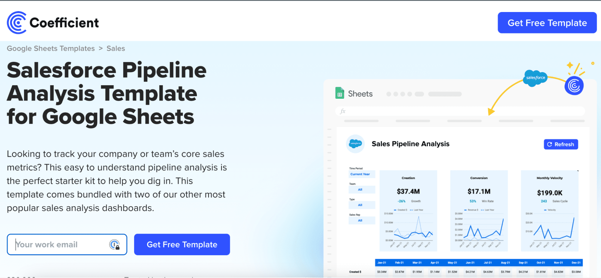
You can save the template to your Google account by clicking the ‘Use Template’ button at the top right corner of your screen.
Coefficient will open in a new spreadsheet.
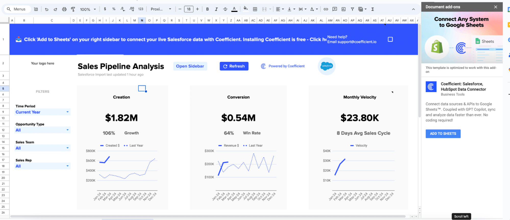
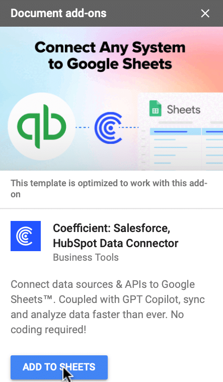
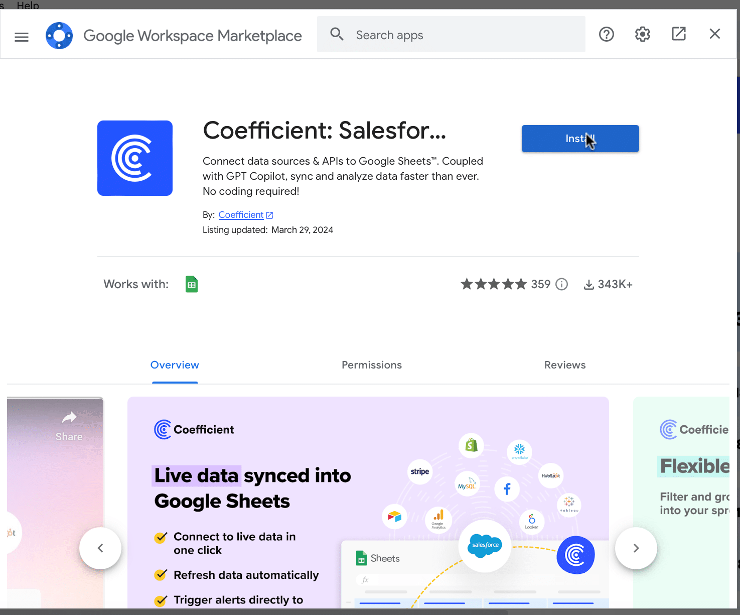
If this is your first time using Coefficient, you’ll need to add it as an add-on to Google Sheets.
Click ‘Add to Sheets’ to continue.
Hit the ‘Install’ button and follow the prompts to complete the installation.
Step 2: Connect Coefficient to Salesforce
After installation is complete, hit ‘Done’ to return to your spreadsheet.
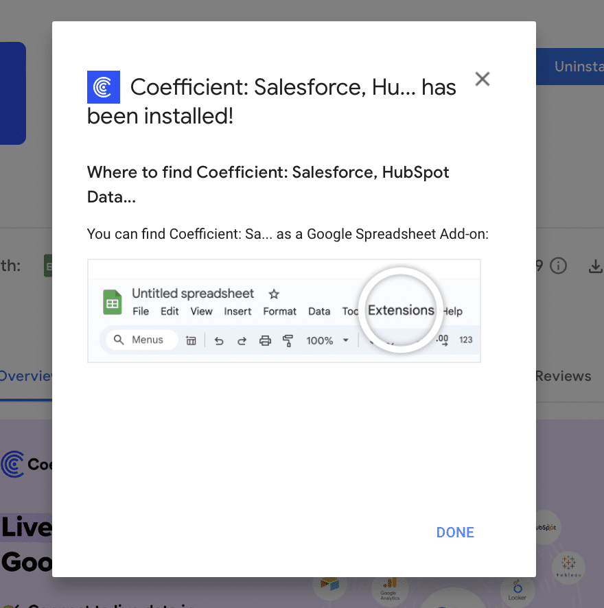
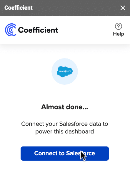
Click ‘Connect to Salesforce’ from the Coefficient menu on the right-hand side of your spreadsheet.
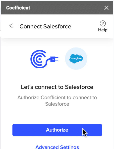
Follow the prompts to authorize Coefficient to your Salesforce account.
If successful, you’ll see the following notification at the top of your spreadsheet.

To update your data, navigate to the ‘Salesforce Import’ tab of your spreadsheet and click ‘Refresh.’
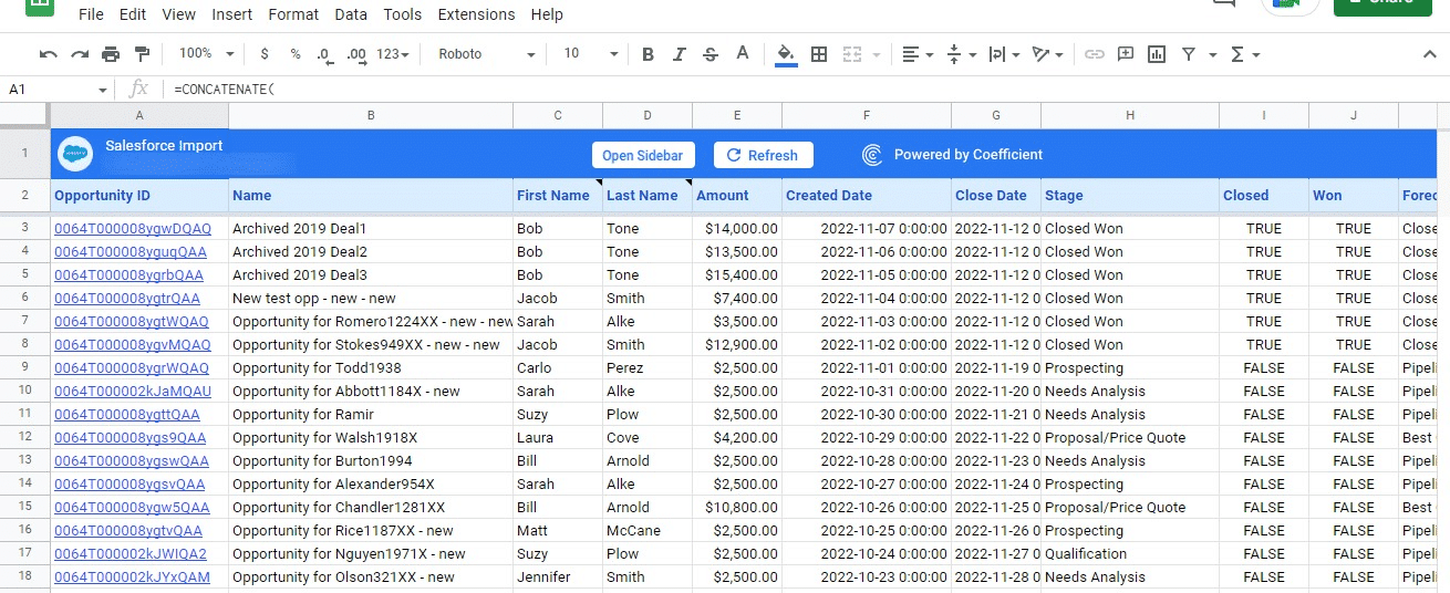
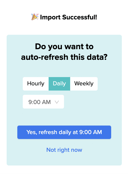
You can also auto-refresh your data by clicking ‘Set Refresh Schedule.’

Set up an hourly, daily, or weekly auto-refresh schedule, and Coefficient will automatically update your data based on that time interval.
That means, going forward, Coefficient will automate your Salesforce data exports to Google Sheets for you.
Step 3. Customize Your Dashboard
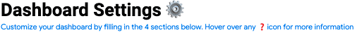
Tailor the template to your organization’s unique needs by navigating to the ‘Settings’ tab.
Company Information
Customize your company information, pipeline coverage ratios, pipeline stages, and team member details for a more personalized analysis.
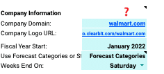
Personalize your dashboard by including your company’s domain URL, logo, and the start of your fiscal year. This ensures that the data and insights are specific to your organization and aligned with your financial reporting periods.
Pipeline Coverage Ratios
Fine-tune your pipeline coverage ratios based on your historical win rates.
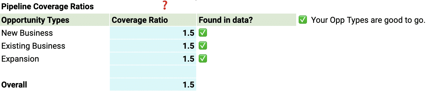
These ratios help you determine the number of opportunities needed in your pipeline to meet your sales targets, ensuring that you have a sufficient volume of potential deals to achieve your goals.
Pipeline Stages
Customize the pipeline stages in the template to mirror those in your Salesforce setup.
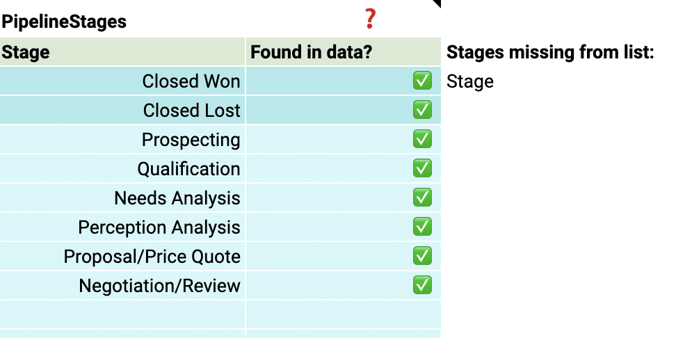
By aligning the stages in the dashboard with your sales process, you can gain accurate insights into the performance and velocity of your pipeline at each stage.
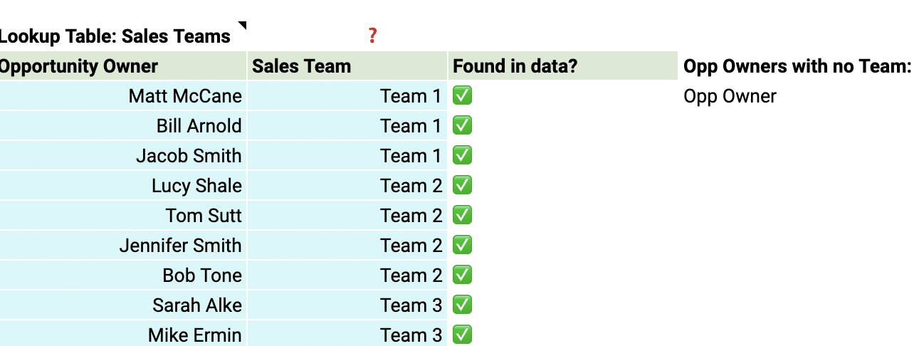
Team members
Add details about your sales team members to the dashboard for a more personalized analysis.
This allows you to track individual performance, identify top performers, and pinpoint areas where team members may need additional support.
With just a few simple customizations, you can transform the Pipeline Velocity Dashboard Template into a powerful tool tailored to your organization’s specific needs.
Deep Dive into the Pipeline Velocity Dashboard Template
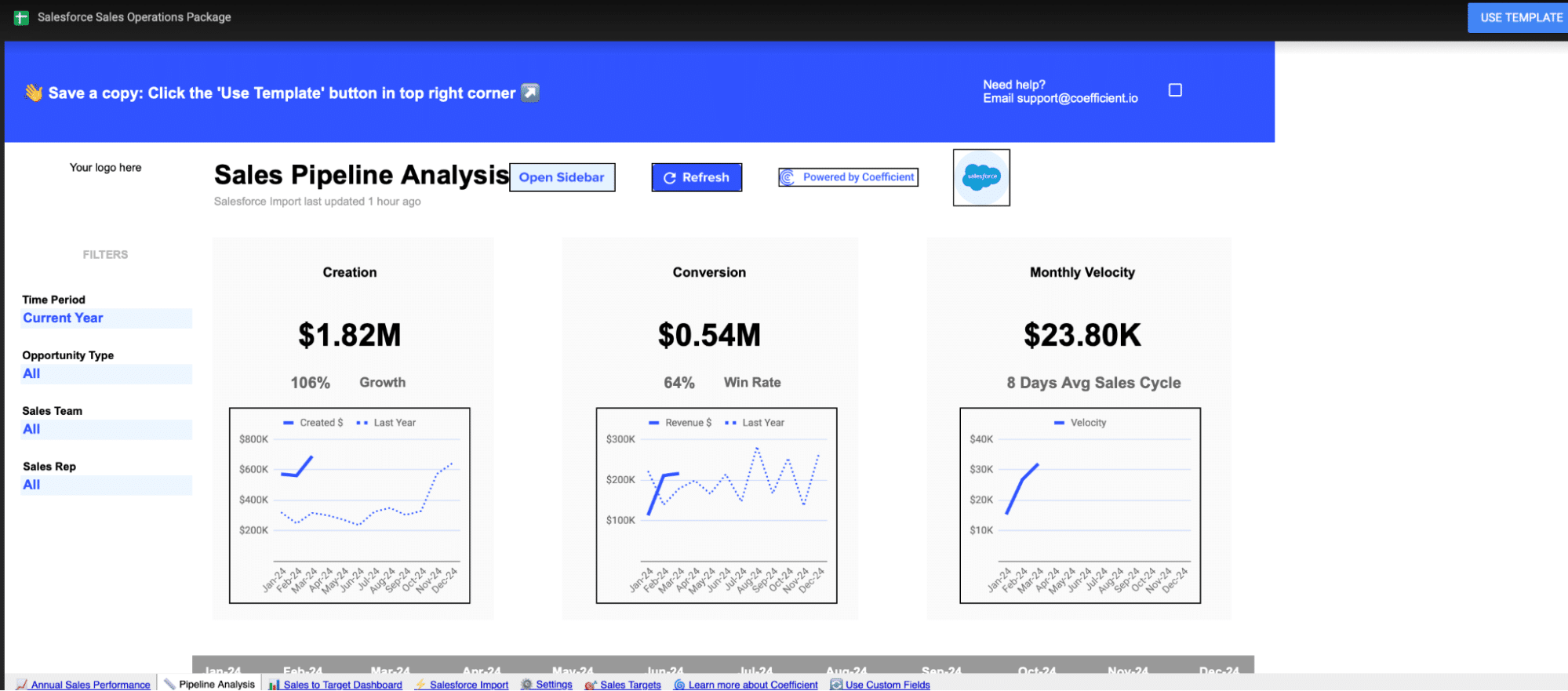
The Pipeline Velocity Dashboard Template offers a detailed view of your pipeline health through three key components:
- Pipeline Creation: Visualizes the growth in the number of opportunities and their potential value, compared year over year.
- Conversion Trends: Shows the percentage of opportunities that successfully turn into sales, also compared year over year.
- Monthly Velocity: Illustrates the average time it takes for opportunities to convert into sales, providing a monthly overview.
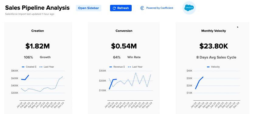
Use these insights to optimize your sales strategies, reallocate resources to the most profitable opportunities, and adjust pricing models in response to market changes.
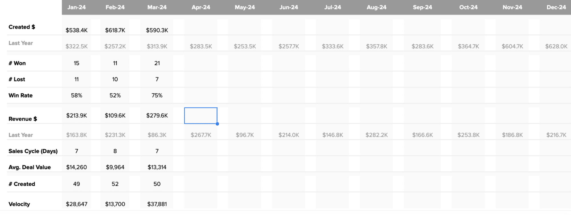
If you want to examine the data more closely, beneath the graphs offer a deeper dive into your pipeline metrics. It displays monthly figures for key indicators such as:
- Number of opportunities created, won, and lost
- Win rate percentage
- Total revenue and comparison to the previous year
- Length of the sales cycle
- Average deal value
- Number of new opportunities created
How to Action Insights into Your Pipeline Velocity
Coefficient’s Pipeline Analysis Template helps you make informed decisions by providing real-time data insights. Here’s how you can use these insights to drive growth:
- Fine-tune sales strategies: Spot trends in pipeline creation and conversion rates to identify what’s working and what needs improvement. If win rates are low, consider tweaking your sales approach or providing more training for your team.
- Put resources where they matter most: Use data on sales velocity and average deal size to focus on the most profitable opportunities or regions. This ensures you’re getting the best return on your investments.
- Keep pricing competitive: Quickly adjust pricing based on real-time data about deal age and size. This helps you stay competitive and profitable as market conditions change.
Real-Time Data: Your Secret Weapon
Coefficient’s dashboard templates give you the power of real-time data, allowing you to:
- Identify market trends early and take action quickly
- Make decisions based on the latest information, keeping your strategies relevant
- Customize the dashboard to focus on your specific priorities and needs
- Share insights easily across your organization, promoting data-driven decision-making
Supercharge Your Sales Pipeline Velocity Today
Download Coefficient’s pipeline velocity dashboard template or start your journey to harness the full potential of your sales data.