
Looker Studio is free until it becomes a problem.
You hit the 5-source blend limit. A dashboard freezes mid-presentation. Your connector to Facebook Ads breaks for the third time this month. Your sales lead asks for a pipeline report and you spend two hours rebuilding something that should take ten minutes.
That’s usually when teams start looking.
This guide covers 8 Looker Studio alternatives worth your time in 2026. Not every one belongs on your shortlist. The right pick depends on where Looker Studio is actually failing you, your team’s technical comfort, and whether you want to learn a new tool from scratch or work from something your team already uses every day.
We’ll be specific about that for each option.
What is Looker Studio?
Looker Studio (formerly Google Data Studio) is Google’s free business intelligence and reporting tool. It connects natively to Google products, offers a drag-and-drop dashboard builder, and lets you share reports via a link. For basic GA4 and Google Ads dashboards, it gets the job done.
The problems start once your data lives outside Google’s ecosystem, your team scales, or your reporting needs get more complex.
Why teams look for Looker Studio alternatives
The 5-source blend limit hits faster than you’d expect. Once you’re combining CRM data, ad spend, finance numbers, and product analytics in one report, you’ve already exceeded what Looker Studio can handle. The workaround most teams land on is pre-processing data in Google Sheets, which adds its own layer of maintenance and failure points.
Connector fees are not free. Looker Studio itself costs nothing. Getting data from anything outside Google’s ecosystem usually does. Third-party connectors run $30 to $300 per month per source, and they break when APIs update.
Performance degrades at scale. Large datasets cause slow load times and dashboard timeouts. This is an architectural issue. You can’t fix it by optimizing your report.
Collaboration is unreliable. Multi-user editing produces glitches. Teams end up creating informal “check-out” systems to avoid overwriting each other’s work, which defeats the purpose of a shared reporting tool.
Branding and customization are limited. For teams sharing dashboards with executives or clients, the output rarely meets a professional standard.
Quick comparison
| Tool | Best For | Starting Price |
|---|---|---|
| Coefficient | RevOps, Finance, Marketing, Sales Ops who work in Google Sheets or Excel | Free Plan available | Paid from $49/month |
| Power BI | Microsoft-centric organizations | $14/user/month |
| Tableau | Data analysts and large enterprises | $75/user/month |
| Looker | Data teams needing an enterprise semantic layer | Custom pricing |
| Databox | Marketing and sales teams needing fast setup | Free (limited) |
| Zoho Analytics | SMBs wanting an affordable, AI-assisted BI tool | From $8/user/month |
| Qlik Sense | Enterprises needing associative analytics | Custom pricing |
| Whatagraph | Marketing agencies managing client reporting | From $199/month |
The 10 best Looker Studio alternatives
1. Coefficient
Best for: Revenue operations, finance, marketing and sales ops teams that work in Google Sheets or Excel
Most Looker Studio alternatives solve one problem by creating another: you get a more powerful tool, but now your team has to learn it, maintain it, and pay for it on top of everything else. Coefficient takes a different approach.
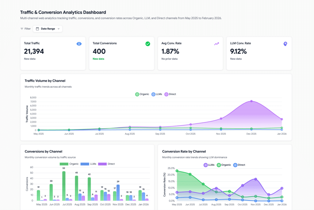
Instead of replacing your spreadsheet, it makes your spreadsheet the center of your data stack. You connect your live data sources directly to Google Sheets or Excel, set a refresh schedule, and your data stays current automatically. When you’re ready to share something beyond the spreadsheet, you use Coefficient’s AI chat interface to build a web dashboard from that same live data.
That last part is worth pausing on. You describe what you want in plain English and the AI builds the dashboard for you. Charts, layout, visualizations. You iterate in the same conversation. No configuration screens to navigate, no blank canvas to stare at.
The dashboard stays connected to your live data. When data in spreadsheet refreshes automatically, the dashboard updates. There’s no export-import cycle, no stale screenshots, no version gap between what’s in the spreadsheet and what leadership sees on the shared link.
Who this is actually built for
This might not be an ideal tool for data engineers or BI analysts. It’s for the RevOps lead who maintains the pipeline report, the finance manager who owns the monthly close model, the sales ops person who needs to show leadership a real-time leaderboard without filing an engineering ticket. Teams that live in spreadsheets and need their dashboards to reflect what’s actually happening right now, not what was true when someone last exported a CSV.
What users say
“What used to take me, who knows how long, now takes me two minutes. I just say ‘make me a dashboard on bookings’ and it’s done.” — Austin Lee, Sales Operations
“Before this, it wasn’t worth trying to up-level visuals to a BI dashboard. AI-native dashboard building within a spreadsheet — that was the one gap nobody filled. Until now.” — Alex Bugajski, Revenue Operations, Lambda Labs
“We use Looker internally and it’s so dated. It doesn’t work, it’s a pain to get data in there. This cuts it out and it’s more attractive.” — Chris Sanders, CFO, Ready Education
“I just built a leaderboard with it. We used to do this in Google Sheets, but as a real dashboard it’s so much better. When we showed it to the sales team and our director, they’re much more confident to actually use the data and believe in it.” — Kevin Liu, Sales Operations, Unity
Key Features
- Live data sync with 100+ connectors including Salesforce, HubSpot, Snowflake, NetSuite, QuickBooks, Google Ads, and more
- AI chat interface to build and publish web dashboards directly from your live spreadsheet data
- Auto-refresh on your schedule (hourly, daily, weekly)
- Write data back to source systems without leaving your spreadsheet
- Slack and email alerts when metrics change
- Historical data snapshots for trend tracking
- Works in both Google Sheets and Excel
Pricing:
Free plan available. Paid plans scale with team size and connector needs starting at $49/month.
How it compares to Looker Studio:
Looker Studio hands you a blank canvas and asks you to figure out the connections. Coefficient gives you live data, a familiar spreadsheet interface, and an AI assistant that builds the dashboard for you. If your team works in Google Sheets or Excel, the learning curve is close to zero.
Get started free with Coefficient
2. Microsoft Power BI
Best for: Organizations already running on Microsoft infrastructure
Power BI is the natural move if your team is embedded in the Microsoft ecosystem: Azure, Office 365, Teams, SQL Server. It handles large datasets without the performance degradation Looker Studio runs into, includes enterprise-grade row-level security that Looker Studio simply doesn’t have, and the per-user pricing is reasonable compared to other enterprise BI tools.
In 2026, Power BI Copilot lets you build report pages, write DAX formulas, and get narrative summaries through a chat interface — similar to how AI assistants are being layered into most tools now.
The tradeoff is complexity. DAX, the formula language Power BI uses for custom calculations, has a steep learning curve for non-analysts. Setting up and maintaining data models takes time. And while viewing a report in Looker Studio is always free, in Power BI every viewer needs a Pro license ($14/user/month) unless you’re paying for Premium Capacity, which starts around $4,995/month.
Pricing: Power BI Pro at $14/user/month (updated April 2025). Premium capacity pricing scales from there.
How it compares to Looker Studio: More powerful, more reliable at scale, better security model. But it costs money, has a real training requirement, and works best when you’re already invested in the Microsoft stack. If your team runs on Google Workspace, Power BI creates more friction than it resolves.
3. Tableau
Best for: Data analysts and enterprises where visualization is a core competency
Tableau is the benchmark for data visualization depth. It handles complex datasets, supports an extensive library of chart types, and gives analysts precise control over how data is presented. For organizations where data storytelling is central to how leadership makes decisions, Tableau delivers at a level most other tools don’t reach.
Creator licenses start at $75/user/month billed annually. At that price point, you need to be confident your team will use it deeply. If you’re building two dashboards a quarter, that budget is hard to justify. If you have a team of analysts producing executive reporting, competitive intelligence, and customer-facing analytics, the investment makes more sense.
The learning curve is real. Tableau is not a tool most business users pick up and run with in a day.
Pricing: Creator at $75/user/month, Explorer at $42/user/month, Viewer at $15/user/month (approximate 2026 pricing).
How it compares to Looker Studio: Dramatically more capable. Also dramatically more expensive and complex. Worth it for organizations where data visualization is a dedicated function, not a side responsibility.
4. Looker
Best for: Data engineering teams that need a governed semantic layer across a large organization
Before going further: Looker and Looker Studio are two different products. Looker Studio is Google’s free dashboard tool. Looker is the enterprise BI platform Google acquired in 2020, and it starts at several thousand dollars per month. If you’re reading this because your free Looker Studio dashboards keep breaking, Looker the enterprise product is almost certainly not what you’re looking for.
That said, it belongs on this list because the confusion is real and the upgrade path from Looker Studio to Looker is something larger organizations do consider.
Looker’s core strength is its semantic layer. Data teams define metrics centrally in LookML, a SQL-based modeling language, and those definitions flow consistently to every report and dashboard in the organization. “Revenue” means the same thing in every report, for every team, because it’s defined once at the data layer rather than recreated in each dashboard. For organizations where metric inconsistency is a genuine operational problem, this is a meaningful capability.
The tradeoffs are significant. LookML requires dedicated data engineering skills. Implementation takes months, not days. And the pricing reflects the enterprise positioning. Most teams frustrated with Looker Studio’s connector costs or blend limits are not ready for what Looker requires in time, skills, and budget.
Pricing: Custom enterprise pricing, typically starting at $5,000 per month and scaling from there.
How it compares to Looker Studio: Not a direct upgrade, it’s a fundamentally different product category that requires a fundamentally different level of investment. Worth evaluating if your organization has a dedicated data team, mature data infrastructure, and consistent metric definition is a real problem at scale. Not the right move if you just need reliable dashboards without the 5-source limit.
5. Databox
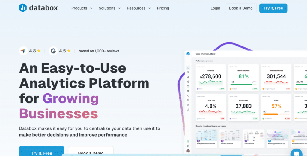
Best for: Marketing and sales teams that need dashboards up quickly without technical setup
Databox is built for speed. Pre-built templates cover common use cases across Google Ads, HubSpot, Facebook Ads, Shopify, and others. Connect an account, pick a template, and you have a working dashboard in minutes. The mobile app is polished. Setup is non-technical.
The limitations surface when your needs grow. The free plan caps you at 3 data source connections, which is rarely enough for real multi-channel reporting. The connector library is narrower than more established platforms. And Databox doesn’t handle data transformation — what you get is exactly what the API returns, so if your data is messy or uses inconsistent naming conventions, you’ll clean it somewhere else before it hits the dashboard.
Pricing: Free plan (3 data sources). Paid plans start around $47/month.
How it compares to Looker Studio: Faster to set up, better templates out of the box, cleaner mobile experience. But it hits its own ceiling quickly. Good as a starting point for small teams; can feel limiting once your reporting needs get more sophisticated.
6. Zoho Analytics
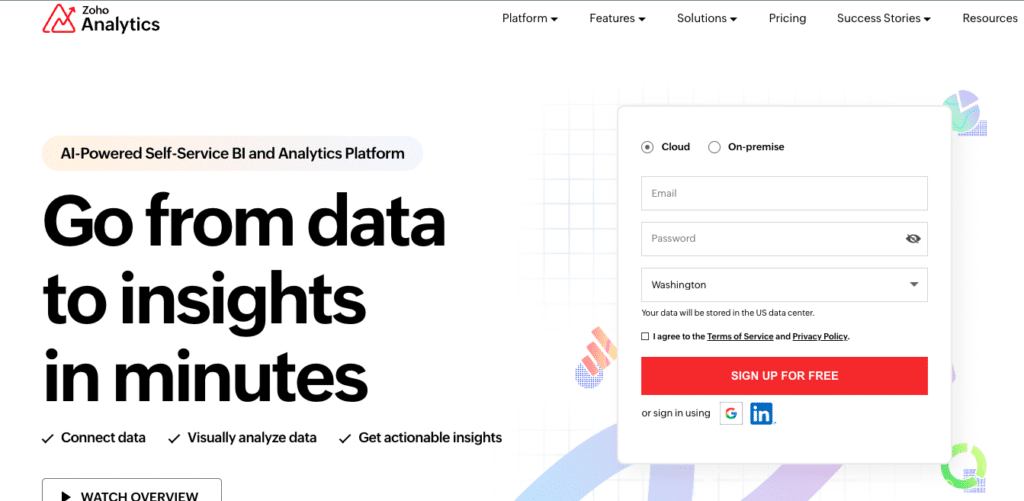
Best for: SMBs that want an affordable, AI-assisted BI platform
Zoho Analytics offers over 500 native data connectors, a no-code dashboard builder, and an AI assistant called Zia that surfaces automated insights and lets users ask questions in plain English. For teams already using Zoho’s broader product suite (CRM, Books, Desk), the integration is particularly tight.
The pricing is genuinely affordable compared to enterprise alternatives. It starts at $8/user/month and includes a free plan for up to 2 users and 10,000 rows. The row-based pricing tiers can become a constraint as your data volume grows, so check the math for your actual data volumes before committing.
Pricing: Free plan available. Paid tiers from $8/user/month billed annually.

Stop exporting data manually. Sync data from your business systems into Google Sheets or Excel with Coefficient and set it on a refresh schedule.
Get Started
How it compares to Looker Studio: More data connectors, AI-assisted insights, no per-connector fees, and a clearer pricing model. A strong value play for SMBs that want to get more out of their data without the cost and complexity of enterprise BI tools.
7. Qlik Sense
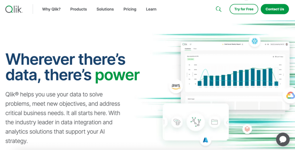
Best for: Enterprises that need deep associative analytics across complex datasets
Qlik Sense uses an associative data model that lets users explore relationships across datasets without predefined drill-down paths. Click a data point and related data throughout the model highlights or grays out, surfacing connections you might not have thought to look for. For organizations doing complex exploratory analysis, this is genuinely useful.
This is an enterprise product with enterprise pricing, enterprise implementation timelines, and an enterprise learning curve. It’s not a replacement for Looker Studio for most teams, it’s a step up in analytical sophistication for organizations that have already outgrown what simpler BI tools can do.
Pricing: Custom enterprise pricing. Expect it to be significantly higher than any other option on this list.
How it compares to Looker Studio: A completely different product category. Suitable for organizations doing large-scale, complex analysis who have the budget and internal resources to match. Not the right move if you’re just frustrated by Looker Studio’s connector fees or load times.
8. Whatagraph
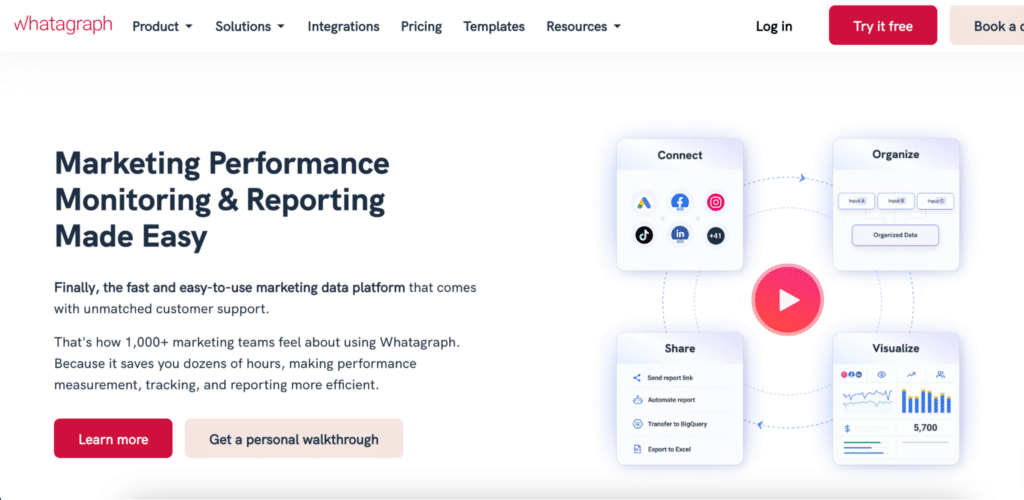
Best for: Marketing agencies managing ongoing client reporting at scale
Whatagraph is purpose-built for agencies that need to produce reports for multiple clients, automate those reports on a schedule, and make them look professional with client branding. It connects to the platforms marketing agencies live in (Google Ads, Meta, LinkedIn, GA4, HubSpot) and lets you duplicate report templates across client accounts without rebuilding from scratch.
The price reflects the agency focus. At $199/month as a starting point, it’s not cheap for a small team. But if your agency is spending significant time every month manually building and distributing client reports, the math on time saved often works out.
Pricing: Starts at $199/month.
How it compares to Looker Studio: Looker Studio has no white-labeling, connector fees add up fast across multiple client accounts, and duplicating report templates across clients is painful. Whatagraph solves all three of those problems, but specifically for agencies. It’s not designed for internal team reporting.
How to pick the right Looker Studio alternative
Before you test anything, get clear on the actual problem. Different frustrations point to different solutions.
If your team works in spreadsheets and wants live dashboards without learning new tools: Coefficient. Your data stays in Google Sheets or Excel, your dashboards stay connected to that live data, and your team doesn’t have to change how they work.
If you’re a Microsoft shop and need enterprise-grade security: Power BI. The per-user licensing adds up, but the depth of integration with the Microsoft stack makes it the clear choice if you’re already there.
If you have dedicated data analysts and visualization is core to your work: Tableau. The cost and learning curve are real, but the output quality and analytical depth are best in class.
If you have a dedicated data team and metric consistency is a real problem at scale: Looker. Expensive and complex, but the semantic layer is genuinely useful for large organizations where different teams are pulling different numbers.
If you’re a marketing or sales team that needs dashboards fast: Databox for a quick start. Coefficient if you want that data to also power automated reports and live dashboards your whole team can access.
If you’re an agency building client reports at scale: Whatagraph. Built specifically for that workflow.
If you’re an SMB that wants AI-assisted BI at an accessible price: Zoho Analytics.
If you need enterprise analytics with deep data exploration: Qlik Sense.
The bottom line
The right Looker Studio alternative is the one your team will actually use, not the one with the most features on a comparison chart.
For most RevOps, finance, marketing and sales ops teams, the answer is a tool that works with the spreadsheets they already live in, gives them live data without manual exports, and lets them publish dashboards that look like they came from a real BI team. That’s what Coefficient is built to do.
Get started free and have your first live dashboard running in under an hour.
Frequently asked questions
What is the difference between Looker and Looker Studio?
They are two separate products. Looker Studio is Google’s free dashboard tool, formerly called Google Data Studio. Looker is Google’s enterprise BI platform, acquired in 2020, which starts at thousands of dollars per month and requires a dedicated data engineering team to implement. Most people searching for Looker Studio alternatives are looking to replace the free tool, not upgrade to the enterprise one.
What is the best free Looker Studio alternative?
Coefficient has a free tier and works directly in Google Sheets or Excel, making it the easiest starting point if your team already uses spreadsheets. Databox also has a limited free plan for up to 3 data sources.
What is the best Looker Studio alternative for marketing agencies?
Whatagraph is purpose-built for agencies managing multi-client reporting. It handles white-labeling, template duplication across accounts, and automated report delivery in ways Looker Studio doesn’t support.
Can I use Looker Studio and an alternative at the same time?
Yes. A common approach is to keep Looker Studio for basic GA4 tracking where it works well and use a more capable tool for everything else. Coefficient works as a layer on top of your existing stack without replacing it.
What is the best Looker Studio alternative for non-technical users?
Coefficient, Databox, and Zoho Analytics all have low technical barriers. Coefficient is the strongest option if your team already works in Google Sheets or Excel since there’s essentially no new interface to learn.
Is Power BI better than Looker Studio?
For organizations in the Microsoft ecosystem, yes. Power BI handles larger datasets, has better row-level security, and integrates more deeply with Azure, Teams, and Excel. The tradeoff is cost and complexity. Every report viewer needs a paid license, and the DAX learning curve is real.


